 Greetings to all readers of our data visualization blog DataViz Weekly! We’ve collected four more charts and maps that should be worth getting your attention. Our today’s choice of cool recent data visualizations includes:
- patterns of how parents and adults without kids use their time,
- global CO2 emission since 1850,
- wages and employment rates in the US (by state), and
- global refugee flow since 2000.
Let’s get down to these now!
DataViz Weekly Data Visualization Blog: June 16, 2017 – June 23, 2017
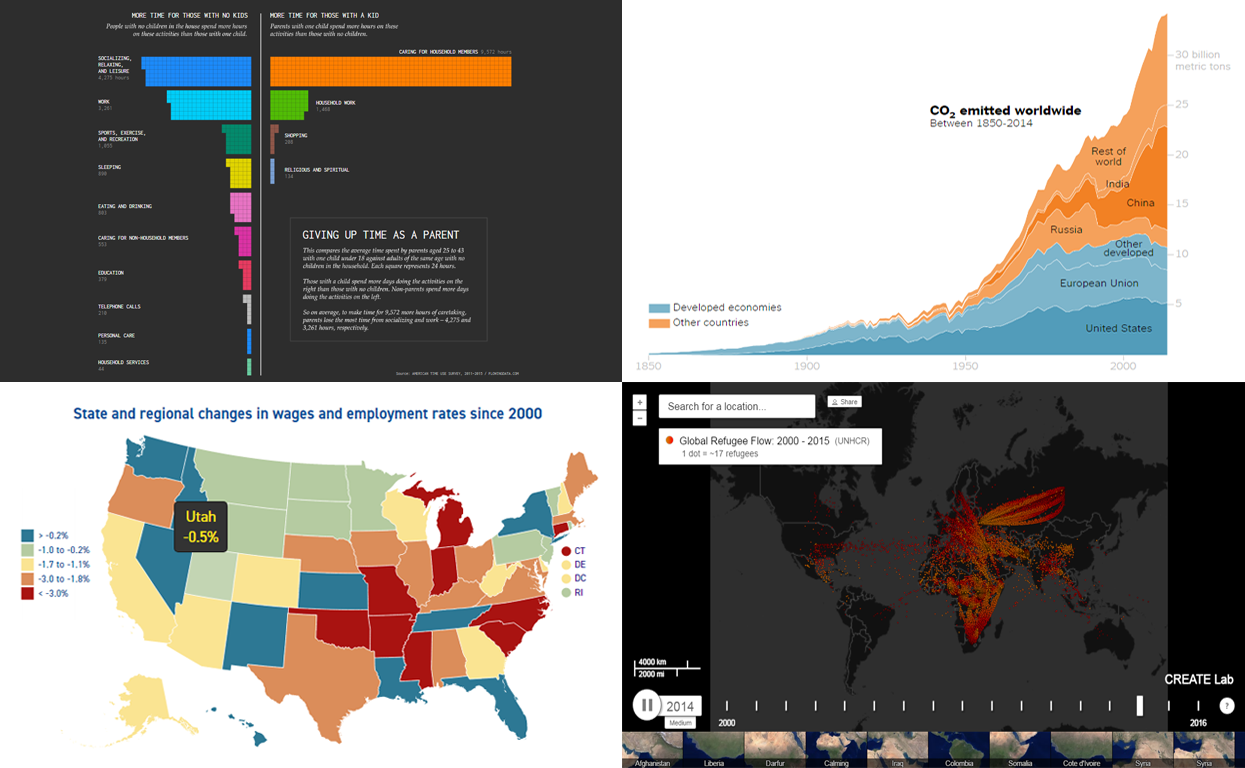
Comparing Time Use Patterns for Parents and Other Adults
Once you’ve become a parent, a lot of things in your life change. Nathan Yau, the creator of data visualization blog FlowingData, visualized information from the American Time Use Survey to better understand the difference between the life styles of the average adults with and without kids. Check out the result – Giving Up Time as a Parent.
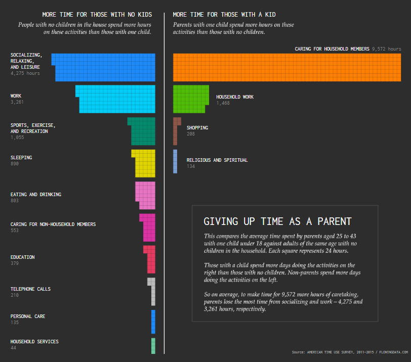
Chart of Global Carbon Dioxide Emission Since 1850
While talking about the United States’ exit from the Paris accord on climate change (2015) announced by President Trump just a few weeks ago, the New York Times published a set of peculiar data visualizations. The bar chart and stacked area charts that are present in the article clearly show the role of the US as the biggest CO2 polluter in the world (and in history).
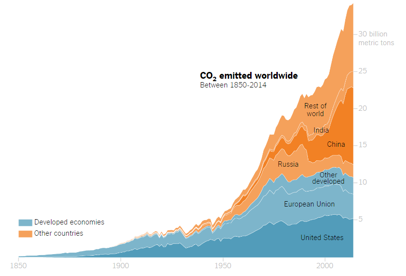
Map Visualizing US Wages and Employment Rates by State
The Center for American Progress shared the results of their new analysis on how wages and employment rates across the United States have changed since 2000. The corresponding article on their blog includes an interactive map that nicely visualizes state-by-state patterns and, in particular, reveals an especially peculiar situation in the Midwest.
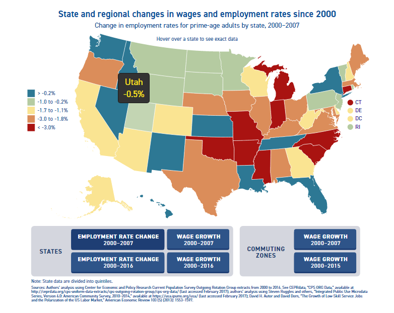
Data Visualization of Global Refugee Flow Between 2000-2015

And the last but absolutely not least data visualization we’ve decided to highlight in this new Data Visualization Weekly issue on our blog is the interactive Global Refugee Flow map. It shows where refugees went to (and from) between the years of 2000 and 2015. What’s more, the day of June 20 – this week’s Tuesday – is celebrated as World Refugee Day, so we could not help sharing this animated map visualization with you.
As always, our data visualization blog and the whole team behind AnyChart JS Charts wish you a wonderful, hopefully absolutely amazing weekend time! But before you begin to chill out, make sure you’ve at least looked through the new interesting article of our Chief of R&D Roman Lubushkin on SitePoint or bookmarked it for thoroughly reading in the near future. After having written the tutorials about JavaScript drawing with GraphicsJS and working with data in AnyChart, now Roman explains how to quickly build interactive JavaScript (HTML5) charts from custom data sets and easily customize the design of visualizations.
All the best!
- Categories: Data Visualization Weekly
- No Comments »