Data Analytics and Visualization Examples Worth Seeing: High Street, Neighborhoods, Trains, Climate — DataViz Weekly
February 8th, 2019 by AnyChart Team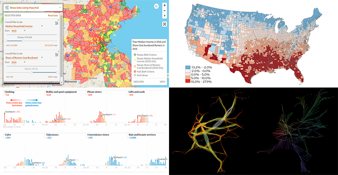 Check out new interesting data analytics and visualization examples from around the web. Here are the topics in the focus of today’s DataViz Weekly:
- high-street crisis in town centers across England and Wales;
- interactive maps of changes in Greater Boston’s neighborhoods;
- connectivity between train stations in the Netherlands;
- economic costs of climate change vs election results in the United States.
- Categories: Data Visualization Weekly
- No Comments »
New Cool Data Visualizations on Emissions, Climate, Travel, and Music — DataViz Weekly
December 7th, 2018 by AnyChart Team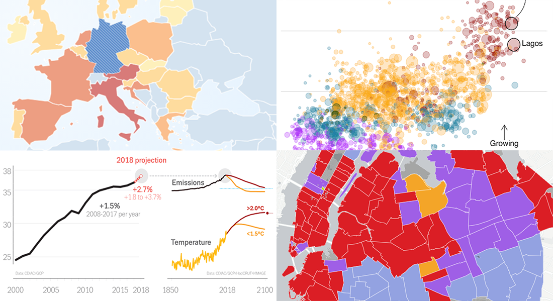 Take a look at new cool data visualizations recently published on the web. In today’s DataViz Weekly, we are glad to feature interesting information graphics from the Global Carbon Project, BBC News, Berliner Morgenpost, and Vivid Seats, dedicated to the following subjects:
- carbon dioxide emissions;
- current state of climate change;
- top 2018 summer travel destinations for Germans;
- top music genres and artists in NYC by neighborhood.
- Categories: Data Visualization Weekly
- No Comments »
New Data Visualizations About Swedish Election, U.S. Cropland, Hurricanes, and Night Lights — DataViz Weekly
September 14th, 2018 by AnyChart Team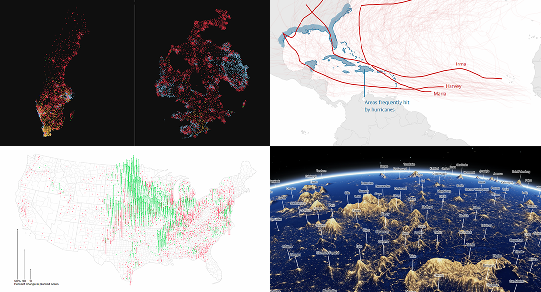 Yay, it’s DataViz Weekly time again! Here’s what new data visualizations we’ve recently found around the web and decided to share with you now:
- Swedish general election results;
- American cropland’s shift away from diversity;
- climate change and hurricanes;
- world cities’ night lights visualized as terrain.
- Categories: Data Visualization Weekly
- No Comments »
Interesting Data Graphics About Warming, Debt, Commuting, and China — DataViz Weekly
September 7th, 2018 by AnyChart Team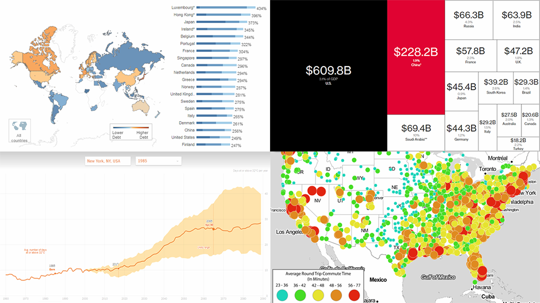 Check out the new issue of DataViz Weekly on the AnyChart blog, showing you four interesting data graphics-based stories and projects on the following topics:
- how much hotter your hometown is than when you were born;
- global debt;
- commute times in U.S. cities;
- China as an aspiring superpower.
- Categories: Data Visualization Weekly
- No Comments »
Data Visualization Projects About Construction, PMI Activity, Climate, and Election — DataViz Weekly
August 24th, 2018 by AnyChart Team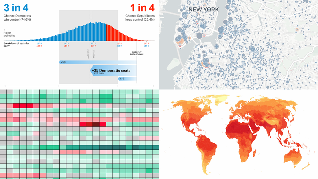 Welcome to DataViz Weekly, a regular feature on the AnyChart blog that highlights some of the most interesting new data visualization projects each Friday.
Here’s what we are glad to tell you about this time:
- active constructions in New York City, in real time;
- global PMI activity;
- cities with no need for air conditioning and heating;
- 2018 U.S. House midterm election forecast.
- Categories: Data Visualization Weekly
- No Comments »
Amazing Charts in New Data Visualization Weekly Collection
June 2nd, 2017 by AnyChart Team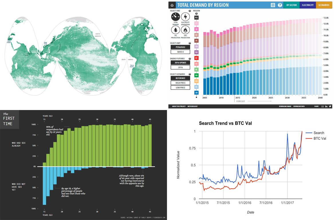 Amazing charts are everywhere around us. We continue sharing the most interesting visualizations that have just recently seen the light and stayed popular around the Web within the past few days. And we are welcoming you to the new issue of the Data Visualization Weekly article series on our blog.
Before getting to another four amazing charts, we are glad to remind you of the biggest data visualization news of the week here in case you missed it: AnyChart JS Charts 7.14.0 was released just a few days ago! So, go ahead and check out the new cool features and improvements that are now available in the new versions of our JavaScript (HTML5) charting libraries – AnyChart, AnyMap, AnyStock, and AnyGantt – if you have not yet done so.
- Categories: Data Visualization Weekly
- No Comments »
Stacked Bar Charts Explained, Vizzies 2017 Winners, Global Temperature Graph, Map of Sea Level Rise | DataViz Weekly
March 31st, 2017 by AnyChart Team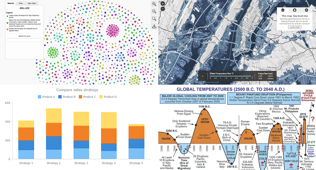
Today is the 13th Friday of the 2017 year, and another weekend is coming! In the meantime, we invite you to enjoy another portion of last week’s notable works in the data visualization field. The first highlight here is the article about stacked bar charts and how to use them, written by our Data Visualization Expert Vitaly Radionov specifically for Smashing Magazine. After briefing you on that, we’ll also take a look at this year’s winners of the Vizzies Challenge, a graph of global temperature change from 2500 BC to 2040 AD, and a (scary) map visualization of the sea level rise expected in the (near?) future.
- Categories: Charts and Art, Data Visualization Weekly
- No Comments »