Data on American Birds, Ukrainian Children, Mega Warehouses, U.S. Government in Interactive Visualizations — DataViz Weekly
September 23rd, 2022 by AnyChart Team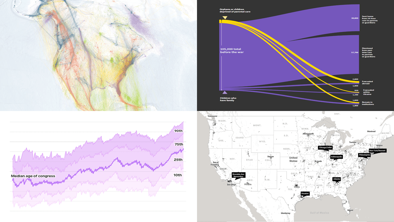 DataViz Weekly keeps you informed of the latest data visualizations that are definitely worth seeing, from our point of view. Check out our new picks:
- American bird migration — Audubon
- Ukrainian children dismissed from residential care institutions — Reuters
- Mega warehouses and their impacts — Sierra
- Age of the U.S. political leaders — Insider
- Categories: Data Visualization Weekly
- No Comments »
Coronavirus in US in Charts and Maps — DataViz Weekly
March 20th, 2020 by AnyChart Team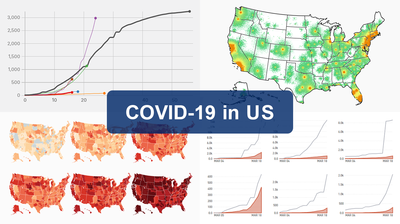 As the novel coronavirus pandemic is in full swing, COVID-19 is now by far the most topical issue on the global agenda. So it’s no surprise that the vast majority of the data visualization projects we’ve come across this week are about the outbreak. That’s why the new DataViz Weekly article is entirely devoted to the same subject — the coronavirus.
We are quite sure many of you have already seen some if not all of the best dashboards, charts, and trackers of the global COVID-19 outbreak from Johns Hopkins University, The New York Times, Financial Times, Business Insider, The Guardian, Bloomberg, and others. Awesome animated simulations from The Washington Post’s Harry Stevens, showing why epidemics like this spread exponentially and how social distancing could help to flatten the curve of COVID-19 cases, have almost certainly came to your attention and does not need to be presented additionally.
Headquartered in the United States, we decided to find out more about what has been going on about COVID-19 in America. Join us on a review of four interesting (though sometimes a bit frightening) data graphics features created by top media outlets, which provide insight into where the U.S. stands — from the perspective of cases and tests (Politico), scenarios (TIME), and hospital bed capacity (The Upshot by NYT), as well as compared to the rest of the world (BuzzFeed News). Check out the special “COVID-19 in US” edition of DataViz Weekly on the AnyChart blog.
- Categories: Data Visualization Weekly
- 2 Comments »
2019 Year in Charts from World Bank, The Economist, FT, and Business Insider — DataViz Weekly
January 3rd, 2020 by AnyChart Team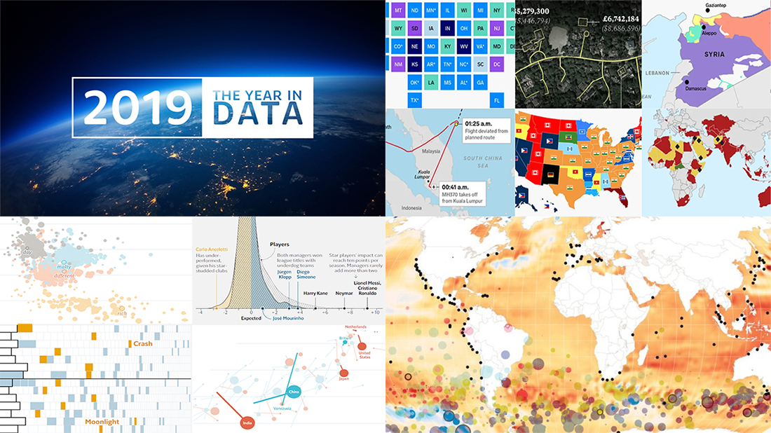 Happy New Year everyone! Now that 2020 is finally here, let’s hold on just one moment to take a look back at 2019. In the first DataViz Weekly post of this new year, we highlight four cool “Year in Charts” stories from the World Bank, The Economist, Financial Times, and Business Insider. Check them out to remember what 2019 was like.
- Categories: Data Visualization Weekly
- 1 Comment »
New Charts and Maps to Check Out — DataViz Weekly
August 23rd, 2019 by AnyChart Team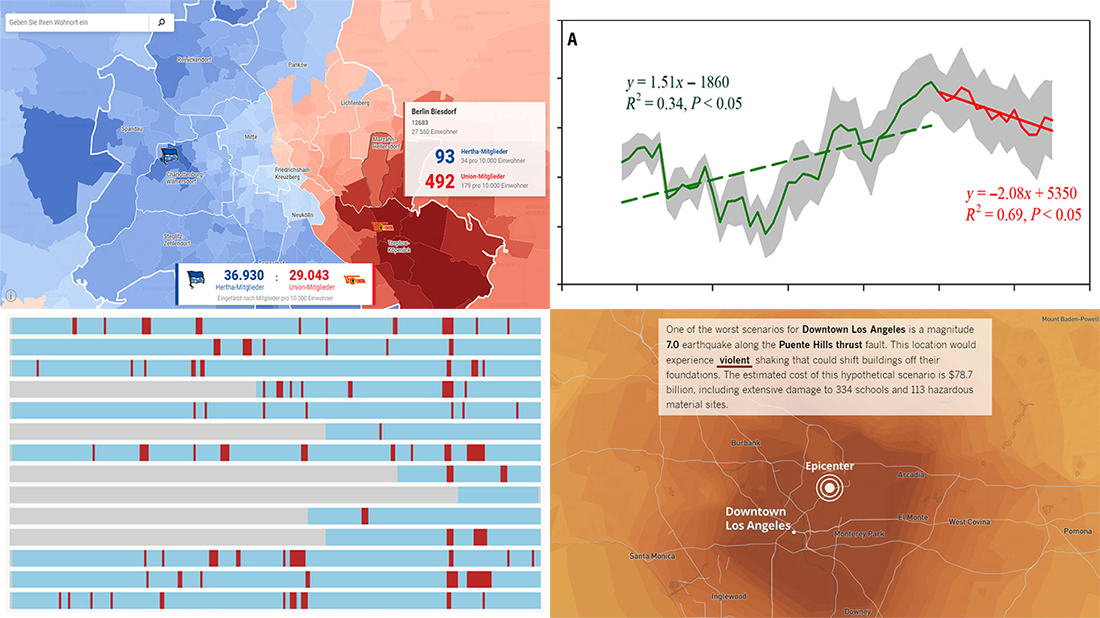 Continuing our DataViz Weekly series, we’ve put together a fresh selection of cool new charts and maps that are worth looking at and exploring. The visualizations we feature this time provide interesting insight into the following topics:
- Economic recessions worldwide in 1960-2019 — Business Insider
- Football divide in Berlin — Berliner Morgenpost
- Earthquake scenarios for California landmarks — Los Angeles Times
- Decline in the global vegetation growth — Science Advances
- Categories: Data Visualization Weekly
- No Comments »
Engaging Data Visualizations About Time, Light, America, and Britain — DataViz Weekly
July 5th, 2019 by AnyChart Team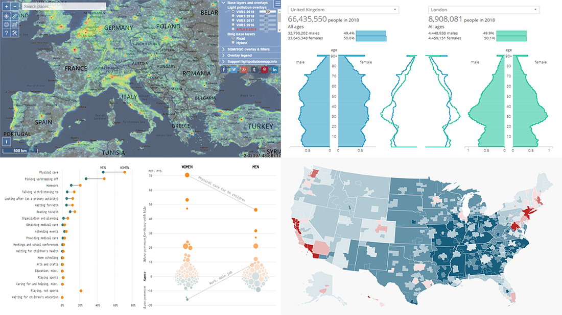 Here are some of the cool, engaging data visualizations we’ve come across these days. They are great examples of how awesome and informative charts can be when they truly let data talk.
The visualizations we are featuring this time on DataViz Weekly are as follows:
- Differences between men and women’s everyday life with kids — FlowingData
- 50 maps showing various aspects of the American life — Business Insider
- New population estimates for the United Kingdom — ONS
- Light pollution around the globe — Jurij Stare
- Categories: Data Visualization Weekly
- No Comments »