Noteworthy New Visualizations to Explore — DataViz Weekly
February 7th, 2025 by AnyChart Team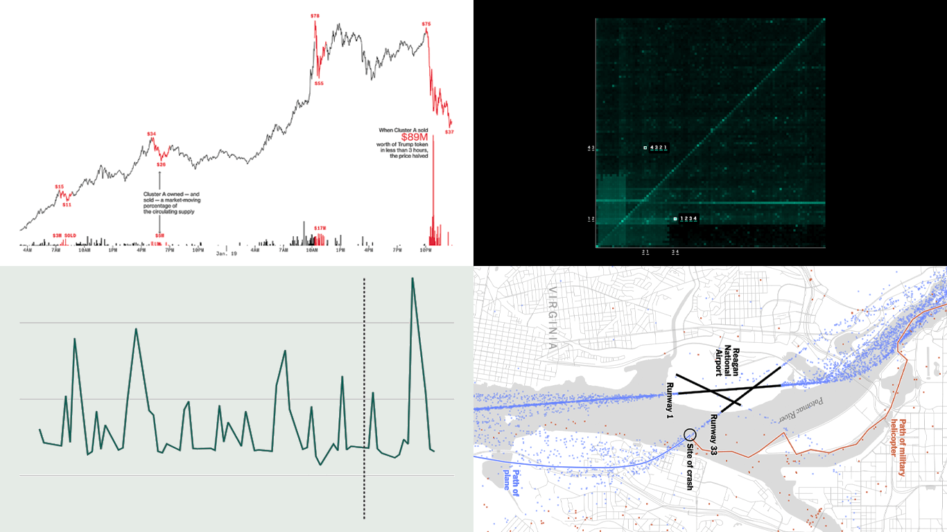 Continuing our regular DataViz Weekly, we’re glad to share the most interesting of all the new data visualizations we’ve recently come across, well worth a look. Here’s what we have lined up this time:
- PIN code popularity — ABC News
- Complexity of D.C. airspace amid the Potomac River midair collision — The New York Times
- Trading patterns in the Trump memecoin — Bloomberg Crypto
- U.S. federal expenditures in real time — The Hamilton Project
- Categories: Data Visualization Weekly
- No Comments »
27 Election Maps of 2024 U.S. Presidential Vote Results — DataViz Weekly Special Edition
November 8th, 2024 by AnyChart Team The 2024 U.S. presidential election has concluded, and media outlets worldwide are offering a plethora of data graphics to convey the election results. In this special edition of DataViz Weekly, we’ve curated a collection of over twenty election maps, showcasing diverse ways to represent voting data — cartograms, choropleth maps, bubble maps, and more. Whether you’re a data enthusiast, professional, or simply intrigued by the 2024 election outcomes, explore the latest U.S. election maps from top media!
💡 Also see our previous special editions with election maps: 2020 U.S. election maps and 2024 UK election maps.
- Categories: AnyMap, Dashboards, Data Visualization Weekly
- No Comments »
New Real-Life Data Visualization Examples — DataViz Weekly
September 27th, 2024 by AnyChart Team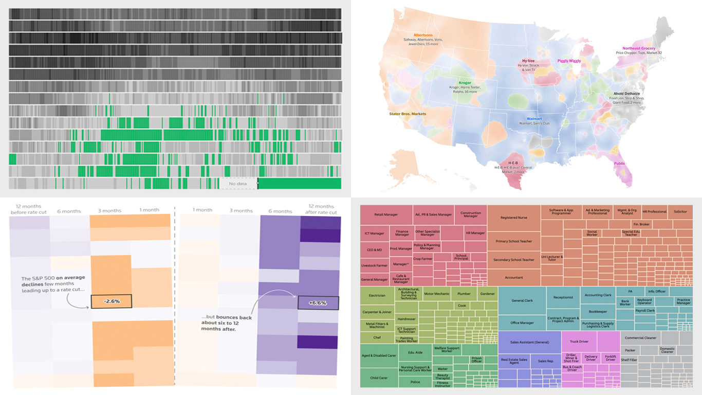 Each week, DataViz Weekly brings you a curated selection of charts and maps based on real-life data. Welcome to our new roundup, continuing to demonstrate how effective data graphics can truly help make sense of complex topics. Take a look at the new data visualization examples we’ve lately found worth highlighting:
- The United Kingdom’s coal-free power era — Ember
- Grocery store ownership in the United States — The Washington Post
- Market reactions to the Federal Reserve’s rate cuts — Reuters
- Marriage patterns by occupation in Australia — ABC News
- Categories: Data Visualization Weekly
- No Comments »
Top Recent Data Graphics from Around Internet — DataViz Weekly
July 8th, 2022 by AnyChart Team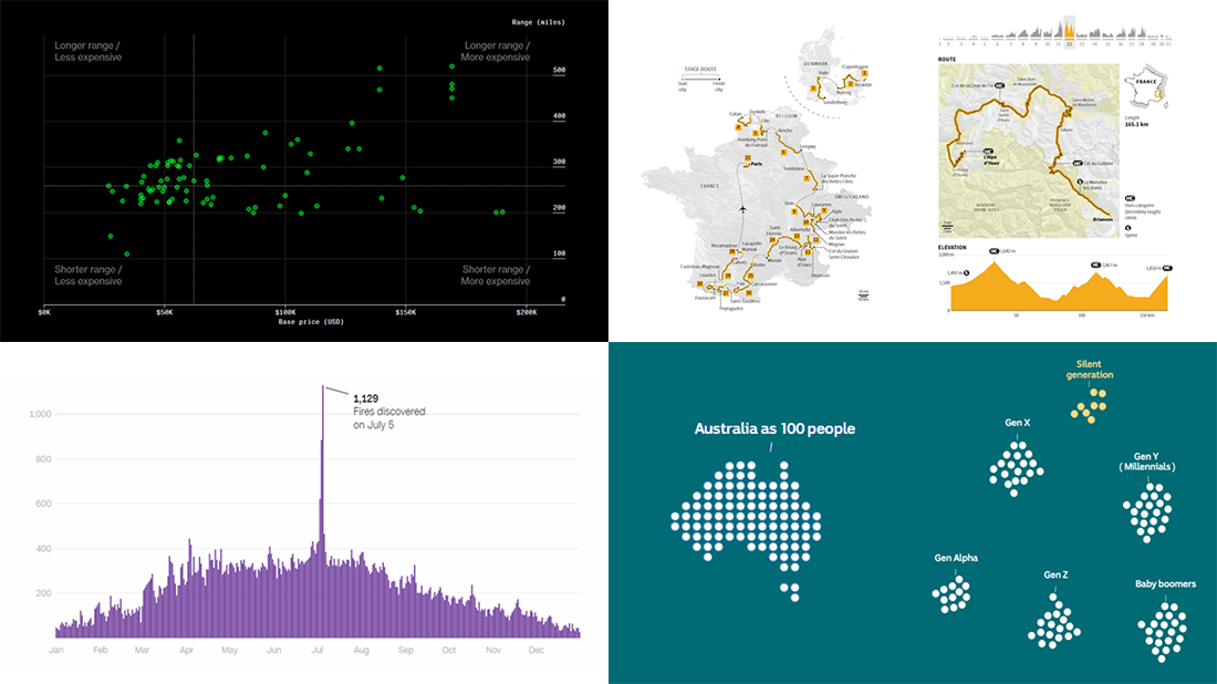 DataViz Weekly is here with an overview of the top data graphics recently published around the internet! Today we are pleased to tell you about the following visualizations:
- Electric car models in comparison — Bloomberg Green
- Australia as 100 people (according to the 2021 census) — ABC News
- Human-caused wildfires in the U.S. around Independence Day — CNN
- 2022 Tour de France route — Reuters
- Categories: Data Visualization Weekly
- No Comments »
Stunning Visualizations of Heat Records, Election Results, Time Splits, Air Pollution Data — DataViz Weekly
May 27th, 2022 by AnyChart Team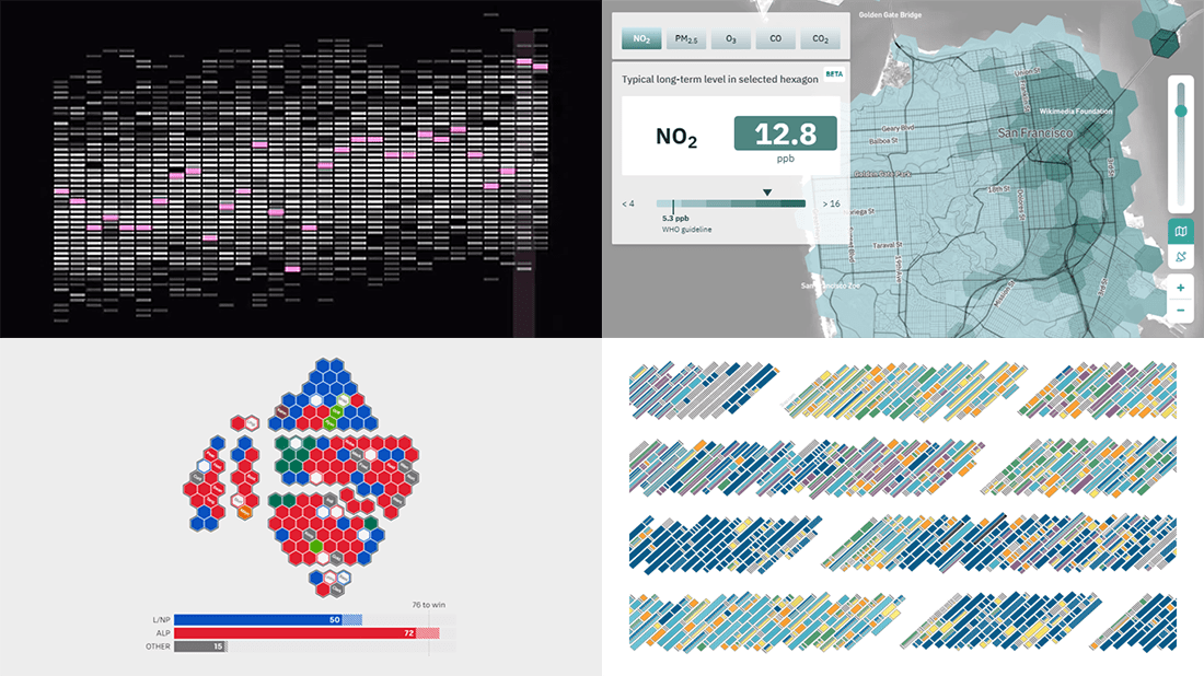 Ready for another serving of stunning data visualizations? Here you go with DataViz Weekly! Look at four projects that have caught our eyes most recently.
- Heat records in 400 U.S. cities — The Pudding
- 2022 Australian election’s unfolding and results — ABC News
- Air quality in the San Francisco Bay Area block by block — Aclima
- Data visualization project time splits by activity — Eli Holder on Nightingale
- Categories: Data Visualization Weekly
- No Comments »
Great Recent Data Graphics Worth Looking At — DataViz Weekly
October 22nd, 2021 by AnyChart Team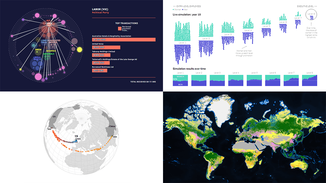 It’s time for DataViz Weekly! Check out the most interesting data visualizations that have recently come to our attention!
- Political donations from the gambling industry in Australia — ABC News
- Land cover worldwide — ESA
- Gender bias in the workplace — NYT Opinion
- World’s carbon “center of gravity” from 1800 through 2020 — The Guardian
- Categories: Data Visualization Weekly
- No Comments »
20+ Electoral Maps Visualizing 2020 U.S. Presidential Election Results — DataViz Weekly Special Edition
November 6th, 2020 by AnyChart Team All eyes on election maps! Yes, they could be misleading. And even widely misleading. But it can be at least so fascinating to look at them, especially at times like this! So, we have curated a list of over twenty reputable resources — as of now, to be precise, 24 and counting! — where you can watch the live results of the 2020 United States Presidential election in compelling data visualizations. At the same time, it is a great chance for you to investigate and understand how election maps (and some other graphics) can look and work in practice.
💡 See also: 2024 U.S. Election Maps (November 2024).
Vote counts may be different on different platforms and update as more data becomes available out there — it’s absolutely okay. The election results are still partial. Over the coming days, all numbers will be adjusted to match the real, final vote count. Just in case: We’ve added only reliable sources — notable, reputable media outlets.
Without further ado, check out maybe the most important data visualizations these days! (Electoral vote count numbers in the text last updated on November 9th, 2020, for each source.)
- Categories: Data Visualization Weekly, News, Third-Party Developers
- 3 Comments »
Compelling Data Visualizations to Check Out This Weekend — DataViz Weekly
October 25th, 2019 by AnyChart Team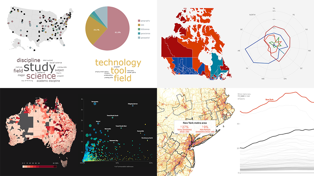 Continuing our regular DataViz Weekly feature, we invite you to check out several compelling data visualizations worth taking a look at, which we’ve noticed and enthusiastically explored these days. Here’s a quick list of the projects highlighted in the new roundup:
- Impact of climate change on the costs and availability of insurance in Australia — ABC News
- “Geography” and “GIS” in the U.S. higher education — Alicia Bradshaw, UW Tacoma
- Auto emissions in America — The New York Times
- Canadian federal election results — CBC/Radio-Canada
- Categories: Data Visualization Weekly
- No Comments »