Choose Right Chart Type for Data Visualization. Part 6: Resource/Project Management
May 17th, 2017 by AnyChart Team Achieving and maintaining effective Project Management is one of the most important challenges for every company. And high-quality visualization of resource usage and activity processes is a great tool for significantly improving the overall performance of a project. Keeping that in mind, we cannot omit the information on how to properly represent projects and resource data.
Read this article to learn what (specific) chart types you can choose to use in such cases.
- Categories: Choosing Chart Type, Tips and Tricks
- 1 Comment »
Choose Right Chart Type for Data Visualization. Part 5: Single-Value Data (Indicators)
May 10th, 2017 by AnyChart Team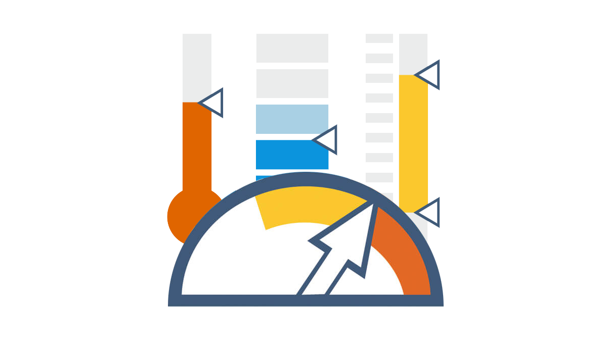 In the previous articles from the Choose Chart Type for Data Visualization series, we covered the ways to visually represent information for data comparison, composition and distribution analysis, and observing trends over time. The current post sheds light on a situation when you only have Single-Value Data that can serve as Indicators of the current performance. In this quite widespread case, plotting each value on a separate chart often makes sense. That is where Gauges and Bullet charts come into play.
- Categories: Choosing Chart Type, Tips and Tricks
- No Comments »
Choose Right Chart Type for Data Visualization. Part 4: Data Distribution
May 4th, 2017 by AnyChart Team Displaying and researching some Data Distribution and relationship between data sets instead of studying precise values in each category is a quite common task in data analysis. It can be solved with the help of the chart types that we are going to identify and explain in this article.
Depending on a situation – the kind of data you have and the specific questions you’d like it to provide answers to – you can pick one approach or another. Just be careful when choosing between one chart type and another for the subsequent data distribution analysis. You want the visualization to clarify data, not obscure it or deliver any sort of confusion. Well, simply make sure you understand the following aspects, mind all the details of your situation, and you will have no problem with visualizing data distribution correctly.
- Categories: Choosing Chart Type, Tips and Tricks
- 1 Comment »
JavaScript Drawing Library GraphicsJS 1.2.0 Released + Introduction from SitePoint
May 3rd, 2017 by AnyChart TeamGraphicsJS, our powerful JavaScript drawing library that we open-sourced last year, has recently got an update to version 1.2.0. It is the next best news of 2017, a great addition to winning a Devies Award with GraphicsJS for the category “JavaScript Technologies” and to the 7.13.0/7.13.1 releases of our JS/HTML5 charting solutions AnyChart, AnyStock, AnyMap, and AnyGantt.
So, we invite you to take a very quick look at the most important updates (we’ll highlight the two below). And then – in case you want to feel the real power of JavaScript drawing and have not used GraphicsJS in your business or fun web projects yet – we are sharing a nice article published on SitePoint just recently. It is an introduction to GraphicsJS based on two tutorials. They will guide you through the most valuable features of this JavaScript drawing library and demonstrate them in action, and you’ll learn how to easily create a naïve art picture and a time-killer game.

JavaScript Drawing with GraphicsJS: Main Improvements
- Closure library and Closure compiler were updated to version 20161024.
- Enjoy an improved JavaScript drawing performance! In particular, we optimized the process of obtaining a link to a container for the stage. Also, resize events are now handled with the help of the Timer object, not the iFrame element.
Now, you are welcome to read the SitePoint article about GraphicsJS. Please do not forget to ask your questions, if any. You may do that by leaving a comment here right below the article.
- Categories: Charts and Art, GraphicsJS, HTML5, JavaScript, News, Tips and Tricks
- 2 Comments »
Choose Right Chart Type for Data Visualization. Part 3: Data Over Time (Trend Context)
April 26th, 2017 by AnyChart Team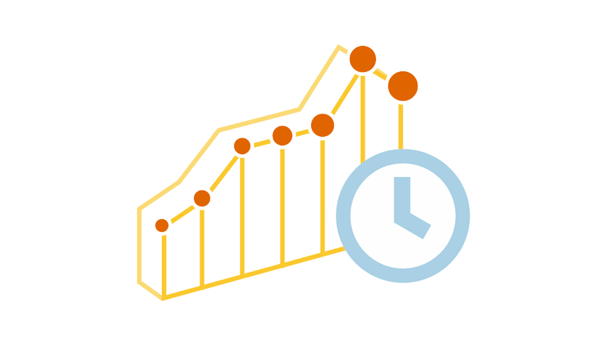 We are continuing the effort to better familiarize you with the world of chart types. This time let’s talk about good ways to visualize and explore Data Over Time.
Watching the change in data over time helps identify trends and dynamics in diverse timeline-based sets of values. Needless to say, choosing a right chart type is very important here. When applying an inappropriate form of visualization to your data, you might end up with an inaccurate idea of what happened in the past, what’s taking place now, and/or what will occur in the future. But we’ll do our best to help you avoid any mistakes in this field so you always make only right decisions based on your date/time data.
So, let’s get to the gist now.
- Categories: Choosing Chart Type, Tips and Tricks
- No Comments »
Choose Right Chart Type for Data Visualization. Part 2: Data Composition, Parts to Whole
April 20th, 2017 by AnyChart Team Illustrating part-to-whole relationships for further analysis is a very popular objective in data visualization. Basically, it is one of the most widespread ones, e.g. along with data comparison. With that in mind, the second part of the Choose Right Chart Type for Data Visualization series on our blog focuses on how to display Data Composition properly.
In particular, this article will show you the best ways to present the share percentages of simple values, compositional patterns in large data sets and hierarchical data (also with subordination), and stages in a process.
- Categories: Choosing Chart Type, Tips and Tricks
- 1 Comment »
Choose Right Chart Type for Data Visualization. Part 1: Data Comparison
April 12th, 2017 by AnyChart Team When it comes to creating data analytics and reporting solutions, choosing the right chart type for a certain data visualization task remains a common challenge. What do you pick for data comparison, studying distribution, observing data over time, or some other purpose? It can be very tricky! To help you overcome this challenge to the best effect, today we are launching a series of articles titled Choose Right Chart Type for Data Visualization. The series is designed to quickly explain what chart types you should pick for different purposes of data analysis. With that said, each article here will be devoted to a specific, yet still big question that you want your data to answer.
The current (first) guide of the series is all about chart types that work best for finding out the differences in data: Data Comparison. In fact, it is one of the most frequently established purposes of data analytics. And sometimes many people use wrong chart types to fulfil it correctly. Now, finally, let’s get to the very point and see what visualization forms work best for comparing data.
- Categories: Choosing Chart Type, Tips and Tricks
- 4 Comments »
How to Name a Graph: Tips for Writing Great Chart Captions
April 5th, 2017 by AnyChart Team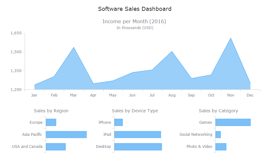 Charts are one of the best ways to display your data in a way that’s meaningful to readers, but if you don’t have great chart captions, your readers may interpret that meaningful information incorrectly.
Readers’ attention spans are waning by the second. In fact, humans now have a shorter attention span than goldfish (yes that cute, little fish you won from the carnival can pay attention better than the average person). This means that most people are scanning through your work. Without a clear, concise chart caption, your chances of getting your message across are slim.
Fear not! Here are some tips to help you come up with excellent chart captions, titles for graphs and dashboards.
How to Integrate AnyChart JavaScript Charts in SAP Web UI
March 30th, 2017 by Sandor van der Neut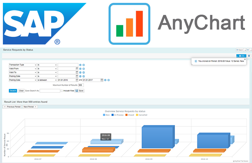 We as ‘mere’ humans are not very good at processing raw statistical data visually when it’s delivered to us in an unrefined form. We are, however, very good in detecting complex patterns when data is presented to us in a graph or a chart. It is therefore no wonder that as a developer you often get the requirement to represent data in a more comprehensible form. When you want to visualize data in the SAP Web UI in a more graphical way the standard possibilities available to you are rather limited. Luckily there are ways to overcome these limitations. When you combine SAP with the graphical power of AnyChart JS Charts a whole range of new possibilities will become available to you.
In this blog I will describe how you can integrate AnyChart in the SAP Web UI with relative ease, how you can feed AnyChart objects with SAP data using both a ‘pull’ and a ‘push’ mechanism and how you can respond in the SAP backend to the events triggered from user interaction with an AnyChart object.
- Categories: AnyChart Charting Component, AnyGantt, AnyMap, AnyStock, Business Intelligence, Dashboards, HTML5, JavaScript, Tips and Tricks
- No Comments »
8 Dashboard Design Trends for 2017
March 28th, 2017 by AnyChart Team. Click to see its interactive version") With the explosion of data in the past few years, the relevance of understanding it better has grown to the highest extent. That is why expertise in interactive charting and dashboard design, as well as in the whole big Data Visualization and Data Science fields in general, has become so important nowadays. In fact, it is usually rather difficult to understand raw data as deeply and quickly as needed. Luckily, neat visual representation of information can be helpful in clarifying even very large amounts of data, discovering and exploring patterns in data, and then making (right) data-driven decisions.
With the explosion of data in the past few years, the relevance of understanding it better has grown to the highest extent. That is why expertise in interactive charting and dashboard design, as well as in the whole big Data Visualization and Data Science fields in general, has become so important nowadays. In fact, it is usually rather difficult to understand raw data as deeply and quickly as needed. Luckily, neat visual representation of information can be helpful in clarifying even very large amounts of data, discovering and exploring patterns in data, and then making (right) data-driven decisions.
Creating dashboards is a great way of transforming diverse relevant data into informative, insightful visualizations as the basis for further analysis. In order to obtain the highest possible efficiency, they should be insightful, featuring robust usability, and visually (and aesthetically) appealing.
Today we’ll talk about the most notable dashboard design trends. Understanding them is very important to each data professional who wants to further improve their skills by keeping up with the times and adhering to the best practices.
- Categories: Business Intelligence, Dashboards, Tips and Tricks
- No Comments »