. Click to see its interactive version") With the explosion of data in the past few years, the relevance of understanding it better has grown to the highest extent. That is why expertise in interactive charting and dashboard design, as well as in the whole big Data Visualization and Data Science fields in general, has become so important nowadays. In fact, it is usually rather difficult to understand raw data as deeply and quickly as needed. Luckily, neat visual representation of information can be helpful in clarifying even very large amounts of data, discovering and exploring patterns in data, and then making (right) data-driven decisions.
With the explosion of data in the past few years, the relevance of understanding it better has grown to the highest extent. That is why expertise in interactive charting and dashboard design, as well as in the whole big Data Visualization and Data Science fields in general, has become so important nowadays. In fact, it is usually rather difficult to understand raw data as deeply and quickly as needed. Luckily, neat visual representation of information can be helpful in clarifying even very large amounts of data, discovering and exploring patterns in data, and then making (right) data-driven decisions.
Creating dashboards is a great way of transforming diverse relevant data into informative, insightful visualizations as the basis for further analysis. In order to obtain the highest possible efficiency, they should be insightful, featuring robust usability, and visually (and aesthetically) appealing.
Today we’ll talk about the most notable dashboard design trends. Understanding them is very important to each data professional who wants to further improve their skills by keeping up with the times and adhering to the best practices.
Revealing Trends in Dashboard Design
Cross-Platform Dashboards Based on Responsive Design Principles
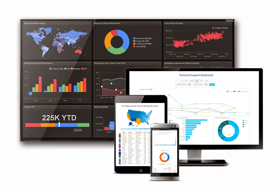
Nowadays, the abundance of portable devices with constant connection to the Internet enables complete mobilization of people and operations. Many people can easily take their work home, analyze data remotely, or explore data visualizations on their cell phones, tablets, and so on in multiple other situations. And dashboards have to adapt to this trend.
Whether it’s the small screen of smartphones or tablets, or the large screen of PC computers and video walls, dashboards now should provide the same great experience on all kinds of displays and platforms. Responsive dashboard design is a great way to keep the completeness, accuracy and insightfulness of a data report across all mobile and desktop devices.
Interactive Dashboard Design as Top-Notch Feature
A static presentation, fixed charts and monolith reports are currently considered a bad dashboard design model. In fact, the days when this was acceptable are long gone.
Instead, it’s an interactive dashboard that can improve viewers’ engagement and provide a beneficial user experience via intuitive controls and visual features. Tooltips that pop up when a data point is hovered over with the mouse, range selection interfaces, exclude/include data point options, etc. – all these enable a much more comprehensive and insightful data analysis. That is why such features are now more and more widespread in top dashboard design practices.
To get a better idea of what the world would look like if we did not have interactivity, take a look at the following simple example of a stacked column (vertical bar) chart from a sample HR dashboard:
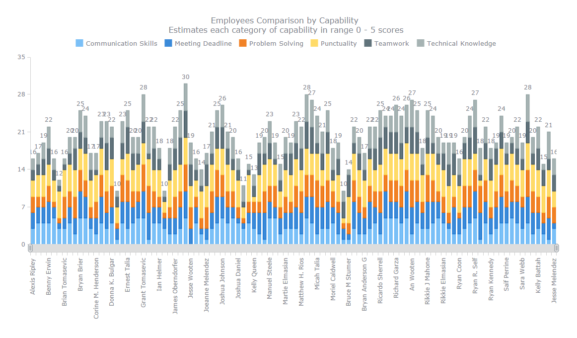
Well, it looks helpful to identify the tallest and smallest total columns overall. But what if we now want to dig into more details? That is hardly possible with that chart but can be easily fixed with the help of the range selection UI controls, not to mention tooltips with additional information. For example:
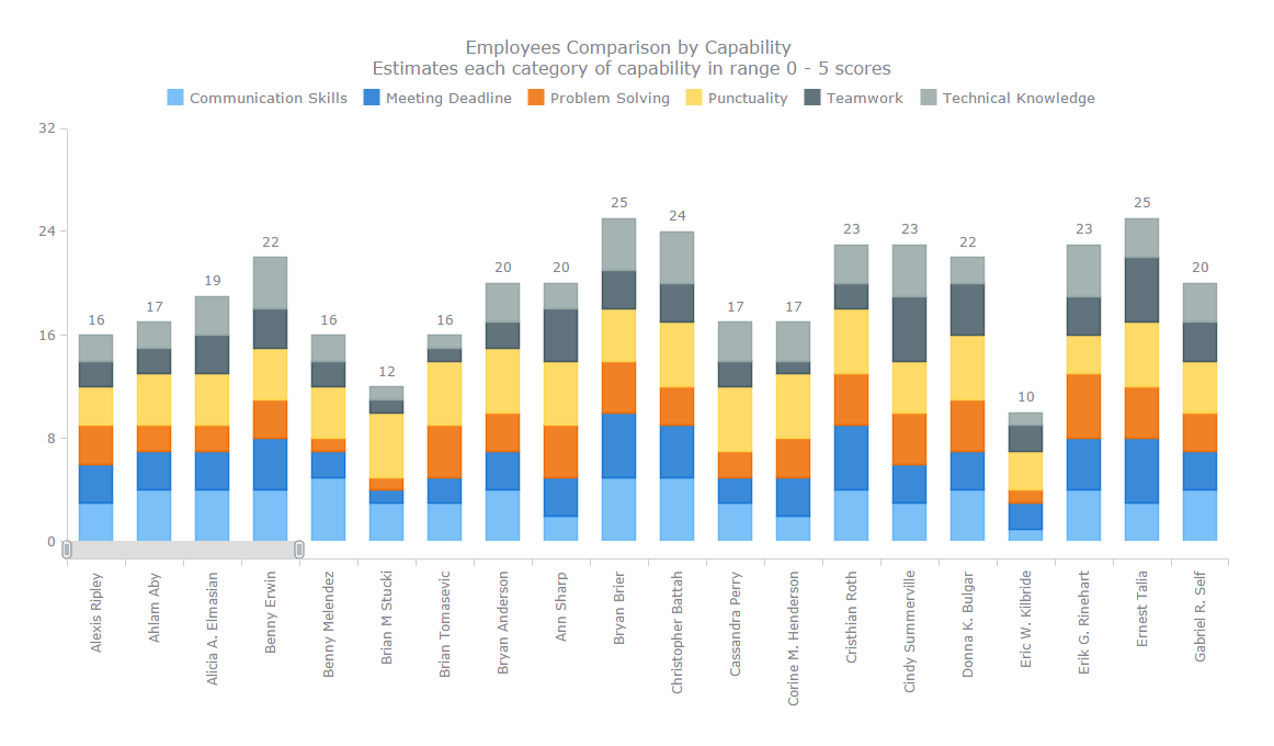
This is just a very basic example of how interactivity and various corresponding features can be helpful in dashboard design.
Updates from Live Data Sources in Real Time
 based Site Speed Evaluation dashboard")
New data is being produced nonstop. Just look at this: 90% of the existing data are reported to have emerged for only the last two years, and, for example, 204 million emails are being sent every minute. These facts clearly demonstrate the gargantuan rate of continuous growth of the aggregate volume of data out there. Moreover, data quickly loses its relevance, and even one-day-old figure can already be irrelevant in a number of cases. As a result, people more and more often need to analyze large amounts of data and/or conduct analysis in real time.
Visualizing large data sets and even big data as well as building real-time visualizations require excellent performance from an appropriate dashboarding solution in addition to its ability to constantly update information once it’s changed in the data source. So be careful when, for example, choosing a JavaScript charting library as not all the data visualization software is a good fit in these terms.
Use of Maps for Geovisualization in Dashboards
")
Volume of geospatial data is growing in line with the data overall. So, today it is pretty common to see map based interactive geovisualizations on various dashboards. There are multiple chart types of that kind, specifically designed for providing a help with analyzing geospatial, location-related data. The most widespread ones are:
- Choropleth map;
- Point map (Dot map);
- Bubble map (Proportion Symbol map);
- Connector map;
- Seat map.
The drill-down feature, which allows viewers to plunge into data one level deeper, has already become a must-have for the leading charting and dashboarding solutions. For example, it lets you easily switch between country, region and area-specific data. When certain locations matter, the map crosshair feature is often used.
Explicit Modularity in Dashboard Layout Design

The modular style is gaining more and more popularity for its attractive simplicity and the ability to place emphasis strikingly well. Having its roots mainly in the typography (the primary field in which the term was coined and pioneered), the style still preserves the distinctive traits of crisp and nifty clarity. The main features of a modularly styled dashboard design are:
- intuitive grid layout, often fluid, allowing individual tiles to flow;
- cognizant use of typography, bringing emphasis to the details without bold stress;
- smart utilization of blank spaces to logically divide the content;
- minimalist graphics without any complexity.
This style plays out great with dashboards because of its ability to facilitate clear and concise communication of data in a beautiful, consistent manner.
Minimalism and Simplicity
 Software Sales Dashboard shown on the picture")
In the context of style, minimalism in dashboard design is likely to be appreciated all the more. Overloading charts with unnecessary graphics, series or points usually makes important details blurred. So, dashboards should display only relevant information, the one that’s going to be useful.
Adherence to concise, almost ascetic visualization and use of simple forms facilitate the perception and analysis of data. That’s why the minimalist design of dashboards is becoming more popular than massive, complexly detailed 3D visuals.
Data Speaks First
")
I believe all of us understand how the style and conciseness are important to the good communication of data by means of dashboards. However, it is also important to understand that the data itself should fit the standards of usability and relevance when visualized. It is absolutely of no use to stick together several charts just because they look cute together.
Not that style should fly out of the window, but it’s data patterns that deserve at least no less attention. There’s certainly a need to make all forms and combinations appropriate to let the data speak and provide insights through its visualization.
Importance of Choosing Right Chart Types for Dashboard Design

Choosing the right chart type for your specific data and purpose is very important. Wrong chart types can make your dashboard much less insightful than it could be, not to mention a mess that could follow harmful decisions based on such a presentation.
All in all, there are so many chart types out there. And sometimes it is very difficult to decide which one is the best to communicate data in this or that situation. However, we are all welcome to get some help here from various resources. In addition to books (and googling), an excellent example is Chartopedia. It is a new data visualization guide which allows you to pick the right chart type depending on the purpose of your data analysis. Chartopedia describes an abundance of chart types in detail, all with live examples and links to relevant documentation manuals on how to quickly create one in JavaScript (HTML5).
Conclusion
Time moves on, and new trends emerge right along. In addition to the eight trends described in this article, there are many others, even more to come.
Keep up with the news feeds of the big data world and do your best to build meaningful, informative interactive dashboards. Basically, practicing is what seems to be the best teacher in many activities, including dashboard design.
- Categories: Business Intelligence, Dashboards, Tips and Tricks
- No Comments »