Recap of the Week – 10/5/2015
October 5th, 2015 by Margaret SkomorokhGood news! This week we have released AnyStock 7.7.0, AnyMap 7.7.0 (with 200+ Map Collection and Bubble Series), and AnyChart 7.7.0 (with new types of Tooltips and the ability to multi-select points). Read more in this blog.
And here are the news on data visualization we have posted on AnyChart Facebook Page and Twitter:
- Time and Place – a successful attempt to find stories from personal data. See how mundane information about one’s movement and activity can be turned into something noteworthy.
- City Layouts – extraordinary views of large capitals and small towns, created using satellite-based information.
- Global threat interactive: What’s the world scared of? Obviously, it depends on the country…
- Categories: AnyChart Charting Component, HTML5, JavaScript, News
- No Comments »
7.7.0 Release
October 1st, 2015 by Margaret SkomorokhA lot of good things come in this grand package: AnyStock HTML5 release, 200+ Map Collection and Bubble Series for AnyMap, and new types of Tooltips along with the ability to multi-select points in AnyChart.
AnyStock 7.7.0 Features
AnyChart Stock and Financial Charts (AnyStock) is a JavaScript-based financial charting solution. AnyStock technology turns your real-time data into highly sophisticated interactive web charts. Designed to display date- and time-based information, AnyStock is an ideal tool for client reporting and performance reporting applications, bringing the analysis of your financial data to life.
 |
Stock Data Engine We are proud to introduce anychart.data.Table, a data layer designed specifically to meet Stock and Financial Charts needs. Beside basic features like data streaming, data mapping, and transaction-based data flow, anychart.data.Table provides the ability to search and select data by DateTime intervals, which allows to implement custom UI elements based on this data. Learn more about Stock Data Engine >> Take a look at the Gallery sample >> |
 |
Ultimate Performance Good rendering performance is essential for Stock and Financial Charts, and AnyStock meets this requirement in full. Our performance tests show the ability to render 300,000 points in less than a second on an average PC. The data stream can append 10,000 data points in 100 milliseconds. You can test it yourself on the performance test page. Take a look at the Speed Test page >> |
This release of AnyStock includes basic chart and plot layout options and basic features (such as Scroller, Legend, and Value Highlighter), along with the Column, Line, and OHLC series types. If you are wondering where the technical indicators, other series types, event markers and drawings are, the answer is simple: in our roadmap! Check it out and see that we will catch up very fast. See the roadmap>>
AnyMap 7.7.0 New Features
 |
Map Collection Without geographical data, it is impossible to create a data visualization related to geographic areas. We are happy to introduce our new Map Collection. For the moment it contains 200+ country maps and one world map. We are planning to extend this collection, and, of course, the ability to create custom maps is available. See Map Collection CDN Page >> Take a look at the Map Collection in AnyChart Playground >> |
 |
Bubble/Proportion Maps Bubble maps (also known as Proportion maps) are usually used to display or compare quantitative data related to geographic areas, be it election results, sales statistics per region, or earthquake magnitude. Take a look at the Map Gallery sample >> Learn more about Bubble/Proportion maps >> |
- Categories: AnyChart Charting Component, AnyGantt, AnyMap, AnyStock, Gantt Chart, HTML5, JavaScript, News
- No Comments »
Recap of the Week – 9/21/2015
September 21st, 2015 by Margaret SkomorokhIn this post you will find a recap of news on data visualization and AnyChart (which we have shared with you this week on AnyChart Facebook Page and here):
- We have created a basic sample to show how you can work with AnyChart JavaScript charts in an SWT application.
- What’s really warming the world? – a nice interactive chat that will help you to explore different factors contributing to global warming.
- Gloam.io – an interactive data visualization of sunrise, sunset, and twilight times. (You can also read an article explaining some interaction details in Gloam.io – http://bit.ly/1UQGsgn)
- Why we still need women’s equality day? – Take a look at this great infographic by TIME and learn some sad numbers.
- 17 Graphs That Are Way Too Real For Introverts.
- Categories: AnyChart Charting Component, HTML5, JavaScript, Uncategorized
- No Comments »
AnyChart and Java Standard Widget Toolkit (SWT)
September 15th, 2015 by Timothy LoginovOverview
The Standard Widget Toolkit (SWT) is a graphical widget toolkit for use with the Java platform. It was originally developed by Stephen Northover at IBM and is now maintained by the Eclipse Foundation in tandem with the Eclipse IDE. It is an alternative to the Abstract Window Toolkit (AWT) and Swing Java GUI toolkits provided by Oracle as part of the Java Platform.
We have created a basic sample to show how you can work with AnyChart in an SWT application.
Contents and Launching
The sample file (click to download) contains the ‘src’ folder with the source code and the ‘jar’ file. You can run the file using the java -jar <jar_file_name> command.
In Mac OS X you can launch the sample like this:
java -XstartOnFirstThread -jar anychart-java-example.jar
In Windows you can do that like this:
java -jar anychart-java-example.jar
Description
This sample shows a basic chart with five points. It listens for the chart draw and point hover events, and logs them into the textArea on the page; anychart.min.js is loaded from AnyChart CDN.
The ‘Add Random Point’ button keeps adding random points until the total point count is 20 and after then removes one point before adding a new one.
Source code is rather simple and self-descriptive, and there are only two things you should look at:
The static String myScript variable defines what script is executed when button is clicked;
The static String createHTML() method generates HTML and puts it into the browser window.
Summary
AnyChart and Java Standard Widget Toolkit (SWT) Sample: anychart-java-swt-example.zip
AnyChart Download: https://www.anychart.com/download/
AnyChart Documentation: https://docs.anychart.com/
AnyChart API: https://api.anychart.com/
AnyChart Overview: AnyChart Web Charts JavaScript Framework
Later we will extend the sample, add more features, and show how to achieve more with AnyChart in Java environment. We also have a number of other samples coming up.
If you created anything with AnyChart in Java applications and are ready to share – please drop us a line in comments, on Facebook, Twitter, or via email (support@anychart.com).
- Categories: AnyChart Charting Component, Tips and Tricks
- 3 Comments »
Recap of the Week – 9/4/2015
September 4th, 2015 by Margaret SkomorokhThis week we have posted the following news on data visualization and AnyChart:
- A quick guide demonstrating how to save AnyChart 6 charts as images in Oracle APEX.
- This interactive map portraying Rennes Metropolis inhabitants is quite enjoyable to play around with. The visualization is based on 18 indicators including location of workplace, marital status, number of cars in the household, and so on. In addition, the initial data were cross-referenced, which makes the picture even more detailed!
- These two colorful infographics will help you to find out what insect venoms are made of and which insect’s sting is the most painful. But don’t worry – summer is over 🙂
- How Is Big Data Changing the World? – An article about Big Data in our everyday lives.
- 13 Helpful Diagrams For People Who Only Care About Cheese – “Knowledge is power: the power to eat more cheese” – there is nothing more to add to this. Enjoy the diagrams!
- Categories: AnyChart Charting Component, HTML5, JavaScript, News
- No Comments »
Saving AnyChart 6 Charts as Images in Oracle APEX
September 2nd, 2015 by Timothy LoginovNOTE: This article tells how to set up the script in Oracle APEX and doesn’t affect AnyChart customers who use AnyChart outside of Oracle APEX.
Oracle Application Express is a web-based application development tool integrated with all editions of Oracle Database. It enables users with limited programming skills to easily develop secure web applications that run inside their Oracle Database, and scale to support tens, hundreds, or thousands of users.
Since Oracle Application Express Release 3.0, AnyChart is used as a charting engine (you can read about this in a success story: Oracle Chooses AnyChart Solution for Latest Release of Oracle® Application Express).
One of the nice features available in AnyChart since version 4.1.0 is the ability to save a Flash chart as an image – in order to make it possible, we have to use a server-side script, which is hosted on the AnyChart.Com site by default (read more about saving charts as images in AnyChart 6).
Federico Bonifazi from Geko Sistemi Informativi s.r.l. shared a solution that allows to save charts as images on the server side. We are very thankful for that and present it here for anyone who wants to do the same. This tutorial is very basic and is not a ready-to-go solution, but it gives the general idea, so you can use it to break ground on your project.
This configuration in based on Oracle Standard Edition on a Linux server, Oracle Rest and Tomcat are used.
- Categories: AnyChart Charting Component, Oracle Apex, Tips and Tricks
- 1 Comment »
Recap of the Week – 8/29/2015
August 29th, 2015 by Margaret SkomorokhThis week we have posted on Facebook the following information on data visualization and AnyChart:
- We have shared a tutorial explaining how to insert AnyChart JavaScript charts into WordPress posts.
- Android Fragmentation Report – Fragmentation is both a strength and weakness of the Android ecosystem, a headache for developers that also provides the basis for Android’s global reach. This visualization demonstrates the scale of the problem.
- Mapping Migration in the United States – In this interactive map by The Upshot, you can find detailed information on how often Americans migrate from their states of birth. (Each shape represents where the people living in a state were born. Within a state, larger shapes mean a group makes up a larger share of the population.)
- How People Engage with Data Visualisations and Why It Matters – An article by Helen Kennedy, Professor of Digital Society at the University of Sheffield, explaining what is visualization literacy and what skills it requires.
- Categories: AnyChart Charting Component, HTML5, JavaScript, News
- No Comments »
AnyChart JavaScript Charts in WordPress Posts
August 26th, 2015 by Margaret SkomorokhData visualization is a rapidly growing Internet industry rooted almost in any aspect of our life. As far as visualization is one of the most effective ways of presenting information, every presentation and every information dashboard requires visual information. Moreover, a well-designed dashboard makes any web page look even better, be it a personal blog or website of a big company.
AnyChart is a flexible JavaScript (HTML5) based solution which allows you to create interactive and great-looking charts, dashboards and visualizations. It is cross-browser and cross-platform, intended for everybody who deals with dashboards, reports, analytics and creates statistical, financial, or any other data visualizations. PCs, Macs, iPhones, iPads, Android devices – AnyChart works everywhere, and you will get the same experience across all devices and browsers.
This article highlights the basics of using AnyChart in WordPress – one of the most popular content management systems. You can easily add a dashboard or a chart in your post, making it more appealing and helping your storytelling.
Adding AnyChart to a WordPress Post
Adding AnyChart to a WordPress post is quite easy. You should open the page editor, switch into Text Editing Mode, insert link to an AnyChart JavaScript file, create a chart container, and add some data and settings, like this:
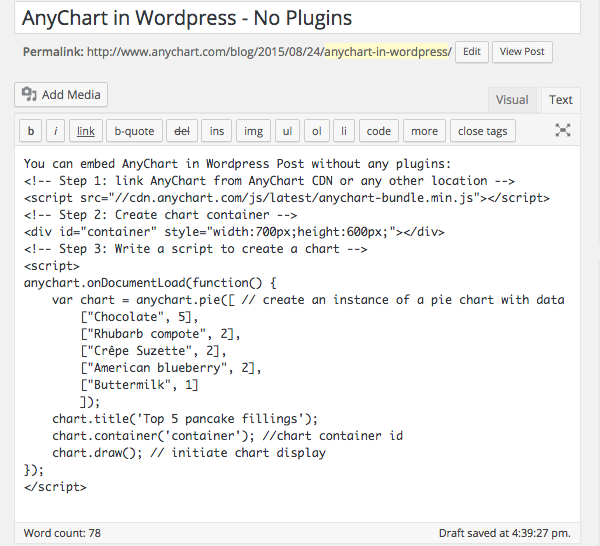
Note: A chart container may be of any size. However, if there are no style settings for the container and it has zero height and zero width, the chart will be added, but it will not be seen. So do not forget to set container size.
You can open your WordPress blog right now, copy paste the code below and try it yourself:
<!-- Step 1: link AnyChart from AnyChart CDN -->

<script src="//cdn.anychart.com/js/latest/anychart-bundle.min.js"></script>

<!-- Step 2: Create chart container -->

<div id="container" style="width:90%;height:600px;"></div>

<!-- Step 3: Write a script to create a chart -->

<script>

  anychart.onDocumentLoad(function() {

    var chart = anychart.pie([ // create an instance of a pie chart with data

    ["Chocolate", 5],

    ["Crêpe Suzette", 2],

    ["American blueberry", 2],

    ["Buttermilk", 1]

  ]);

  chart.title('Top 5 pancake fillings');

  chart.container('container'); //chart container id

  chart.draw(); // initiate chart display

  });

</script>
That’s basically all you need to to! Could it be easier? Now the page is ready to be published, but do not forget to preview it and make sure that everything looks fine and there are no mistakes in the data.
See below what you get if everything is done right – it actually is a live AnyChart JavaScript Pie Chart which is embedded in AnyChart WordPress Blog the way described above. Hover the slices to see tooltips, click to select them. If you don’t see anything – please check if JavaScript is enabled in your browser.
The <script> tag with data should not contain any empty lines! If there are any, WordPress will replace them with the <p> tag, and the data may be corrupted. Read below to learn how to avoid this.
Disabling Smart Insert
The way of integrating AnyChart from the sample above is quite convenient. But in most cases we may need a little bit more. Just dividing data into paragraphs may help in seeing what is right and what is not, and simple comments are very desirable in some cases. It doesn’t take much to achieve it: WordPress provides you with a number of plugins allowing to disable smart insert (which messes with your code in the first place). You can use, for example, the “Raw HTML” plugin or any other – it doesn’t matter which one you choose. After activating your plugin, wrap the script in the tags specified by the plugin developers (you will need the [raw]…[/raw] tag in case you choose the “Raw HTML” plugin). Then you are free to use any number of empty lines you want and insert comments and notes. It will make no difference in terms of visualization, but it may be of a great help in adjusting and debugging the chart.
Referencing the Script in the Head of a Page
AnyChart.js can be referenced in any part of a page, but we recommend to add the link to the head tag of your blog if you are going to use charts regularly. There are quite a few plugins (like this one) for inserting scripts into the head section, and in some themes you may need to work with wp_head.
Read More
All necessary information about AnyChart can be found in our extensive documentation, API, and Playground.
You can download the component at https://www.anychart.com/download/
Do not hesitate to contact our Support Team or Sales Team if something is still not quite clear.
- Categories: AnyChart Charting Component, Tips and Tricks
- 1 Comment »
AnyChart, AnyMap, and AnyGantt 7.6.0
August 13th, 2015 by Margaret Skomorokh
We are proud to announce 3 new releases – AnyChart 7.6.0, AnyMap 7.6.0, AnyGantt 7.6.0. Our team has been working hard to make our products even more aesthetically pleasing, and now all AnyChart charts have a new modern look and design (See the New Look and Theming feature). We have also added a number of other great improvements, and here are the most important of them:
AnyChart 7.6.0 New Features
 |
All AnyChart products now support the Theming feature which makes customizing and integrating charts easier. With Theming, you can set similar visual and functional settings for all charts without duplicating your code. Take a look at Gallery samples >> Learn more about Theming >> |
 |
Crosshairs are thin vertical and horizontal lines centered on a data point, which are useful when you want to locate a point precisely on your chart or to analyse data by comparing different charts. Take a look at a Gallery sample >> Learn more about Crosshair >> |
 |
Pie/Donut Charts are popular, nice-looking, and very easy to understand, and now you can make them even more attractive by adding 3D! Take a look at Gallery samples >> Learn more about 3D Pie Chart >> |
AnyMap 7.6.0 Features
- Choropleth Maps provide an easy way to visualize how a measurement varies across a geographic area.
- Ordinal Color Range looks like several boxes of different colors which depend on the palette chosen according to the type of a map and its data.
- Quantitative Color Range is a bar colored with a gradient, its colors depend on the palette of a map and its data.
- Full Compatibility with other Charts – when you need to show any extra information along with a map – no problem! Use AnyMap with any other charts.
AnyGantt 7.6.0 New Features
- Now a double-click on borders of data grid columns resets their width to the default value.
- Added the ability to draw the Baseline above the Actual, see API Reference for details.
- AnyGantt now supports formatting for Data Grid Columns, see API Reference for details.
AnyChart version history: https://www.anychart.com/products/anychart/history/
AnyMap version history: https://www.anychart.com/products/anymap/history/
AnyGantt version history: https://www.anychart.com/products/anygantt/history/
Trial download: https://www.anychart.com/download/
P.S. The set of ready-to-use maps is rather small for the moment, but we will add about a hundred maps in a week, and then the list will just keep growing.
- Categories: AnyChart Charting Component, AnyGantt, AnyMap, HTML5, JavaScript, News
- No Comments »
AnyMap News and Recap of the Week
July 26th, 2015 by Margaret SkomorokhGood news, everyone! We are putting finishing touches on the new AnyMap HTML5 engine, along with the new version of AnyChart with an amazing Theming Feature: ability to segregate settings and data once and till the end of times (if you wish to) and switch visual presets on-the-fly. And we are going to show the first demo of AnyStock HTML5 next week too.
Also, some interesting stuff we’ve encountered this week and covered on AnyChart Facebook Page:
We’ve noticed Line Charts in Age of Wonders III and Triumph Studios spotted that we were on the tutorial level.
Two great projects from the UK:
- Seeing Data: Making Sense of Data Through Visualisations is a research project which aims to understand how people make sense of data visualisations, the project is headed by Helen Kennedy, Professor of Digital Society at the Department of Sociological Studies, University of Sheffield.
- Compound Interest is a site that aims to take a closer look at the chemical compounds we come across on a day-to-day basis. It also provides graphics for educational purposes, both for teacher and student use. The site is run single-handedly by Andy Brunning, a chemistry teacher based in the UK who creates the graphics for the site in his spare time.
- Categories: AnyChart Charting Component, AnyMap, AnyStock, News
- No Comments »