AnyChart Triumphs Again: Awarded Best in Data Analytics and Visualization in 2024
February 19th, 2024 by AnyChart Team We are delighted to announce that AnyChart has won the prestigious 2024 DEVIES Awards in the Data Analytics & Visualization category, marking our victory for the second consecutive year!
The award celebrates our JavaScript charting library, continuously acknowledged as the world’s leading data visualization solution for developers. As AnyChart JS forms the cornerstone of our broader product line, this recognition once again highlights the technological excellence and innovation inherent in our entire suite of offerings, including the extensions for Qlik Sense.
- Categories: AnyChart charting component, AnyGantt, AnyMap, AnyStock, Big Data, Blogroll, Business Intelligence, Dashboards, Financial charts, Gantt Chart, HTML5, JavaScript, News, Oracle Apex, Qlik, Stock charts, Success stories
- No Comments »
Remembering 2023, Welcoming 2024
January 10th, 2024 by AnyChart Team Happy New Year! As the last echoes of festive celebrations fade away and we dive into the adventures of 2024, let’s bid a final farewell to 2023 by reflecting on its best moments.
For us at AnyChart, it was a remarkable year:
- Celebrated our 20th anniversary — indeed, we’ve been innovating since 2003.
- Awarded as the Best in Data Analytics & Visualization.
- Introduced more cool features and tweaks to our JavaScript charting library and other solutions.
- Launched new powerful extensions for Qlik Sense, with the Decomposition Tree taking center stage — join us in reviewing our year in the Qlik ecosystem.
- Reached some noteworthy milestones — now boasting over 80 JS charting tutorials on our blog, our Android charting library gleaming with over 2K stars on GitHub, and our social media family expanded to over 20K followers.
Looking ahead, our dedication remains unwavering: to empower your data viz and analytics journey with new and better tools. Thank you for growing with us, and cheers to your continued success, brighter and bolder in 2024!
- Categories: AnyChart charting component, AnyGantt, AnyMap, AnyStock, Big Data, Blogroll, Business Intelligence, Charts and Art, Dashboards, Financial charts, Gantt Chart, HTML5, JavaScript, News, Qlik, Stock charts
- No Comments »
How to Build Point Map with JavaScript
December 22nd, 2023 by Awan Shrestha If you’re a budding developer or data enthusiast eager to explore map creation, you’re in the right place. In this tutorial, I’ll guide you through how to easily build an interactive point map using JavaScript.
To make things even more interesting, I’ll use data on the number of millionaires in cities as an example. By the end of this tutorial, you’ll have made a visually stunning JS point map, ready to tell the story of the world’s wealthiest cities and a solid understanding of applying these skills to any data and scenarios. And stick around for a bonus at the end — I’ll also show you how to transform your point map into a bubble map where the size of the markers conveys additional information.
Ready to master the JS point mapping technique? Let’s get started, and don’t forget to join me in the bonus section where size matters!
Read the JS charting tutorial »
- Categories: AnyChart charting component, AnyMap, Big Data, HTML5, JavaScript, JavaScript chart tutorials, Tips and tricks
- No Comments »
Unwrapping Enhanced Interactivity for Calendar and Circle Packing Charts in AnyChart 8.12.0
December 7th, 2023 by AnyChart Team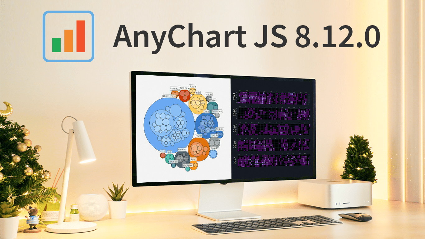 As the magic holiday season approaches, we’re thrilled to unwrap our latest gift of the year — AnyChart 8.12.0, the newest version of our powerful JavaScript charting library. Packed with various bug fixes and improvements, this release introduces a remarkable feature for Calendar and Circle Packing charts — interactivity events. Learn more about it and upgrade right now!
- Categories: AnyChart charting component, AnyGantt, AnyMap, AnyStock, Big Data, Business Intelligence, Dashboards, Financial charts, Gantt Chart, HTML5, JavaScript, News, Stock charts
- No Comments »
William Dibbern Uses AnyChart JS Charts to Visualize Wedding Guest Data
August 14th, 2023 by AnyChart Team The world’s leader in data visualization, AnyChart has a proven track record of empowering enterprises with robust charting solutions. However, the true essence of AnyChart lies in its versatility — it extends beyond corporate analytics, to making data meaningful in our everyday lives.
For example, meet William Dibbern, an Engineering Manager based in Chicago, who ingeniously applied our JavaScript charting library to his upcoming wedding plans, turning them into a heartfelt blend of technology and emotion.
Join us for an insightful interview with Will as we delve into his journey, exploring how he harnessed the power of AnyChart JS Charts to craft a delightful experience that celebrates love and data in a refreshingly personal way.
- Categories: AnyChart charting component, AnyMap, Charts and Art, HTML5, JavaScript, Success stories, Third-party developers
- No Comments »
How to Build Choropleth Map with JavaScript
May 18th, 2023 by Shachee Swadia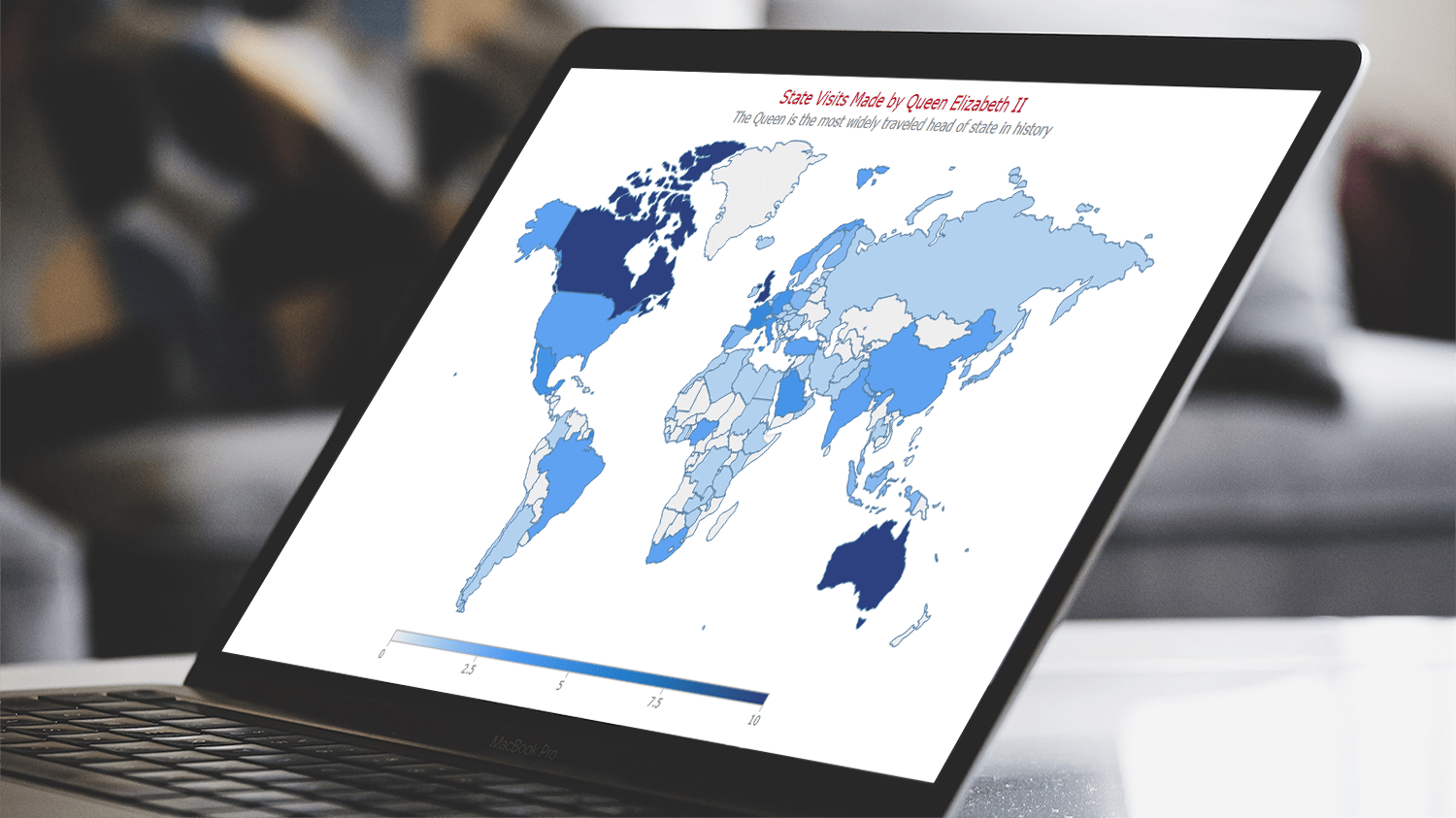 Are you ready to learn how to create a choropleth map with JavaScript like a boss? Maps are a powerful way to visualize data, but building one from scratch can be a daunting task. Don’t worry, I’m here to help!
In this tutorial, I’ll guide you through the process of building a JavaScript choropleth map step by step. And to make things more interesting, we’ll use Queen Elizabeth II’s state visits as an example to showcase the power of this type of map.
Get ready to impress yourself and your audience with stunning data visualizations, and let’s get started on this exciting journey together!
Read the JS charting tutorial »
- Categories: AnyChart charting component, AnyMap, HTML5, JavaScript, JavaScript chart tutorials, Tips and tricks
- No Comments »
Exciting New Technical Indicators & More in AnyChart JS Charts 8.11.1
May 10th, 2023 by AnyChart Team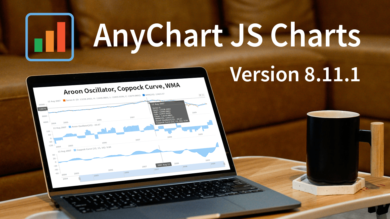 Great news! We’ve just launched version 8.11.1 of our JS charting library, and it comes with some awesome new features and improvements. Our top stars this time around are three new technical indicators that are now available straight out of the box: Aroon Oscillator, Coppock Curve, and WMA. That’s right, now in addition to the dozens of indicators already supported in our stock charts, these new options provide even more ways to improve technical analysis.
But that’s not all! We’ve also updated some of the geo maps in our collection, making them more accurate and detailed. Plus, we’ve squashed some pesky bugs in our Gantt, stock, map, and basic charts, ensuring an even smoother experience when handling specific, advanced cases.
Take a quick tour of the new indicators to discover how they can enhance technical analysis. We’ll also give you a brief overview of the other updates, so you can get the most out of our latest release. Let’s go explore!
- Categories: AnyChart charting component, AnyGantt, AnyMap, AnyStock, Big Data, Business Intelligence, Dashboards, Financial charts, Gantt Chart, HTML5, JavaScript, News, Stock charts
- No Comments »
Creating Interactive Flow Maps with JavaScript
March 22nd, 2023 by Awan Shrestha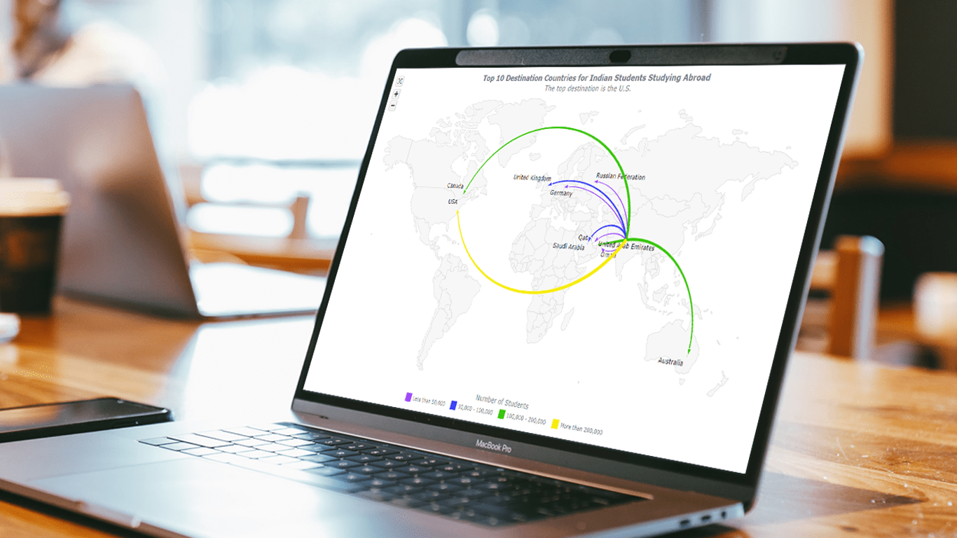 Flow maps are a powerful way to represent the movement of objects between different geographic locations, and with JavaScript, creating an interactive flow map is easier than you might think. Flow maps combine the functionality of a map and a flow diagram; this type of visualization shows the direction of movement of people, goods, money, or information, as well as the quantity of those.
In this step-by-step tutorial, we’ll guide you through the process of creating a JavaScript flow map. To make it more practical, we’ll use the example of visualizing the number of students from India studying abroad in different countries. By following the tutorial, you’ll learn how to create your own flow maps using JavaScript, regardless of the data you choose to use.
So, let’s get started! Follow along with us to learn how to develop your own JS Flow Map.
Read the JS charting tutorial »
- Categories: AnyChart charting component, AnyMap, HTML5, JavaScript, JavaScript chart tutorials, Tips and tricks
- No Comments »
CEO Anton Baranchuk Receives 2023 DEVIES Award for AnyChart
February 16th, 2023 by AnyChart Team Last night was amazing: Anton Baranchuk, CEO and Co-founder of AnyChart, received our award for Best in Data Analytics and Visualization at DeveloperWeek’s DEVIES Awards ceremony in Oakland, California!
Check out some photos from the event in this quick story!
- Categories: AnyChart charting component, AnyGantt, AnyMap, AnyStock, Big Data, Business Intelligence, Financial charts, Gantt Chart, GraphicsJS, HTML5, JavaScript, News, Qlik, Stock charts
- No Comments »
AnyChart Named Best in Data Analytics & Visualization 🏆
February 3rd, 2023 by AnyChart Team We’re proud to announce that AnyChart has won a prestigious 2023 DEVIES Award in the Data Analytics & Visualization category! Many thanks to the jury and congratulations to all our partners and customers!
Celebrating 20 years in the market this year, we at AnyChart have been working hard to develop the best-in-class data visualization solutions. And we will keep innovating and excelling!
The DEVIES Awards are the definitive annual awards for the software industry, recognizing outstanding design, engineering, and innovation in developer technology across multiple categories. This year, winners were selected from record-high hundreds of nominations by an expert-led panel of the DevNetwork Advisory Board, including representatives of Accenture, DigitalOcean, EA, Google, IBM, Salesforce, and other great companies.
- Categories: AnyChart charting component, AnyGantt, AnyMap, AnyStock, Big Data, Business Intelligence, Dashboards, Financial charts, Gantt Chart, GraphicsJS, HTML5, JavaScript, News, Oracle Apex, Qlik, Stock charts, Success stories
- 2 Comments »