New DataViz About Dating, TV Shows, Populists, and School Safety — DataViz Weekly
November 30th, 2018 by AnyChart Team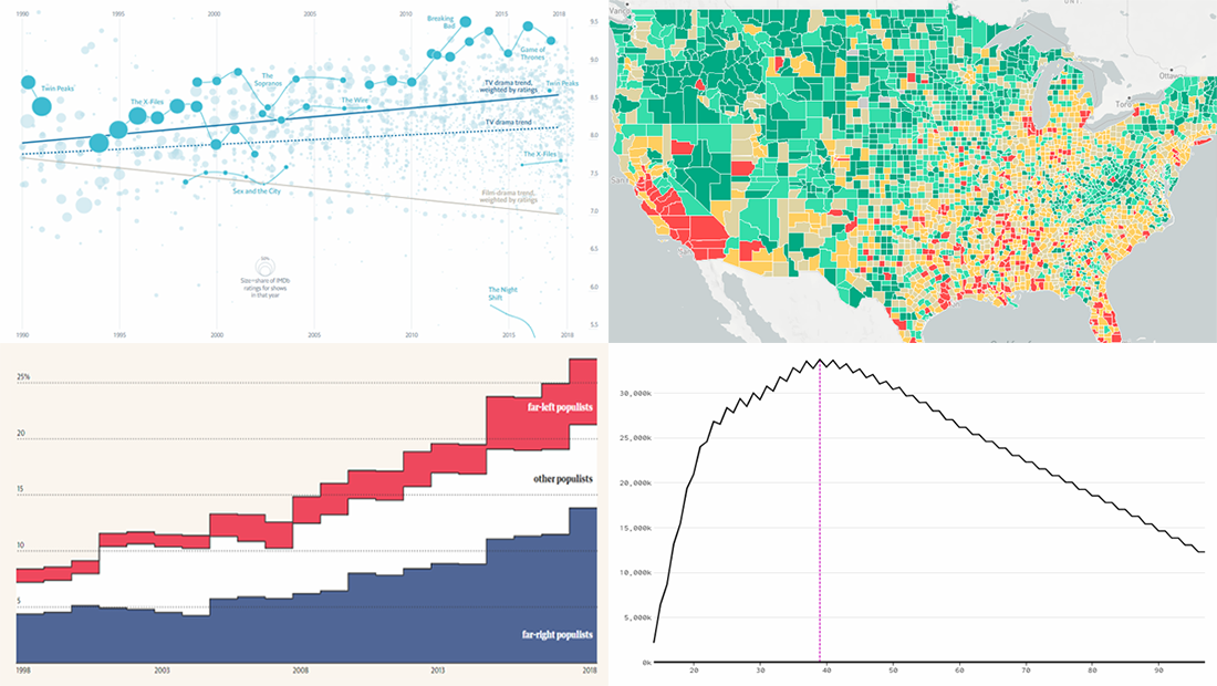 Data visualization is a wonderful way to represent data for intuitive, insightful exploration. The following new dataviz works we’ve found are actually good examples to prove this point.
Today on Data Visualization Weekly:
- dating pool by age;
- TV shows in IMDb user ratings;
- rise of populist parties in Europe;
- safety on the roads around American schools.
- Categories: Data Visualization Weekly
- No Comments »
2018 Midterm Election Results in Data Visualization — DataViz Weekly
November 9th, 2018 by AnyChart Team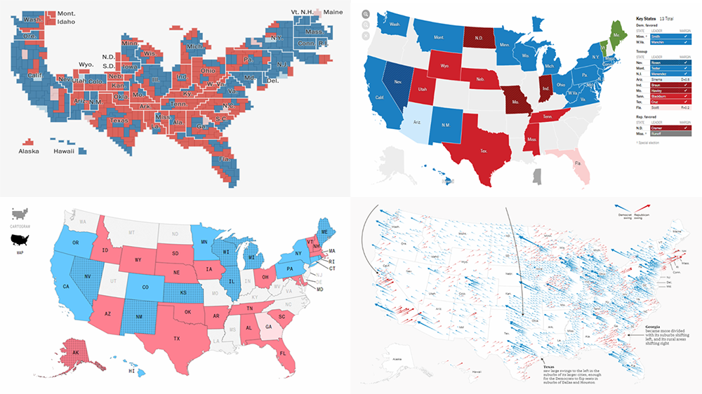 The 2018 midterm election in the United States of America has been among the hottest topics on the media agenda for quite a long time. Various publications were covering the course of the House, Senate, and governor campaigns, sharing forecasts from analysts, and so on. Now that voting is over, all eyes are on the outcome.
Today’s DataViz Weekly will show you how several prominent publications communicated the results of the midterms to their readers with the help of data visualization techniques: The New York Times, The Washington Post, Bloomberg, and The Guardian. So get ready for a lot of choropleth maps! But not only.
- Categories: Data Visualization Weekly
- 1 Comment »
Data Visualization Projects About Construction, PMI Activity, Climate, and Election — DataViz Weekly
August 24th, 2018 by AnyChart Team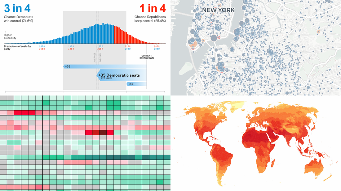 Welcome to DataViz Weekly, a regular feature on the AnyChart blog that highlights some of the most interesting new data visualization projects each Friday.
Here’s what we are glad to tell you about this time:
- active constructions in New York City, in real time;
- global PMI activity;
- cities with no need for air conditioning and heating;
- 2018 U.S. House midterm election forecast.
- Categories: Data Visualization Weekly
- No Comments »