Politics Across New Data Visualizations — DataViz Weekly
April 4th, 2025 by AnyChart Team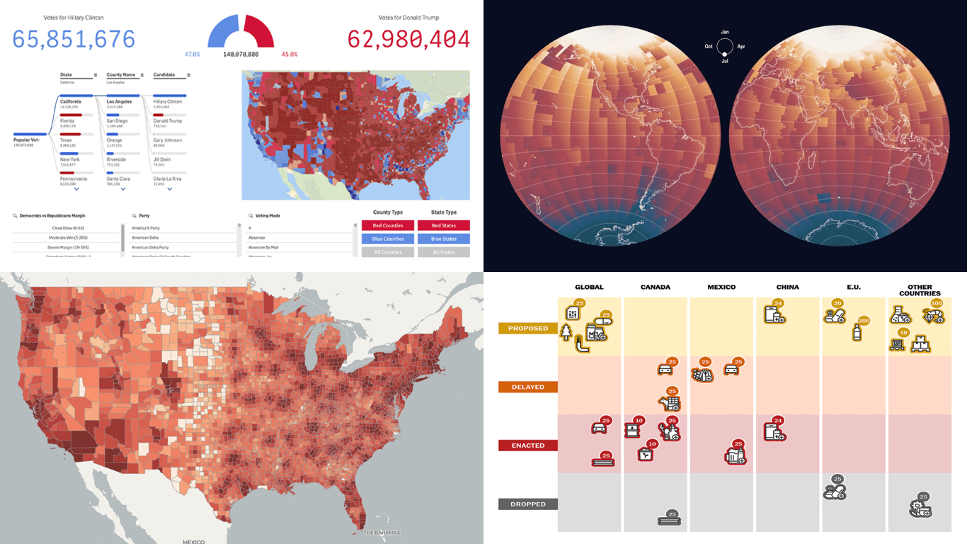 Politics shapes the world in many ways — and, as always, data visualization helps make sense of it all. This time in DataViz Weekly, we are looking at how charts and maps reflect political shifts, decisions, and consequences — from election results and government budgets to tariff policies and even time zones.
One of these projects is ours. We hesitated for a moment — but let’s be honest, we would have featured it anyway if we had stumbled upon it elsewhere.
So, without further ado, here are the four new data visualization projects we think you’ll want to check out:
- U.S. presidential elections — AnyChart
- Trump tariffs timeline — The Washington Post
- Science funding cuts in the United States — SCIMaP
- Politics of time zones — The Economist
- Categories: Data Visualization Weekly
- No Comments »
Data Visualization in Action: Fresh Examples — DataViz Weekly
February 14th, 2025 by AnyChart Team We’re back with DataViz Weekly, where we showcase some of the best new data visualization examples — from individual charts and maps to full-scale visual stories and projects. Take a look at our latest picks:
- Swiss research funding — Colas Droin
- Education and voting patterns in U.S. presidential elections — Jon Boeckenstedt
- City walkability and improvement potential — The Economist & Matteo Bruno et al.
- Self-censorship in Super Bowl halftime shows — Artur Galocha for The Washington Post
- Categories: Data Visualization Weekly
- No Comments »
New Charts & Maps Turning Data Into Insights — DataViz Weekly
January 31st, 2025 by AnyChart Team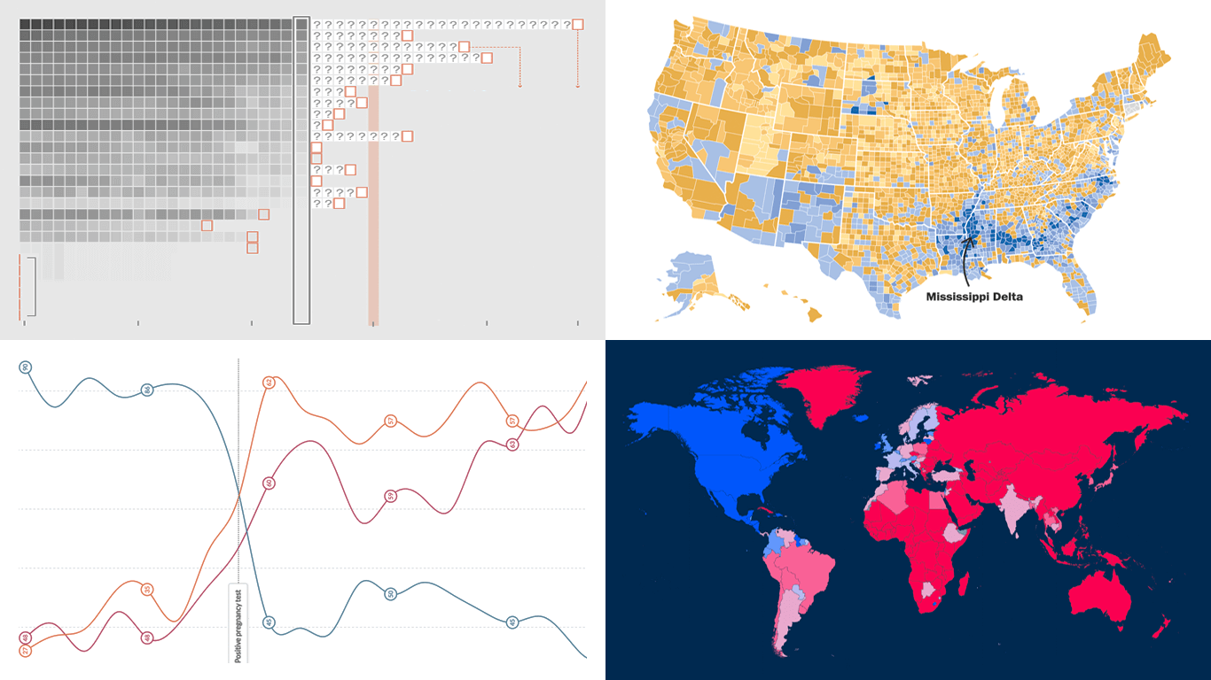 DataViz Weekly is here with a spotlight on new charts and maps that do a great job of turning data into meaningful insights. Today, we invite you to explore the following projects, each demonstrating how data visualization helps reveal patterns, tell stories, and deepen understanding:
- European electricity transition — Ember
- The United States vs. China on global trade — Lowy Institute
- Single-parent families in America — The Washington Post
- Pregnancy through health metric shifts — Maggie Appleton
- Categories: Data Visualization Weekly
- No Comments »
27 Election Maps of 2024 U.S. Presidential Vote Results — DataViz Weekly Special Edition
November 8th, 2024 by AnyChart Team The 2024 U.S. presidential election has concluded, and media outlets worldwide are offering a plethora of data graphics to convey the election results. In this special edition of DataViz Weekly, we’ve curated a collection of over twenty election maps, showcasing diverse ways to represent voting data — cartograms, choropleth maps, bubble maps, and more. Whether you’re a data enthusiast, professional, or simply intrigued by the 2024 election outcomes, explore the latest U.S. election maps from top media!
💡 Also see our previous special editions with election maps: 2020 U.S. election maps and 2024 UK election maps.
- Categories: AnyMap, Dashboards, Data Visualization Weekly
- No Comments »
New Real-Life Data Visualization Examples — DataViz Weekly
September 27th, 2024 by AnyChart Team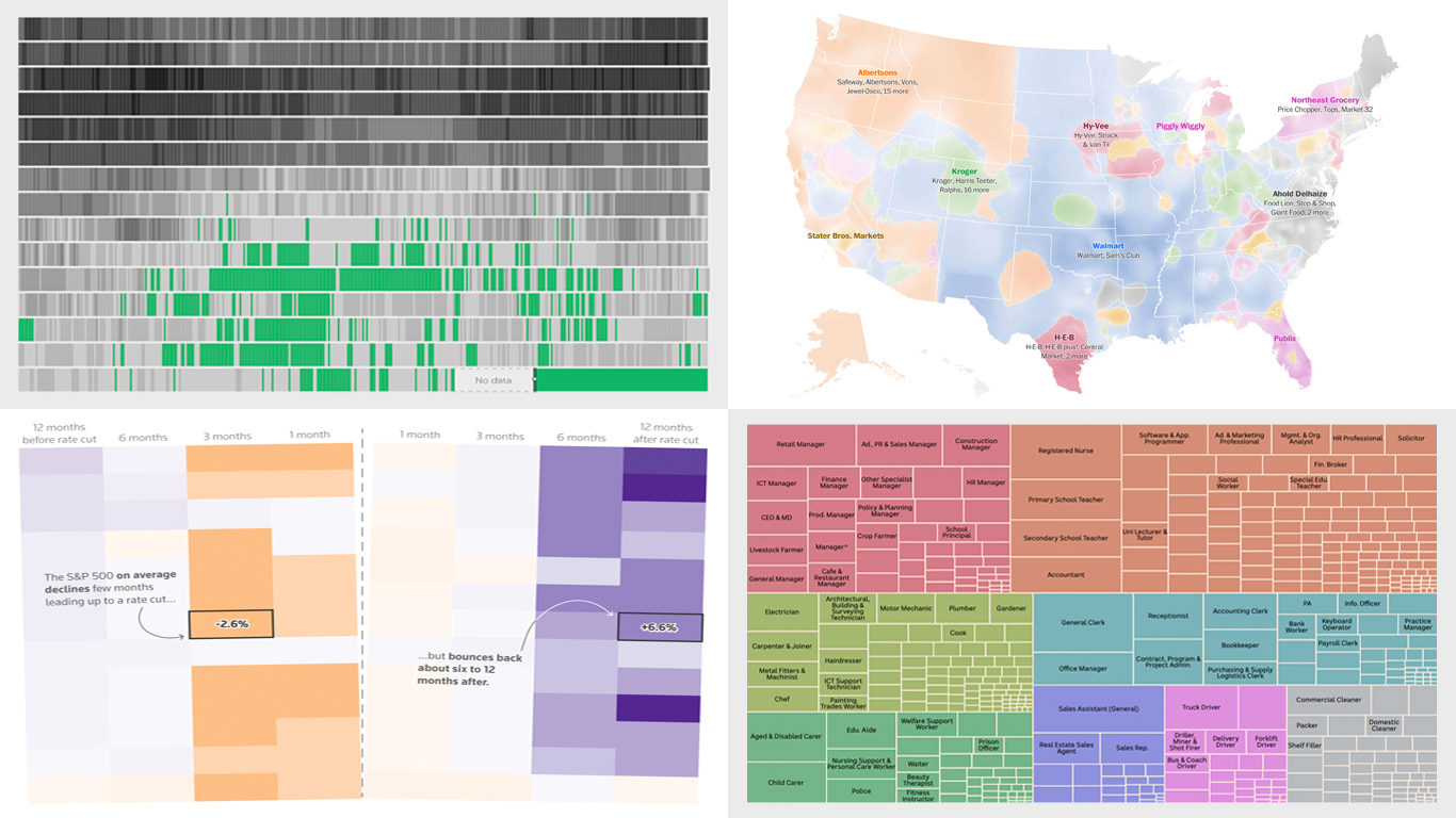 Each week, DataViz Weekly brings you a curated selection of charts and maps based on real-life data. Welcome to our new roundup, continuing to demonstrate how effective data graphics can truly help make sense of complex topics. Take a look at the new data visualization examples we’ve lately found worth highlighting:
- The United Kingdom’s coal-free power era — Ember
- Grocery store ownership in the United States — The Washington Post
- Market reactions to the Federal Reserve’s rate cuts — Reuters
- Marriage patterns by occupation in Australia — ABC News
- Categories: Data Visualization Weekly
- No Comments »
Discovering Fresh Compelling Visual Data Stories — DataViz Weekly
September 20th, 2024 by AnyChart Team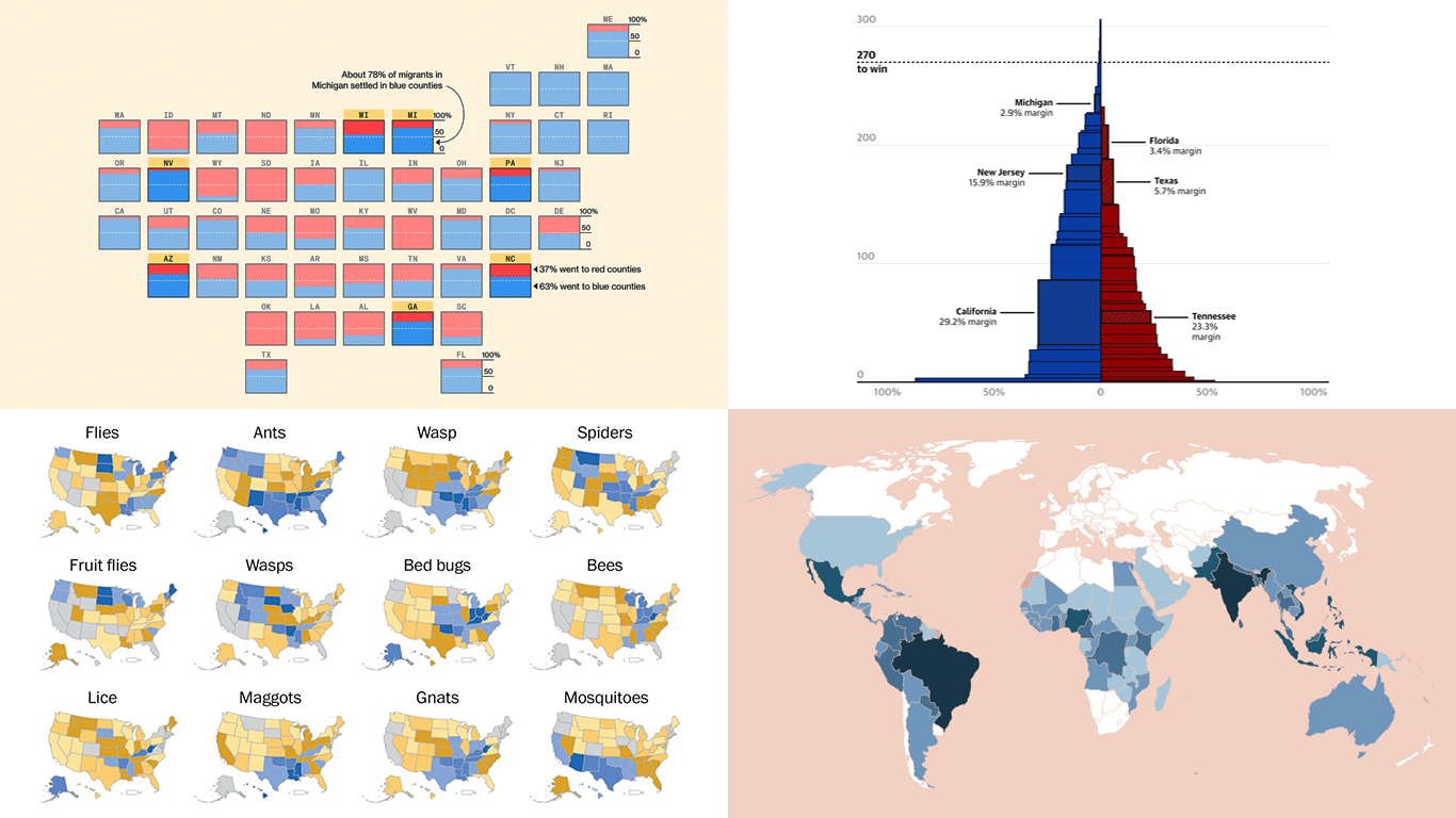 When properly visualized, data comes to life and reveals the stories hidden within the numbers. In this edition of DataViz Weekly, we showcase a selection of new projects that present data in compelling and insightful ways. Let’s dive into the visual data stories that caught our attention this week.
- Neglected tropical diseases — Nexo
- Migrants in U.S. swing states — Bloomberg
- Decisive votes in U.S. presidential elections — The Guardian
- What Americans are searching to kill — The Washington Post
- Categories: Data Visualization Weekly
- No Comments »
Paris 2024 Olympic Medal Count Trackers — DataViz Weekly
August 9th, 2024 by AnyChart Team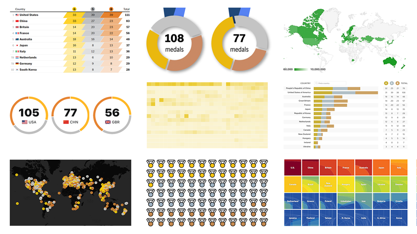 The Paris Summer Olympics are in full swing. If you’re interested in tracking the results and want to know which countries are excelling, numerous media outlets have prepared a variety of medal count trackers. In this special edition of DataViz Weekly, we showcase a selection of these projects, with a special focus on those that not only display numbers but also present them through compelling visualizations. Let’s dive in!
- Categories: Data Visualization Weekly
- No Comments »
Stunning New Data Visualization Examples in Our Curated Collection — DataViz Weekly
July 26th, 2024 by AnyChart Team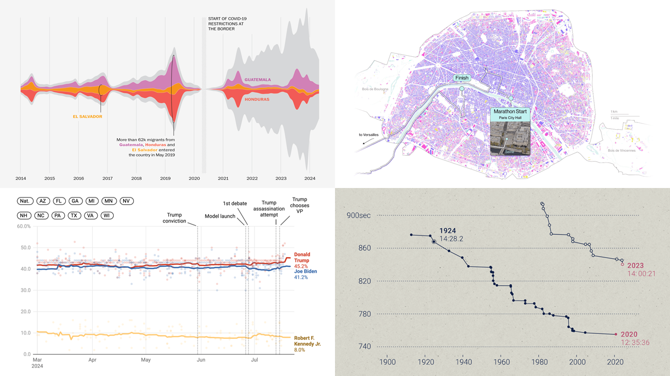 Welcome to DataViz Weekly, where we present a curated selection of stunning data visualization examples our there. Whether you’re a data professional or simply interested in visual data, these charts and maps can provide both inspiration and practical ideas. Here’s what we have for you to explore today:
- U.S. immigration patterns — WaPo
- 2024 U.S. presidential election forecast — Silver Bulletin
- Paris Olympics 100 years later — SCMP
- Extreme heat challenges at the 2024 Summer Olympics — Bloomberg Green
- Categories: Data Visualization Weekly
- No Comments »
Visualizing Forecast Accuracy, College Admissions, Global Demographics, and Election Results — DataViz Weekly
July 12th, 2024 by AnyChart Team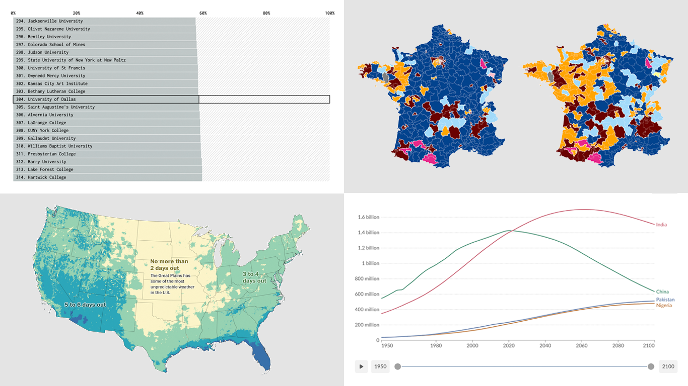 Ready for a fresh dose of impressive data visualizations crafted by seasoned professionals? Here’s what DataViz Weekly has in store for you this time:
- Weather forecast accuracy across the United States — The Washington Post
- U.S. college admission rates — FlowingData
- Global demographic shifts — Our World in Data
- France’s parliamentary election results — Various publications
- Categories: Data Visualization Weekly
- No Comments »
Exploring Insights with Data Visualization — DataViz Weekly
May 3rd, 2024 by AnyChart Team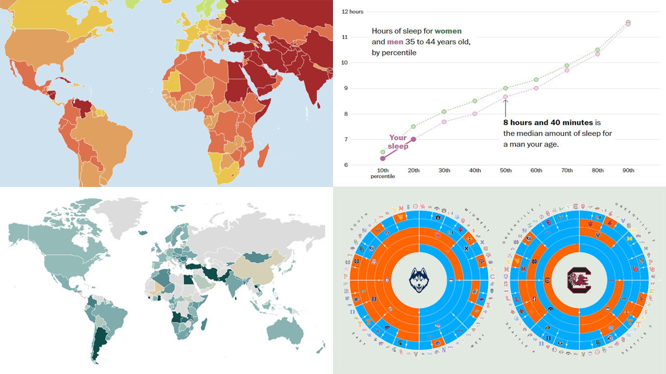 Welcome to the new DataViz Weekly, where we continue exploring the transformative power of data visualization. This edition presents a selection of new examples of how charts and maps can help us understand trends and patterns in various subjects — from sports and philanthropy to global challenges like press freedom and inflation, and everyday topics such as sleep. Here are the projects featured this time:
- March Madness philanthropy challenge — Bloomberg
- 2024 World Press Freedom Index — Reporters Without Borders
- Global Inflation Tracker — Council on Foreign Relations
- Sleep trends in America — The Washington Post
- Categories: Data Visualization Weekly
- No Comments »