Data Visualization in Action: Fresh Examples — DataViz Weekly
February 14th, 2025 by AnyChart Team We’re back with DataViz Weekly, where we showcase some of the best new data visualization examples — from individual charts and maps to full-scale visual stories and projects. Take a look at our latest picks:
- Swiss research funding — Colas Droin
- Education and voting patterns in U.S. presidential elections — Jon Boeckenstedt
- City walkability and improvement potential — The Economist & Matteo Bruno et al.
- Self-censorship in Super Bowl halftime shows — Artur Galocha for The Washington Post
- Categories: Data Visualization Weekly
- No Comments »
New Cool Graphics From Around the Web — DataViz Weekly
July 10th, 2020 by AnyChart Team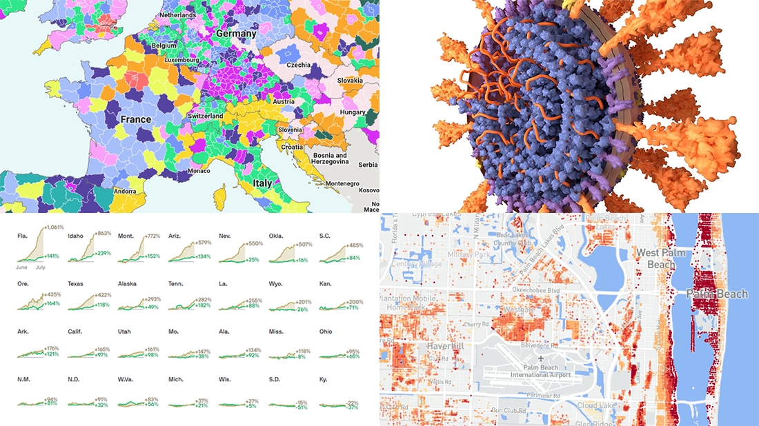 It’s Friday and we’re glad to share with you some of the most interesting third-party visualizations we’ve recently come across. Here’s what DataViz Weekly has for you to check out this time — look at these cool graphics:
- Future of jobs in the regions of Europe — McKinsey Global Institute, Google, et al.
- Flood risk factor database for the United States — First Street Foundation, et al.
- Changes in new cases against testing — Axios
- All we know about SARS-CoV-2 — Scientific American
- Categories: Data Visualization Weekly
- 1 Comment »
Visual Data Analysis in Action with Examples on Laugh, DST, Science, and Health — DataViz Weekly
November 8th, 2019 by AnyChart Team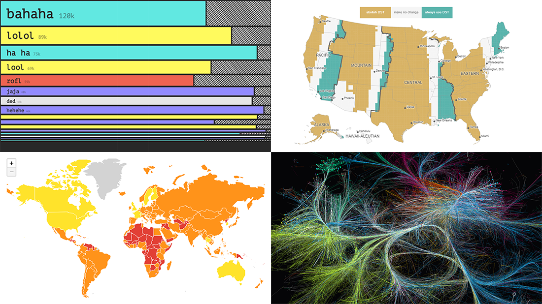 Visual data analysis can be extremely helpful when you need to make sense of large amounts of diverse information. Check out several new striking examples! The four projects in the spotlight of today’s DataViz Weekly roundup have been made public just about now and we are glad to introduce them to you right now:
- Laughing online — The Pudding
- DST gripe assistant tool — Andy Woodruff
- 150 years of papers — Nature
- Global health security — JHU, NTI, and EIU
- Categories: Data Visualization Weekly
- No Comments »
New Charts and Maps to Check Out — DataViz Weekly
August 23rd, 2019 by AnyChart Team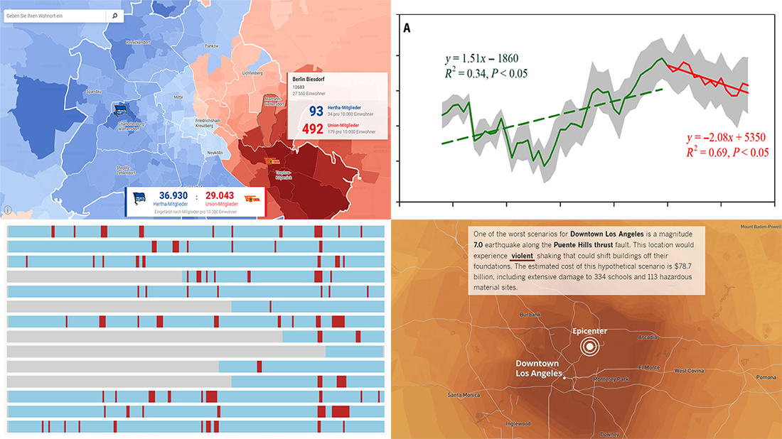 Continuing our DataViz Weekly series, we’ve put together a fresh selection of cool new charts and maps that are worth looking at and exploring. The visualizations we feature this time provide interesting insight into the following topics:
- Economic recessions worldwide in 1960-2019 — Business Insider
- Football divide in Berlin — Berliner Morgenpost
- Earthquake scenarios for California landmarks — Los Angeles Times
- Decline in the global vegetation growth — Science Advances
- Categories: Data Visualization Weekly
- No Comments »
Beauty of Data Visualization – DataViz Weekly
October 13th, 2017 by AnyChart Team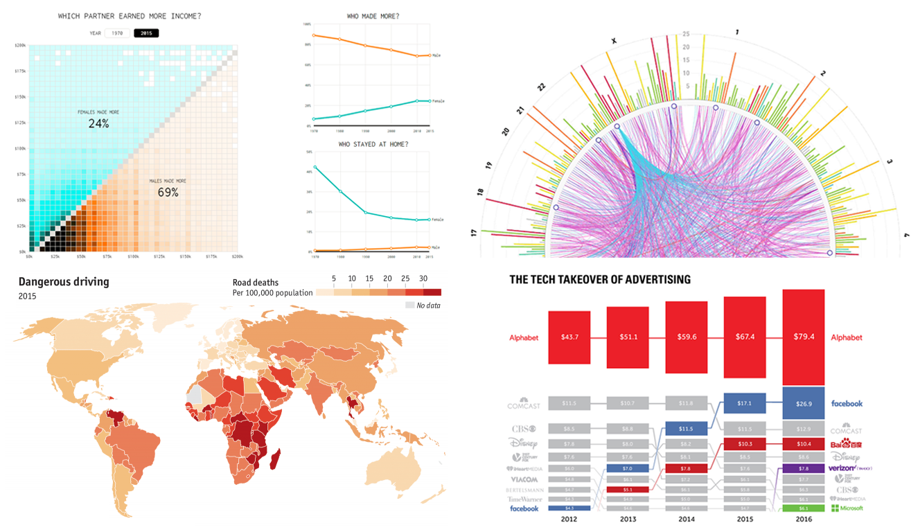 The beauty of data visualization lies not only in a pretty design or any graphical features one might like to implement. Also – and actually, foremost – it is about making data speak and communicate trends, connections, and patterns previously hidden or simply been harder to discover and explore.
Check out the new Data Visualization Weekly with several new examples of dataviz that are both informative and cute:
- tech takeover of the global advertising industry;
- road deaths in developing countries;
- who earns more in male-female partner households in the US;
- SFARI Gene – gene-centered autism research data and visuals.
- Categories: Data Visualization Weekly
- No Comments »