 The beauty of data visualization lies not only in a pretty design or any graphical features one might like to implement. Also – and actually, foremost – it is about making data speak and communicate trends, connections, and patterns previously hidden or simply been harder to discover and explore.
Check out the new Data Visualization Weekly with several new examples of dataviz that are both informative and cute:
- tech takeover of the global advertising industry;
- road deaths in developing countries;
- who earns more in male-female partner households in the US;
- SFARI Gene – gene-centered autism research data and visuals.
Beauty of Data Visualization in DataViz Weekly: October 6, 2017 – October 13, 2017
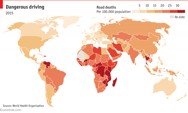
Tech Takeover of Global Advertising
Visual Capitalist made a chart showing that tech companies have overtaken the global advertising industry during the last few years.
Here we can clearly see traditional media like 21st Century Fox, CBS, and others losing positions in this market. At the same time, tech giants such as Alphabet, Facebook, and Baidu have been at the forefront of the tech takeover. Verizon (now with Yahoo! among its assets) and Facebook broke into the top 10 companies by global advertising revenue last year.
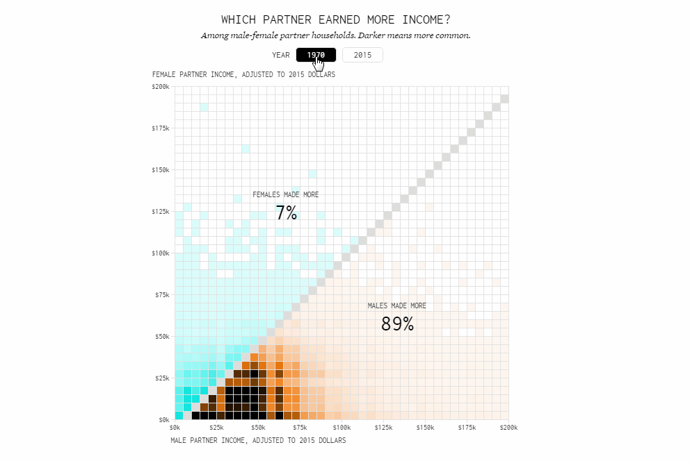
Road Deaths in Developing Countries
According to the data revealed and visualized by The Economist, roads in developing countries are getting more and more deadly. At the same time, the overall rate of mortality is actually falling.
Check out the choropleth map displaying the number of deaths on the roads per 100,000 people, by country. In addition, you obviously wouldn’t like to miss out on the two bar charts in the article that’ll tell you more on the subject.
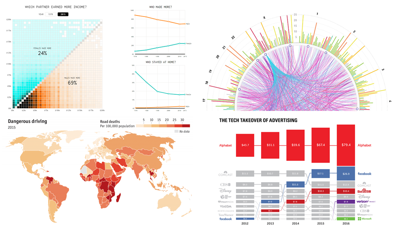
Who Earns More in Male-Female Partner Households in US
Nathan Yau looked into the question of who makes more money in the US households, men or women.
See his post on FlowingData with four interesting data visualization pieces that explain much about the situation and how it changed between 1970 and 2015. On average, husbands still have a higher income than wives. However, a clear trend here is convergence.
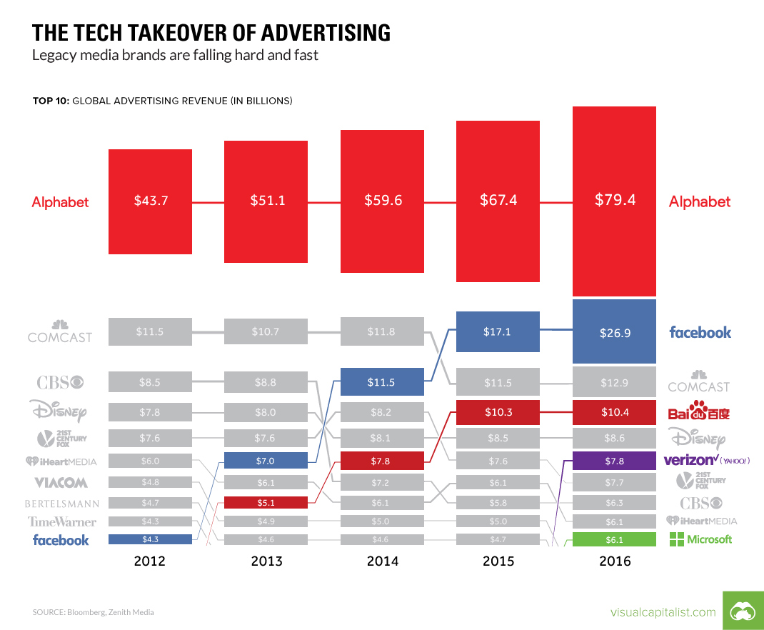
SFARI Gene: Gene-Centered Autism Research Data and Visuals
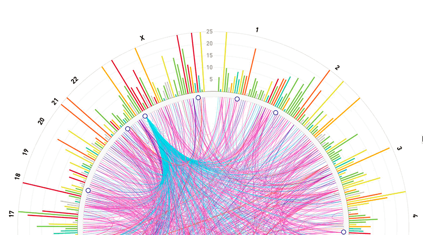
The SFARI Gene website is now redesigned, featuring a better, streamlined user interface along with new interactive data visualizations and tools for research of the human genetic underpinnings of autism.
Here you’ll find a lot of data visualized. That is definitely a must-see and bookmark resource for all members of the autism research community.
***
Stay tuned to DataViz Weekly on the blog of AnyChart JS Charts. Whenever you stumble upon a nice infographic or chart example that nicely shows the beauty of data visualization, don’t hesitate to send us a note in the comments, or on Twitter or Facebook, or via Customer Support.
- Categories: Data Visualization Weekly
- No Comments »