Best JavaScript Gantt Chart Libraries in 2025–2026
November 5th, 2025 by Jay Stevenson Gantt charts are among the most effective ways to visualize tasks, timelines, and dependencies, making them a core component of modern project management practices. For developers building web applications, the right JavaScript Gantt chart library can dramatically save development time and deliver a professional, interactive experience directly in the browser.
The ecosystem in 2025–2026 includes a wide range of solutions — from free open-source libraries for simple timelines to enterprise-grade components with advanced scheduling engines and resource management features. Some prioritize speed and simplicity, while others focus on deep functionality and seamless integration into broader charting or UI stacks.
This article reviews the most notable JavaScript Gantt chart libraries available today. Each library is presented with its functionality, performance and scalability, integration options, licensing, and support. Whether you are building an internal tool, a SaaS application, or a full-scale enterprise system, this guide will help you quickly identify the Gantt solution that best fits your needs.
- Categories: AnyChart Charting Component, AnyGantt, Big Data, Business Intelligence, Dashboards, Gantt Chart, HTML5, JavaScript, Tips and Tricks
- No Comments »
MARVI Project Uses AnyChart Android Charts to Visualize Groundwater Data in MyWell App
May 25th, 2023 by AnyChart Team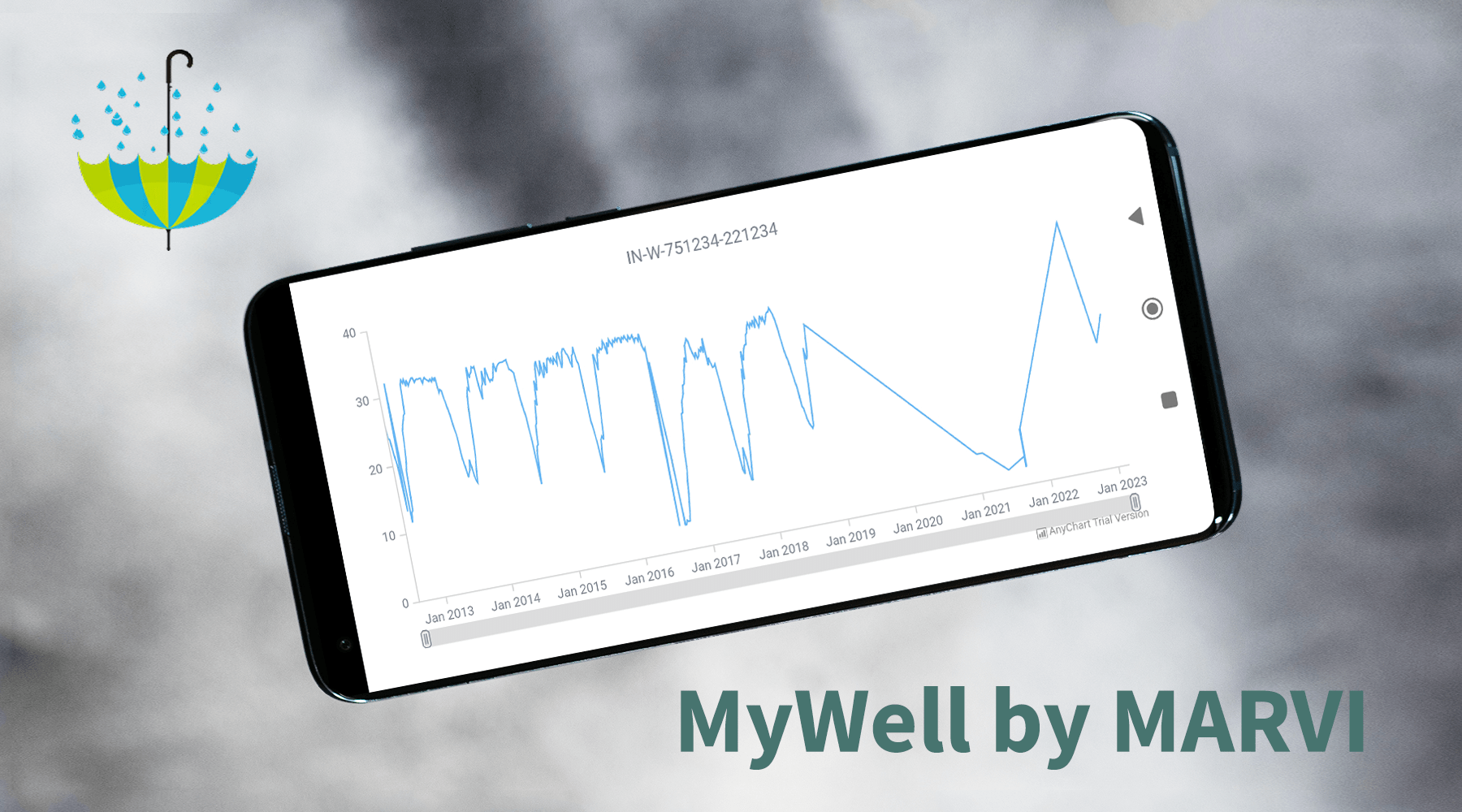
At AnyChart, we take great pride in our position as leaders in the global data visualization industry. Our JavaScript Charting Library is renowned for its excellence for developers, while our Qlik Sense Extensions continue to push the boundaries with innovative solutions for analysts. But we don’t stop at being awesome! We also bring the ultimate data visualization magic to Android app developers with AnyChart Android Charts! You’ve probably come across these charting wonders in some of your favorite mobile apps. Today, we’re putting the spotlight on one specific use case that caught our attention.
We recently had a blast speaking with Professor Basant Maheshwari, the lead scientist at the MARVI project. Their mission? To revolutionize groundwater management through community empowerment. They are achieving that with the help of MyWell, a mobile app that streamlines crowdsourced data collection to sustain groundwater resources, ensure access to clean drinking water, and boost livelihoods. MyWell harnesses the power of our Android data visualization library. And to fuel MARVI’s noble mission, we provided them with a complimentary license to wield the mighty AnyChart within the app.
Dive into the inspiring world of MARVI and MyWell, and witness firsthand how AnyChart contributes to making a real difference for ordinary people while paving the way for the future of groundwater management.
- Categories: AnyChart Charting Component, AnyStock, Big Data, HTML5, JavaScript, Stock Charts, Success Stories
- No Comments »
AnyChart Named Best in Data Analytics & Visualization ?
February 3rd, 2023 by AnyChart Team We’re proud to announce that AnyChart has won a prestigious 2023 DEVIES Award in the Data Analytics & Visualization category! Many thanks to the jury and congratulations to all our partners and customers!
Celebrating 20 years in the market this year, we at AnyChart have been working hard to develop the best-in-class data visualization solutions. And we will keep innovating and excelling!
The DEVIES Awards are the definitive annual awards for the software industry, recognizing outstanding design, engineering, and innovation in developer technology across multiple categories. This year’s winners were selected from record-high hundreds of nominations by an expert-led panel of the DevNetwork Advisory Board, including representatives of Accenture, DigitalOcean, EA, Google, IBM, Salesforce, and other great companies.
- Categories: AnyChart Charting Component, AnyGantt, AnyMap, AnyStock, Big Data, Business Intelligence, Dashboards, Financial Charts, Gantt Chart, GraphicsJS, HTML5, JavaScript, News, Oracle Apex, Qlik, Stock Charts, Success Stories
- 2 Comments »
Building Column Charts with JavaScript
December 29th, 2022 by Shachee Swadia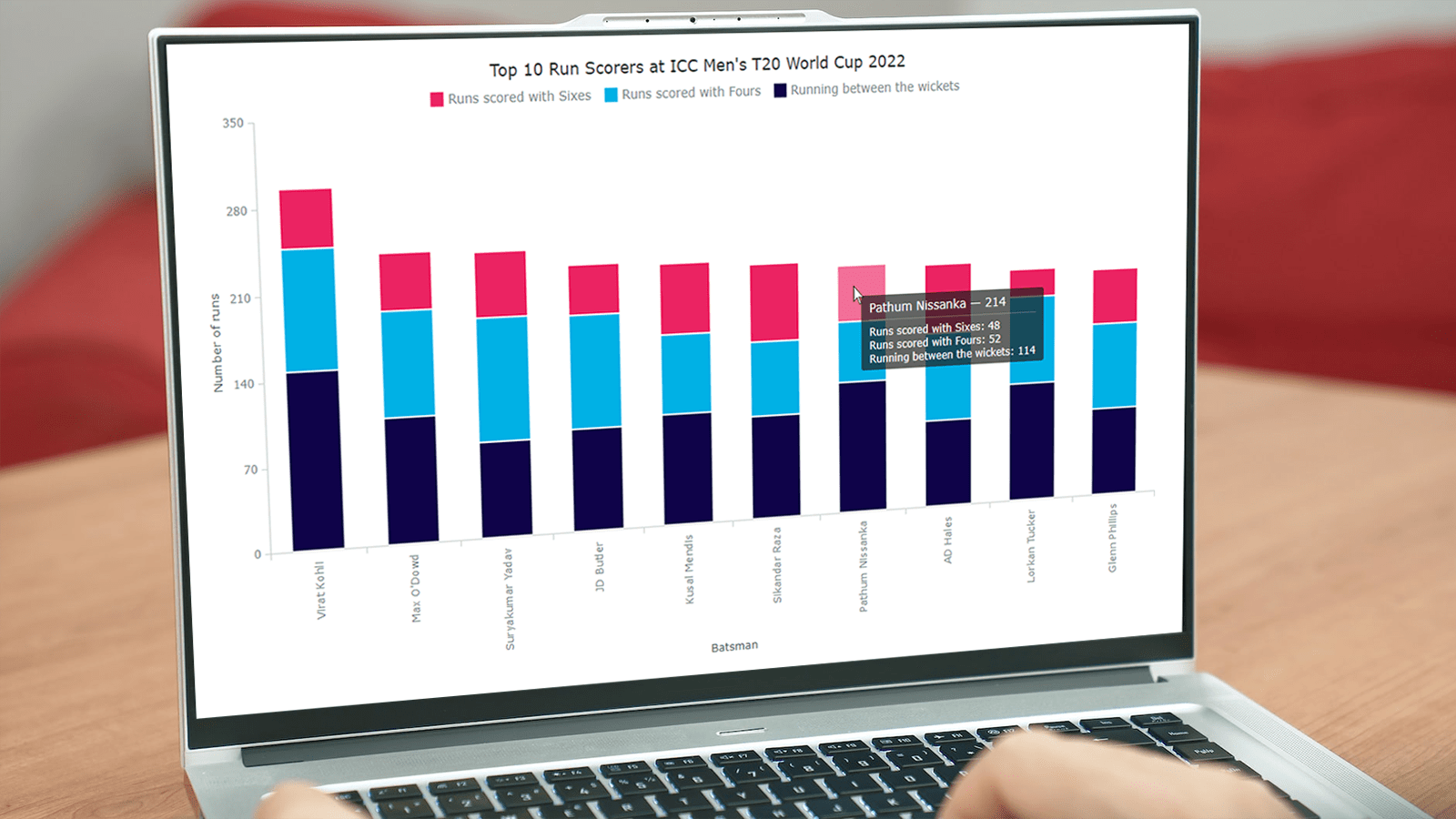 With data everywhere around, we should know how to graphically represent it to better (and faster) understand what it tells us. One of the most common data visualization techniques is column charts, and I want to show you how you can easily create interactive ones using JavaScript.
A column chart is a simple, yet powerful way to display data when you need to compare values. From this tutorial, you will learn to make its different variations — basic single-series, multi-series, stacked, and 100% stacked column graphs — and apply effective customizations in a few more lines of JS code.
As a cricket fan, I thoroughly watched the ICC Men’s T20 World Cup held last month in Australia. I decided to use some data related to the championship for illustrative visualizations. JavaScript column charts built throughout this tutorial will let us look into the batting statistics, and more precisely, the number of runs scored by the top 10 batsmen at the tournament. Let’s have fun learning!
Read the JS charting tutorial »
- Categories: AnyChart Charting Component, HTML5, JavaScript, JavaScript Chart Tutorials, Tips and Tricks
- 2 Comments »
How to Create Word Tree Using JavaScript
October 14th, 2022 by Awan Shrestha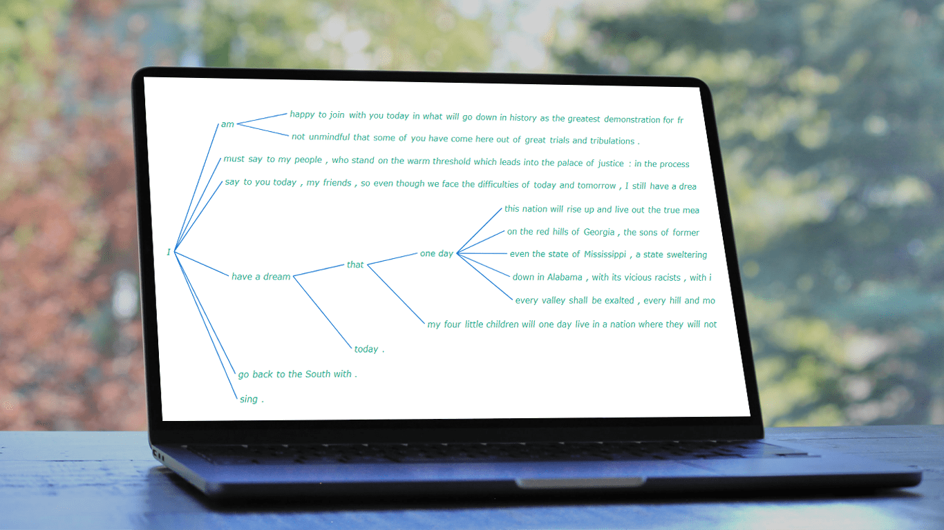 It is a pure fact that a graphical or pictorial representation of data, known as a data visualization, conveys information faster than raw data in arrays, spreadsheets, or dense reports. Charts make data easier to understand, which further helps to quickly develop valuable insights. Interesting, right? Now, let’s have a look at one chart type called a word tree and see how to build it with ease.
A word tree is a data visualization form designed to show multiple parallel sequences of words (or phrases) as they appear in a text. Analyzing texts becomes easier with word trees as they display, by means of a branching structure, how selected words are connected to others.
In this tutorial, I will walk you through the process of creating a beautiful word tree chart with JavaScript (HTML5). The text being visualized will be the famous speech “I Have a Dream” by minister and civil rights activist Martin Luther King Jr. Each step will be explained in detail, and you’ll see everything is pretty simple. Sit tight and enjoy the learning!
Read the JS charting tutorial »
- Categories: AnyChart Charting Component, HTML5, JavaScript, JavaScript Chart Tutorials, Tips and Tricks
- No Comments »
AnyChart JS Charts 8.11.0 Released with Awesome New Data Visualization Features
December 7th, 2021 by AnyChart Team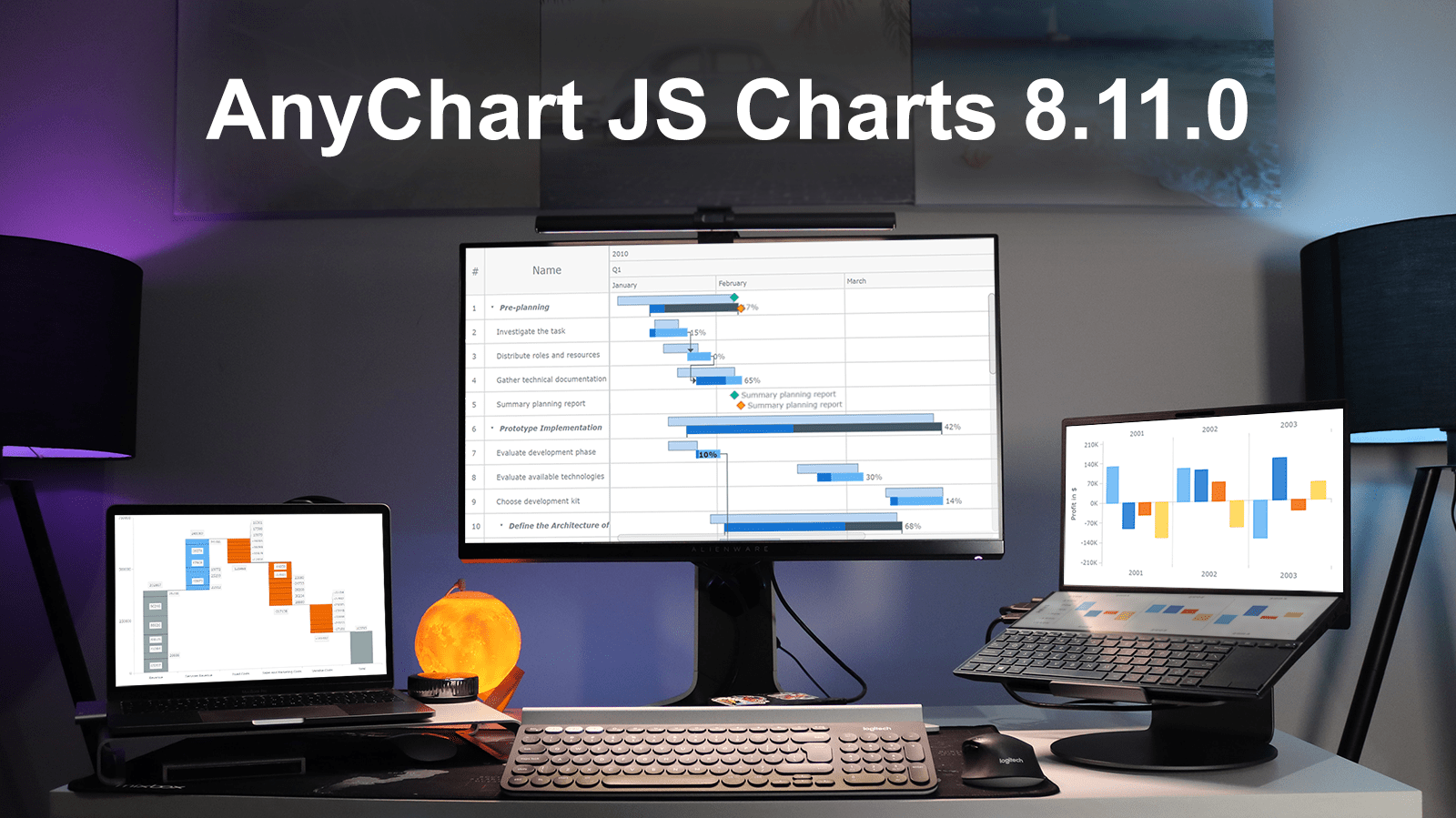 Excited to tell you we’ve just pushed a major update to our JavaScript charting library! The newly arrived features and improvements make our core solution even more flexible, adding awesome fresh capabilities designed to further help you on your data visualization development journey. Intrigued? Let us show what’s new in AnyChart JS Charts 8.11.0 right away!
»»» See What’s New in AnyChart 8.11.0! «««
- Categories: AnyChart Charting Component, AnyGantt, Gantt Chart, HTML5, JavaScript, News
- 3 Comments »
StopCorona Creator Shares How They Visualize COVID-19 Data Using AnyChart
May 21st, 2020 by AnyChart Team Earlier, we introduced you to a new, ever-updating COVID tracker that uses AnyChart to visualize the latest pandemic data in insightful charts, StopCorona.info. To let you know more, we also talked to Vadim Peskov, CEO at Diffco, the app development company behind StopCorona, and asked him a few questions.
Read our quick interview to learn more about StopCorona and their experience using our JavaScript charting library for interactive data visualization. (Stack: MySQL/Symfony/Angular.)
- Categories: AnyChart Charting Component, Big Data, Charts and Art, HTML5, JavaScript, Success Stories
- 3 Comments »