Modular JavaScript Charting: AnyChart 8 Premiere
October 2nd, 2017 by AnyChart Team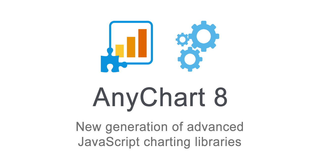 Fall is an amazing time for TV, movie, theater, and other art lovers as that’s when a lot of premieres are being launched. Well, we are happy to contribute to the debut mainstream this time! Meet AnyChart 8, a modular JavaScript charting system taking the convenience, performance, and customization in the art of interactive data visualization to the next level.
Join us in reviewing the core innovations delivered in the 8th, module-based generation of AnyChart, including the brand new features now available in our JS charting libraries AnyChart, AnyStock, AnyGantt, and AnyMap, as well as what else is in our nearest plans.
AnyChart JS Charts 8.0.0: Modules, Custom Builds, and Much More
The 8.0.0 release of the AnyChart, AnyGantt, AnyMap, and AnyStock JavaScript (HTML5) charting libraries delivers a lot of brand new features and technical improvements. Please see the list below for a quick overview of what’s new.
- Categories: AnyChart Charting Component, AnyGantt, AnyMap, AnyStock, Dashboards, Financial Charts, Gantt Chart, HTML5, JavaScript, News, Stock Charts
- 5 Comments »
Data Visualization with JavaScript: The Story of AnyChart JS Charts
September 7th, 2017 by AnyChart Team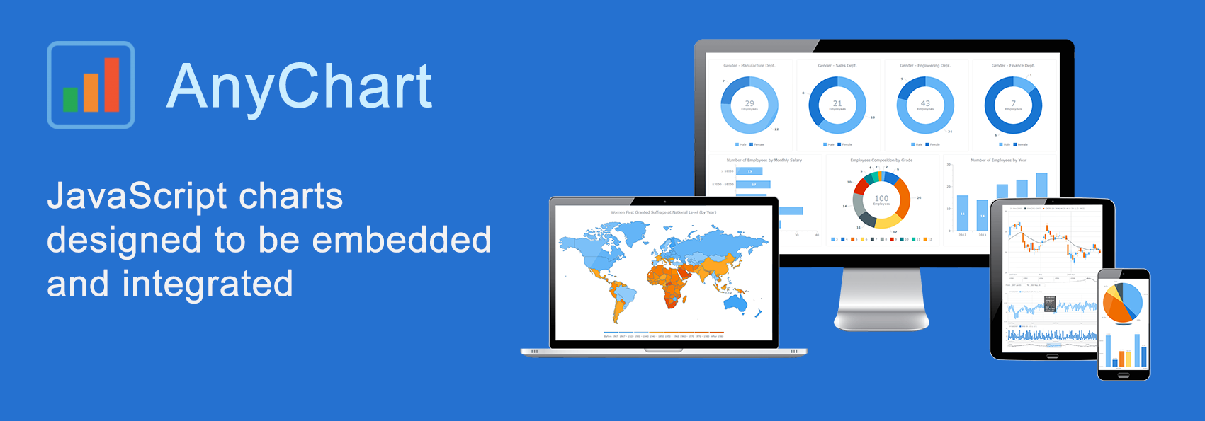 AnyChart is a flexible JavaScript (HTML5) based solution that allows you to create interactive and great looking charts. It is a cross-browser and cross-platform charting solution intended for everybody who deals with creation of dashboard, reporting, analytics, statistical, financial or any other data visualization solutions. AnyChart works everywhere -PCs, Macs, iPhones, iPads, Android devices and helps businesses transform operational data into actionable information.
Kevin William David interviewed Anton Baranchuk, CEO at AnyChart to know more.
- Categories: AnyChart Charting Component, AnyGantt, AnyMap, AnyStock, Business Intelligence, Flash Platform, GraphicsJS, HTML5, JavaScript, Oracle Apex, Qlik, Success Stories
- No Comments »
Choose Right Chart Type for Data Visualization. Part 3: Data Over Time (Trend Context)
April 26th, 2017 by AnyChart Team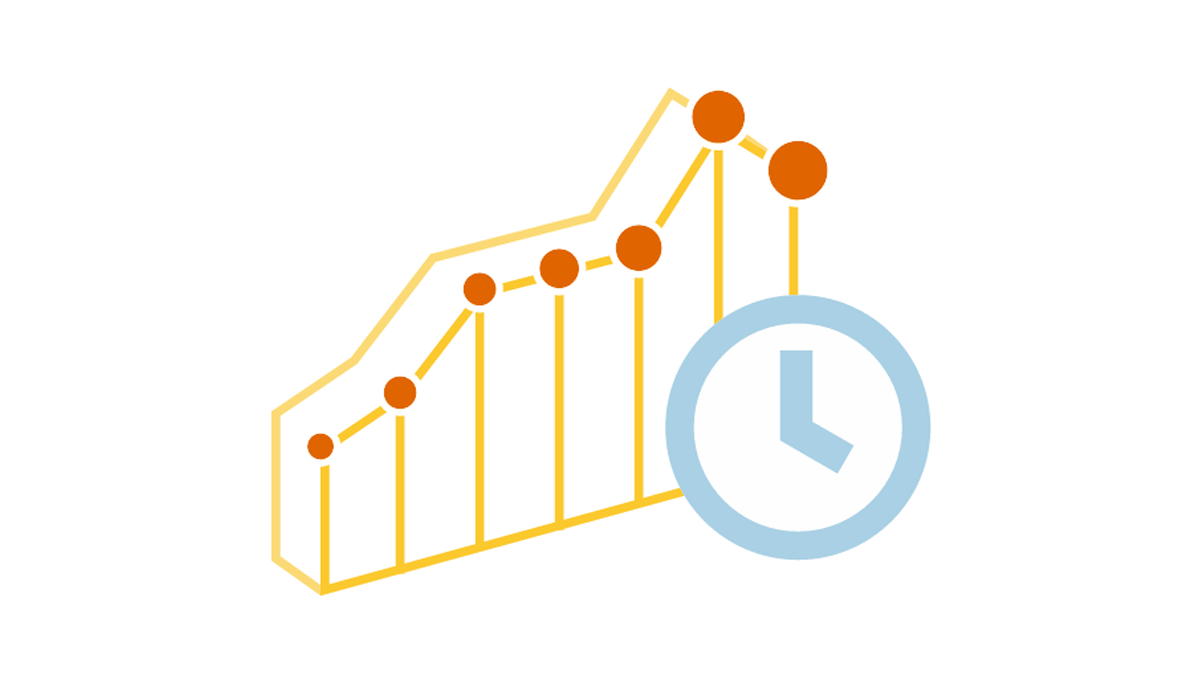 We are continuing the effort to better familiarize you with the world of chart types. This time let’s talk about good ways to visualize and explore Data Over Time.
Watching the change in data over time helps identify trends and dynamics in diverse timeline-based sets of values. Needless to say, choosing a right chart type is very important here. When applying an inappropriate form of visualization to your data, you might end up with an inaccurate idea of what happened in the past, what’s taking place now, and/or what will occur in the future. But we’ll do our best to help you avoid any mistakes in this field so you always make only right decisions based on your date/time data.
So, let’s get to the gist now.
- Categories: Choosing Chart Type, Tips and Tricks
- No Comments »
JavaScript Charts Library Update 7.13.1 Released for AnyChart, AnyStock, AnyMap, AnyGantt
April 18th, 2017 by AnyChart Team “Sweet April showers do spring May flowers,” once wrote 16th-century English poet Thomas Tusser. Well, our customers already know that AnyChart’s April brings flowers, too! Last year we launched the great 7.10.0 version of the AnyChart JavaScript charts library and, basically, of our whole data visualization product family. Now, in the year of 2017, April brings you another great update.
So, please all greet the 7.13.1 release of AnyChart, AnyMap, AnyStock, and AnyGantt – our cute first spring flowers grown especially for you!
- Categories: AnyChart Charting Component, AnyGantt, AnyMap, AnyStock, HTML5, JavaScript, News, Qlik
- 2 Comments »
8 Dashboard Design Trends for 2017
March 28th, 2017 by AnyChart Team. Click to see its interactive version") With the explosion of data in the past few years, the relevance of understanding it better has grown to the highest extent. That is why expertise in interactive charting and dashboard design, as well as in the whole big Data Visualization and Data Science fields in general, has become so important nowadays. In fact, it is usually rather difficult to understand raw data as deeply and quickly as needed. Luckily, neat visual representation of information can be helpful in clarifying even very large amounts of data, discovering and exploring patterns in data, and then making (right) data-driven decisions.
With the explosion of data in the past few years, the relevance of understanding it better has grown to the highest extent. That is why expertise in interactive charting and dashboard design, as well as in the whole big Data Visualization and Data Science fields in general, has become so important nowadays. In fact, it is usually rather difficult to understand raw data as deeply and quickly as needed. Luckily, neat visual representation of information can be helpful in clarifying even very large amounts of data, discovering and exploring patterns in data, and then making (right) data-driven decisions.
Creating dashboards is a great way of transforming diverse relevant data into informative, insightful visualizations as the basis for further analysis. In order to obtain the highest possible efficiency, they should be insightful, featuring robust usability, and visually (and aesthetically) appealing.
Today we’ll talk about the most notable dashboard design trends. Understanding them is very important to each data professional who wants to further improve their skills by keeping up with the times and adhering to the best practices.
- Categories: Business Intelligence, Dashboards, Tips and Tricks
- No Comments »
Interactive Technical Support Dashboard Created with AnyChart JavaScript (HTML5) Charts
March 20th, 2017 by AnyChart Team Technical Support Dashboard is a great tool to keep track of all the support and related activities in your company. It can be very helpful in both monitoring your support team’s performance and revealing issue patterns in customer requests for further use by product strategy and development officers. And when you already have data, all you need is to decide how to visualize it, preferably quickly, easily, and fully compatibly with your own corporate software.
Now that the Web has completely adhered to the HTML5 standard, JavaScript charting libraries are the best type of solution for interactive data visualization. They can deliver all necessary dashboarding features and make the whole process of creating a dashboard for your web app pretty straightforward. Of course, you should just choose a right JavaScript charting library first that will entirely comply with your specific data visualization objectives.
But let’s get back to the very gist. Today we are glad to present the Technical Support Dashboard created with the JavaScript charting library of AnyChart. It is our new sample, available under the Apache 2.0 license, and you can feel free to make good use of it in your own business intelligence solutions. In particular, such a dashboard will help you fully control the support and make right data-driven decisions based on your data.
Now let’s take a closer look at this cool (and helpful) interactive JavaScript (HTML5) dashboard.
- Categories: AnyChart Charting Component, Business Intelligence, Dashboards, HTML5, JavaScript
- No Comments »
HR Dashboard – Built With AnyChart JavaScript (HTML5) Charts Library
September 1st, 2016 by AnyChart TeamAn HR dashboard is a powerful BI solution that can mightily facilitate making right, data-driven decisions about the workforce in your company – from recruiting and training courses to compensations and job promotions. Smart visualization of all relevant staff-related data, with all charts and graphs on a single page, allows your Human Resources Department to see various metrics at-a-glance. As a result, HR managers are given the power to easily identify trends, outliers, and relationships when it comes to reports and data analysis, and to make sure each decision is well-timed and will drive even more success for your enterprise.
After all, it is the employees that are the most valuable asset.
To inspire and show you how easy it gets to implement this approach with the help of AnyChart JS Charts library, we added an interactive JavaScript-based Human Resources Dashboard to the Business Solutions section of our website as a new HTML5 business dashboard sample with the full source code. It nicely visualizes various employee related data, including demographics, payrolls, performance measurements, and so on. Of course, you are welcome to fork this sample and use our HR Dashboard fully or partially to create your own solution.

Now let’s have a closer look at this interactive HTML5 dashboard, including its composition and some peculiar features. Read more »
- Categories: AnyChart Charting Component, Business Intelligence, Dashboards, HTML5, JavaScript, News
- No Comments »