 Technical Support Dashboard is a great tool to keep track of all the support and related activities in your company. It can be very helpful in both monitoring your support team’s performance and revealing issue patterns in customer requests for further use by product strategy and development officers. And when you already have data, all you need is to decide how to visualize it, preferably quickly, easily, and fully compatibly with your own corporate software.
Now that the Web has completely adhered to the HTML5 standard, JavaScript charting libraries are the best type of solution for interactive data visualization. They can deliver all necessary dashboarding features and make the whole process of creating a dashboard for your web app pretty straightforward. Of course, you should just choose a right JavaScript charting library first that will entirely comply with your specific data visualization objectives.
But let’s get back to the very gist. Today we are glad to present the Technical Support Dashboard created with the JavaScript charting library of AnyChart. It is our new sample, available under the Apache 2.0 license, and you can feel free to make good use of it in your own business intelligence solutions. In particular, such a dashboard will help you fully control the support and make right data-driven decisions based on your data.
Now let’s take a closer look at this cool (and helpful) interactive JavaScript (HTML5) dashboard.
Technical Support Dashboard: Composition
This interactive HTML5 dashboard consists of six JavaScript charts: one line chart, one stacked column chart, two bar charts, and two donut charts.
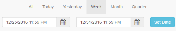
At the top of the visualization, we made a box with a UI for easy date/time range selection.
The first chart we actually see in this support dashboard is a line chart that displays the timeline of tickets. Each data point here is highlighted with a marker, so you can easily notice how many calls, emails, requests from you site, and online chats your team processed on one day or another. Here you can instantly switch the view to the stacked column chart, which can help you proceed from observing time-based trends to a more focus on the differences. Hovering over a data point triggers an appropriate tooltip to show up and provide additional information. The legend is also interactive: You can click the items to show or hide one series or another.

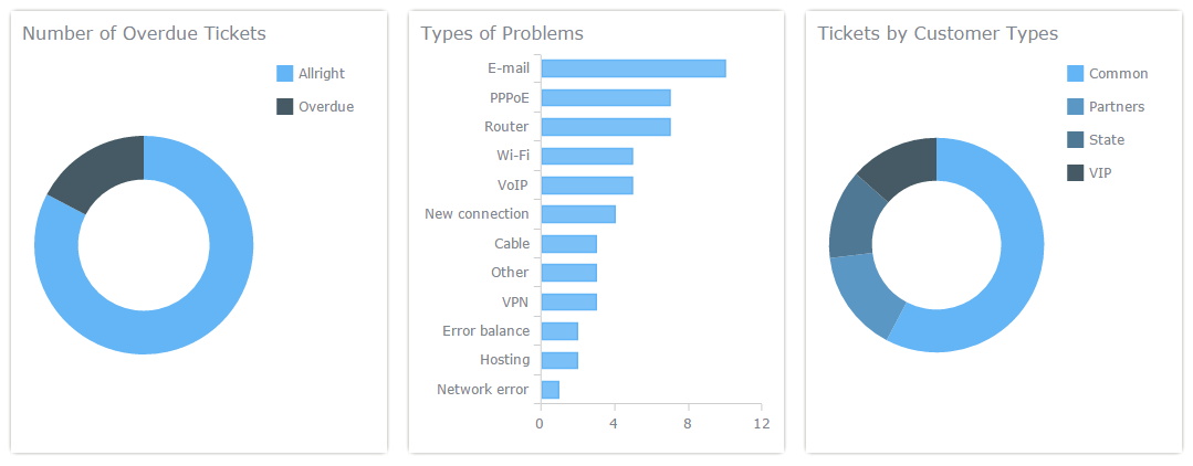
The second level of our technical support dashboard provides more insights into tickets. The donut chart on your left displays the share of overdue tickets in the total amount of tickets. The bar chart in the center allows you to reveal the most popular ticket subjects. And the donut chart on your right shows the composition of tickets by type of your customer they’ve come from.
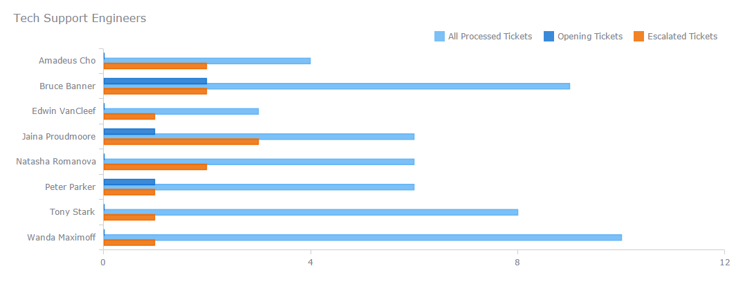
The bottom section of this interactive JS dashboard represents staff-related data in a multi-series bar chart. Here you’ll be able to assess the performance of each of your technical support engineers by comparing their how many tickets they processed, opened, and escalated. Again, you can customize the view to focus on one specific ticket type or another by interacting with the chart’s legend.
Technical Support Dashboard: Development
If right now you need to develop an HTML technical support dashboard, consider taking this sample as your first draft and then modify and customize it the way you want. You can check it out live, in the interactive version, right here on AnyChart.com. And this support dashboard is waiting for your forks on GitHub, folks!
And at all events, consider AnyChart as a helper. It is known to be a very robust JavaScript library for building interactive dashboards just like any other chart-based data visualizations. Moreover, you can easily implement the AnyMap and AnyStock libraries along with AnyChart to provide your dashboard with beautiful JS maps and timeline data based charts respectively, if you want. Check out the JS Charts API Reference and Docs in which we explain everything in detail.
You are always welcome to use other interactive dashboard samples from the Business Solutions collection and chart galleries (e.g. see AnyChart’s gallery) for your own data visualization needs as well, when necessary. For example, we have HR Dashboard, Investment Portfolio Dashboard, CIO Dashboard, Sales Dashboard, Web Analytics Dashboard, and many other nice examples. This will help you keep the things even less time (and effort) consuming.
- Categories: AnyChart Charting Component, Business Intelligence, Dashboards, HTML5, JavaScript
- No Comments »