Nobel Laureates’ Countries, or Making Tag Cloud with JavaScript
October 3rd, 2023 by Awan Shrestha The Nobel Prize 2023 announcements are just around the corner, scheduled from October 2 to 9. Recently, I stumbled upon this news, sparking my interest in Nobel laureates and their countries of origin.
This curiosity led me to the comprehensive list of Nobel Prize winners on Britannica, which I transformed into an interactive tag cloud (or word cloud) using JavaScript, providing an elegant means to explore and uncover the countries with the highest number of Nobel laureates throughout history.
During this process, it dawned on me that this visualization could serve as an excellent illustrative example for a tutorial on creating interactive JS-based tag clouds. So, if you share my curiosity about Nobel laureates by country, you’re in for a treat right below! and if you’re eager to learn how I brought this tag cloud to life — and, therefore, how you can create your own — read on!
Read the JS charting tutorial »
- Categories: AnyChart Charting Component, Big Data, HTML5, JavaScript, JavaScript Chart Tutorials, Tips and Tricks
- No Comments »
Maigret.de Picks AnyChart JS Charts to Visualize Data on Georges Simenon’s Work
December 29th, 2021 by AnyChart Team When data is all around, it’s no wonder to see charts here or there as they greatly help make sense of it. With thousands of happy customers worldwide, both for our JS charting library and Qlik charting extensions, we have seen countless applications for data visualization across all fields and industries. Some use cases, however, might be less expected than others. What about a website dedicated to literature?
Maigret.de — a remarkable resource about Georges Simenon, a famous Belgian writer best known for creating police detective Jules Maigret — has recently started to publish interactive data graphics revealing interesting patterns and facts in his immense work. All the charts on the website are built with AnyChart.
We have chatted with Maigret.de’s creator Oliver Hahn about his project, data visualizations, and experience using our solutions. Read the quick interview and go check out the website. (Stack: HTML/MySQL.)
- Categories: AnyChart Charting Component, Books, HTML5, JavaScript, Success Stories
- No Comments »
AnyChart JS Charts Used to Visualize Data on Ancient French Riddles
June 30th, 2021 by AnyChart Team As global leaders in data visualization solutions, we feel it is part of our mission to support educational and research projects by granting their authors a free license to use our products. Les Énigmes de Mercure (The Riddles of Mercury) by Timothée Léchot from the University of Neuchâtel (UniNE) is one such initiative we are proud to back on non-commercial terms.
Recently, we had a quick talk with Timothée and asked him a few questions to learn more about his project and experience visualizing data with the AnyChart JS charting library. Read our quick interview below. (Stack: PHP/MySQL.)
- Categories: AnyChart Charting Component, Big Data, Charts and Art, HTML5, JavaScript, Success Stories
- No Comments »
Visualizing Reddit Data Using AnyChart JS Charting Library
November 25th, 2020 by AnyChart Team Leading the data visualization market with the best-in-class solutions, we are always excited to see how not only companies but also individuals from all over the world use them to produce interactive charts in their projects. Here’s one new interesting example we’ve recently learned about. A developer created “Cloud a Subreddit,” a web project that generates a beautiful interactive Word Cloud chart out of any given Reddit’s subreddit with the help of the AnyChart JS library.
[Editor’s note: The interviewee’s personal details have been removed following a GDPR request.]
We had a quick interview with the creator to learn more about the work and experience of using AnyChart. Check it out.
- Categories: AnyChart Charting Component, Big Data, HTML5, JavaScript, Success Stories
- No Comments »
Visualizing Data About Energy Mix, Subreddit Posts, Hate Crimes, and McDonald’s Ice Cream Availability — DataViz Weekly
November 13th, 2020 by AnyChart Team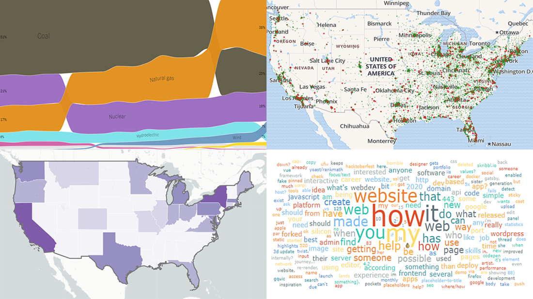 DataViz Weekly is back — check out some of the most interesting third-party data visualization projects we have recently come across! Let’s start with a quick list and then take a closer look at each:
- Electricity generation in America since 2001 — NYT
- Subreddits in word clouds — Cloud a Subreddit
- Hate crimes in the United States — UCLA
- McDonald’s ice cream machine status — Rashiq Zahid
- Categories: Data Visualization Weekly
- No Comments »
Flippity Uses AnyChart in Word Cloud Visualization Tool
October 26th, 2020 by AnyChart Team
While thousands of companies choose AnyChart to operate interactive data visualization in commercial projects, we are especially proud our charting solutions have been put for good use in education. Here’s a great new case, for example.
Have you heard about Flippity? It is a fascinating free web project providing teachers (and students) with an extremely straightforward way to turn Google Sheets’ spreadsheets into something cool and useful in the education process — flashcards, quizzes, games, timelines, leaderboards, random name pickers, progress indicators, and many other online things. Earlier this year, Flippity added a dedicated tool to create a Word Cloud from a Google spreadsheet, and we are excited it is powered by our JavaScript charting library!
To learn and tell you more about Flippity and their experience using AnyChart JS for data visualization, we had a quick talk with Steve Fortna, a school teacher from Massachusetts and the creator of Flippity. Check out the interview! (Stack: HTML/Google Sheets.)
- Categories: AnyChart Charting Component, HTML5, JavaScript, Success Stories
- No Comments »
How to Create JavaScript Word Cloud Chart — Tutorial for Web Developers
April 30th, 2019 by Irina Maximova
Wondering how to make a beautiful interactive Word Cloud using JS? Then you’re in the right place! In this data visualization tutorial, I’ll guide you through the entire development process, demonstrating it’s easier to create a JavaScript word cloud chart for an HTML5 app or web page than you might think!
Also known as tag clouds, word clouds represent a popular visual technique designed to reveal how often tags (or basically, any words) are mentioned in a given text body. Essentially, the word cloud chart type leverages diverse colors and sizes to display at a glance different levels of relative prominence.
Now that we’ve got an idea of what a word cloud is, let’s get down to learning how to quickly code one using JavaScript!
Read the JS charting tutorial »
- Categories: AnyChart Charting Component, HTML5, JavaScript, JavaScript Chart Tutorials, Tips and Tricks
- 8 Comments »