Stunning New Charts & Maps from Around Internet — DataViz Weekly
October 4th, 2024 by AnyChart Team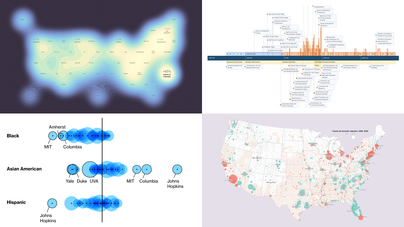 Charts and maps have a unique power to let data talk, transforming raw numbers into meaningful insights that anyone can grasp. In this edition of DataViz Weekly, we’re featuring some of the most stunning new examples of how data visualization brings information to life.
- Hazard-prone locations in the United States attracting migration — NYT
- Shifts in college admissions after the affirmative action ruling — Bloomberg
- Google search trends around U.S. elections — Google Trends and Truth & Beauty
- Interactive timeline of Roman history — AnyChart
- Categories: Data Visualization Weekly
- No Comments »
Stock Chart Creation in JavaScript: Step-by-Step Guide
September 5th, 2023 by Shachee Swadia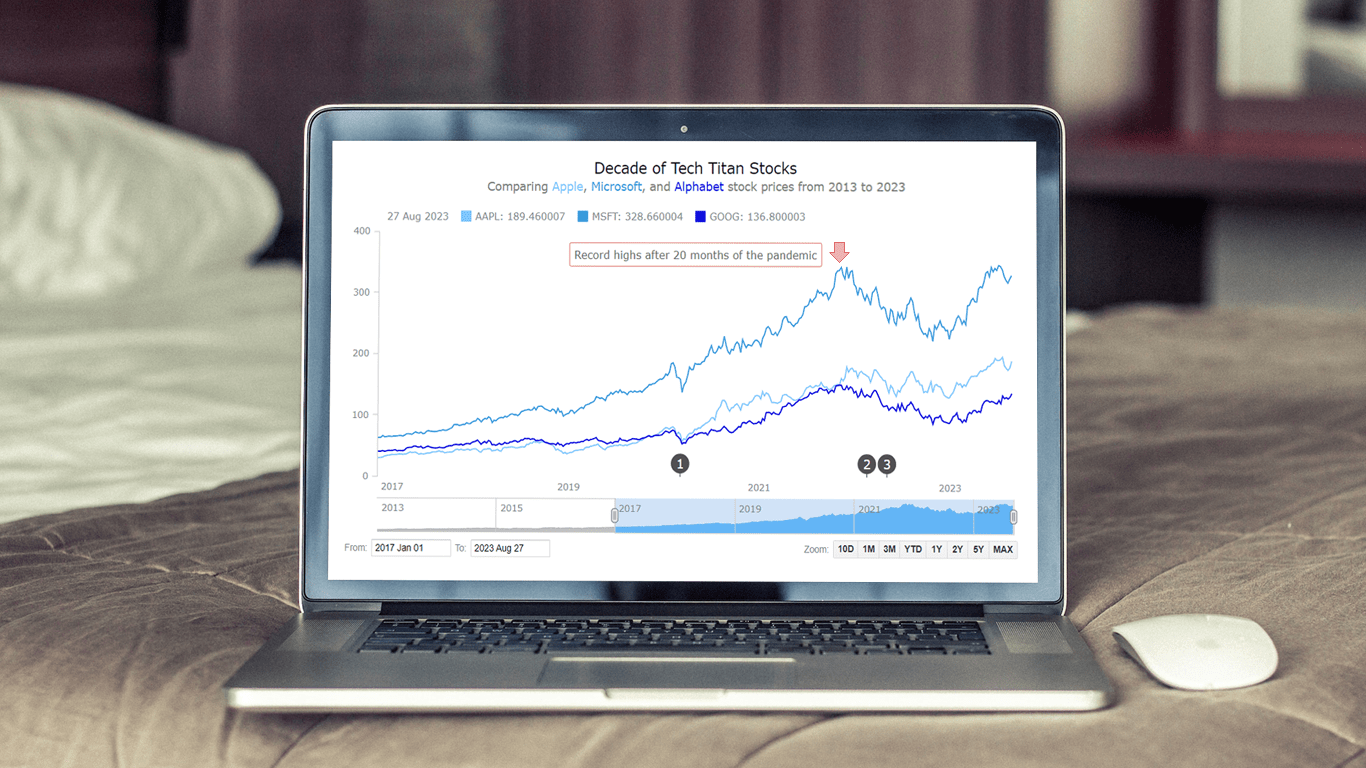 Chances are, you’ve come across various stock charts, whether you’re a seasoned trader or not. If crafting your data graphics piques your interest, you’re in the right place. Welcome to this user-friendly tutorial on building an interactive stock chart using JavaScript!
The JS stock chart we’ll create by the end of this guide will visually compare stock prices for three tech giants — Apple, Microsoft, and Google (Alphabet) — over the past decade. It’s a robust example to illustrate the stock charting process and the power of market data visualization.
So, hop on board as we explore the world of stock charts and learn how to create one from scratch.
Read the JS charting tutorial »
- Categories: AnyChart Charting Component, AnyStock, Big Data, Financial Charts, HTML5, JavaScript, JavaScript Chart Tutorials, Stock Charts, Tips and Tricks
- No Comments »
Engaging Data Graphics on Hobbies, Protests, Commute, and Reddit — DataViz Weekly
April 23rd, 2021 by AnyChart Team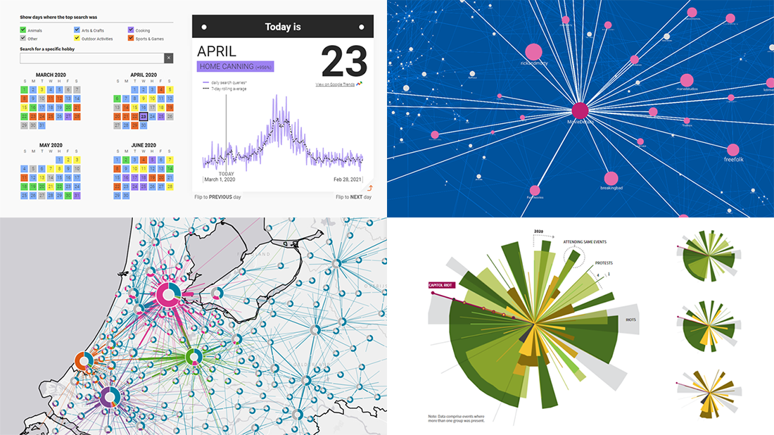 Can’t wait for a new portion of engaging data graphics? We’ve got it for you right here, right now! The following visualizations caught our eye this week, and DataViz Weekly is here to make sure you do not miss out on them:
- Top trending hobbies during the COVID-19 pandemic — Polygraph and Google Trends
- Right-wing protests in America in 2020-2021 — Reuters
- Commuting in the Netherlands — Statistics Netherlands
- Map of Reddit — Andrei Kashcha
- Categories: Data Visualization Weekly
- No Comments »
Creating Waterfall Chart with JS
March 16th, 2021 by Dilhani Withanage Do you want to know how to easily add a waterfall chart to a web page or application using JavaScript? This tutorial will make sure you’re prepared to confidently deal with that sort of interactive data visualization development!
Waterfall charts illuminate how a starting value turns into a final value over a sequence of intermediate additions (positive values) and subtractions (negative values). These additions and subtractions can be time-based or represent categories such as multiple income sources and expenditures. In finance, a waterfall chart is often called a bridge; you may have also heard it referred to as a cascade, Mario, or flying bricks chart.
To see waterfall charts in action and learn how to build them with JavaScript (HTML5), we need some interesting real-world data to visualize. In this tutorial, let’s look at the 2020 income statement for Alphabet Inc. (GOOGL), the parent company of Google.
Hence, be with me to reach our target step by step, so in the end, you’ll see how a lot of numbers can be made sense of with real ease when illustrated as a beautiful, interactive, JS waterfall chart. All aboard!
Read the JS charting tutorial »
- Categories: AnyChart Charting Component, Business Intelligence, HTML5, JavaScript, JavaScript Chart Tutorials, Tips and Tricks
- No Comments »
New Cool Graphics From Around the Web — DataViz Weekly
July 10th, 2020 by AnyChart Team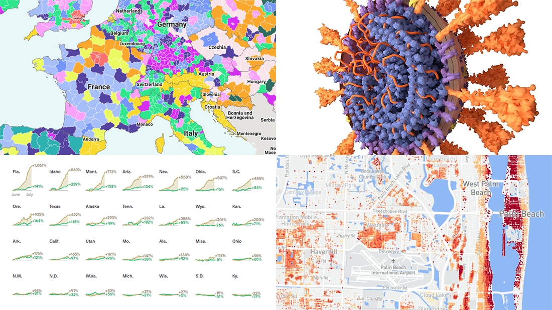 It’s Friday and we’re glad to share with you some of the most interesting third-party visualizations we’ve recently come across. Here’s what DataViz Weekly has for you to check out this time — look at these cool graphics:
- Future of jobs in the regions of Europe — McKinsey Global Institute, Google, et al.
- Flood risk factor database for the United States — First Street Foundation, et al.
- Changes in new cases against testing — Axios
- All we know about SARS-CoV-2 — Scientific American
- Categories: Data Visualization Weekly
- 1 Comment »
4 Great Visualization Projects on Privacy, Electricity, Ocean, and Emotions — DataViz Weekly
June 14th, 2019 by AnyChart Team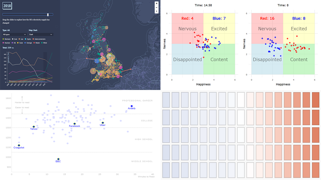 Are you ready to check out new compelling visualization projects? DataViz Weekly is awaiting your attention! Today in the focus:
- Privacy policies of 150 popular websites and apps
- Transformation of electricity supply in the United Kingdom
- Oceans in the changing climate
- Emotions during a basketball game
- Categories: Data Visualization Weekly
- No Comments »