Flippity Uses AnyChart in Word Cloud Visualization Tool
October 26th, 2020 by AnyChart Team
While thousands of companies choose AnyChart to operate interactive data visualization in commercial projects, we are especially proud our charting solutions have been put for good use in education. Here’s a great new case, for example.
Have you heard about Flippity? It is a fascinating free web project providing teachers (and students) with an extremely straightforward way to turn Google Sheets’ spreadsheets into something cool and useful in the education process — flashcards, quizzes, games, timelines, leaderboards, random name pickers, progress indicators, and many other online things. Earlier this year, Flippity added a dedicated tool to create a Word Cloud from a Google spreadsheet, and we are excited it is powered by our JavaScript charting library!
To learn and tell you more about Flippity and their experience using AnyChart JS for data visualization, we had a quick talk with Steve Fortna, a school teacher from Massachusetts and the creator of Flippity. Check out the interview! (Stack: HTML/Google Sheets.)
- Categories: AnyChart Charting Component, HTML5, JavaScript, Success Stories
- No Comments »
How to Build Box Plot Using JavaScript: Visualizing World Happiness
September 22nd, 2020 by Wayde Herman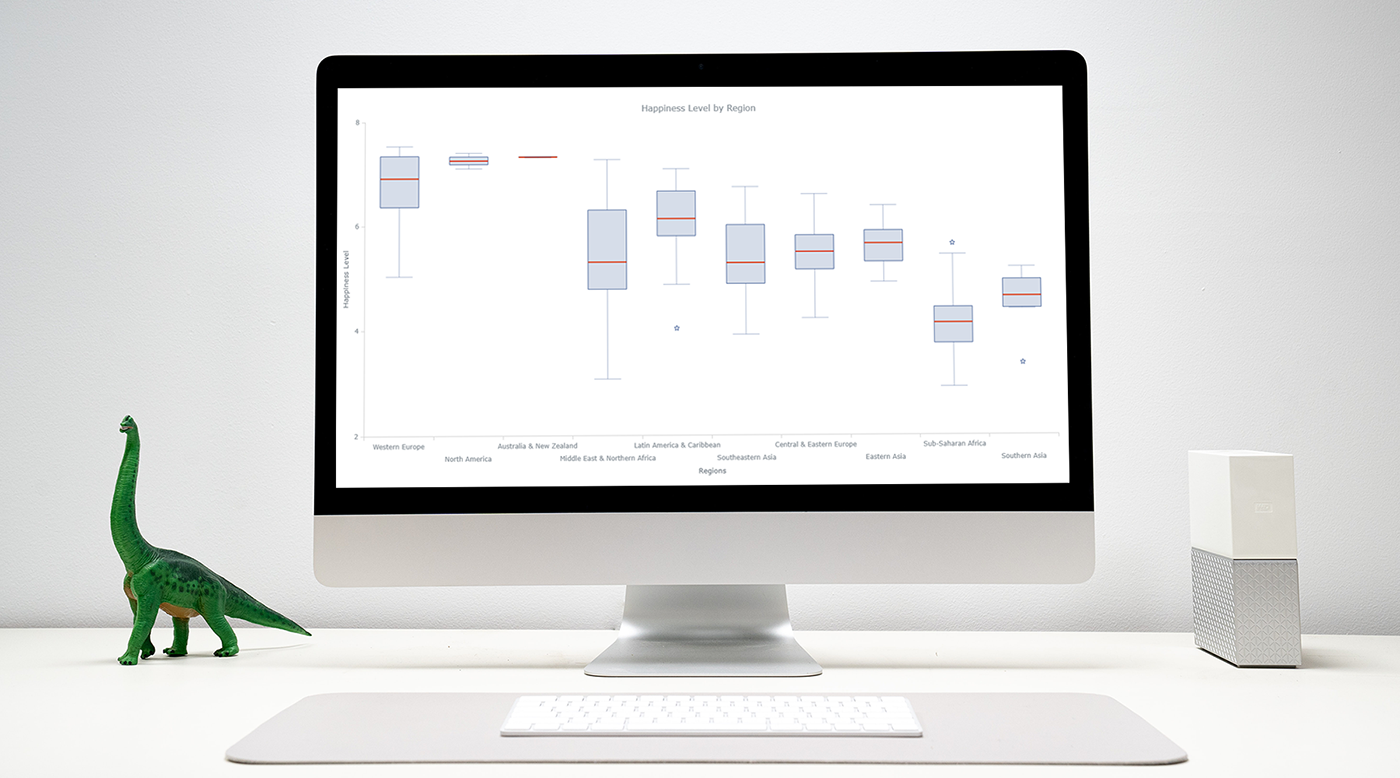 Data visualization is an important and sometimes undervalued tool in a data scientist’s toolkit. It allows us to gain an understanding and intuition about the data, through exploratory data analysis, which influences preprocessing, feature engineering, and the correct machine learning algorithm choice. It also helps to better evaluate models and even allows you to spot areas in the data where models could have poor performance.
Taking data visualization one step further by adding interactivity is even more advantageous. By adding interactive elements to your visualizations you create a more engaging experience. This in turn makes a user ‘explore’ visualizations instead of just reading them!
In this tutorial, I will be covering how to build an interactive data visualization, specifically a box plot as an example, using JavaScript and a charting library. I will begin by first briefly covering the basics of box plots before going through the steps of building one and then finally using the technique in a fun example to investigate the distribution of happiness between the different regions of the planet in an attempt to answer the question: ‘Where should you live to be happier?’.
Read the JS charting tutorial »
- Categories: AnyChart Charting Component, Big Data, Business Intelligence, HTML5, JavaScript, JavaScript Chart Tutorials, Tips and Tricks
- 1 Comment »
Visual Analytics Examples for City Climate, Pain Pills, Water Fountains, and Space Travels — DataViz Weekly
July 19th, 2019 by AnyChart Team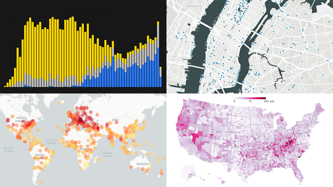 Enjoy another selection of new cool data visualization projects as great examples of visual analytics in action. Here’s what questions the charts featured today on DataViz Weekly show answers to:
- What city’s current climate will your city’s climate resemble in 2050? — Crowther Lab
- How legal pain pills were distributed across the United States in 2006-2012? — The Washington Post
- Where is the nearest water fountain? — Matthew Moy de Vitry
- How space travel has developed since Sputnik in 1957? — Reuters
- Categories: Data Visualization Weekly
- No Comments »