New Data Stories Driven by Visualization — DataViz Weekly
August 22nd, 2025 by AnyChart Team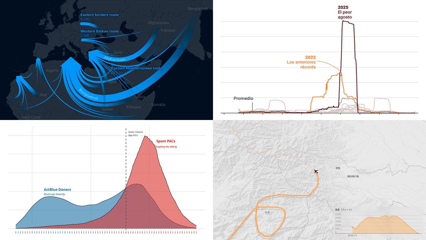 Visual graphics often play a crucial role in revealing the stories hidden in data. They help untangle complex realities while highlighting insights that might otherwise be hard to grasp. This edition of DataViz Weekly showcases recent articles where robust visualization of data drives effective storytelling:
- Donor age in U.S. political fundraising — On Data and Democracy
- Migration across the Mediterranean — Reuters
- Wildfires in Spain — Colpisa
- Japan Airlines Flight 123 crash, 40 years ago — Nikkei
- Categories: Data Visualization Weekly
- No Comments »
27 Election Maps of 2024 U.S. Presidential Vote Results — DataViz Weekly Special Edition
November 8th, 2024 by AnyChart Team The 2024 U.S. presidential election has concluded, and media outlets worldwide are offering a plethora of data graphics to convey the election results. In this special edition of DataViz Weekly, we’ve curated a collection of over twenty election maps, showcasing diverse ways to represent voting data — cartograms, choropleth maps, bubble maps, and more. Whether you’re a data enthusiast, professional, or simply intrigued by the 2024 election outcomes, explore the latest U.S. election maps from top media!
💡 Also see our previous special editions with election maps: 2020 U.S. election maps and 2024 UK election maps.
- Categories: AnyMap, Dashboards, Data Visualization Weekly
- No Comments »
Fresh Data Visuals That Impressed Us — DataViz Weekly
November 4th, 2024 by AnyChart Team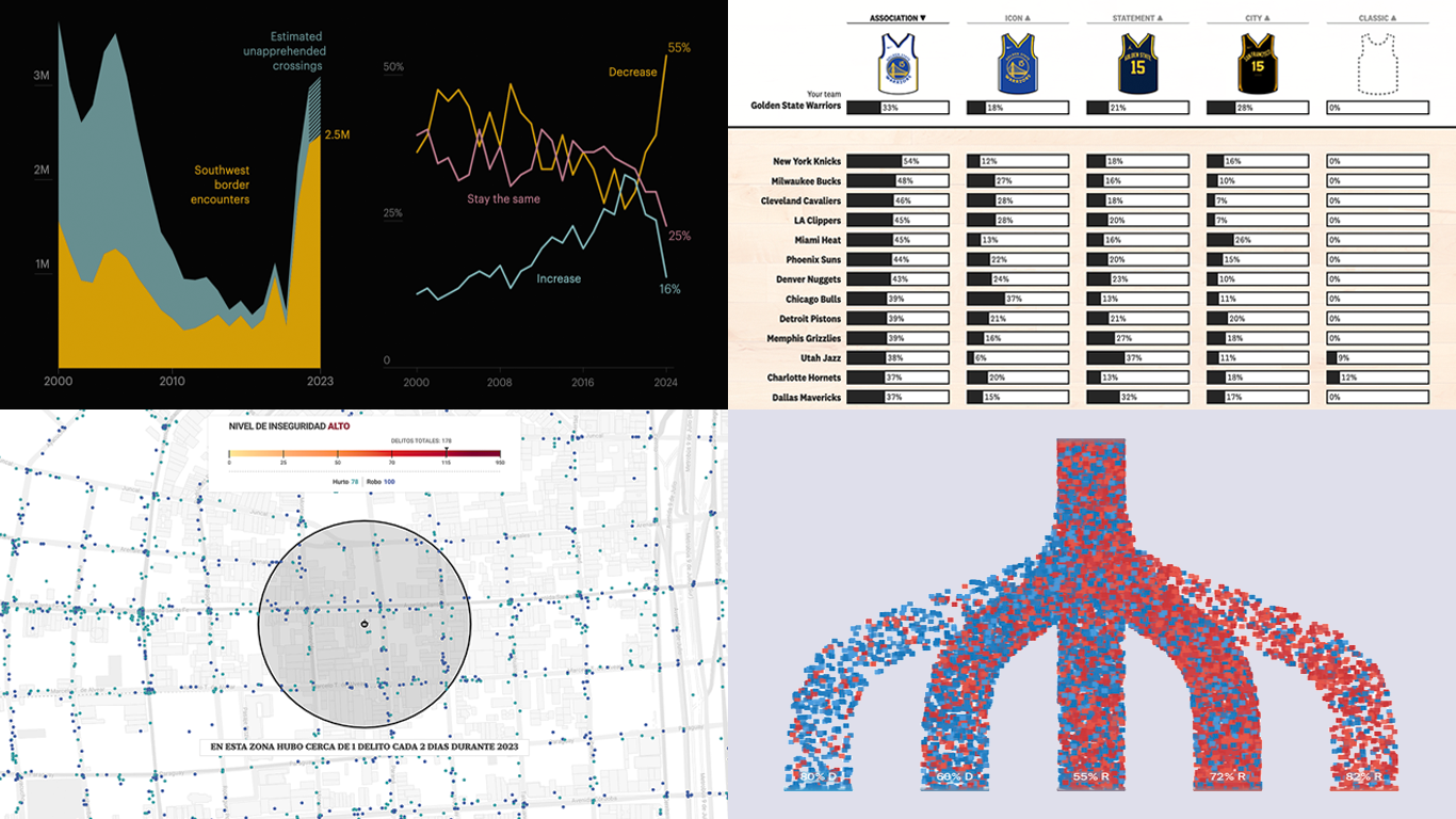 We’re a bit behind schedule after last week’s big release of updates for our Qlik Sense extensions, including the transformative AI Splits feature in the Decomposition Tree. But finally, here we are with a fresh edition of DataViz Weekly! Check out the projects with charts and maps that stood out to us most lately:
- U.S. immigration trends in historical context — ProPublica
- Crime trends in Buenos Aires — LA NACION
- Evolution of NBA uniform colors — The Pudding
- Internal migration and political polarization in the United States — The Upshot
- Categories: Data Visualization Weekly
- No Comments »
Impressive New Data Visuals for Your Inspiration — DataViz Weekly
October 11th, 2024 by AnyChart Team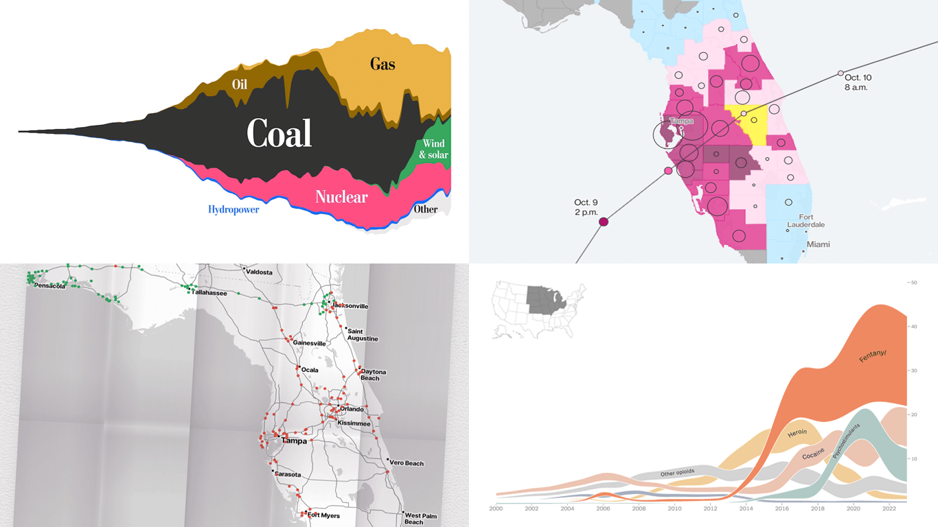 Ready for another dose of impressive data visuals? DataViz Weekly is back with a fresh selection of projects that use powerful graphics to help unravel various trends and patterns. Here are our top picks from what we’ve most recently come across out there:
- End of the UK’s coal power era and lessons for the world — The Washington Post
- Hurricane Milton’s impact and power outages — Bloomberg
- Waffle House Index for Florida under and after Milton — Riley Walz
- Opioid overdose deaths across the United States — NYT Opinion
- Categories: Data Visualization Weekly
- No Comments »
Paris 2024 Olympic Medal Count Trackers — DataViz Weekly
August 9th, 2024 by AnyChart Team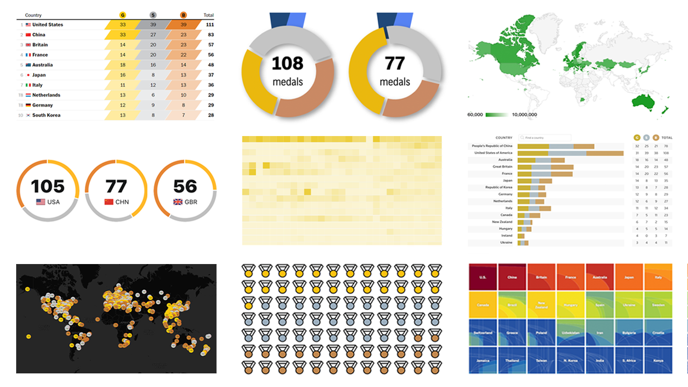 The Paris Summer Olympics are in full swing. If you’re interested in tracking the results and want to know which countries are excelling, numerous media outlets have prepared a variety of medal count trackers. In this special edition of DataViz Weekly, we showcase a selection of these projects, with a special focus on those that not only display numbers but also present them through compelling visualizations. Let’s dive in!
- Categories: Data Visualization Weekly
- No Comments »
Excellent Examples of Data Graphics from Around Internet — DataViz Weekly
August 27th, 2021 by AnyChart Team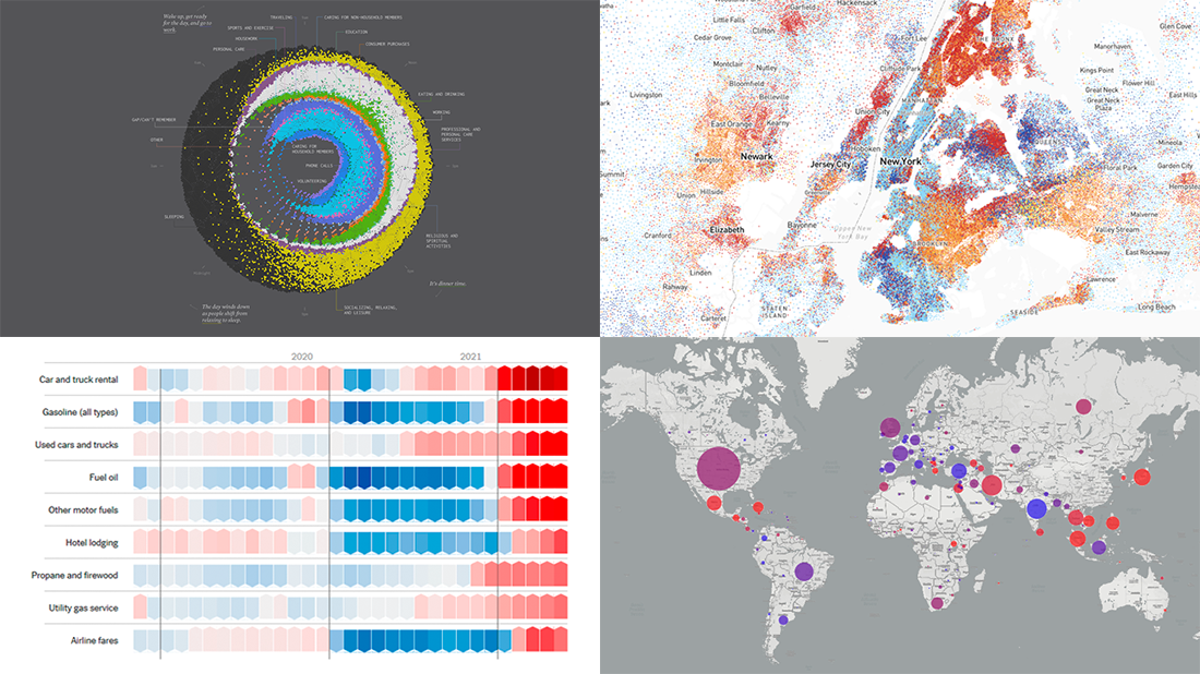 Are you ready for another set of excellent data graphics examples? It’s time! The following projects made it to the newest DataViz Weekly digest — see the list below and keep reading for a closer look!
- Average weekday in the life of Americans — Nathan Yau
- Race and ethnicity across the United States — CNN
- Inflation in the United States — NYT Opinion
- COVID-19 spread across the world over time — Olivia Jack
- Categories: Data Visualization Weekly
- No Comments »
Making JS Dot Density Map to Visualize Shipping Ports Across Globe
April 20th, 2021 by Shachee Swadia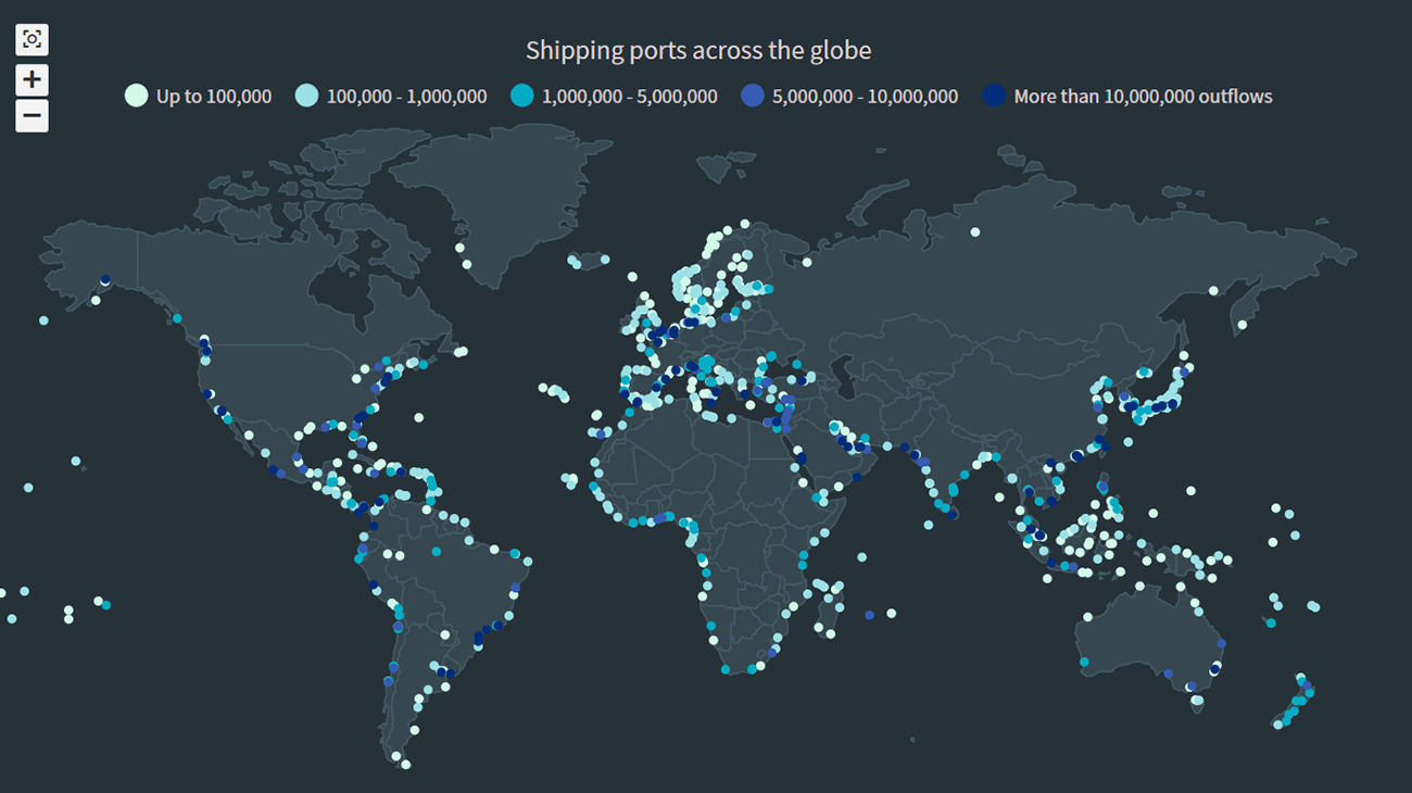 The recent incident of the Suez Canal blockage caught my interest in shipping and prompted me to explore the various shipping ports around the globe. There are more than 850 ports in the world and to get an overall view of where these are located, I decided to plot them on a dot map, or dot density map, using JavaScript.
Building an interactive JS dot density map can seem like a daunting task. But let me assure you that it can be pretty straightforward. Right now, I will show how to make a fully functional dot map chart using a JavaScript library for data visualization.
Read the JS charting tutorial »
- Categories: AnyChart Charting Component, AnyMap, Big Data, HTML5, JavaScript, JavaScript Chart Tutorials, Tips and Tricks
- No Comments »
Visualizing Organization Structure, Location Guesses, Time Allocation, and Retreats from Streets — DataViz Weekly
January 17th, 2020 by AnyChart Team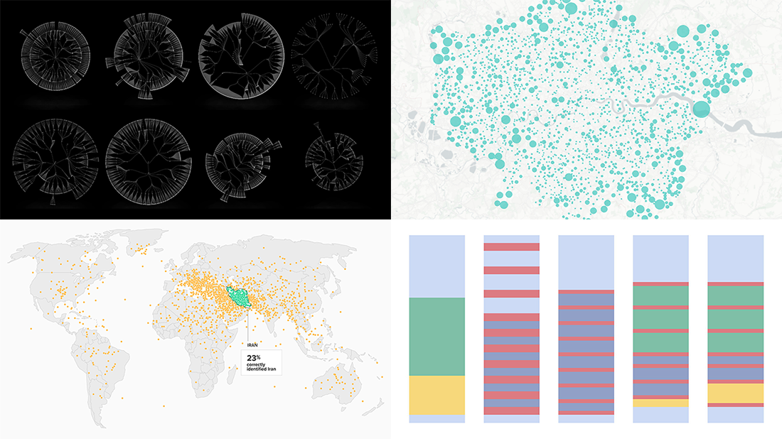 Join us on a quick review of some of the most interesting projects with cool charts and maps made public just recently. These are good examples of visualizing organization structure, changes in time spending patterns, and more. Here’s a full list of the projects highlighted in today’s DataViz Weekly:
- Structure of British government departments — Peter Cook
- Identifying Iran on unlabeled maps — Morning Consult
- Time allocation before and with a baby — Caitlin Hudon
- Retreats from busy streets in big cities — Hans Hack
- Categories: Data Visualization Weekly
- No Comments »
Compelling Data Visualizations to Check Out This Weekend — DataViz Weekly
October 25th, 2019 by AnyChart Team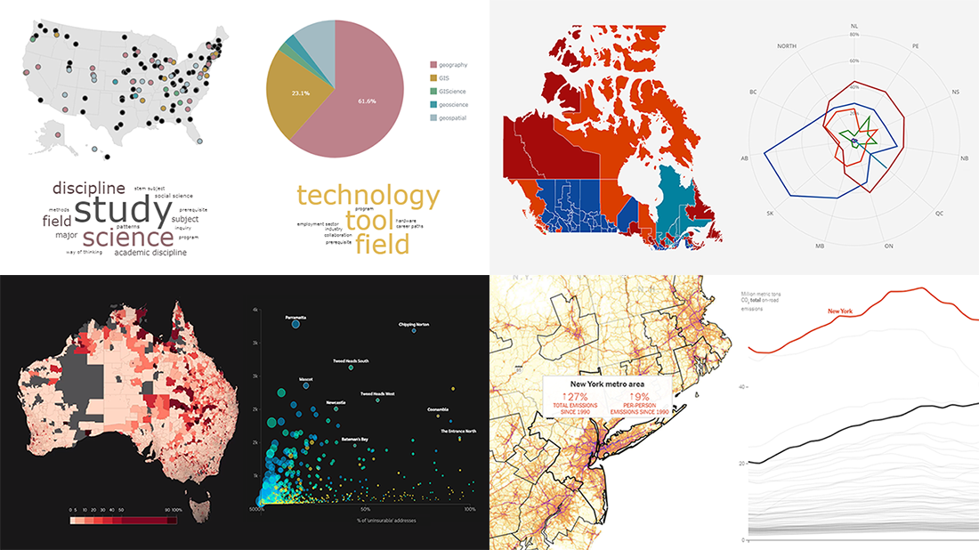 Continuing our regular DataViz Weekly feature, we invite you to check out several compelling data visualizations worth taking a look at, which we’ve noticed and enthusiastically explored these days. Here’s a quick list of the projects highlighted in the new roundup:
- Impact of climate change on the costs and availability of insurance in Australia — ABC News
- “Geography” and “GIS” in the U.S. higher education — Alicia Bradshaw, UW Tacoma
- Auto emissions in America — The New York Times
- Canadian federal election results — CBC/Radio-Canada
- Categories: Data Visualization Weekly
- No Comments »
Choose Right Chart Type for Data Visualization. Part 7: Geovisualization with Maps (Geo-Related Data)
May 24th, 2017 by AnyChart Team Geovisualization and map-based analysis of geo-data sets related to given territories or spatial environments can provide significant insight into trends and assist greatly in exploring and associating the impacts of variables. Nowadays, maps are used for data visualization very frequently, both as standalone geovisualizations and part of complex dashboards.
In this new article within the framework of our Choose Right Chart Type for Data Visualization series, we’ll write about map charts and explain how (when) to properly use each of corresponding types.
- Categories: Choosing Chart Type, Tips and Tricks
- No Comments »