Four Recent Data Visualization Projects That Held Our Interest — DataViz Weekly
May 15th, 2026 by AnyChart Team
A new Friday, a new round of DataViz Weekly. We are here to share a small selection of data visualization projects that pulled us in lately and we believe will do the same for you. See what is in this edition:
- Winners and losers on Polymarket — The Washington Post
- Patterns in English similes — The Pudding
- Big Tech lobbying in Germany — Zentrum für Digitalrechte und Demokratie
- Atlas of global progress — The World Bank
- Categories: Data Visualization Weekly
- No Comments »
Visualizing Data on AI Content, Press Freedom, Pet Boom, and Divorce — DataViz Weekly
May 8th, 2026 by AnyChart Team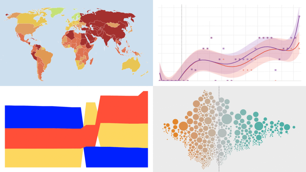
Data visualization does not take weeks off. We track charts and maps as they appear across the web and bring the most compelling finds together in DataViz Weekly. Our picks for this edition:
- AI-generated content on the web — Jonas Dolezal, Sawood Alam, Mark Graham, and Maty Bohacek
- Divorce rates by job — Nathan Yau
- Global press freedom at a 25-year low — Reporters Without Borders
- Italy’s pet boom — Il Sole 24 Ore
- Categories: Data Visualization Weekly
- No Comments »
Fresh Data Visuals That Caught Our Attention — DataViz Weekly
May 1st, 2026 by AnyChart Team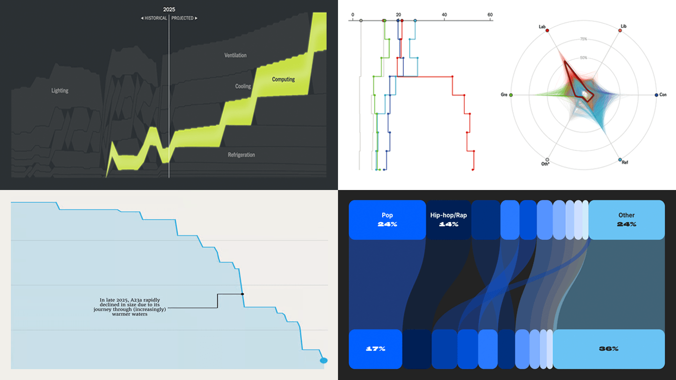
Every week, countless data visuals appear across all domains and formats. Every Friday, we curate those we found most interesting, sharing them as examples of data visualization work in practice. Glad to feature today in DataViz Weekly:
- British voter intent by demographic — The Economist
- America’s electrical grid under strain — The New York Times
- Disappearance of iceberg A23a — The European Correspondent
- 2025 year in music — Chartmetric
- Categories: Data Visualization Weekly
- No Comments »
More Great Charts and Maps to See — DataViz Weekly
April 24th, 2026 by AnyChart Team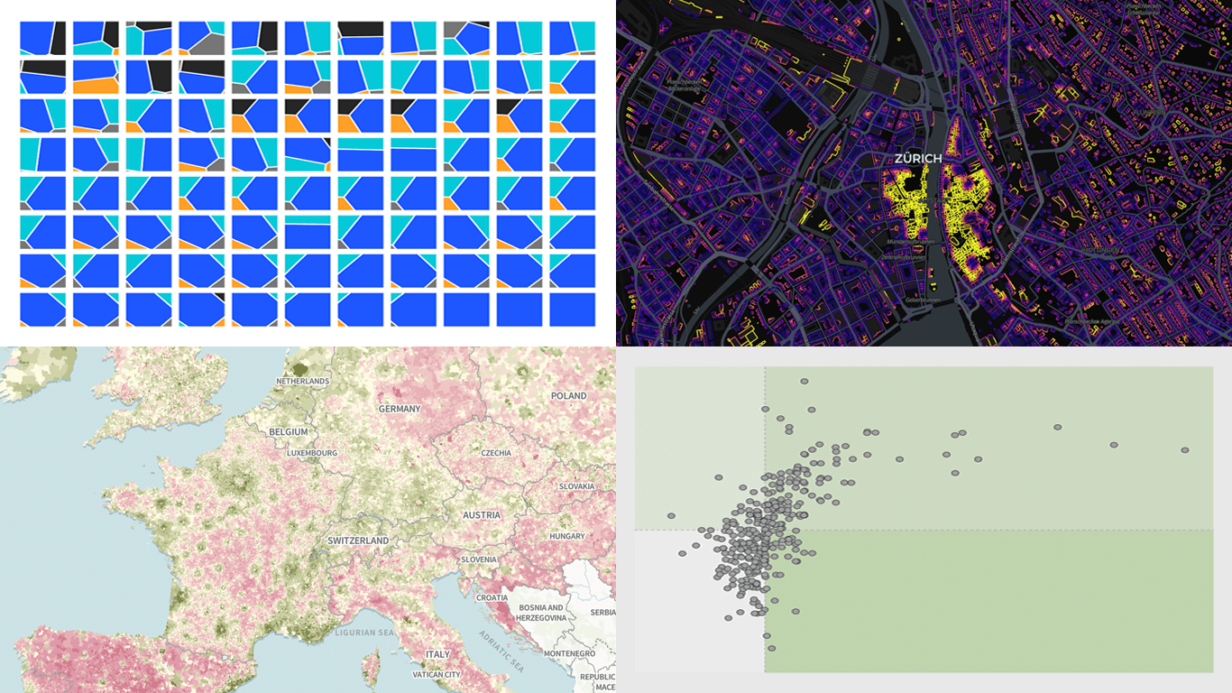
There is always more to see when it comes to great charts and maps. Welcome to DataViz Weekly, where we put a spotlight on notable data visualizations as they come out around the web. Here are the projects that made the cut this time:
- Tehran strike damage by land use — Bloomberg
- Six decades of population change in Europe — Correctiv
- Job stability across occupations in the United States — Nathan Yau
- Buildings by proximity to roads — Benjamin Lozes
- Categories: Data Visualization Weekly
- No Comments »
How Data Visualization Opens Up Complex Subjects — DataViz Weekly
April 17th, 2026 by AnyChart Team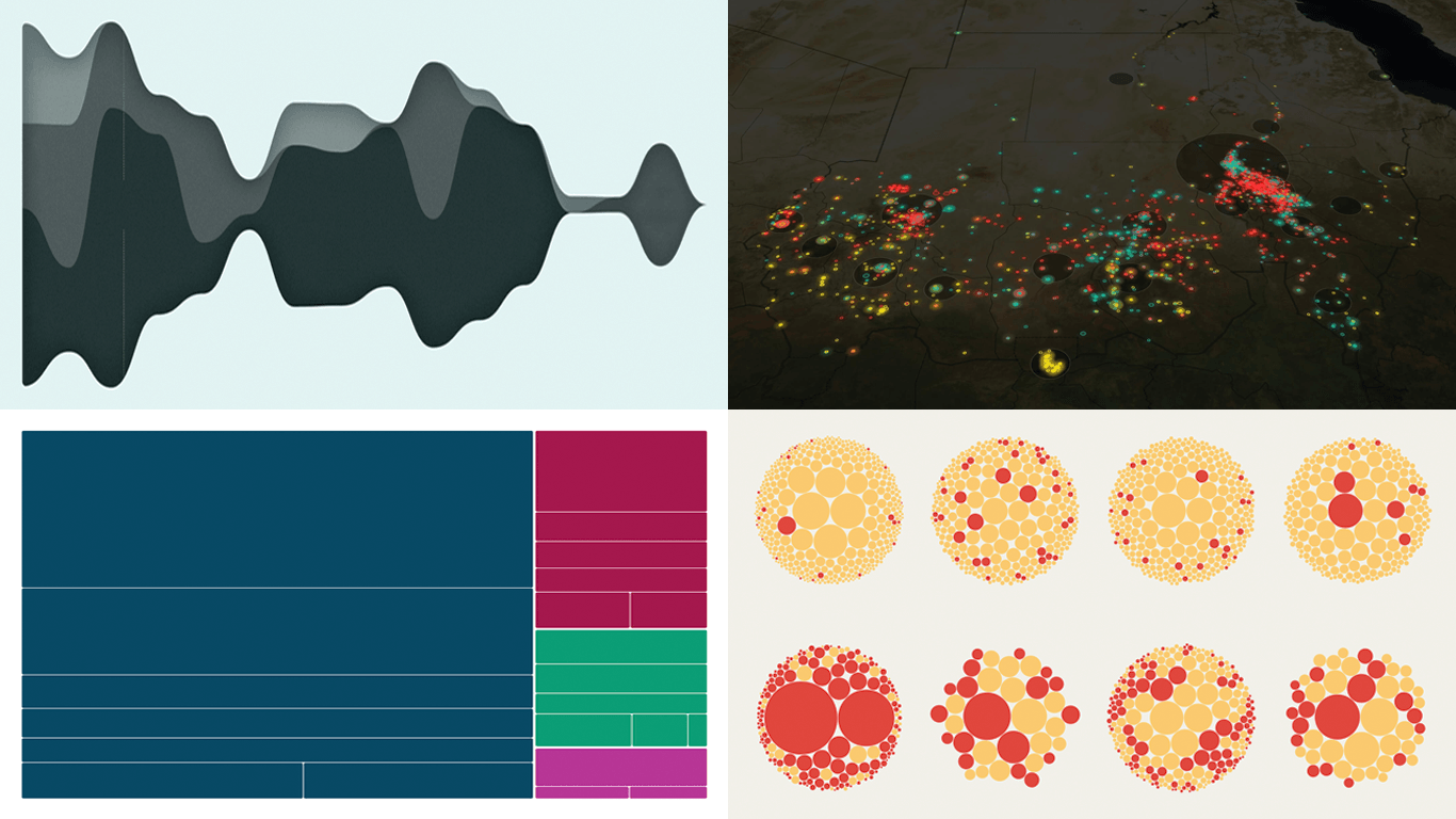
Robust data visualization makes complex subjects easier to see and understand. DataViz Weekly is our ongoing series collecting the best examples we come across most recently. Check out what stood out to us this week:
- Causes of death across countries — Our World in Data
- Cuba’s oil crisis — Reuters
- Family business succession wave — The Economist
- Three years of war in Sudan — Al Jazeera
- Categories: Data Visualization Weekly
- No Comments »
New Data Graphics Worth Exploring — DataViz Weekly
April 10th, 2026 by AnyChart Team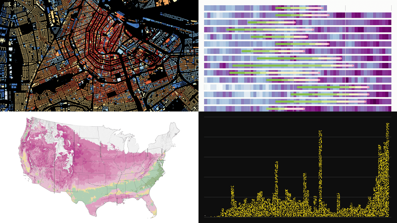 Good data graphics keep turning up online, and we never stop looking. DataViz Weekly is our regular roundup of the latest examples we think are worth your attention. Take a look at our new picks:
- Early leaves and blooms across the United States — The Washington Post
- D.C. cherry blossom shifts — Sara Staedicke
- Satellites crowding Earth’s orbit — The Guardian
- Every building in the Netherlands by year built — Bert Spaan
- Categories: Data Visualization Weekly
- No Comments »
Compelling Fresh Examples of Data Visualization in Action — DataViz Weekly
April 3rd, 2026 by AnyChart Team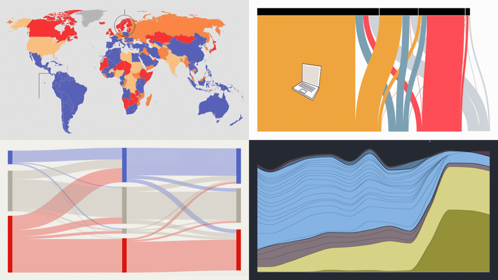
Data visualization has two core purposes: explanation and exploration. In DataViz Weekly, you can see how they naturally end up combining. Check out some of the most interesting data visualization examples we’ve found around the web lately, where charts and maps do their job in a compelling way:
- China’s rise in AI research talent — The Economist
- Shadow fleet capitalizing on the Iran war — The Financial Times
- Vietnam’s rise as a U.S. electronics supplier — Bloomberg
- Food self-sufficiency by country — Amanda Shendruk
- Categories: Data Visualization Weekly
- No Comments »
When Data Makes the Story — DataViz Weekly
March 27th, 2026 by AnyChart Team
Data has stories to tell. Visualization helps them reach us. Continuing our regular DataViz Weekly feature, we are happy to share new examples of how that works in the real world. Here’s what caught our attention these days:
- Strait of Hormuz oil and gas flows — The New York Times
- Rural hospital crisis in the United States — Reuters
- Arrests of immigrant parents of U.S. citizen children — ProPublica
- U.S. state-to-state migration flows — Will Sigal
- Categories: Data Visualization Weekly
- No Comments »
From Personal Grocery Receipts to Global Data Centers — DataViz Weekly
March 20th, 2026 by AnyChart Team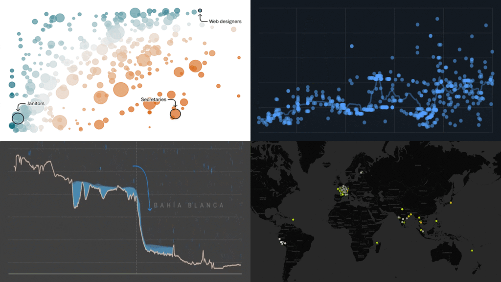
Data is everywhere, but what it means is rarely obvious on its own. DataViz Weekly is back with four projects that illustrate how good visuals help close that gap. Featured today:
- 25 years of egg prices — John Rush
- Jobs most at risk from AI — The Washington Post
- Bahía Blanca flood reconstruction — LA NACION
- Global data center expansion — Environmental Reporting Collective
- Categories: Data Visualization Weekly
- No Comments »
Visualizing Data on Iran Crisis, Pokémon Taxonomy, U.S. Immigration, Human Happiness — DataViz Weekly
March 6th, 2026 by AnyChart Team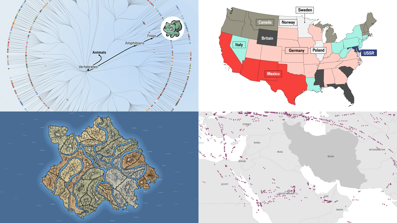 The web keeps producing data visualization work across all kinds of subjects and formats. We keep tracking it, and DataViz Weekly is where the most interesting projects we come across get their spotlight. See our latest picks:
- Iran crisis and its impact — Reuters
- Pokémon taxonomy tree — The Straits Times
- 250 years of U.S. immigration — The Economist
- Terrain of human happiness — The Pudding
- Categories: Data Visualization Weekly
- No Comments »