More Great Charts and Maps to See — DataViz Weekly
April 24th, 2026 by AnyChart Team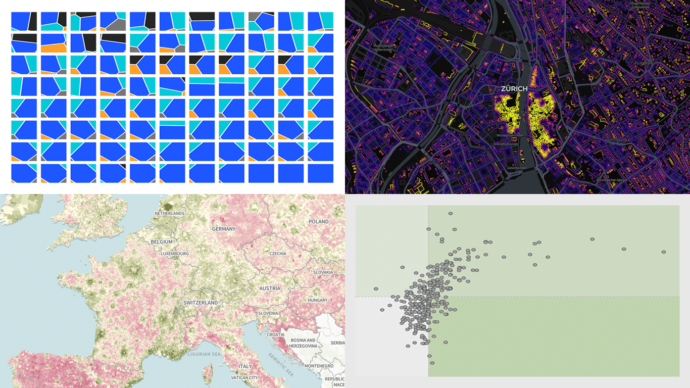
There is always more to see when it comes to great charts and maps. Welcome to DataViz Weekly, where we put a spotlight on notable data visualizations as they come out around the web. Here are the projects that made the cut this time:
- Tehran strike damage by land use — Bloomberg
- Six decades of population change in Europe — Correctiv
- Job stability across occupations in the United States — Nathan Yau
- Buildings by proximity to roads — Benjamin Lozes
- Categories: Data Visualization Weekly
- No Comments »
New Data Graphics Worth Exploring — DataViz Weekly
April 10th, 2026 by AnyChart Team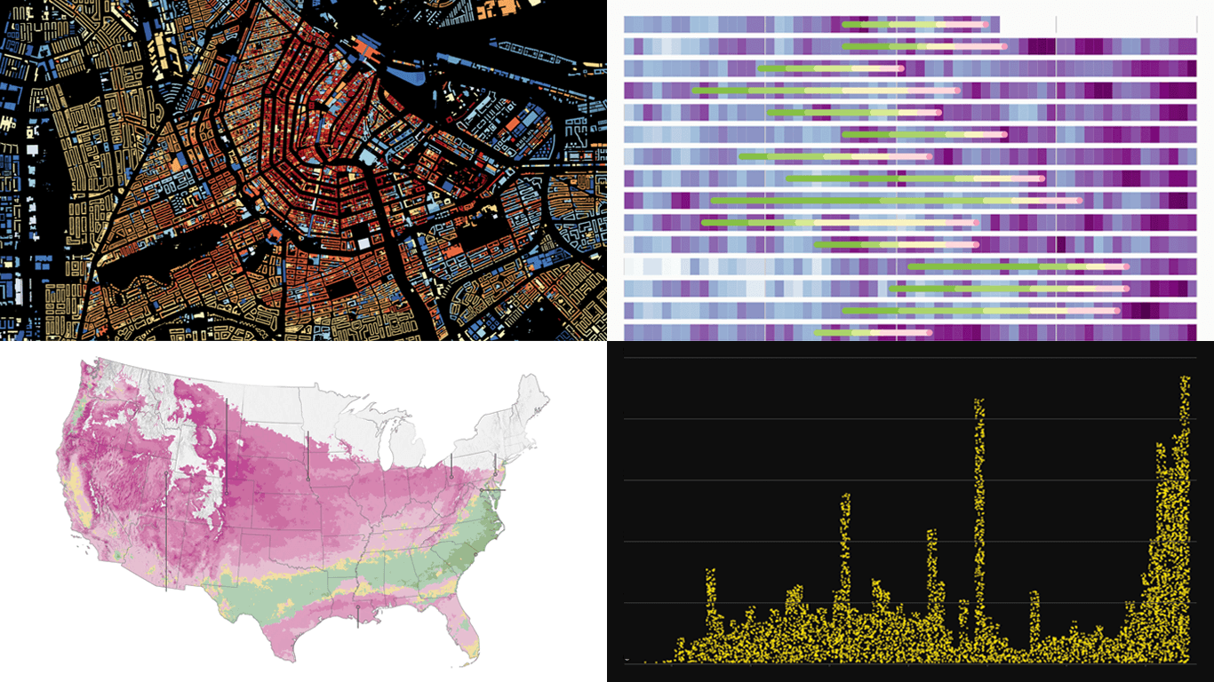 Good data graphics keep turning up online, and we never stop looking. DataViz Weekly is our regular roundup of the latest examples we think are worth your attention. Take a look at our new picks:
- Early leaves and blooms across the United States — The Washington Post
- D.C. cherry blossom shifts — Sara Staedicke
- Satellites crowding Earth’s orbit — The Guardian
- Every building in the Netherlands by year built — Bert Spaan
- Categories: Data Visualization Weekly
- No Comments »
Compelling Fresh Examples of Data Visualization in Action — DataViz Weekly
April 3rd, 2026 by AnyChart Team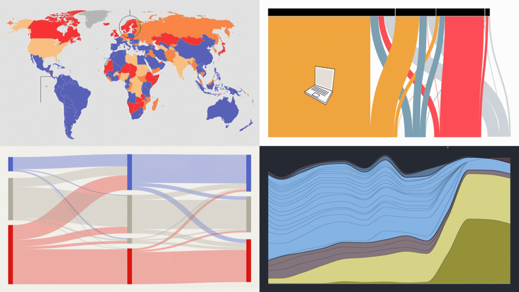
Data visualization has two core purposes: explanation and exploration. In DataViz Weekly, you can see how they naturally end up combining. Check out some of the most interesting data visualization examples we’ve found around the web lately, where charts and maps do their job in a compelling way:
- China’s rise in AI research talent — The Economist
- Shadow fleet capitalizing on the Iran war — The Financial Times
- Vietnam’s rise as a U.S. electronics supplier — Bloomberg
- Food self-sufficiency by country — Amanda Shendruk
- Categories: Data Visualization Weekly
- No Comments »
When Data Makes the Story — DataViz Weekly
March 27th, 2026 by AnyChart Team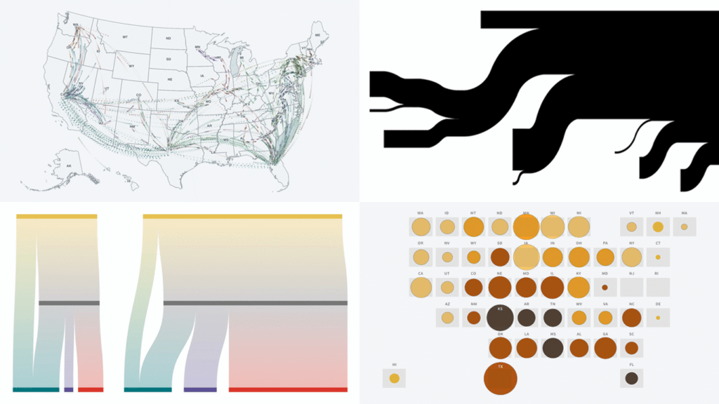
Data has stories to tell. Visualization helps them reach us. Continuing our regular DataViz Weekly feature, we are happy to share new examples of how that works in the real world. Here’s what caught our attention these days:
- Strait of Hormuz oil and gas flows — The New York Times
- Rural hospital crisis in the United States — Reuters
- Arrests of immigrant parents of U.S. citizen children — ProPublica
- U.S. state-to-state migration flows — Will Sigal
- Categories: Data Visualization Weekly
- No Comments »
Visualizing Data on Iran Crisis, Pokémon Taxonomy, U.S. Immigration, Human Happiness — DataViz Weekly
March 6th, 2026 by AnyChart Team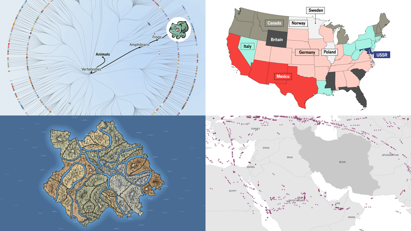 The web keeps producing data visualization work across all kinds of subjects and formats. We keep tracking it, and DataViz Weekly is where the most interesting projects we come across get their spotlight. See our latest picks:
- Iran crisis and its impact — Reuters
- Pokémon taxonomy tree — The Straits Times
- 250 years of U.S. immigration — The Economist
- Terrain of human happiness — The Pudding
- Categories: Data Visualization Weekly
- No Comments »
Fresh Examples of Visuals Bringing Data to Life — DataViz Weekly
February 27th, 2026 by AnyChart Team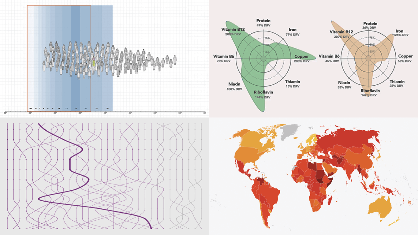 Every week, someone somewhere turns a pile of data into something you actually want to look at. We round up the best examples from what we found right here in DataViz Weekly. On the list this time:
- Corruption Perceptions Index 2025 — Transparency International
- U.S. college degrees by field since 1970 — FlowingData
- Women’s clothing sizes — The Pudding
- What’s actually in liver — Gourmet Data
- Categories: Data Visualization Weekly
- No Comments »
Noteworthy Data Visualization Projects to Explore — DataViz Weekly
February 20th, 2026 by AnyChart Team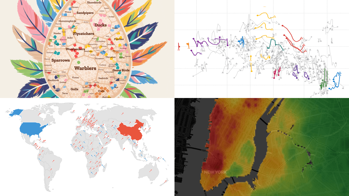 Visualization is designed to make data easier for the human brain to process, helping us compare, find structure, and see change. DataViz Weekly is here with great new examples we’ve spotted lately that demonstrate this in practice. Featured today:
- Bird search trends in the United States — Visual Cinnamon
- Rent prices across New York City — West Egg Development
- GDP vs. air pollution in world cities — Development Data Lab
- Shifts from U.S. to China through UN votes — The Guardian
- Categories: Data Visualization Weekly
- No Comments »
Best Data Visualizations of 2025 — DataViz Weekly
January 9th, 2026 by AnyChart Team In 2025, data visualization kept proving its value as a practical way to work through complexity without losing the thread. From conflict and humanitarian crises to climate risks, technology, culture, and long-running social trends, charts and maps helped people see structure, scale, and change more clearly.
This special edition of DataViz Weekly brings together the best data visualizations of 2025 as selected in major year-end picks. It features selections from FlowingData, GIJN, The Pudding, and Datawrapper, followed by a set of newsroom year-in-graphics roundups for more storytelling standouts from across the year.
- Categories: Data Visualization Weekly
- No Comments »
Data Visuals That Stood Out to Us This Week — DataViz Weekly
December 12th, 2025 by AnyChart Team Welcome to DataViz Weekly, where we highlight strong examples of data visualization in action. Take a look at the projects that stood out to us this week:
- Global defense industry at record highs — Reuters
- Climate-driven rise in home insurance costs — The New York Times
- Interactive Star Wars galaxy map — Tim Sircoloumb
- Sizes of life on Earth — Neal Agarwal
- Categories: Data Visualization Weekly
- No Comments »
Compelling New Data Visualizations From Around the Web — DataViz Weekly
October 31st, 2025 by AnyChart Team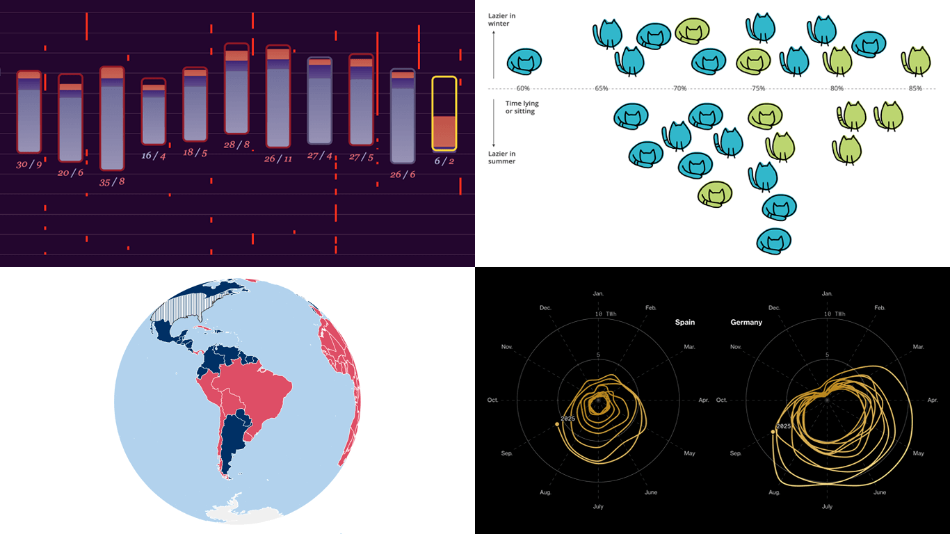 Data becomes much easier to explore and explain when it is shown visually. If you want to see how that plays out in practice, you are in the right place. Welcome to DataViz Weekly, where we round up the most interesting charts and maps we have spotted over the past week. Featuring this time:
- Solar pressure on Europe’s power grid — Bloomberg
- China’s trade rise over two decades — Folha de S.Paulo
- Sleep deprivation in wartime Ukraine — Texty.org.ua
- Cats’ laziness — Lisa Hornung
- Categories: Data Visualization Weekly
- No Comments »