 Visualization is designed to make data easier for the human brain to process, helping us compare, find structure, and see change. DataViz Weekly is here with great new examples we’ve spotted lately that demonstrate this in practice. Featured today:
- Bird search trends in the United States — Visual Cinnamon
- Rent prices across New York City — West Egg Development
- GDP vs. air pollution in world cities — Development Data Lab
- Shifts from U.S. to China through UN votes — The Guardian

Data Visualization Weekly: February 13–20, 2026
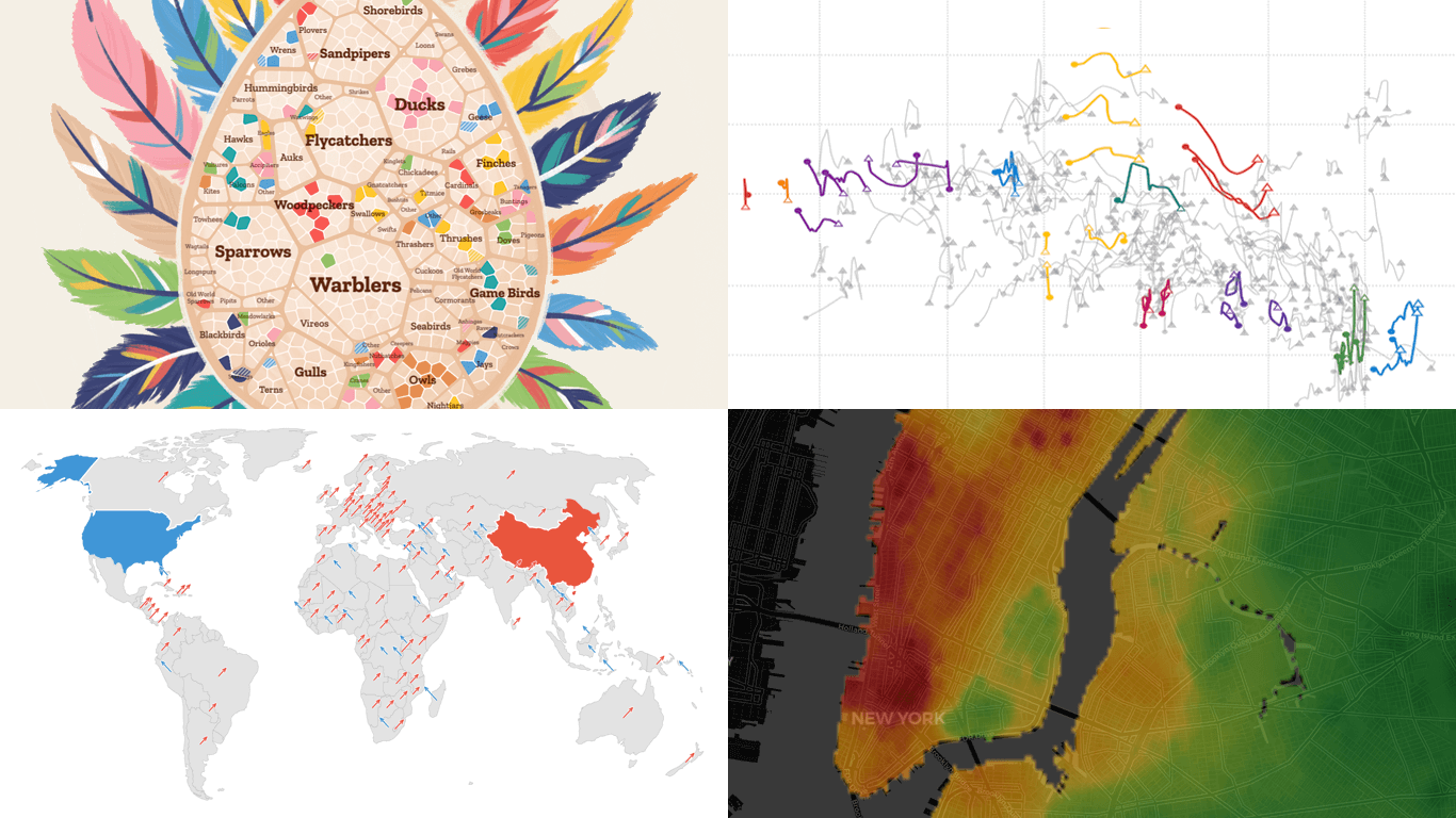
Bird Search Trends Across U.S.
📣 NEW! I’ve just released the BIGGEST and perhaps most creative project I’ve ever worked on!
“Searching for Birds” https://t.co/CgFoywkrjq 🐤
A #dataviz article & exploration that dives into the data that connects humans with birds, by looking at how we search for birds. pic.twitter.com/KKHTTGkElY
— Nadieh Bremer (@NadiehBremer) February 12, 2026
People search for birds online for all kinds of reasons. It might be a striking sighting in the backyard, a rare visitor making the news, or simple curiosity sparked by a flash of color.
Nadieh Bremer built a visual story exploring what Google Trends data reveals about the birds that capture attention in the United States. It opens with a line chart showing how a Snowy Owl sighting in NYC sent search interest spiking. From there, a nest-shaped graphic represents the most Googled bird groups, and an egg-shaped diagram breaks North American and Hawaiian species down by shape and type, highlighting those with significant search interest.
The story also features bar-based comparisons showing how the same species rank across observations, Google searches, and population sizes. A cartogram shows the most searched bird per state. Line charts spanning the past decade trace search interest waves for the 50 most Googled birds. There is also a Gemini-powered chatbot to help you identify a bird from a description or learn more about a specific species
See the project on Visual Cinnamon.
Rent Prices Across NYC
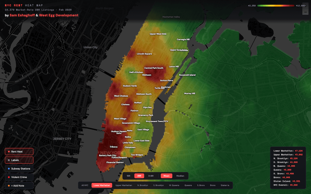
Rental prices in New York City vary widely. What you pay depends heavily on the borough and neighborhood.
Sam Eshaghoff and West Egg Development visualized thousands of market-rate listings from StreetEasy as of February 2026 on a heat map. The map covers all five boroughs, with a continuous color gradient showing prices from the lowest to the most expensive areas. Hovering over any point on the map shows the estimated rent for that location. You can switch between one-bedroom, two-bedroom, and three-plus-bedroom listings, as well as between mean and median.
Subway stations and violent crime data are available as overlays. A sidebar compares local averages to Manhattan and citywide figures, and a region selector breaks rents out by borough subregion. There is also an option to drop personal notes and ratings onto the map, turning it into a lightweight apartment-hunting worksheet.
Explore the map here.
GDP vs. Air Pollution in World Cities
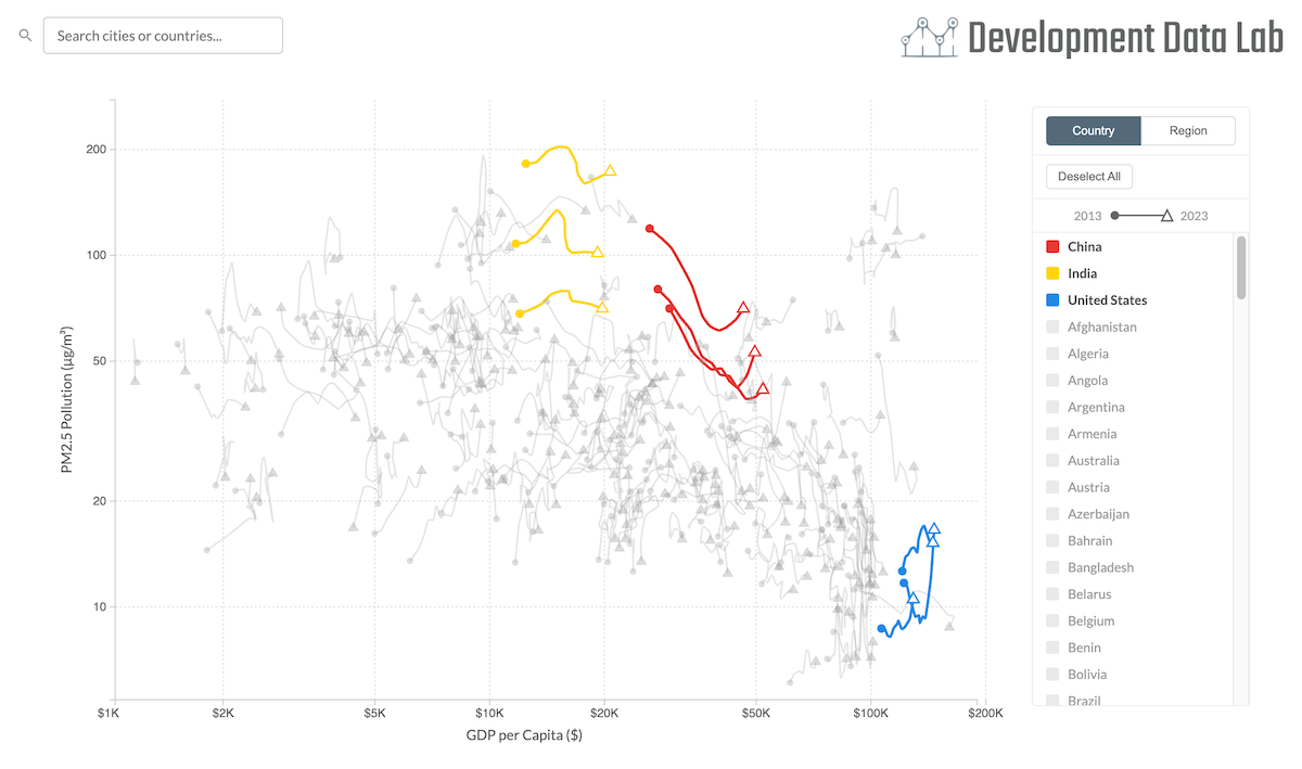
Air pollution is a major concern in growing cities around the world. One well-known idea in economics, the environmental Kuznets curve, suggests that pollution rises with early growth but eventually falls as cities get richer.
The Development Data Lab built a connected scatter plot that lets you explore how this has played out across the world’s largest cities, tracking the three largest per country from 2013 to 2023. City GDP per capita runs along the horizontal axis and PM2.5 air pollution along the vertical.
Each city’s trajectory appears as a line, with a circle marking its 2013 position and a triangle marking 2023. Clicking or hovering on a country in the legend highlights its cities, and multiple selections can be active at once, making it easy to compare paths side by side. A tab switches the view from country-level to regional groupings.
Take a closer look at the chart on the Development Data Lab website.
Shifts in U.S.-China Alignment Through UN Votes
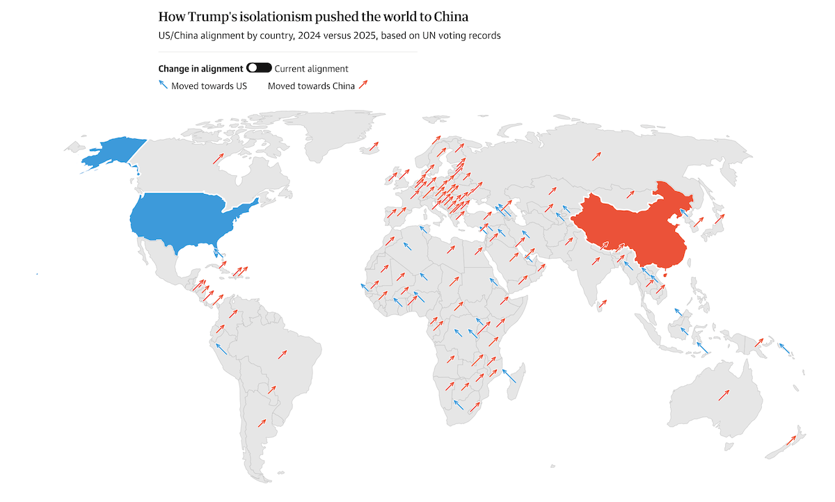
Countries that consistently vote the same way on contested United Nations resolutions tend to share common interests. The United States has recently found itself on the opposite side of many such votes from its traditional allies.
The Guardian visualized findings from a Focaldata report analyzing UN General Assembly voting records to gauge where countries stand between the U.S. and China. The article opens with an interactive world map that toggles between two views: a proportional symbol map showing the direction of each country’s shift between 2024 and 2025 using arrows, and a choropleth map displaying current alignment.
Packed circles sized by GDP then compare how many countries are strongly aligned with each side, making the shift over time for the U.S. immediately visible. The piece also includes line chart panels tracking individual allies and continent averages over time, and closes with a bubble chart showing that the fastest-growing economies tend to cluster toward the Chinese end of the axis.
Check out the article on The Guardian, by Ashley Kirk, Alex Clark, and Heidi Wilson.
Wrapping Up
From bird searches and rent prices to world cities and geopolitics, this week’s picks cover a wide range of subjects. But all of them use thoughtful visualization to make complex data easier to take in and explore. We will be back next week with more great examples of charts and maps at work in DataViz Weekly.
- Categories: Data Visualization Weekly
- No Comments »