When Data Makes the Story — DataViz Weekly
March 27th, 2026 by AnyChart Team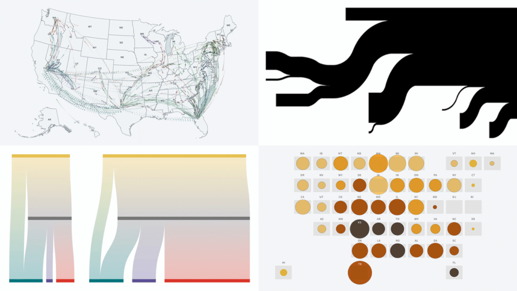
Data has stories to tell. Visualization helps them reach us. Continuing our regular DataViz Weekly feature, we are happy to share new examples of how that works in the real world. Here’s what caught our attention these days:
- Strait of Hormuz oil and gas flows — The New York Times
- Rural hospital crisis in the United States — Reuters
- Arrests of immigrant parents of U.S. citizen children — ProPublica
- U.S. state-to-state migration flows — Will Sigal
- Categories: Data Visualization Weekly
- No Comments »
Visualizing Data on Iran Crisis, Pokémon Taxonomy, U.S. Immigration, Human Happiness — DataViz Weekly
March 6th, 2026 by AnyChart Team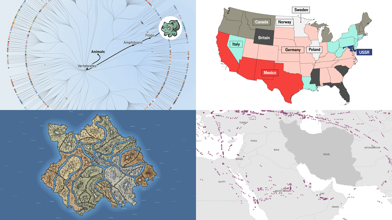 The web keeps producing data visualization work across all kinds of subjects and formats. We keep tracking it, and DataViz Weekly is where the most interesting projects we come across get their spotlight. See our latest picks:
- Iran crisis and its impact — Reuters
- Pokémon taxonomy tree — The Straits Times
- 250 years of U.S. immigration — The Economist
- Terrain of human happiness — The Pudding
- Categories: Data Visualization Weekly
- No Comments »
Fresh Examples of Visuals Bringing Data to Life — DataViz Weekly
February 27th, 2026 by AnyChart Team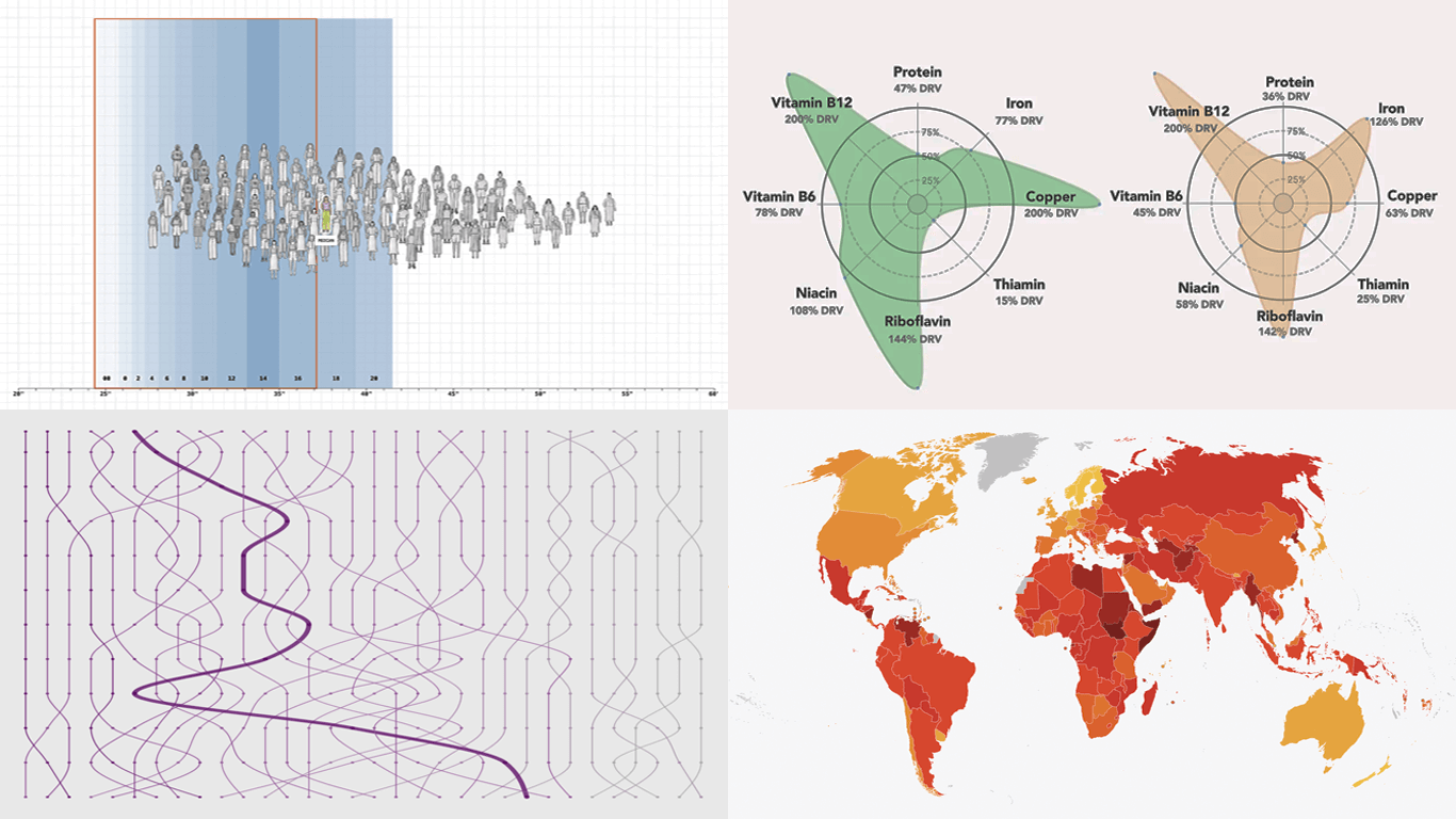 Every week, someone somewhere turns a pile of data into something you actually want to look at. We round up the best examples from what we found right here in DataViz Weekly. On the list this time:
- Corruption Perceptions Index 2025 — Transparency International
- U.S. college degrees by field since 1970 — FlowingData
- Women’s clothing sizes — The Pudding
- What’s actually in liver — Gourmet Data
- Categories: Data Visualization Weekly
- No Comments »
Noteworthy Data Visualization Projects to Explore — DataViz Weekly
February 20th, 2026 by AnyChart Team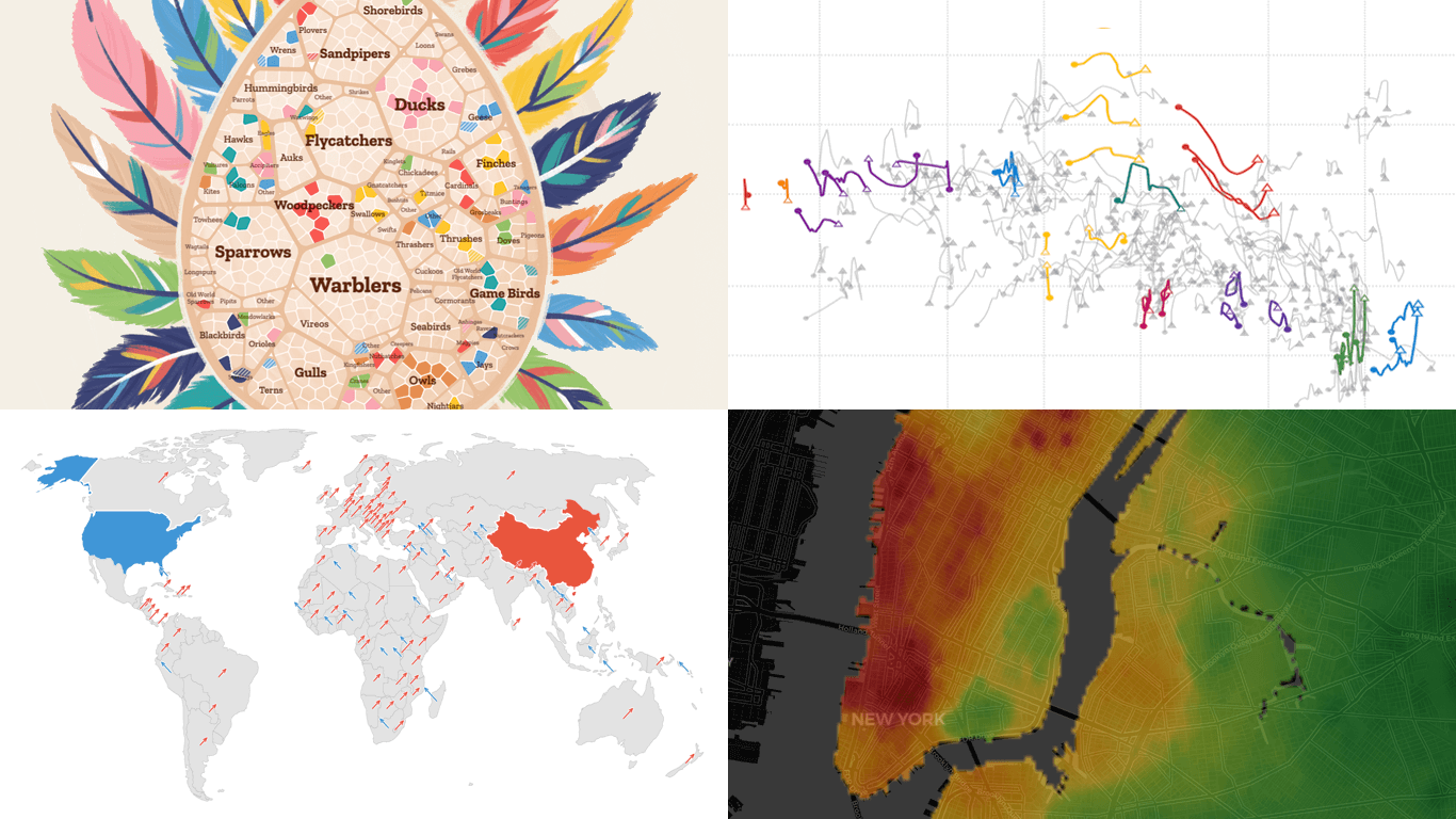 Visualization is designed to make data easier for the human brain to process, helping us compare, find structure, and see change. DataViz Weekly is here with great new examples we’ve spotted lately that demonstrate this in practice. Featured today:
- Bird search trends in the United States — Visual Cinnamon
- Rent prices across New York City — West Egg Development
- GDP vs. air pollution in world cities — Development Data Lab
- Shifts from U.S. to China through UN votes — The Guardian
- Categories: Data Visualization Weekly
- No Comments »
Data Graphics That Caught Our Eye This Week — DataViz Weekly
February 13th, 2026 by AnyChart Team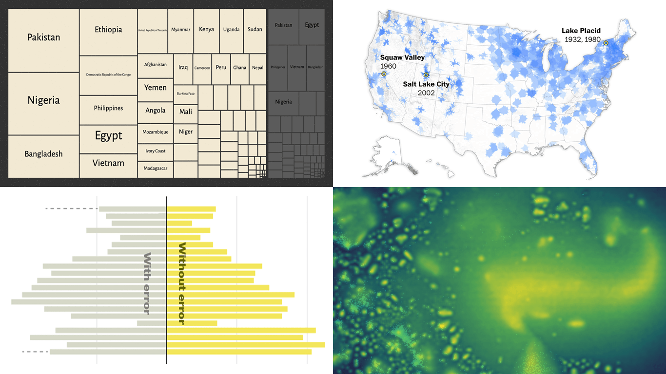 Welcome back to DataViz Weekly! This is our regular roundup of data graphics we think are worth opening and looking at closely. Here is what made the cut this week:
- Bluesky following clusters — Theo Sanderson
- Quadruple axel in figure skating — The New York Times
- Winter sports access across the United States — The Washington Post
- Climate vulnerability vs. social protection — SNRD AP, GIZ, and Revisual Labs
- Categories: Data Visualization Weekly
- No Comments »
Best Data Visualizations of 2025 — DataViz Weekly
January 9th, 2026 by AnyChart Team In 2025, data visualization kept proving its value as a practical way to work through complexity without losing the thread. From conflict and humanitarian crises to climate risks, technology, culture, and long-running social trends, charts and maps helped people see structure, scale, and change more clearly.
This special edition of DataViz Weekly brings together the best data visualizations of 2025 as selected in major year-end picks. It features selections from FlowingData, GIJN, The Pudding, and Datawrapper, followed by a set of newsroom year-in-graphics roundups for more storytelling standouts from across the year.
- Categories: Data Visualization Weekly
- No Comments »
Happy Holidays and Year-End Note for 2025
December 23rd, 2025 by AnyChart Team As 2025 winds down, we want to say thank you to our customers, partners, and everyone who builds and uses analytics every day. Merry Christmas and Happy New Year from all of us at AnyChart!
Closing out 2025, we are sharing this holiday sweater as a small nod to a theme we focused on this year ?
- Categories: AnyChart Charting Component, Big Data, Blogroll, Business Intelligence, Dashboards, Humor, JavaScript, News, Qlik
- No Comments »
Data Visuals That Stood Out to Us This Week — DataViz Weekly
December 12th, 2025 by AnyChart Team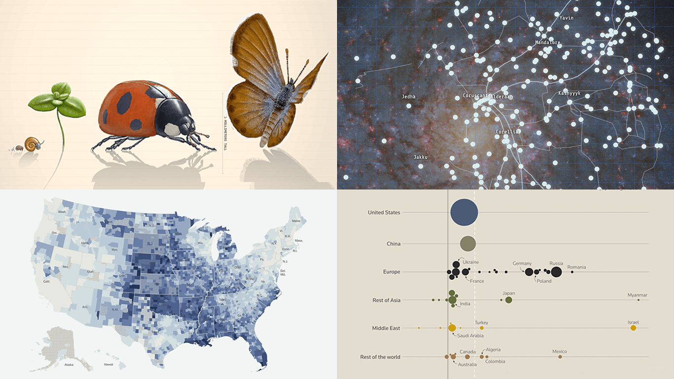 Welcome to DataViz Weekly, where we highlight strong examples of data visualization in action. Take a look at the projects that stood out to us this week:
- Global defense industry at record highs — Reuters
- Climate-driven rise in home insurance costs — The New York Times
- Interactive Star Wars galaxy map — Tim Sircoloumb
- Sizes of life on Earth — Neal Agarwal
- Categories: Data Visualization Weekly
- No Comments »
Enhancing AI-Assisted JavaScript Chart Development with Context7 MCP and Claude
November 26th, 2025 by AnyChart Team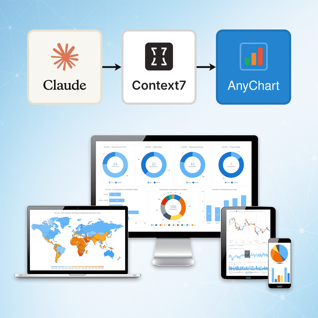 At AnyChart, we are constantly exploring tools and workflows that help developers work more efficiently, stay up to date, and minimize friction when integrating data visualization into their projects.
One approach we’ve recently tested — and found highly effective — is connecting Claude to Context7 via the Model Context Protocol (MCP). This integration gives Claude access to a continuously updated, extensive database of technical documentation across libraries, packages, and APIs.
This means you can rely on Claude not just for reasoning, but also for live, accurate, and authoritative documentation retrieval, dramatically reducing the chances of outdated suggestions or hallucinated methods.
- Categories: AnyChart Charting Component, AnyGantt, AnyMap, AnyStock, Big Data, Business Intelligence, Charts and Art, Dashboards, Financial Charts, Gantt Chart, GraphicsJS, HTML5, JavaScript, JS Chart Tips, News, Stock Charts, Third-Party Developers, Tips and Tricks
- No Comments »
Best JavaScript Gantt Chart Libraries in 2025–2026
November 5th, 2025 by Jay Stevenson Gantt charts are among the most effective ways to visualize tasks, timelines, and dependencies, making them a core component of modern project management practices. For developers building web applications, the right JavaScript Gantt chart library can dramatically save development time and deliver a professional, interactive experience directly in the browser.
The ecosystem in 2025–2026 includes a wide range of solutions — from free open-source libraries for simple timelines to enterprise-grade components with advanced scheduling engines and resource management features. Some prioritize speed and simplicity, while others focus on deep functionality and seamless integration into broader charting or UI stacks.
This article reviews the most notable JavaScript Gantt chart libraries available today. Each library is presented with its functionality, performance and scalability, integration options, licensing, and support. Whether you are building an internal tool, a SaaS application, or a full-scale enterprise system, this guide will help you quickly identify the Gantt solution that best fits your needs.
- Categories: AnyChart Charting Component, AnyGantt, Big Data, Business Intelligence, Dashboards, Gantt Chart, HTML5, JavaScript, Tips and Tricks
- No Comments »