 Visualization is a well-established way to translate complex data into a form people can quickly understand, making patterns, trends, and outliers easier to see. Depending on the nature of the data and the questions behind it, different techniques may be used. DataViz Weekly is here with a few fresh, illustrative examples from the real world:
- AI industry interconnections — De Tijd
- Funding halt across Democratic and Republican districts — The New York Times
- TikTok watch-time trends — The Washington Post
- Sea temperatures and anomalies worldwide — Gary Oberbrunner
Data Visualization Weekly: October 17–24, 2025
AI Industry Interconnections (De Tijd)
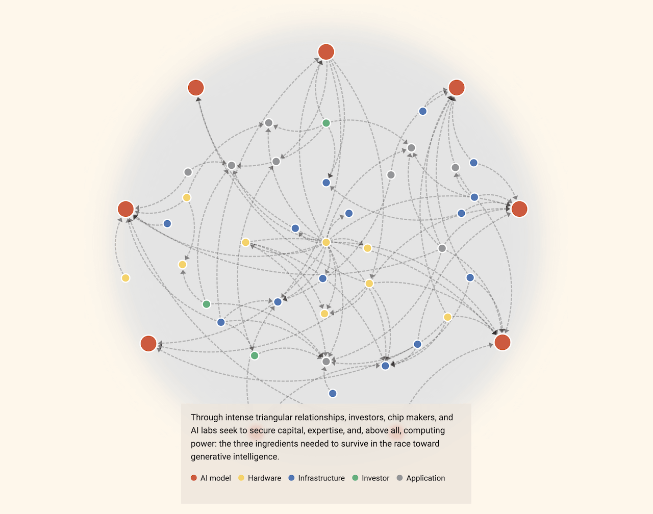
The artificial intelligence sector is increasingly shaped by overlapping alliances among chipmakers, cloud providers, and research labs. Billion-dollar deals now link competitors and partners alike as companies seek capital, computing power, and market dominance in a fast-consolidating ecosystem.
De Tijd visualizes this global web of relationships through an interactive network graph mapping the cross-shareholdings and strategic links among major players, from Nvidia, AMD, and OpenAI to Microsoft, CoreWeave, and SoftBank. Each connection represents a financial or corporate relationship, such as an investment, partnership, or shared venture. As readers move through the story, the diagram brings the relevant companies and links into focus, showing how deeply intertwined the global AI value chain has become.
See the interactive on De Tijd, by Stephanie De Smedt, Thomas Roelens, and Raphael Cockx.
Funding Halt Across Democratic and Republican Districts (The New York Times)
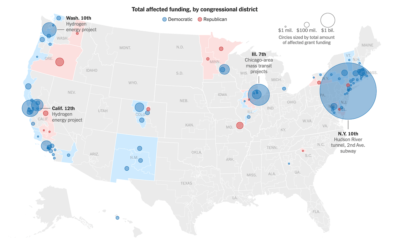
As the federal shutdown in the United States drags on, billions in public investments have been put on hold. Infrastructure, clean energy, and transportation projects across the country face uncertainty as funding pauses and cancellations ripple through.
The New York Times examined the distribution of halted grants and found that most affected projects are based in Democratic-led areas. The accompanying interactive bubble map visualizes the total frozen funding by congressional district, with circles sized by amount and colored by party affiliation. Tooltips reveal details on the number of projects and sums involved.
Check out the piece on The New York Times, by Tony Romm and Lazaro Gamio.
TikTok Watch-Time Trends (The Washington Post)
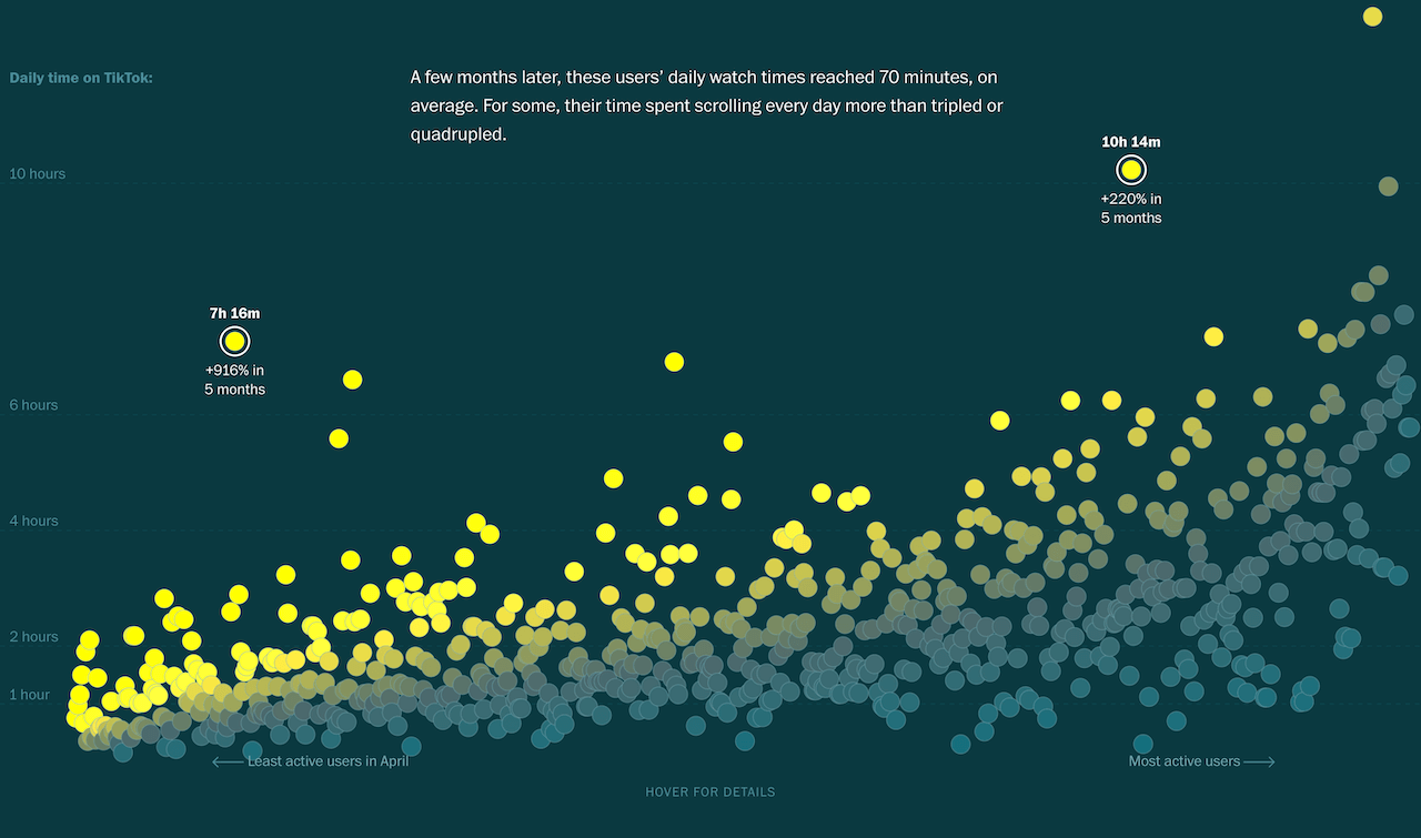
Short-form video apps are designed to hold attention, but few do so as effectively as TikTok. What begins as brief entertainment often grows into hours of daily scrolling, raising questions about how algorithms and interface design influence user behavior and well-being.
The Washington Post analyzed real usage data shared by more than 800 U.S. TikTok users to understand how habits build and intensify over time. The story begins with an interactive dot chart where each marker represents a person’s daily watch time, shifting month by month to show evolving use patterns. As readers scroll, the points animate to reveal how lighter users gradually increased their screen time while heavy users sustained multi-hour sessions. Hovering over a point displays individual watch times and percentage changes, showing how personalized feeds and endless swiping can reinforce compulsive engagement.
Look at the article on The Washington Post, by Caitlin Gilbert, Richard Sima, Leslie Shapiro, Aaron Steckelberg, and Clara Ence Morse.
Sea Temperatures and Anomalies Worldwide (Gary Oberbrunner)
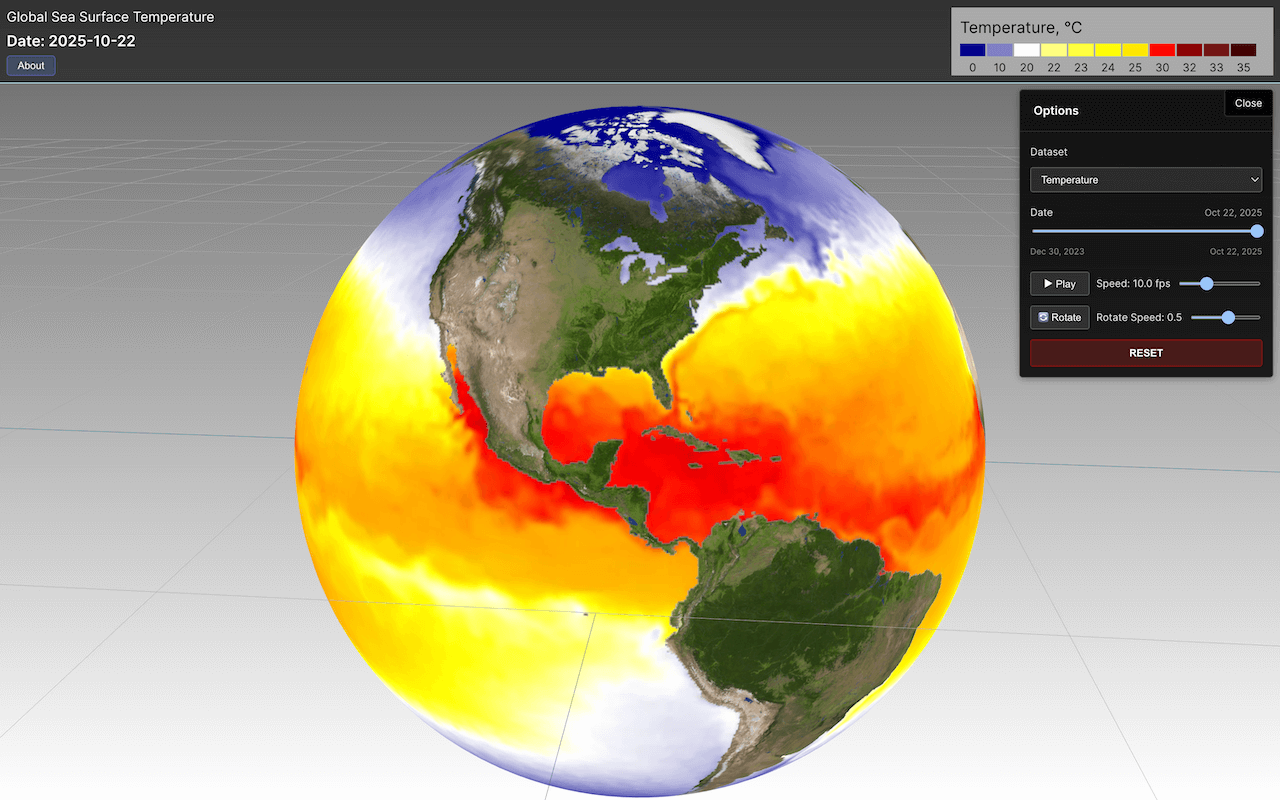
Oceans absorb most of the excess heat trapped by greenhouse gases, influencing weather patterns and long-term climate dynamics. Monitoring their surface temperatures helps reveal trends such as El Niño, coral bleaching, and intensifying storms.
Gary Oberbrunner mapped NASA’s daily Optimally Interpolated Sea Surface Temperature (OISST) data on an interactive 3D globe. Users can toggle between absolute temperatures and anomalies from the long-term average, rotate and zoom the planet, and animate data through time to observe evolving sea surface patterns and the global distribution of ocean warming.
Explore the tool at globe-viz.oberbrunner.com.
Wrapping Up
Each of these projects shows a different way visualization can uncover meaning in data. Together, they illustrate how effectively charts and maps help reveal structure and insight. Stay tuned for more compelling examples in Data Visualization Weekly.
- Categories: Data Visualization Weekly
- No Comments »