Creating Radar Chart with JavaScript
December 23rd, 2022 by Awan Shrestha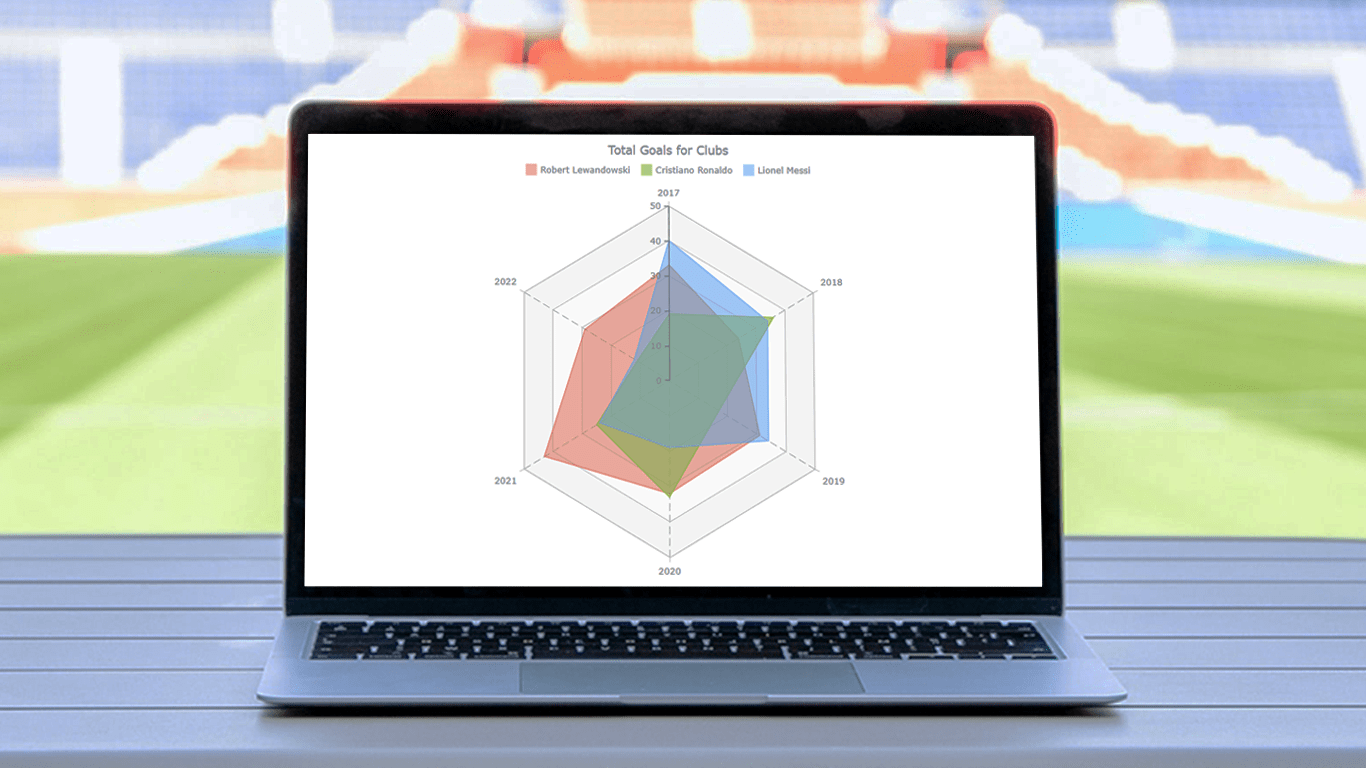 There are various data visualization techniques designed to reveal insights that numbers alone just can’t. In this tutorial, we will see how to easily create a radar chart using JavaScript. It is an effective way to graphically represent multivariate data of several quantitative variables.
Writing the tutorial during the FIFA World Cup 2022, I could not resist taking some football data for a practical illustration. The JS radar chart examples built and customized here step by step will plot the number of goals three top players have scored for their clubs over the last six years: Lionel Messi, Cristiano Ronaldo, and Robert Lewandowski.
The whistle for kickoff is blown, and it all begins!
Read the JS charting tutorial »
- Categories: AnyChart Charting Component, HTML5, JavaScript, JavaScript Chart Tutorials, Tips and Tricks
- No Comments »
How to Create Mosaic Plot with JavaScript
August 15th, 2022 by Shachee Swadia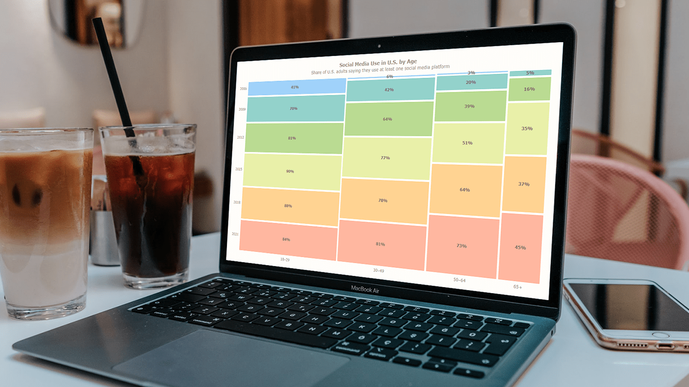 Have you heard of a mosaic plot? It is a very interesting chart type designed to facilitate exploring relationships between variables. Mosaic plots (also known as mosaic charts) visualize data in rectangular tiles whose width encodes one variable and height the other.
If you’d like to learn how to create such an elegant diagram with ease, follow me as I will show you the ropes right now! Along this tutorial, I will be building an interactive mosaic plot of social media adoption in the United States by age group and year, using JavaScript and explaining every step in detail.
Read the JS charting tutorial »
- Categories: AnyChart Charting Component, HTML5, JavaScript, JavaScript Chart Tutorials, Tips and Tricks
- No Comments »
How to Make JavaScript Polar Chart
November 11th, 2021 by Shachee Swadia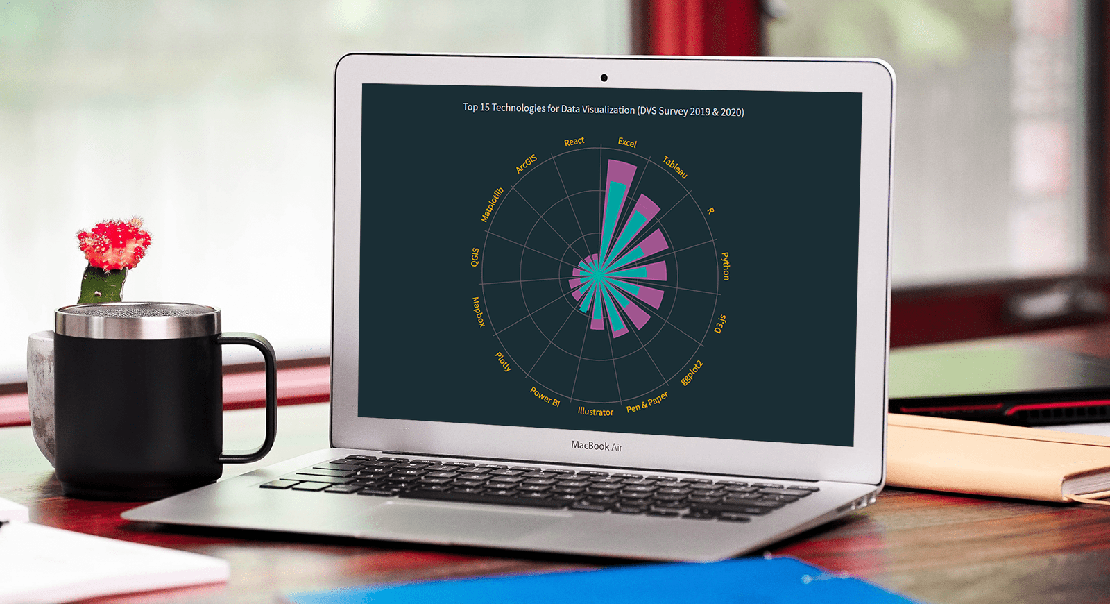 Polar charts often look impressive, which makes some people think that creating them is a tricky process demanding plenty of skills and expertise. Well, I am going to debunk this myth right now! Let me show you how to easily visualize data in a beautiful interactive JavaScript Polar Chart.
Fundamentally, a polar chart is a variation of a circular graph drawn with polar coordinates. It can also work well to visualize some sorts of categorical data for comparisons, which is exactly the case I want to demonstrate now. In this tutorial, I will build a column polar chart, with the bars growing from the center of the diagram to represent values with their length.
Data Visualization Society (DVS) conducts an annual State of the Industry survey of data viz practitioners, and I thought it could be a great opportunity to play with some of its latest data. In particular, I wanted to look at the most popular technologies used for data visualization based on the responses. So here, I will produce a JS polar chart that plots the top 15 ones, making up a cool illustrative real-world example.
It will be fun — come along, everyone!
Read the JS charting tutorial »
- Categories: AnyChart Charting Component, HTML5, JavaScript, JavaScript Chart Tutorials, Tips and Tricks
- No Comments »
How I Created Sunburst Chart Using JavaScript to Visualize COVID-19 Data
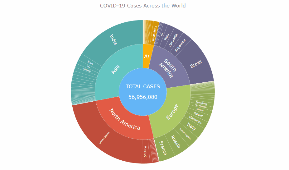
December 8th, 2020 by Shachee Swadia Almost recovered from COVID-19 myself these days, I decided to explore how the world is currently doing, during the pandemic. So I created a sunburst chart to see at a glance what continents and countries are more (and less) affected by the coronavirus than others. The process was quick and I thought someone could be interested to learn about how such data visualizations can be built in a pretty straightforward way, even with very little technical skills. So I also made a tutorial. And here I am — (1) sharing my interactive sunburst chart of COVID cases and (2) describing how I created it using JavaScript in a matter of minutes, step by step!
My JS sunburst chart provides an overview of the situation as of November 24, 2020, and also shows the global count, continent-wide data, and country-wise proportions for the current active COVID-19 cases and deaths. Scroll down to explore it by yourself and check out the tutorial along the way. Here is a sneak peek of the final chart to get you excited:
This sunburst charting tutorial is mainly for beginners to data science. So before we get to business, let’s make sure we’re on the same page. I’ll explain what a sunburst chart is and how it works, to start with. Then I’ll show you how to create a cool and colorful interactive visualization like that with JavaScript (and you can do it even if you don’t know it too well). That’s the plan!
Read the JS charting tutorial »
- Categories: AnyChart Charting Component, Big Data, Business Intelligence, HTML5, JavaScript, JavaScript Chart Tutorials, Tips and Tricks
- No Comments »
Choose Right Chart Type for Data Visualization. Part 1: Data Comparison
April 12th, 2017 by AnyChart Team When it comes to creating data analytics and reporting solutions, choosing the right chart type for a certain data visualization task remains a common challenge. What do you pick for data comparison, studying distribution, observing data over time, or some other purpose? It can be very tricky! To help you overcome this challenge to the best effect, today we are launching a series of articles titled Choose Right Chart Type for Data Visualization. The series is designed to quickly explain what chart types you should pick for different purposes of data analysis. With that said, each article here will be devoted to a specific, yet still big question that you want your data to answer.
The current (first) guide of the series is all about chart types that work best for finding out the differences in data: Data Comparison. In fact, it is one of the most frequently established purposes of data analytics. And sometimes many people use wrong chart types to fulfil it correctly. Now, finally, let’s get to the very point and see what visualization forms work best for comparing data.
- Categories: Choosing Chart Type, Tips and Tricks
- 4 Comments »