 Polar charts often look impressive, which makes some people think that creating them is a tricky process demanding plenty of skills and expertise. Well, I am going to debunk this myth right now! Let me show you how to easily visualize data in a beautiful interactive JavaScript Polar Chart.
Fundamentally, a polar chart is a variation of a circular graph drawn with polar coordinates. It can also work well to visualize some sorts of categorical data for comparisons, which is exactly the case I want to demonstrate now. In this tutorial, I will build a column polar chart, with the bars growing from the center of the diagram to represent values with their length.
Data Visualization Society (DVS) conducts an annual State of the Industry survey of data viz practitioners, and I thought it could be a great opportunity to play with some of its latest data. In particular, I wanted to look at the most popular technologies used for data visualization based on the responses. So here, I will produce a JS polar chart that plots the top 15 ones, making up a cool illustrative real-world example.
It will be fun — come along, everyone!
JS Polar Chart Preview
Take a sneak peek at what the final JavaScript polar chart will look like:
Building JavaScript Polar Chart in 4 Simple Steps
To create a polar chart here, I will use a JavaScript charting library. Such libraries are equipped with pre-written code for basic functions, which makes it easier and quicker to create a data visualization.
For this tutorial, I’ve picked the AnyChart JavaScript library since it is simple to use, flexible, and free for non-commercial use. Also, it is a great library to start with because of a lot of examples and good documentation.
Generally speaking, it is possible to split the entire process of creating any JS graph including a polar chart into four fundamental steps or stages. They are:
- Create a basic web page in HTML.
- Reference the required JavaScript files.
- Add the data.
- Write some JS code to draw the chart.
Join me in following these steps to make an awesome interactive JavaScript-based polar chart visualization!
1. Create a basic web page in HTML
To begin with, I create a basic HTML page and a block element that will hold the polar chart:
<html>
  <head>
    <title>JavaScript Polar Chart</title>
    <style type="text/css">
      html, body, #container {
        width: 100%; height: 100%; margin: 0; padding: 0;
      }
    </style>
  </head>
  <body>
    <div id="container"></div>
  </body>
</html>
As you see the <div> element is given an id so that I can refer to it later in the code. Also, the width and height of the <div> block are specified as 100% to make the polar chart render over the whole page.
2. Reference the required JavaScript files
Next, in the <head> section of the page, I reference the specific scripts of the charting library being used.
Here, I am working with AnyChart, so I will include the required files from its CDN. The library is modular, and for the polar chart, all I need is the handy core and polar modules.
<html>
  <head>
    <title>JavaScript Polar Chart</title>
    <script src="https://cdn.anychart.com/releases/8.10.0/js/anychart-core.min.js"></script>
    <script src="https://cdn.anychart.com/releases/8.10.0/js/anychart-polar.min.js"></script>
    <style type="text/css">
      html, body, #container {
        width: 100%; height: 100%; margin: 0; padding: 0;
      }
    </style>
  </head>
  <body>
    <div id="container"></div>
    <script>
      // All the JS polar chart code will come here.
    </script>
  </body>
</html>
3. Add the data
To get a dataset for my future polar chart, I filtered DVS’s Data Visualization Census Survey 2020 data and identified the 15 most commonly used technologies as answered by the respondents.
Now, to properly add this data to the chart, I create an array with the category name as the x parameter, as we are plotting on the X-axis, and the measure of each of the categories as the value parameter.
// add data as an array of objects
var data = [
  { x: 'Excel', value: 44.7 },
  { x: 'Tableau', value: 36.1 },
  { x: 'Pen & Paper', value: 27.1 },
  { x: 'R', value: 25 },
  { x: 'Python', value: 24.1 },
  { x: 'D3.js', value: 21.2 },
  { x: 'Illustrator', value: 20.3 },
  { x: 'ggplot2', value: 19.8 },
  { x: 'Power BI', value: 18.7 },
  { x: 'Plotly', value: 11.8 },
  { x: 'Matplotlib', value: 10.58 },
  { x: 'Mapbox', value: 9.28 },
  { x: 'QGIS', value: 9.22 },
  { x: 'ArcGIS', value: 7.18 },
  { x: 'React', value: 7.4 }
];
The preparations are all done and it is time now to make the JavaScript-based polar chart show up on the canvas!
4. Write some JS code to draw the polar chart
The first thing I do here is add a function enclosing all the JS polar chart code. This ensures that everything inside it will execute only after the web page is ready.
Making a polar chart in JavaScript is pretty much straightforward. I just write one line of code to create it, then add the data array prepared in the previous step, and connect the data to the chart creating a column series.
anychart.onDocumentReady(function () {

  // create a polar chart
  var chart = anychart.polar();

  // add data as an array of objects
  var data = [
    { x: 'Excel', value: 44.7 },
    { x: 'Tableau', value: 36.1 },
    { x: 'Pen & Paper', value: 27.1 },
    { x: 'R', value: 25 },
    { x: 'Python', value: 24.1 },
    { x: 'D3.js', value: 21.2 },
    { x: 'Illustrator', value: 20.3 },
    { x: 'ggplot2', value: 19.8 },
    { x: 'Power BI', value: 18.7 },
    { x: 'Plotly', value: 11.8 },
    { x: 'Matplotlib', value: 10.58 },
    { x: 'Mapbox', value: 9.28 },
    { x: 'QGIS', value: 9.22 },
    { x: 'ArcGIS', value: 7.18 },
    { x: 'React', value: 7.4 }
  ];

  // connect the data creating a column series
  var columnSeries = chart.column(data);

});
The data is categorical, consisting of discrete values. So I specify the X-scale as ordinal. I also set the Y-axis as ‘false’ to avoid displaying the corresponding values.
// set the x-scale
chart.xScale('ordinal');

// disable the y-axis
chart.yAxis(false);
It is always important to name the chart so that the viewer has no problem quickly understanding what is shown. So, I set the polar chart title:
// set the chart title
chart
  .title('Top 15 Technologies for Data Visualization (DVS Survey 2020)');
Finally, I reference the previously added <div> container and command to display the resulting polar chart.
// set the chart container id
chart.container('container');

// initiate the chart display
chart.draw();
Initial Polar Chart Result
Lo and behold, an interactive JavaScript-based polar chart is ready with these few lines of code!
Check out this initial version here and feel free to play around with it on AnyChart Playground or CodePen.
<html>
  <head>
    <title>JavaScript Polar Chart</title>
    <script src="https://cdn.anychart.com/releases/8.10.0/js/anychart-core.min.js"></script>
    <script src="https://cdn.anychart.com/releases/8.10.0/js/anychart-polar.min.js"></script>
    <style type="text/css">
      html,
      body,
      #container {
        width: 100%;
        height: 100%;
        margin: 0;
        padding: 0;
      }
    </style>
  </head>
  <body>
    <div id="container"></div>
    <script>
      anychart.onDocumentReady(function () {

        // create a polar chart
        var chart = anychart.polar();

        // add data as an array of objects
        var data = [
          { x: 'Excel', value: 44.7 },
          { x: 'Tableau', value: 36.1 },
          { x: 'Pen & Paper', value: 27.1 },
          { x: 'R', value: 25 },
          { x: 'Python', value: 24.1 },
          { x: 'D3.js', value: 21.2 },
          { x: 'Illustrator', value: 20.3 },
          { x: 'ggplot2', value: 19.8 },
          { x: 'Power BI', value: 18.7 },
          { x: 'Plotly', value: 11.8 },
          { x: 'Matplotlib', value: 10.58 },
          { x: 'Mapbox', value: 9.28 },
          { x: 'QGIS', value: 9.22 },
          { x: 'ArcGIS', value: 7.18 },
          { x: 'React', value: 7.4 }
        ];

        // connect the data creating a column series
        var columnSeries = chart.column(data);

        // set the x-scale
        chart.xScale('ordinal');

        // disable the y-axis
        chart.yAxis(false);

        // set the chart title
        chart
          .title('Top 15 Technologies for Data Visualization (DVS Survey 2020)');

        // set the chart container id
        chart.container('container');

        // initiate the chart display
        chart.draw();

      });
    </script>
  </body>
</html>
Such a polar graph picture makes it clearly seen that, according to the latest DVS survey, Microsoft Excel is the most popular technology for data visualization, followed by Tableau, pen & paper, and R.
Actually, this is just a basic version. And there are so many things that we can add. Follow along as I demonstrate how this (and basically any other) JS polar chart can be customized for a more functional and funkier representation!
Customizing JS Polar Chart
There are various ways how you can customize a polar chart like this. Right now, I am going to show you how to make some quick, yet effective tweaks.
A. Modify the width of the points
The default width of the points can be changed and set according to your preference. I want to reduce it to make the polar chart look like a set of petals. This is very easily done in just one line of code:
// set the width of the series points
chart.pointWidth(10);
B. Improve the tooltip and the title
Then, I want to modify the default tooltip of the polar chart to make it more insightful. Since the values are percentage figures, I add the percentage sign right next to them:
// set the tooltip
chart.tooltip().format("{%value}%");
Next, I just add a bit of padding to the bottom of the chart title:
// configure the chart title
chart
    .title()
    .enabled(true)
    .text('Top 15 Technologies for Data Visualization (DVS Survey 2019 & 2020)')
    .padding({ bottom: 20 });
You can look at the full code of this JavaScript polar chart iteration on AnyChart Playground or CodePen.
C. Add a second series
I decided to see how the use of these data visualization technologies had changed, and for that purpose, add data for the year 2019, making the polar chart more informative and bringing more value to it from the point of view of data analysis.
So, I include the 2019 data and give the data for each year the variable names of data1 (for 2020) and data2 (for 2019). Similarly, I connect the two datasets to two series and give them each a name. Check out how it’s done:
// data for 2020
var data1 = [
    { x: 'Excel', value: 44.7 },
    { x: 'Tableau', value: 36.1 },
    { x: 'Pen & Paper', value: 27.1 },
    { x: 'R', value: 25 },
    { x: 'Python', value: 24.1 },
    { x: 'D3.js', value: 21.2 },
    { x: 'ggplot2', value: 19.8 },
    { x: 'Illustrator', value: 20.3 },
    { x: 'Power BI', value: 18.7 },
    { x: 'Plotly', value: 11.8 },
    { x: 'Matplotlib', value: 10.58 },
    { x: 'Mapbox', value: 9.28 },
    { x: 'QGIS', value: 9.22 },
    { x: 'ArcGIS', value: 7.18 },
    { x: 'React', value: 7.4 }
];

// data for 2019
var data2 = [
    { x: 'Excel', value: 54.7 },
    { x: 'Tableau', value: 44.3 },
    { x: 'R', value: 37.7 },
    { x: 'Python', value: 34.2 },
    { x: 'D3.js', value: 33.6 },
    { x: 'ggplot2', value: 32.3 },
    { x: 'Pen & Paper', value: 30.1 },
    { x: 'Illustrator', value: 25.3 },
    { x: 'Power BI', value: 17.3 },
    { x: 'Plotly', value: 16.1 },
    { x: 'Mapbox', value: 15.1 },
    { x: 'QGIS', value: 12.9 },
    { x: 'Matplotlib', value: 11.1 },
    { x: 'ArcGIS', value: 10.2 },
    { x: 'React', value: 10.1 }
]

// create two series and connect the data respectively
var columnSeries2 = chart.column(data2);
var columnSeries1 = chart.column(data1);

// set the series names
// series #1
columnSeries1.name('2020');
// series #2
columnSeries2.name('2019');
I keep the width of the original 2020 series as previously defined and make the 2019 series a bit wider so it gets easier to distinguish between them visually:
// set the width of the series points
// series #1
columnSeries1.pointWidth(10);
// series #2
columnSeries2.pointWidth(15);
D. Change the colors
Now, I want to set different colors for each of the series, and I choose two of the three main DVS colors: Turquoise (#2db1a4) and Plum (#9f5f9c). The third color will be made use of just a little bit later.
// customize the series color
// series #1
columnSeries1.color('#2db1a4');
// series #2
columnSeries2.color('#9f5f9c');
The AnyChart JavaScript charting library provides multiple pre-built themes. To make the polar chart look more vibrant with the DVS colors, I set a dark color theme, namely Dark Glamour. So, I add the necessary script in the <head> section and then include the theme in the main JS code. Like this:
<script src="https://cdn.anychart.com/releases/8.10.0/themes/dark_glamour.min.js"></script>

...

// set the chart design theme
anychart.theme('darkGlamour');
E. Enhance the labels, tooltip, and title
Here is where I use the third color of the DVS logo, Mustard. I modify the polar chart labels by setting this color for each and changing the font size parameter to improve legibility:
// configure the chart labels
var labels = chart.xAxis().labels();
labels.fontSize(14)
  .fontColor('#dcb22a');
Next, I modify the tooltip to reflect the colors of each of the series along with the labels and make it look more engaging:
// set the tooltip title
chart.tooltip().title().fontColor('#dcb22a');

// set the tooltip content
chart.tooltip().format("{%seriesName}: {%value}%").fontSize(14).fontWeight(600);

// set the tooltip font color
// series #1
columnSeries1.tooltip().fontColor('#2db1a4')
// series #2
columnSeries2.tooltip().fontColor('#9f5f9c');
Lastly, I modify the polar chart title to include both years and customize its font size and color for enhanced appearance:
// configure the chart title
chart
.title()
.enabled(true)
.text('Top 15 Technologies for Data Visualization (DVS Survey 2019 & 2020)')
.fontSize(16)
.fontColor("#d5dcdc")
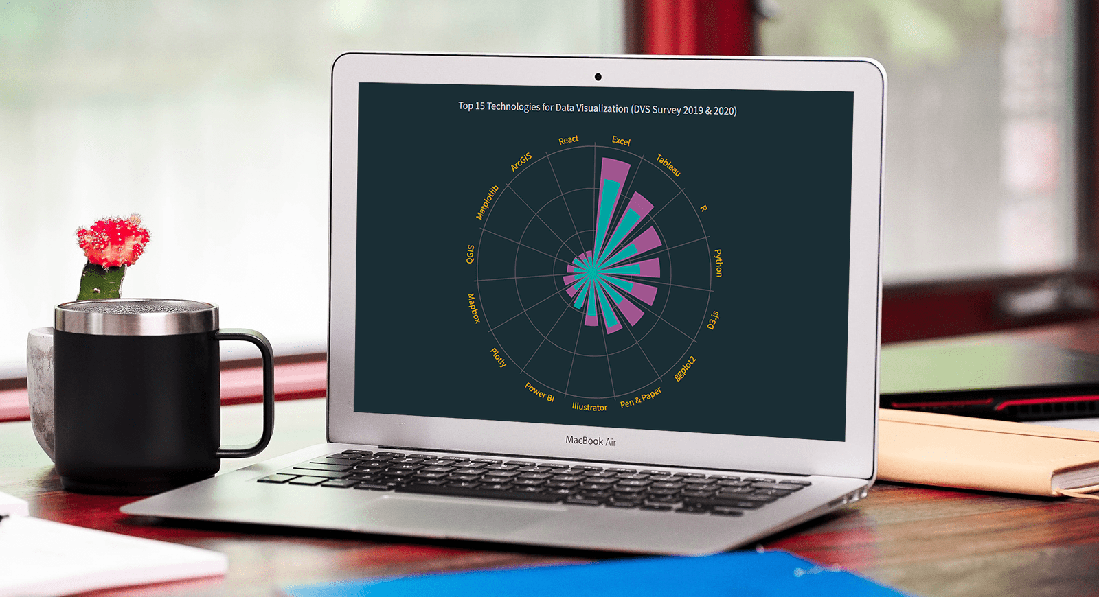
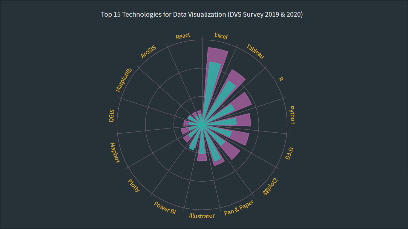
.padding({ bottom: 20 });Final Polar Chart Result
That’s it! An absolutely stunning and insightful JavaScript polar chart is all done!
We see that the top technologies for data visualization remain mostly unchanged for both years. But the percentages of most of the 15 technologies are lower in 2020 than in 2019, which hints at the growth of those beyond the top 15. The only exception is Power BI, whose usage increased. Matplotlib’s usage remained about the same in 2020 as in 2019.
Check out the entire code of this final interactive JS polar chart below and feel free to try some experimentation on AnyChart Playground or CodePen.
<html>

<head>
  <title>JavaScript Polar Chart</title>
  <script src="https://cdn.anychart.com/releases/8.10.0/js/anychart-core.min.js"></script>
  <script src="https://cdn.anychart.com/releases/8.10.0/js/anychart-polar.min.js"></script>
  <script src="https://cdn.anychart.com/releases/8.10.0/themes/dark_glamour.min.js"></script>
  <style type="text/css">
    html,
    body,
    #container {
      width: 100%;
      height: 100%;
      margin: 0;
      padding: 0;
    }
  </style>
</head>

<body>
  <div id="container"></div>
  <script>
    anychart.onDocumentReady(function () {

      // set the chart design theme
      anychart.theme('darkGlamour');

      // create a polar chart
      var chart = anychart.polar();

      // data for 2020
      var data1 = [
        { x: 'Excel', value: 44.7 },
        { x: 'Tableau', value: 36.1 },
        { x: 'Pen & Paper', value: 27.1 },
        { x: 'R', value: 25 },
        { x: 'Python', value: 24.1 },
        { x: 'D3.js', value: 21.2 },
        { x: 'ggplot2', value: 19.8 },
        { x: 'Illustrator', value: 20.3 },
        { x: 'Power BI', value: 18.7 },
        { x: 'Plotly', value: 11.8 },
        { x: 'Matplotlib', value: 10.58 },
        { x: 'Mapbox', value: 9.28 },
        { x: 'QGIS', value: 9.22 },
        { x: 'ArcGIS', value: 7.18 },
        { x: 'React', value: 7.4 }
      ];

      // data for 2019
      var data2 = [
        { x: 'Excel', value: 54.7 },
        { x: 'Tableau', value: 44.3 },
        { x: 'R', value: 37.7 },
        { x: 'Python', value: 34.2 },
        { x: 'D3.js', value: 33.6 },
        { x: 'ggplot2', value: 32.3 },
        { x: 'Pen & Paper', value: 30.1 },
        { x: 'Illustrator', value: 25.3 },
        { x: 'Power BI', value: 17.3 },
        { x: 'Plotly', value: 16.1 },
        { x: 'Mapbox', value: 15.1 },
        { x: 'QGIS', value: 12.9 },
        { x: 'Matplotlib', value: 11.1 },
        { x: 'ArcGIS', value: 10.2 },
        { x: 'React', value: 10.1 }
      ];

      // set the x-scale
      chart.xScale('ordinal');

      // disable the y-axis
      chart.yAxis(false);

      // create two column series and connect the data respectively
      var columnSeries2 = chart.column(data2);
      var columnSeries1 = chart.column(data1);

      // set the series names
      // series #1
      columnSeries1.name('2020');
      // series #2
      columnSeries2.name('2019');

      // set the width of the series points
      // series #1
      columnSeries1.pointWidth(10);
      // series #2
      columnSeries2.pointWidth(15);

      // customize the series color
      // series #1
      columnSeries1.color('#2db1a4');
      // series #2
      columnSeries2.color('#9f5f9c');

      // configure the chart labels
      var labels = chart.xAxis().labels();
      labels.fontSize(14)
        .fontColor("#dcb22a");

      // set the tooltip title
      chart.tooltip().title().fontColor('#dcb22a');

      // set the tooltip content
      chart.tooltip().format("{%seriesName}: {%value}%").fontSize(14).fontWeight(600);

      // set the tooltip font color
      // series #1
      columnSeries1.tooltip().fontColor('#2db1a4')
      // series #2
      columnSeries2.tooltip().fontColor('#9f5f9c');

      // configure the chart title
      chart
        .title()
        .enabled(true)
        .text('Top 15 Technologies for Data Visualization (DVS Survey 2019 & 2020)')
        .fontSize(16)
        .fontColor("#d5dcdc")
        .padding({ bottom: 20 });

      // set the chart container id
      chart.container('container');

      // initiate the chart display
      chart.draw();

    });
  </script>
</body>

</html>
Conclusion
Polar charts are a very cool type of data visualization. And it is not that difficult to create a beautiful interactive one with JS even if you are a beginner. Don’t miss out on the polar plot documentation to learn more about what is possible in a JavaScript polar chart visualization and how using polar coordinates instead of the ordinal scale can work.
Please let me know if you have any questions and go on to create some exciting and useful visualizations on your own!
The team of AnyChart thanks Shachee Swadia, a freelance data designer, for writing this awesome JavaScript Polar Chart tutorial for our blog.
Learn more about polar charts on Chartopedia and don’t miss more JavaScript charting tutorials on our blog.
Would you like to write a cool guest post for us? We want to hear your ideas!
- Categories: AnyChart Charting Component, HTML5, JavaScript, JavaScript Chart Tutorials, Tips and Tricks
- No Comments »