Compelling Fresh Examples of Data Visualization in Action — DataViz Weekly
April 3rd, 2026 by AnyChart Team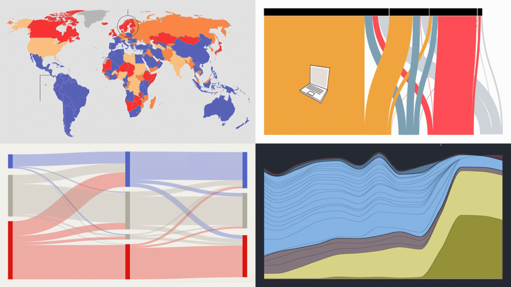
Data visualization has two core purposes: explanation and exploration. In DataViz Weekly, you can see how they naturally end up combining. Check out some of the most interesting data visualization examples we’ve found around the web lately, where charts and maps do their job in a compelling way:
- China’s rise in AI research talent — The Economist
- Shadow fleet capitalizing on the Iran war — The Financial Times
- Vietnam’s rise as a U.S. electronics supplier — Bloomberg
- Food self-sufficiency by country — Amanda Shendruk
- Categories: Data Visualization Weekly
- No Comments »
From Personal Grocery Receipts to Global Data Centers — DataViz Weekly
March 20th, 2026 by AnyChart Team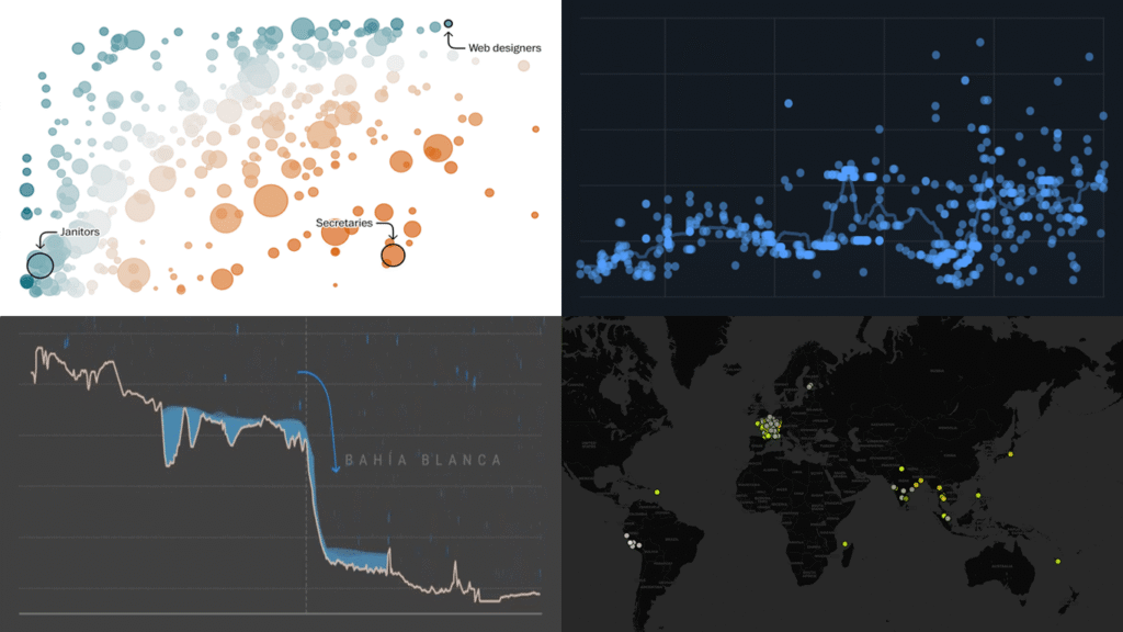
Data is everywhere, but what it means is rarely obvious on its own. DataViz Weekly is back with four projects that illustrate how good visuals help close that gap. Featured today:
- 25 years of egg prices — John Rush
- Jobs most at risk from AI — The Washington Post
- Bahía Blanca flood reconstruction — LA NACION
- Global data center expansion — Environmental Reporting Collective
- Categories: Data Visualization Weekly
- No Comments »
Enhancing AI-Assisted JavaScript Chart Development with Context7 MCP and Claude
November 26th, 2025 by AnyChart Team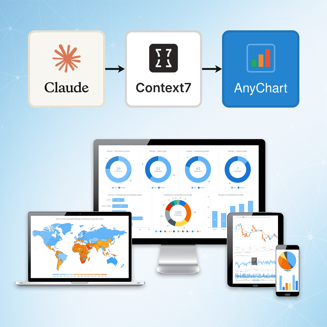 At AnyChart, we are constantly exploring tools and workflows that help developers work more efficiently, stay up to date, and minimize friction when integrating data visualization into their projects.
One approach we’ve recently tested — and found highly effective — is connecting Claude to Context7 via the Model Context Protocol (MCP). This integration gives Claude access to a continuously updated, extensive database of technical documentation across libraries, packages, and APIs.
This means you can rely on Claude not just for reasoning, but also for live, accurate, and authoritative documentation retrieval, dramatically reducing the chances of outdated suggestions or hallucinated methods.
- Categories: AnyChart Charting Component, AnyGantt, AnyMap, AnyStock, Big Data, Business Intelligence, Charts and Art, Dashboards, Financial Charts, Gantt Chart, GraphicsJS, HTML5, JavaScript, JS Chart Tips, News, Stock Charts, Third-Party Developers, Tips and Tricks
- No Comments »
Introducing AI Splits for Instant Root Cause Insights in Qlik Sense
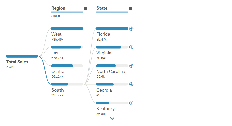
October 31st, 2024 by AnyChart Team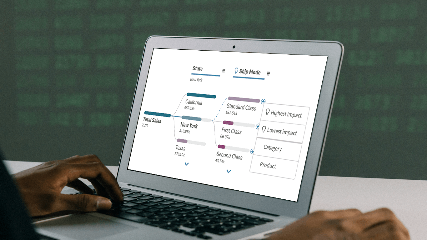 In today’s fast-paced business environment, rapidly understanding the underlying factors within vast amounts of data is crucial for informed decision-making. The Decomposition Tree in Qlik Sense excels at breaking down complex datasets to reveal the “why” behind the numbers. Now, with the game-changing AI Splits feature, this visual becomes even more powerful, automatically highlighting critical impacts and elevating root cause analysis to new heights.
Let’s explore what makes AI Splits transformative and how to implement it.
Read more at qlik.anychart.com »
- Categories: Big Data, Business Intelligence, News, Qlik
- No Comments »
New AI & Visualization Features for Data Analysis in Qlik Sense
October 31st, 2024 by AnyChart Team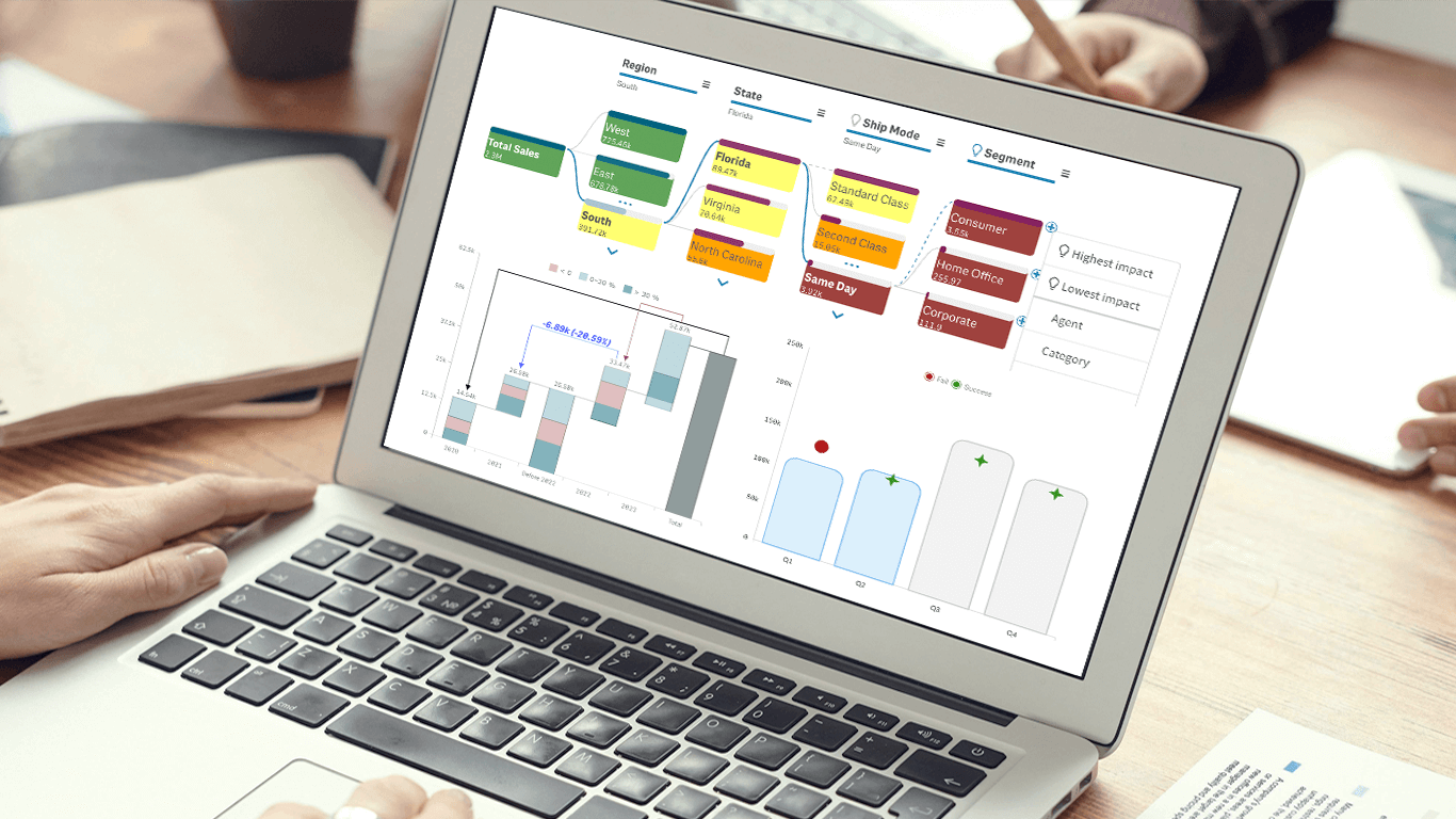 We’re excited to announce a series of updates to our extensions for Qlik Sense! They bring greater flexibility and precision to your data visualizations, allowing for uncovering deeper insights even more effectively. The most stunning new feature is AI Splits in the Decomposition Tree — let your users find the highest and lowest impacts with unprecedented speed!
Read on to learn what’s new at qlik.anychart.com »
- Categories: Big Data, Business Intelligence, News, Qlik
- No Comments »
Join AnyChart at QlikWorld Tour 2023
August 10th, 2023 by AnyChart Team Get ready to dive into an exceptional data experience at QlikWorld Tour 2023! We at AnyChart are super stoked to be part of this epic roadshow as proud sponsors and warmly invite you to join us in one of the participating U.S. cities:
- Dallas (The Star in Frisco) — August 10
- San Francisco (Oracle Park) — August 24
- New York (Pier60 at Chelsea Pier) — September 18
- Atlanta (College Football Hall of Fame) — September 20
Spoiler alert: The star of the show will be our first-ever presentation of YODA — Your Own Documents Assistant, the newest, groundbreaking, AI-driven extension for Qlik Sense. Be among the first to witness its power!
Read more at qlik.anychart.com »
- Categories: AnyChart Charting Component, AnyGantt, Big Data, Business Intelligence, Dashboards, Gantt Chart, News, Qlik
- No Comments »
4 Great Examples of Data Visualization in Action — DataViz Weekly
August 28th, 2020 by AnyChart Team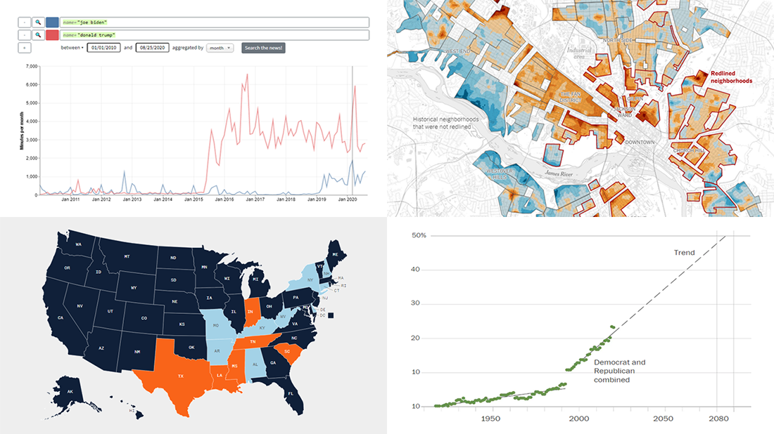 We’ve curated another four great examples of data visualization in action. Would you like to learn about them and check them out right now? Wait no longer! Below is a list of the projects highlighted in the new DataViz Weekly — just give it a glance and go ahead!
- Exploring a link between racism in the housing policy and hotter neighborhoods — The New York Times
- Analyzing the content of cable TV news — Stanford University
- Tracking gender inequality in American politics — The Washington Post
- Summarizing voting rules for the 2020 U.S. election by state — NBC News
- Categories: Data Visualization Weekly
- No Comments »
StopCorona Creator Shares How They Visualize COVID-19 Data Using AnyChart
May 21st, 2020 by AnyChart Team![]() Earlier, we introduced you to a new, ever-updating COVID tracker that uses AnyChart to visualize the latest pandemic data in insightful charts, StopCorona.info. To let you know more, we also talked to Vadim Peskov, CEO at Diffco, the app development company behind StopCorona, and asked him a few questions.
Earlier, we introduced you to a new, ever-updating COVID tracker that uses AnyChart to visualize the latest pandemic data in insightful charts, StopCorona.info. To let you know more, we also talked to Vadim Peskov, CEO at Diffco, the app development company behind StopCorona, and asked him a few questions.
Read our quick interview to learn more about StopCorona and their experience using our JavaScript charting library for interactive data visualization. (Stack: MySQL/Symfony/Angular.)
- Categories: AnyChart Charting Component, Big Data, Charts and Art, HTML5, JavaScript, Success Stories
- 3 Comments »
Top Big Data Trends for 2017
September 13th, 2017 by Jay Stevenson Big Data has been growing exponentially as a very special segment in the core of today’s data analytics, with all the more organizations and companies collecting, visualizing, exploring and communicating large amounts of various kinds of data. In this article, we will talk about notable big data trends that we see in and for 2017 and also take a quick look at some technologies being widely used in this field today.
- Categories: Big Data, Business Intelligence, Dashboards
- No Comments »