IDS Chooses AnyChart for Its Reporting and Analysis Systems
November 21st, 2011 by Margaret SkomorokhWe are happy to publish a new success story, this time about AnyChart and Independent Data Services (IDS) – a company from the upstream oil and gas industry.
IDS, founded in 1995, is the world’s largest provider of web-based reporting and analysis services to the upstream oil and gas industry. IDS’ latest release — DataNet2 — makes full use of Web 2.0-compliant technologies and WITSML feeds to capture and deliver data via the web to unlimited users. The DataNet2 suite of products includes VisNet — a back-end query engine which extracts knowledge from every part of the DataNet2 system.
The challenge was:
- To visualize the data returned by VisNet (KPI’s, benchmarks) and create configurable and interactive charts.
- To ensure that all visualizations would be customizable, matching IDS’ high standards.
- To implement a variety of charts.
AnyChart’s charting technology was used to generate visualizations for VisNet because:
- The component allows for the creation of advanced and good-looking animated charts.
- AnyChart is very flexible and provides a lot of features, which made it a good choice for IDS’ project.
- The AnyChart library includes a wide range of charts which is constantly growing. Currently VisNet supports Bar, Column, Pie, Line, and Scatter graphs, but more will be added.
You can enjoy the success story here:
| IDSIDS Chooses AnyChart for Its Reporting and Analysis Systems >> |
Other stories can be found here: https://www.anychart.com/company/success_stories.php
- Categories: AnyChart Charting Component, Success Stories
- No Comments »
AnyChart 6.0.5 Released
November 14th, 2011 by Timothy LoginovToday we are glad to announce the release of AnyChart 6.0.5. We are constantly improving the HTML5 engine, and soon it will become fully functional. Besides that, we keep adding new features and refining various aspects of AnyChart, including the smallest details (which, as we believe, are never insignificant) to make it more and more convenient to use.
In AnyChart 6.0.5 we have introduced a number of important improvements:
- A new Scale Auto Calculation Mode – Axes Scales: Scale Auto Calculation Modes.
- A new scale attribute always_show_zero – Axes Scales: Always Show Zero in Auto Calculation Mode.
- AnyChart Flex Component can now be used in Android applications.
- AnyChart Flash Integration can now be used in iOs applications.
- The getInformation() method now returns gauges and pointers collection for Gauge charts.
- AnyChart() constructor can now have up to three parameters, where the third parameter is a custom chart id.
- Chart custom messages are now configured in a different way: properties are replaced with a messages object. Read more in the Preloader tutorial.
- The getPNG() function now have two optional parameters: width and height. Read more in the Save as Image tutorial.
- Series now have a new attribute – enabled – which allows to hide them when a chart is rendered and then show again using the showSeries() method. Read more in the tutorial on working with data in JavaScript.
- A number of features, such as label controls, color swatch control, actions, templates, and the apply_palletes_to attribute are now fully supported in the HTML5 engine.
Important note: Because of the bug in Flash Player 11.0.1.152 Radar and Polar charts are displayed incorrectly. If you use any of 5.x or 6.x AnyChart versions with this version of Flash Player, please, switch either to AnyChart 6.0.5 or to Flash Player 11.1.102.55 (or later).
For more bug fixes and version history, see: http://anychart7.com/products/anychart/history/
Trial download is available at: https://www.anychart.com/download/
Please, feel free to contact us if any questions arise. We appreciate our clients and work hard to anticipate their needs and keep pace with the latest demands of the industry, making our charts even more flexible and attractive.
- Categories: AnyChart Charting Component
- No Comments »
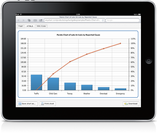
Building a Large Chart Ecosystem with AnyChart and Native XML Databases
September 22nd, 2011 by Timothy Loginov Today we are glad to present you a detailed case study: Building a Large Chart Ecosystem with AnyChart and Native XML Databases by Dan McCreary.
Dan McCreary is an enterprise metadata strategy architect who has worked in the technology field for over 17 years. His career has taken him through the fields of solid state physics, computer chip design, supercomputing, working with Steve Jobs and NeXT Computer, and founding his own consulting firm — Integrity Solutions, which is now part of the WAM!NET Professional Services division. In the fall of 2000, Dan McCreary in collaboration with several other technology and marketing professionals formed Dan McCreary and Associates — a technology strategy development consulting firm specializing in helping firms align their business and technology strategies by effectively managing their metadata.
Executive Summary
The AnyChart system, when used within a native XML database, is ideal for building and maintaining a very large number of charts that can be quickly managed by non-programmers. Central to the AnyChart product is the declarative nature of XML files and the focus on “what” should be displayed, but not “how” the charts are rendered. This allows the target platform to change from Flash to HTML5 (currently in Beta) without any changes by the chart authoring system. AnyChart’s domain specific language for chart specification can also be easily extended for business specific tasks. This approach has saved our customers tens of thousands of dollars building interactive dashboards as well as much higher quality and consistency of the final products.
This document shows how functions such as validation, search, quality, consistency, extensibility, and agility can be easily maintained using standardized, cross-platform XQuery libraries. This is just one example of how NoSQL (not only SQL) systems are ideal for managing semi-structured data.
Background
There are many charting software packages that are designed to create a simple bar charts or line charts on the web. But most of these systems break down once you need to create multiple charts for multiple users in multiple business units and yet still retain consistency and quality across hundreds or even thousands of charts. Our experience is that AnyChart, when combined with native XML databases, can allow large complex charting systems to be easily maintained by non-programmers.
By using AnyChart system and native XML databases, we have created a large complex ecosystem where even very large numbers of charts can be quickly and easily managed. The secret is to combine the declarative nature of AnyChart XML files with a native XML database that can easily query all the charts in use based on a variety of search parameters.
Unlike many charting software systems that provide Java, .Net, JSON or JavaScript interfaces, the core chart format in AnyChart is an XML file. Unlike imperative or procedural code, XML can be queried with XQuery just like a relational database can be queried with SQL. XML files have the benefit of being standardized as well as having a very large set of tools to test compliance to business rules. For example, unlike JSON files, XML files can be validated against XPath expression tests, XML Schemas as well as be check for business rule compliance using tools such as Schematron and XQuery reports.
This case study will show that when combined with a native XML database, AnyChart systems can be very easy to manage by non-programmers.
- Categories: AnyChart Charting Component
- No Comments »
ISFB Chooses AnyChart for School Monitoring Solution
September 17th, 2011 by Margaret SkomorokhWe are glad to introduce a new success story – about AnyChart and Information Systems for Business (ISFB).
ISFB is a company that develops various information system based on thin client technology, using Drupal as a platform.
Particularly, ISFB created a system that allows monitoring of schools’ readiness for the academic year — the project was implemented for the Ministry of Education of the Komi Republic (Russian Federation). Such monitoring is held each year by a commission that evaluates whether schools match state standards, and in 2011 it was decided to make the results open to public at http://school.rkomi.ru/
The challenge was:
- To plot interactive pie charts and stacked bars showing schools’ readiness in different aspects.
- To create charts matching the design of the site and clear for the general public.
- To make an easy updatable visualization so that new data about schools could be added on-the-fly.
AnyChart was chosen as a solution because:
- The component supports a vide variety of charts types and different interactivity options.
- Due to XML interface, it is easy to draw and update charts. XML data files can be created both manually and using server side scripts.
- AnyChart is a designer friendly component: it allows easy chart configuration, and provides a convenient way of setting colors for any elements of charts.
You can enjoy the success story here:
| IFSB ISFB Chooses AnyChart for School Monitoring Solution >> |
Other stories can be found at: https://www.anychart.com/company/success_stories.php
- Categories: AnyChart Charting Component, Success Stories
- No Comments »
AnyChart 6.0.1 Update
September 12th, 2011 by Timothy LoginovAnyChart 6.0.1 is published and live on our site, we are working hard on HTML5 engine, and this week the following changes have been made:
- Funnel chart type
- Custom attributes feature
Version history: http://6.anychart.com/products/anychart7/history/
Trial download: https://www.anychart.com/download/
- Categories: AnyChart Charting Component
- No Comments »
AnyChart 6.0 with HTML5 Support Available
September 5th, 2011 by Margaret Skomorokh![]()
We are glad to announce the release of AnyChart 6.0 containing an HTML5 (SVG based) version of our component.
Our aim is to make the HTML5 version a complete substitution for the Flash version as well as to make the switch to HTML5 as easy as possible. Another thing that we see as a highest priority is the compatibility of our component with different browsers and platforms.
So key features of the HTML5 version are the following:
- HTML5 charts are configured exactly the same way as Flash ones – in XML.
- The names of API methods are the same.
- The HTML5 version is designed to work in all up-to-date versions of popular desktop browsers, such as Chrome, Safari, Firefox, Internet Explorer, and Opera.
- It is also compatible with popular browsers for the mobile platforms Android (2.2+) and iOS (iPhone, iPad, iPod Touch).
Though we have fully integrated the HTML5 version with our documentation as well as with the redistributable package, HTML5 support is still in the beta phase. Not all chart types and not all features are available for the moment, and we do not yet guarantee that all your charts in SVG version will look and work exactly like they do in Flash version.
However, we are going to cover all Flash version features by the HTML5 engine by the end of the year, and you will be able to upgrade your charts without any significant changes in your web sites and applications.
You can see how our HTML5 engine works in the examples from the Documentation and Gallery sections – just select an HTML5 tab when you view a chart. In case the features required to display a certain sample are not ready yet, you will see a relevant message.
To review an instruction on implementation, see HTML5 Migration Guide tutorial.
We are working hard to make the HTML5 version work exactly like the Flash version, and AnyChart will be updated each 1 or 2 weeks this fall. Check our web site or subscribe to our blog RSS or Twitter to be always aware of the latest changes.
Thank you once again for the interest in AnyChart – Modern Data Visualization Solution.
- Categories: AnyChart Charting Component
- No Comments »
Advices by Edward Tufte: Importance of Context for Charts
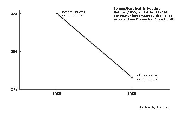
July 29th, 2011 by Margaret SkomorokhWe continue posting tips from Edward Tufte‘s works. In The Visual Display Of Quantitative Information, he puts a lot of attention to the problem of lying in charts.
It is assumed that charts are aimed to show the truth about data in the most demonstrative way, but this demonstrativeness is a two-edged weapon. Owing to some tricks – or mistakes – data may seem not what they are. One of them is the lack of context.
According to Tufte,
To be truthful and revealing, data graphics must bear on the question at the heart of quantitative thinking: “Compared to what?” The emaciated, data-thin design should always provoke suspicion, for graphics often lie by omission, leaving out data sufficient for comparisons.
The author gives an example of such a graphic – it shows the number of traffic deaths before and after stricter enforcement by the police against cars exceeding the speed limit:
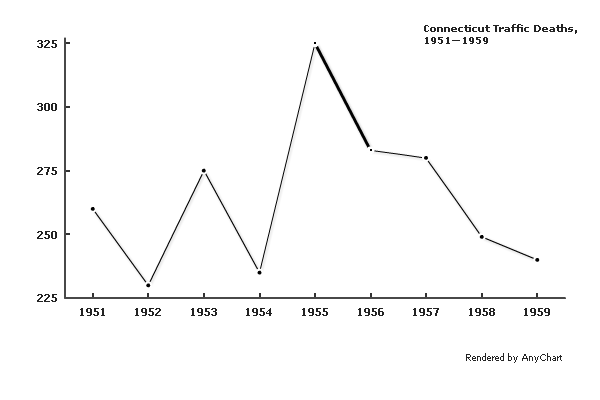
A few more data points make the situation much clearer:
A different context would cause a very different interpretation:
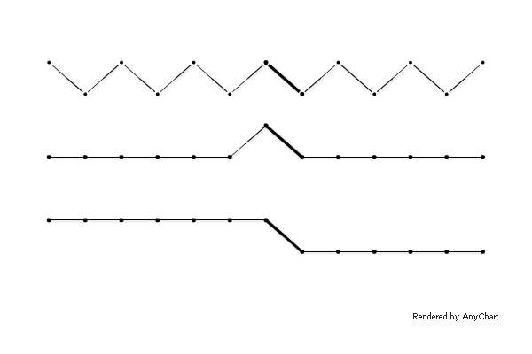
Comparison to adjacent states shows that the crackdown on speeding decreased the number of traffic fatalities not only in Connecticut:
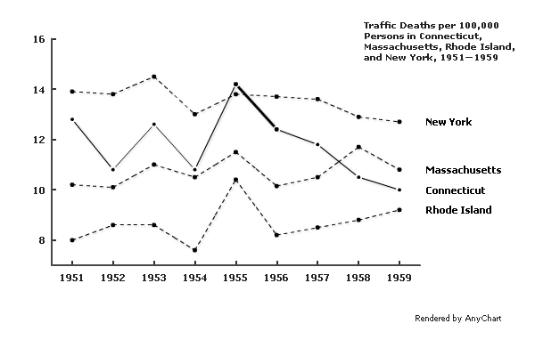
Of course, if one needs to distort the meaning of data, concealing the context may be a relatively useful tip, but in other situations, it is definitely a mistake. The principle formulated by Edward Tufte is:
Graphics must not quote data out of context.
- Categories: AnyChart Charting Component, Tips and Tricks
- No Comments »
AnyChart GraphJam: Lord of the Rings 3D Column Chart
July 22nd, 2011 by Margaret SkomorokhAmong numerous chart types that AnyChart allows creating there are 3D Column Charts. Using this tool, we have made our version of a GraphJam chart that wittily mocks the good old Lord of the Rings trilogy:
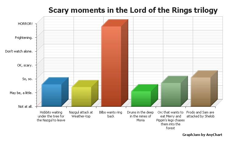
To check out other examples of 3D Column Charts, visit 3D Column Charts section in AnyChart charts gallery.
- Categories: AnyChart Charting Component
- No Comments »
AnyStock 1.4.0 Available
July 6th, 2011 by Margaret SkomorokhThe ability to set left and right timescale paddings in pixels was in extreme demand, and we always do our best to provide our customers with as wide range of built-in technical indicators as possible – so we have decided not to put off the AnyStock 1.4.0 update that gives you the full control of timescale margins and three new technical indicators:
Thus, AnyStock has become even better than before and now supports already 30 built-in and ready-to-use technical indicators.
Download AnyStock 1.4.0: https://www.anychart.com/download/
Version history: http://6.anychart.com/products/anystock7/history/
- Categories: AnyChart Charting Component
- No Comments »
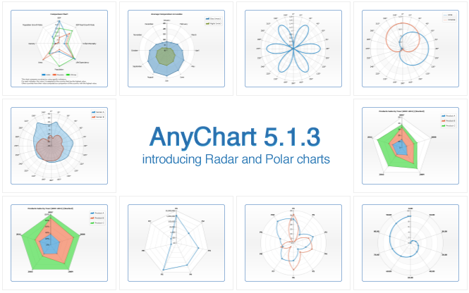
AnyChart 5.1.3 Released
July 6th, 2011 by Margaret SkomorokhWe are proud to announce the availability of the long-awaited AnyChart 5.1.3 with new chart types and numerous fixes and improvements!
New chart types
- Radar Chart
A radar chart is a graphical method of displaying multivariate data. Variables are represented on axes starting from the same point, where the relative position and angle of the axes is uninformative. It is also known as spider chart, star chart, kiviat diagram, etc. AnyChart allows displaying three types of series on radar charts: Line, Area and Marker. - Polar Chart
A polar chart is a plot drawn on a circular grid, showing trends in values on the basis of angles: each point on a plane is determined by a distance from a fixed point and an angle from a fixed direction. AnyChart allows drawing Line, Area and Marker series on polar plots.
New features
- A new external method that allows animating updated values.
- New formatting keywords that allow controlling the number of characters in token: maxChar and maxCharFinalChars.
- New parameters in chartMouseMove, pointMouseOut, pointMouseOver events: mouseX and mouseY.
- Multiseries pie and donut charts can now use outside labels with connectors.
Bug fixes
- Minor missing values interpolation algorithm issue is fixed.
- Flex component “tooltip stick” problem is solved.
- Wrong positioning of labels for points with zero value is fixed.
Download AnyChart 5.1.3: https://www.anychart.com/download/
Version history: http://6.anychart.com/products/anychart7/history/
- Categories: AnyChart Charting Component
- No Comments »