May 13th, 2024 by AnyChart Team
 Qlik Connect 2024 is on the horizon, and we’re pleased to announce that AnyChart will be participating as an Emerald sponsor and exhibitor. Join us from June 3–5 at Rosen Shingle Creek in Orlando, Booth #807!
Read more at qlik.anychart.com »
May 10th, 2024 by AnyChart Team
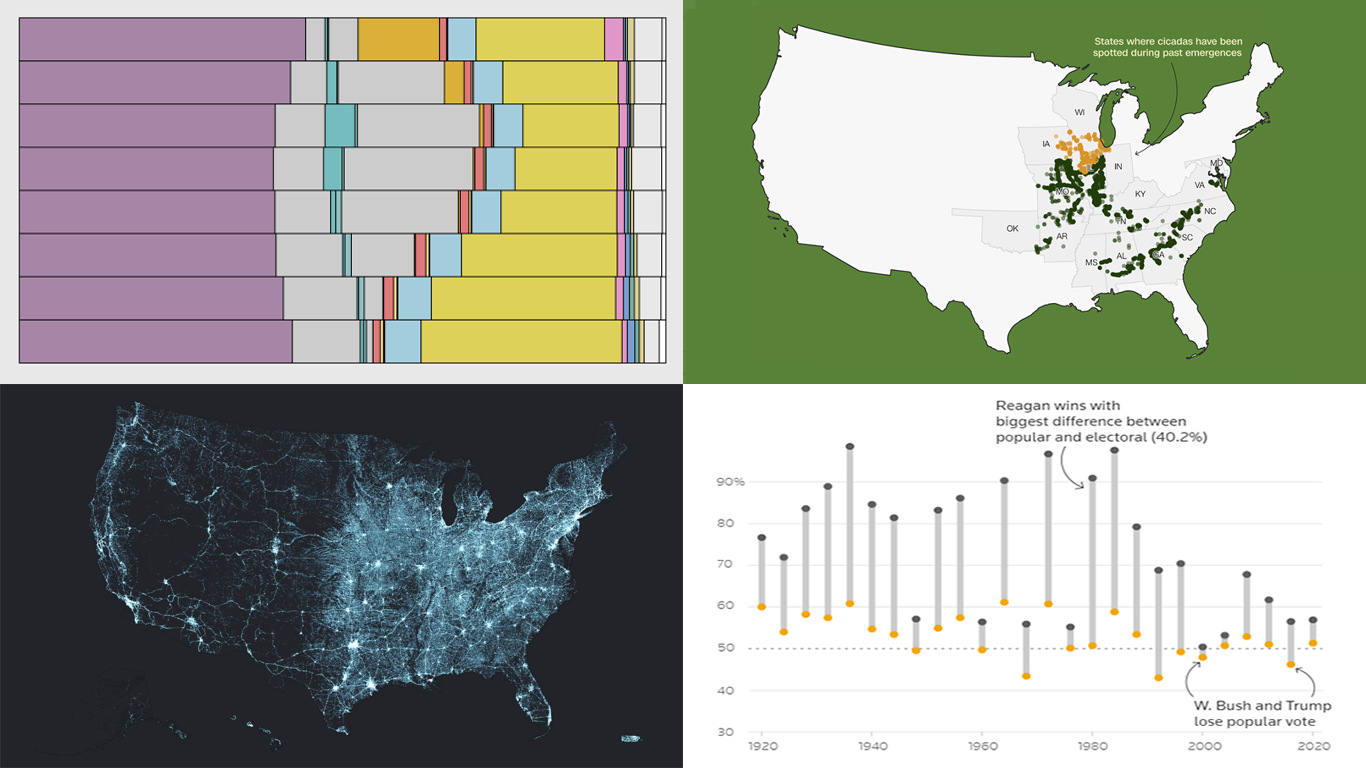 Data visualization serves as a powerful tool that enhances our understanding of complex data, transforming raw figures into insights. DataViz Weekly is here to share several great examples that demonstrate this capability in action. This week, we highlight four data visualization projects that have recently captured our attention:
- Exploring the U.S. bridges — Esri
- Analyzing time use by age — FlowingData
- Tracking historic cicada emergence 2024 — CNN
- Understanding election polls — Reuters
Read more »
May 3rd, 2024 by AnyChart Team
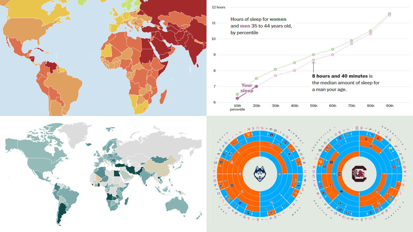 Welcome to the new DataViz Weekly, where we continue exploring the transformative power of data visualization. This edition presents a selection of new examples of how charts and maps can help us understand trends and patterns in various subjects — from sports and philanthropy to global challenges like press freedom and inflation, and everyday topics such as sleep. Here are the projects featured this time:
- March Madness philanthropy challenge — Bloomberg
- 2024 World Press Freedom Index — Reporters Without Borders
- Global Inflation Tracker — Council on Foreign Relations
- Sleep trends in America — The Washington Post
Read more »
April 26th, 2024 by AnyChart Team
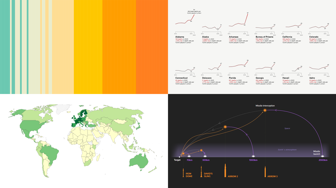 DataViz Weekly is here! Today, we spotlight cool new projects that illuminate how complex topics can be presented and explored in a comprehendible and impactful manner with the help of appropriate data graphics. Here’s a quick look at what we’re covering today:
- Evaluating agri-environmental policy effectiveness globally — Our World in Data
- Visualizing сlimate сhange across generations — The Tardigrade
- Revealing pandemic toll on U.S. prison populations — The Marshall Project
- Exploring Israel’s integrated air defense capabilities in action — Reuters
Read more »
April 19th, 2024 by AnyChart Team
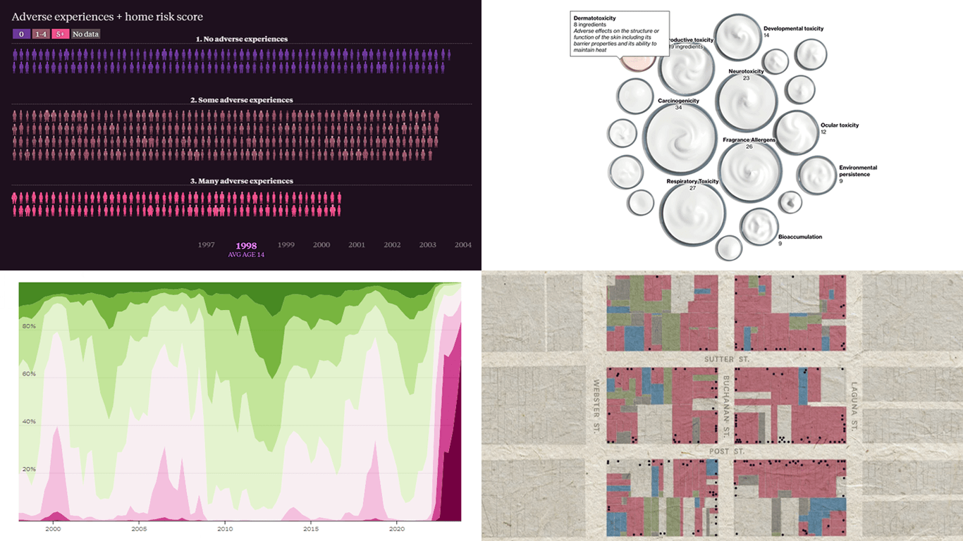 This week’s DataViz Weekly showcases a quartet of compelling data-driven stories, each powered by the adept use of data visualization techniques. These narratives not only inform but inspire, perhaps sparking creative concepts for your upcoming projects.
Here are the visual stories featured in this issue:
- Unraveling the hold of historical mortgage rates in the U.S. — The Upshot
- Retelling the transformation of San Francisco’s Japantown after Roosevelt’s Executive Order 9066 — The San Francisco Chronicle
- Revealing hidden risks in common fragrances — Bloomberg
- Exploring the persistent shadows of teen adversity — The Pudding
Read more »
April 18th, 2024 by Taylor Brooks
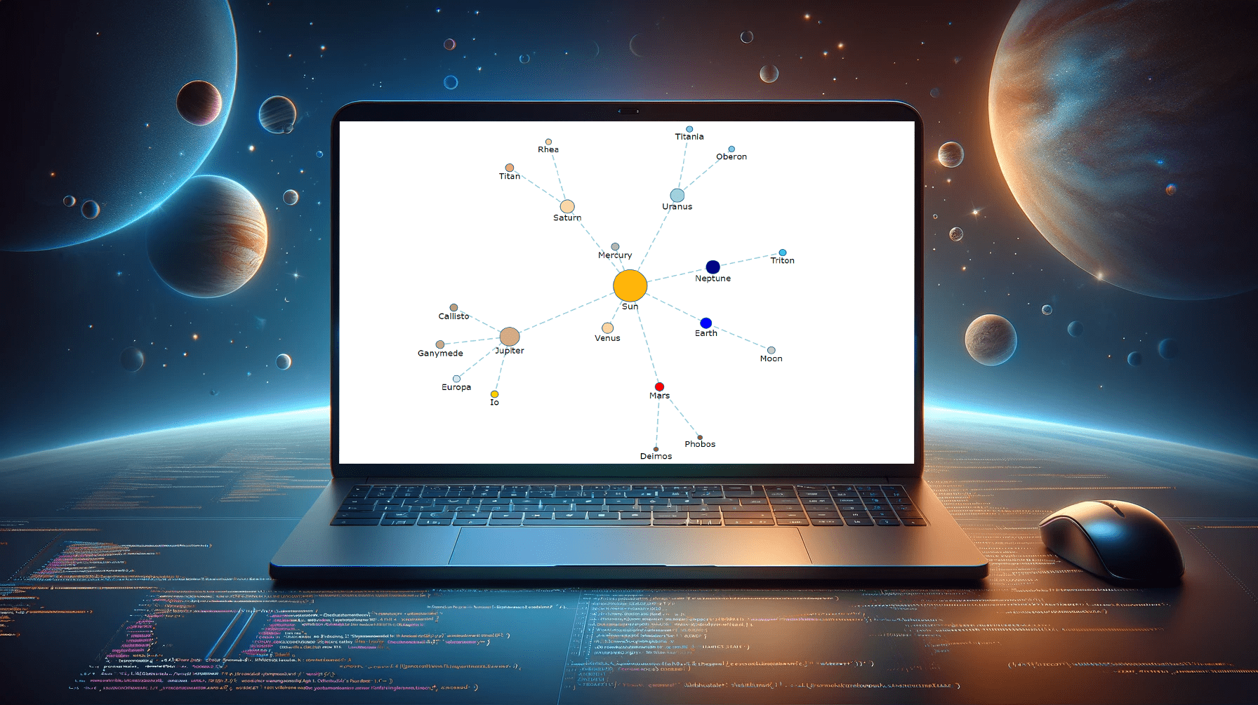 Creating a vibrant network graph in JavaScript might seem like crafting a digital cosmos: intricate, fascinating, yet entirely within reach. Whether you’re aiming to illustrate the complex interconnections within a galaxy, a social network, or the internal hierarchy of a multinational corporation, network graphs serve as a powerful tool to bring data to life, revealing hidden patterns and insights through visual representation.
Let’s embark on a journey to demystify the process, guiding you step-by-step on how to construct your very own network graph, with the Solar System as our illustrative example.
Read the JS charting tutorial »
April 12th, 2024 by AnyChart Team
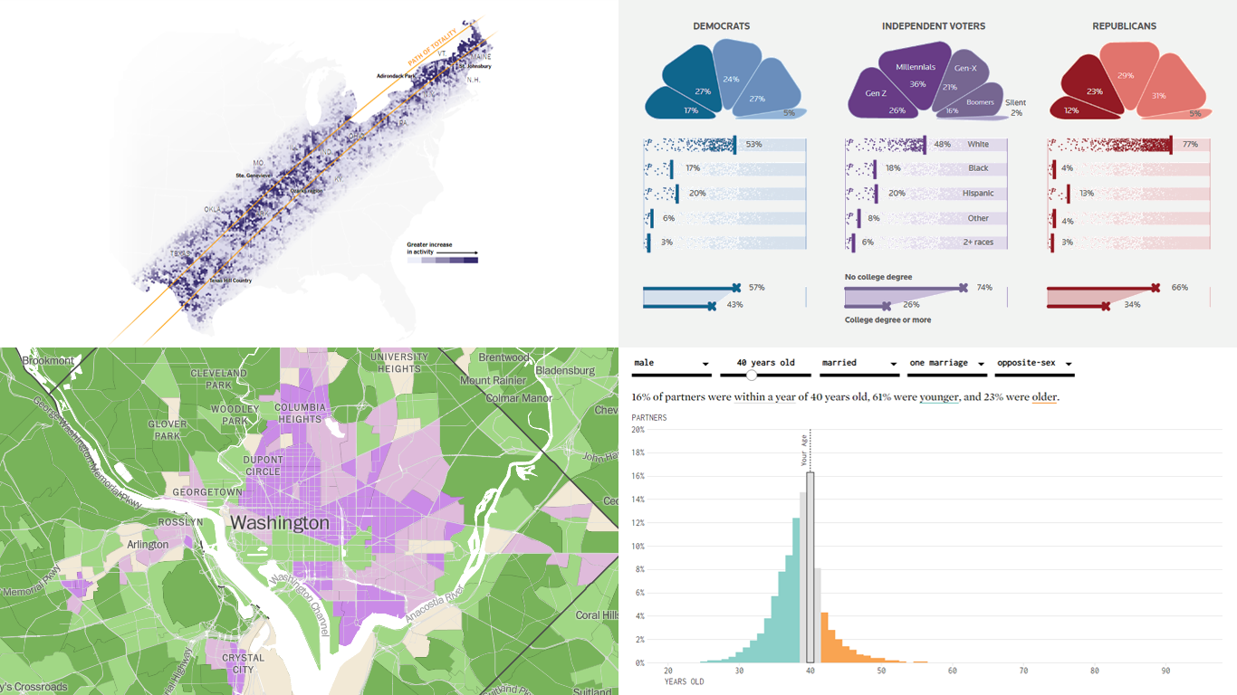
Welcome back to DataViz Weekly! We’re thrilled to restart our series, presenting each Friday a carefully curated selection of recent data visualizations that have caught our eye from around the web. These charts and maps serve as excellent examples of how data can be transformed into insightful and engaging graphical representations for understanding complex issues.
This time, we feature:
- Eclipse traffic and movements — The New York Times
- America’s access to natural spaces — The Washington Post
- Marital age patterns — FlowingData
- Profiling independent voters — Reuters
Join us as we take a closer look at these visualizations and check them out for a dose of inspiration.
Read more »
April 3rd, 2024 by AnyChart Team
 Listening to our community is foundational to our development efforts. In response to feedback from some of our customers, we’ve just added new features to the Decomposition Tree extension for Qlik Sense, aimed at enriching data insights. Here’s a quick overview.
Read more at qlik.anychart.com »
March 25th, 2024 by AnyChart Team
 An important note for Qlikkies: Are you ready to elevate your dashboards? Dive into our latest Qlik tutorial — discover the power of the Decomposition Tree and learn how to create it in Qlik Sense in about no time!
Learn more and watch the tutorial at qlik.anychart.com »
March 6th, 2024 by AnyChart Team
 Hey Qlikkies! Still burying insights under layers of charts and sheets? It’s time to break free from wrestling with complex datasets and win the hearts of your business users!
Join our exclusive webinar and meet the Decomposition Tree — a new powerhouse visualization that’s taken Power BI by storm and now graces Qlik Sense. This game-changer slices through data complexity, offering root cause analysis on a single sheet. Drilling down into the heart of any value with superhero speed has never been easier! No more juggling overcomplicated visuals — just instant insights, effortlessly.
Learn more and register »