27 Election Maps of 2024 U.S. Presidential Vote Results — DataViz Weekly Special Edition
November 8th, 2024 by AnyChart Team The 2024 U.S. presidential election has concluded, and media outlets worldwide are offering a plethora of data graphics to convey the election results. In this special edition of DataViz Weekly, we’ve curated a collection of over twenty election maps, showcasing diverse ways to represent voting data — cartograms, choropleth maps, bubble maps, and more. Whether you’re a data enthusiast, professional, or simply intrigued by the 2024 election outcomes, explore the latest U.S. election maps from top media!
💡 Also see our previous special editions with election maps: 2020 U.S. election maps and 2024 UK election maps.
- Categories: AnyMap, Dashboards, Data Visualization Weekly
- No Comments »
2021 Year in Review in Graphics — DataViz Weekly
December 31st, 2021 by AnyChart Team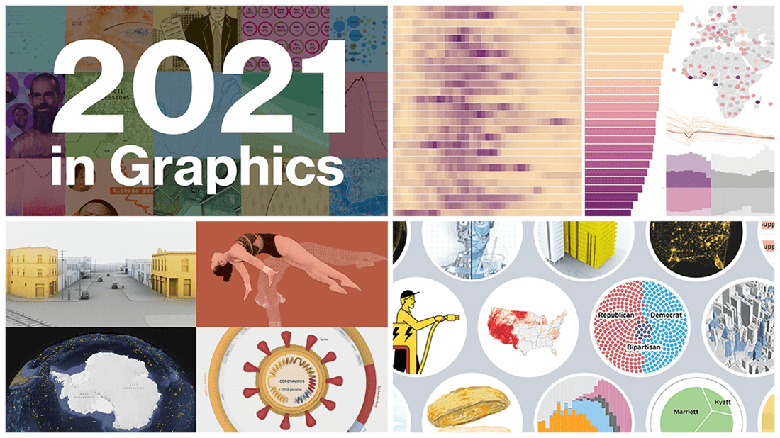 As we get ready to ring in the New Year 2022, it’s a great time to take a look back at 2021! Over the last 365 days, various experts in data graphics and visual storytelling have done their best to help us better understand what was going on around us with the help of static and interactive charts, maps, and infographics. Now we want to let you recall the most important matters that shaped the passing year from the lens of data visualization.
Here, in the final DataViz Weekly issue of 2021, we bring you a roundup of the year-in-review-in-graphics recaps on Bloomberg, The Wall Street Journal, The New York Times, and POLITICO.
Check it out, see the awesome visuals, and enjoy the start of a very happy, healthy, and prosperous new year that we wish you all to have in 2022! 😎🎉
- Categories: Data Visualization Weekly
- 1 Comment »
20+ Electoral Maps Visualizing 2020 U.S. Presidential Election Results — DataViz Weekly Special Edition
November 6th, 2020 by AnyChart Team All eyes on election maps! Yes, they could be misleading. And even widely misleading. But it can be at least so fascinating to look at them, especially at times like this! So, we have curated a list of over twenty reputable resources — as of now, to be precise, 24 and counting! — where you can watch the live results of the 2020 United States Presidential election in compelling data visualizations. At the same time, it is a great chance for you to investigate and understand how election maps (and some other graphics) can look and work in practice.
💡 See also: 2024 U.S. Election Maps (November 2024).
Vote counts may be different on different platforms and update as more data becomes available out there — it’s absolutely okay. The election results are still partial. Over the coming days, all numbers will be adjusted to match the real, final vote count. Just in case: We’ve added only reliable sources — notable, reputable media outlets.
Without further ado, check out maybe the most important data visualizations these days! (Electoral vote count numbers in the text last updated on November 9th, 2020, for each source.)
- Categories: Data Visualization Weekly, News, Third-Party Developers
- 3 Comments »
New Interesting Charts on China’s Rise, Top B-Schools, NFL, and Food Categorization — DataViz Weekly
December 21st, 2018 by AnyChart Team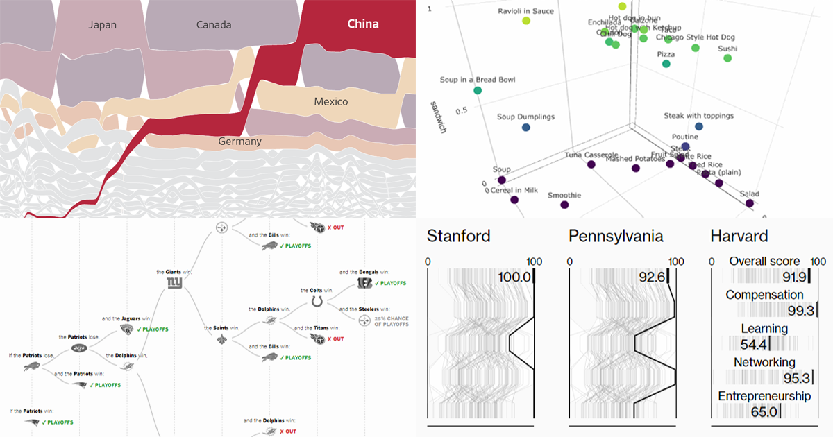 Get ready for another portion of new interesting charts from around the web! Here’s what topics are covered in the data visualization projects that have made it to DataViz Weekly this time:
- China as a trade Leviathan;
- top business schools in America and worldwide;
- NFL playoff paths for each team;
- food categorization as a sandwich, salad, or soup.
- Categories: Data Visualization Weekly
- No Comments »