New Interesting Data Visualizations on NBA, Spending, and Gender Pay Gap — DataViz Weekly
March 15th, 2019 by AnyChart Team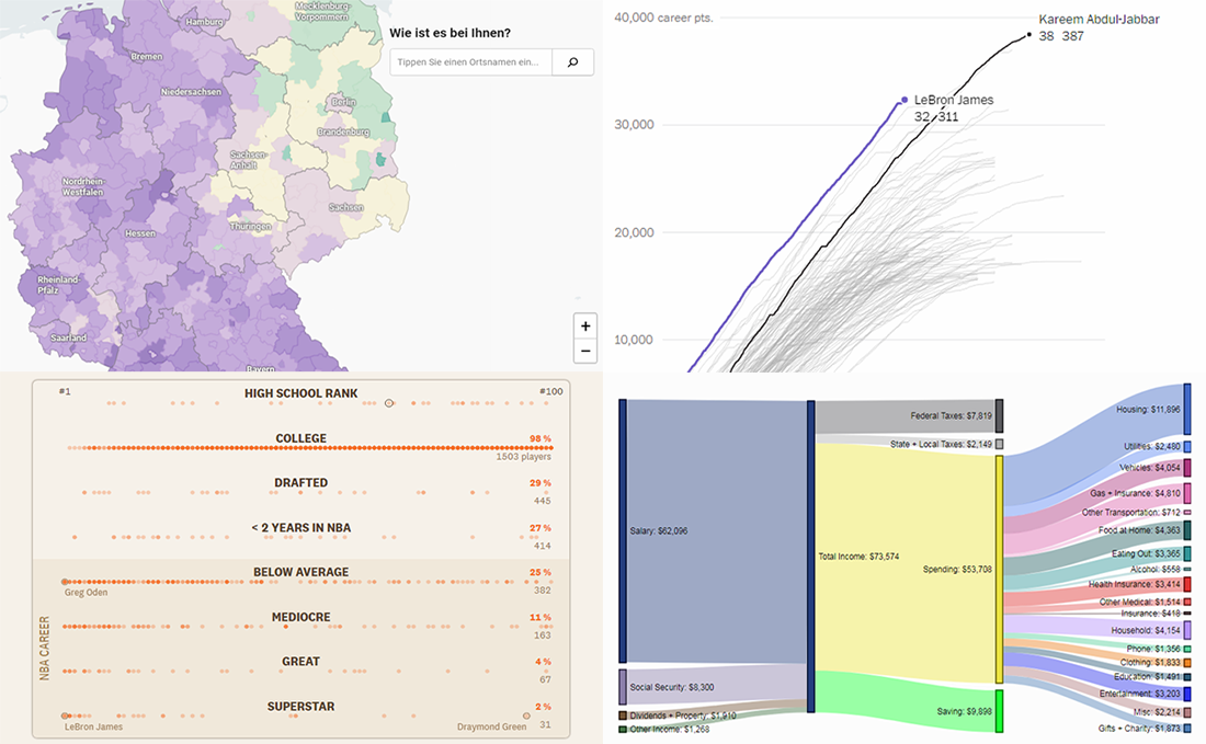 Continuing the regular DataViz Weekly feature on the AnyChart blog, today we are happy to tell you about new interesting data visualizations we’ve found these days — wonderful examples of charts designed for visual storytelling and analytics:
- gender pay gap in Germany;
- NBA’s all-time scoring leaders, now with LeBron James in top 4;
- from leading high school basketball players to NBA superstars;
- household spending in the United States, by income group.
- Categories: Data Visualization Weekly
- No Comments »
Qlik Extension Gets Gantt Chart and Tag Cloud in Version 2.5.0
November 6th, 2018 by AnyChart Team Following the 8.4.0 release of the AnyChart JS Charts library, now we’ve also got an awesome major update for our data visualization extension for Qlik Sense. Its version 2.5.0 is already available, adding Gantt Chart and Tag Cloud to the list of supported chart types.
Meet AnyChart Qlik Extension 2.5.0!
- Categories: AnyChart Charting Component, Qlik
- No Comments »
JS Sankey Diagram and Other Improvements in AnyChart 8.4.0 Released Just Now
October 8th, 2018 by AnyChart Team The year’s third major update for AnyChart is out, featuring the JS Sankey Diagram chart type as the ultimate centerpiece of the new release.
Learn more about AnyChart 8.4.0 and start making use of our updated JavaScript (HTML5) libraries for interactive data visualization right away.
- Categories: AnyChart Charting Component, AnyGantt, AnyMap, AnyStock, HTML5, JavaScript
- 1 Comment »