Stunning New Charts & Maps from Around Internet — DataViz Weekly
October 4th, 2024 by AnyChart Team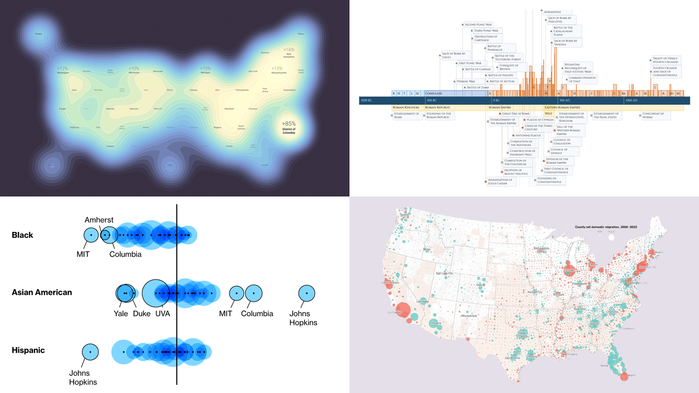 Charts and maps have a unique power to let data talk, transforming raw numbers into meaningful insights that anyone can grasp. In this edition of DataViz Weekly, we’re featuring some of the most stunning new examples of how data visualization brings information to life.
- Hazard-prone locations in the United States attracting migration — NYT
- Shifts in college admissions after the affirmative action ruling — Bloomberg
- Google search trends around U.S. elections — Google Trends and Truth & Beauty
- Interactive timeline of Roman history — AnyChart
- Categories: Data Visualization Weekly
- No Comments »
Creating Timeline Chart of Roman History Using JavaScript
October 3rd, 2024 by AnyChart Team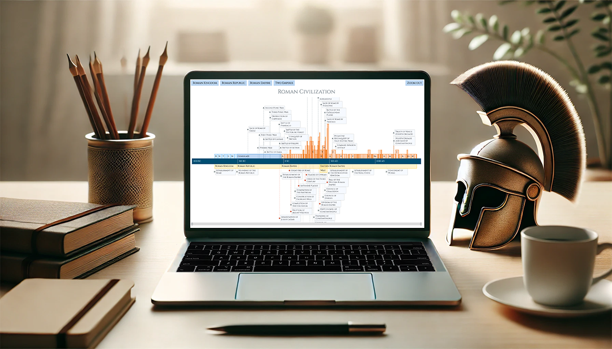 Ever caught yourself thinking about the Roman Empire more often than you’d like to admit? You’re not alone, and we’ve got just the thing for you! With the recent AnyChart JS Charts 8.13.0 release, we’ve enhanced our timeline chart for better support of historical data visualization. We’d love to showcase this improvement in action.
We’ve added a Roman History Timeline to our gallery of timeline chart examples, and we now invite you to discover how it was developed from scratch. In this in-depth JavaScript charting tutorial, we’ll cover everything from A to Z, meticulously guiding you through each step — from setting up the HTML environment to adding detailed data and customizing the visualization to make the chart both informative and engaging. The final result is an interactive timeline that you can proudly call your own Roman Empire.
So, whether you’re a history enthusiast caught up in the recent meme trend or a developer eager to expand your data visualization skills, follow along and learn how to create compelling historical timeline charts using JavaScript!
Read the JS charting tutorial »
- Categories: AnyChart Charting Component, Big Data, HTML5, JavaScript, JavaScript Chart Tutorials, Tips and Tricks
- No Comments »
Introducing AnyChart 8.13.0 for Elevated JavaScript Charting Experience
October 3rd, 2024 by AnyChart Team AnyChart 8.13.0 is now available, bringing a set of new features and improvements designed to further elevate your data visualization experience. In this release, we’ve focused on enhancing the Timeline, Waterfall, and Circle Packing charts in our JavaScript charting library, making them even more flexible and user-friendly. Read on to explore what’s new!
- Categories: AnyChart Charting Component, AnyGantt, AnyMap, AnyStock, Big Data, Business Intelligence, Dashboards, Financial Charts, Gantt Chart, HTML5, JavaScript, News, Stock Charts
- No Comments »
How to Make Timeline Chart (in JavaScript)
August 4th, 2022 by Shachee Swadia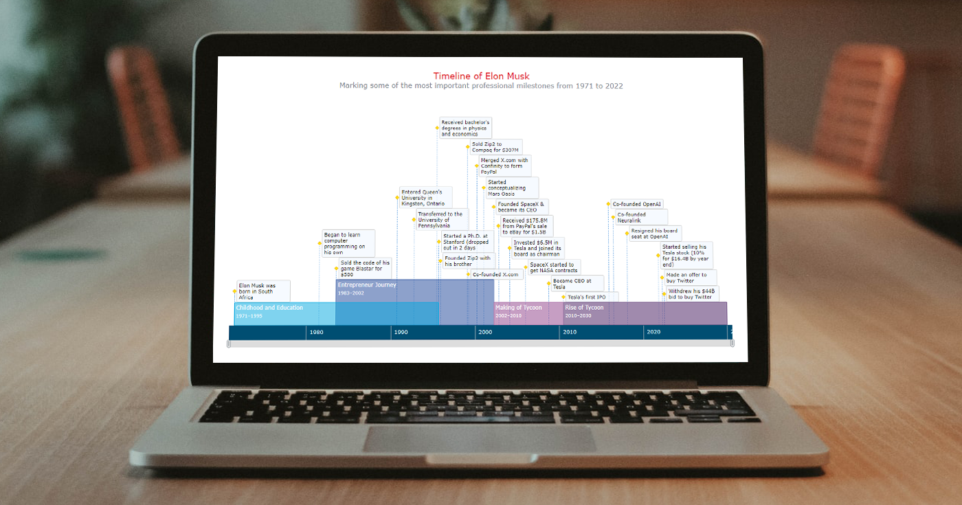 A timeline chart is an excellent way to represent important events and periods in chronological order. Now, let me teach you how to easily create an elegant interactive visualization like that using JavaScript!
To make this tutorial both helpful and entertaining, I decided to take real data. Join me as I visualize the life of Elon Musk in a JS timeline chart step by step, focusing on the most important events in his career as an entrepreneur and investor.
Read the JS charting tutorial »
- Categories: AnyChart Charting Component, HTML5, JavaScript, JavaScript Chart Tutorials, Tips and Tricks
- No Comments »
Maigret.de Picks AnyChart JS Charts to Visualize Data on Georges Simenon’s Work
December 29th, 2021 by AnyChart Team When data is all around, it’s no wonder to see charts here or there as they greatly help make sense of it. With thousands of happy customers worldwide, both for our JS charting library and Qlik charting extensions, we have seen countless applications for data visualization across all fields and industries. Some use cases, however, might be less expected than others. What about a website dedicated to literature?
Maigret.de — a remarkable resource about Georges Simenon, a famous Belgian writer best known for creating police detective Jules Maigret — has recently started to publish interactive data graphics revealing interesting patterns and facts in his immense work. All the charts on the website are built with AnyChart.
We have chatted with Maigret.de’s creator Oliver Hahn about his project, data visualizations, and experience using our solutions. Read the quick interview and go check out the website. (Stack: HTML/MySQL.)
- Categories: AnyChart Charting Component, Books, HTML5, JavaScript, Success Stories
- No Comments »
How to Create Interactive Timeline Chart with JavaScript
June 17th, 2021 by Shachee Swadia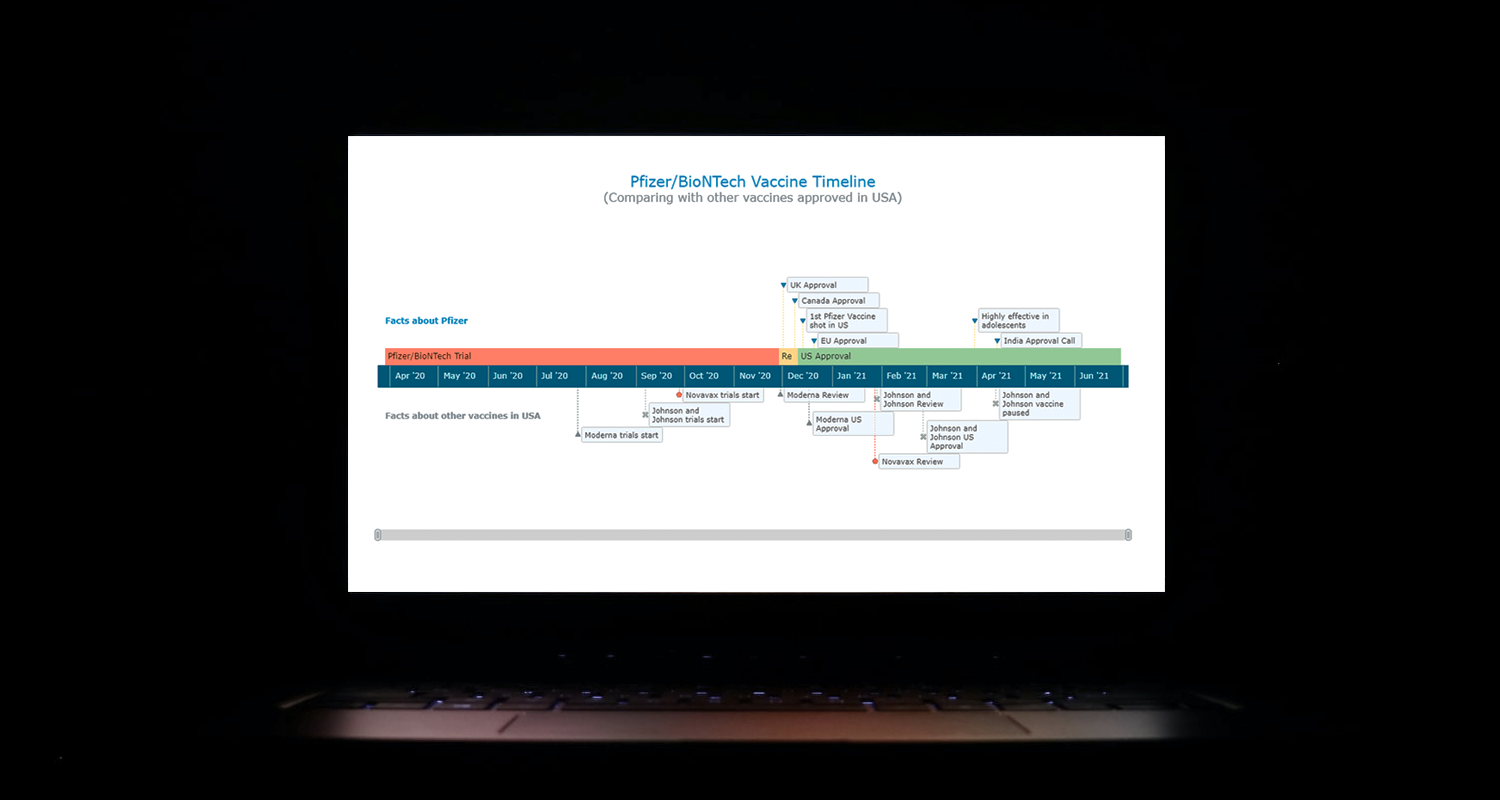 I think all of us have come across timelines somewhere or the other; as a means of conveying chronological information, the classic timeline is unmatched, both in the depth of information conveyed and the “cool” factor, when done with a deft creative touch. So, with that said, would you like to learn how to build a timeline chart using JavaScript that both looks great and is simple to create? (Of course, you do!) Follow along with me as I take you through the step-by-step breakdown for developing your own JS timeline with a practical example.
As the world continues to battle with COVID-19, the long-awaited good news is the development of vaccines across the globe. Here, I decided to build an interactive timeline that showcases the phases of Pfizer-BioNTech vaccine development in the United States. To add more contextual information, I also wanted to show approvals from other countries and some related facts, including the dates for the development of the 3 other vaccines approved for usage in the US.
Read the JS charting tutorial »
- Categories: AnyChart Charting Component, Big Data, Charts and Art, HTML5, JavaScript, JavaScript Chart Tutorials, Tips and Tricks
- No Comments »