Exploring Insights with Data Visualization — DataViz Weekly
May 3rd, 2024 by AnyChart Team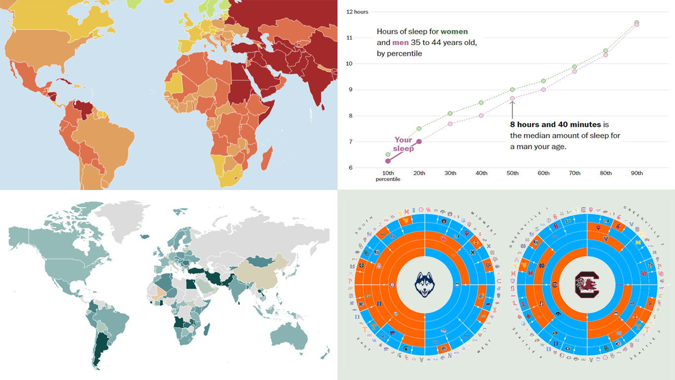 Welcome to the new DataViz Weekly, where we continue exploring the transformative power of data visualization. This edition presents a selection of new examples of how charts and maps can help us understand trends and patterns in various subjects — from sports and philanthropy to global challenges like press freedom and inflation, and everyday topics such as sleep. Here are the projects featured this time:
- March Madness philanthropy challenge — Bloomberg
- 2024 World Press Freedom Index — Reporters Without Borders
- Global Inflation Tracker — Council on Foreign Relations
- Sleep trends in America — The Washington Post
- Categories: Data Visualization Weekly
- No Comments »
Visualizing Data on Prices, Emissions, Workforce, Palm Oil — DataViz Weekly
November 12th, 2021 by AnyChart Team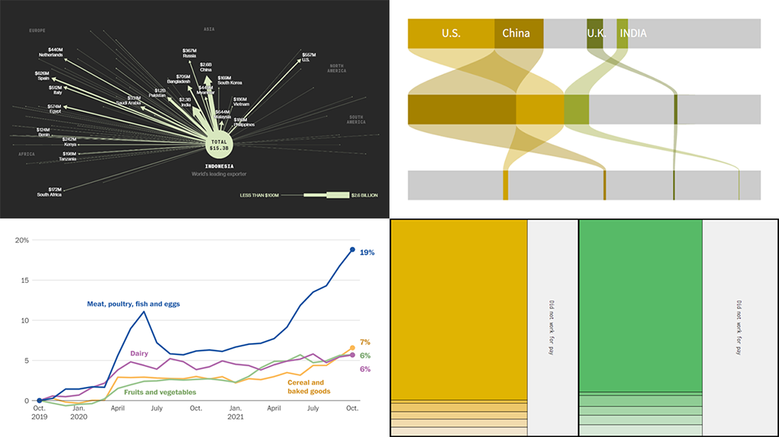 Hi everyone! DataViz Weekly is here to introduce you to some awesome new data visualizations that we have recently found out there and admired!
- Inflation in America — The Washington Post
- Carbon dioxide emissions by country — Reuters
- Shifts in how much U.S. men and women work — Nathan Yau
- Sustainable palm oil problem — Bloomberg Green
- Categories: Data Visualization Weekly
- No Comments »
Excellent Examples of Data Graphics from Around Internet — DataViz Weekly
August 27th, 2021 by AnyChart Team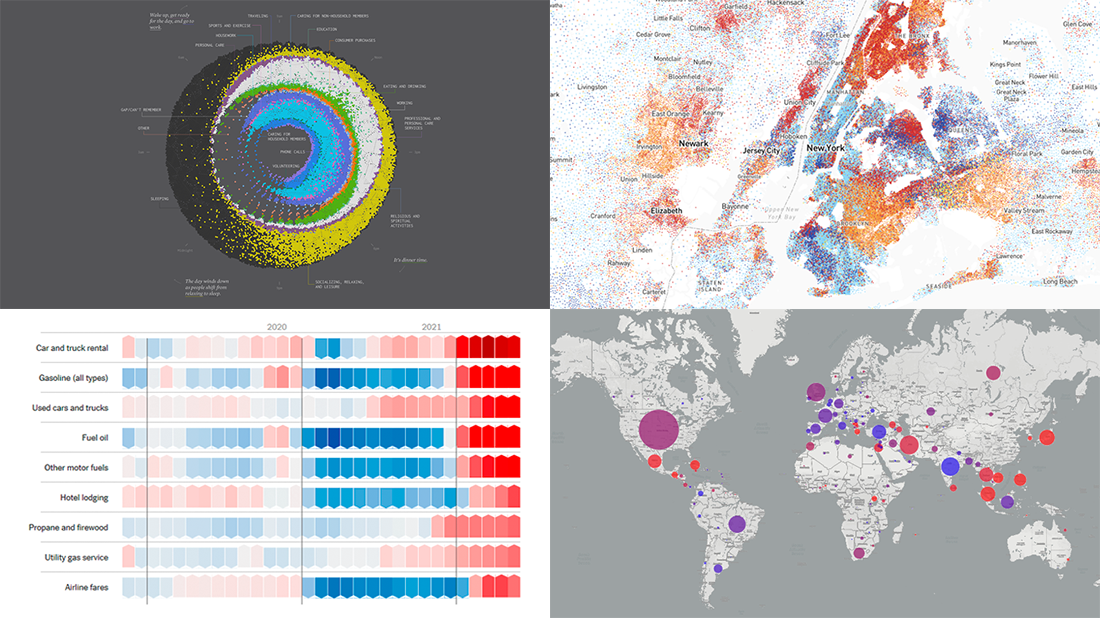 Are you ready for another set of excellent data graphics examples? It’s time! The following projects made it to the newest DataViz Weekly digest — see the list below and keep reading for a closer look!
- Average weekday in the life of Americans — Nathan Yau
- Race and ethnicity across the United States — CNN
- Inflation in the United States — NYT Opinion
- COVID-19 spread across the world over time — Olivia Jack
- Categories: Data Visualization Weekly
- No Comments »