Powering Financial Charts in Free Online Currency Converter by EODHD APIs
April 21st, 2025 by AnyChart Team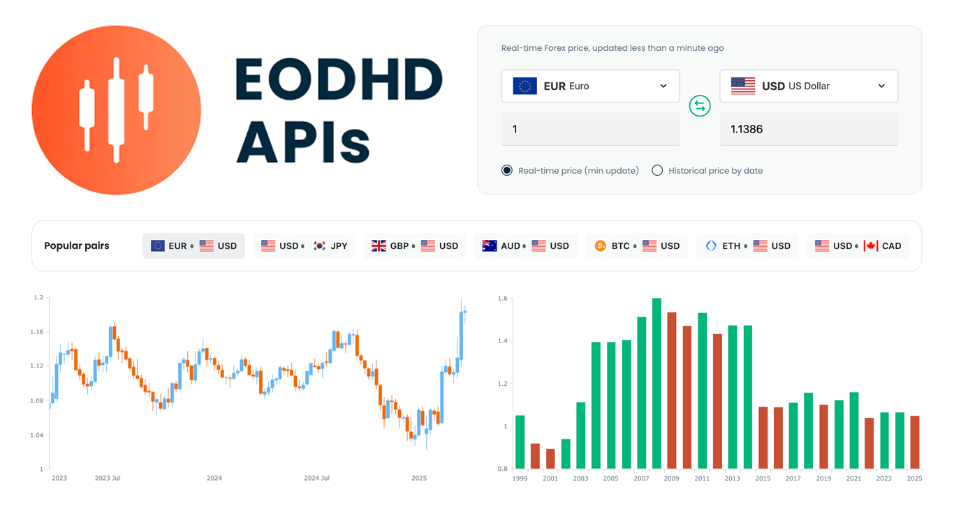 We are pleased to share that EODHD APIs, a prominent provider of financial market data, selected our JavaScript charting library to power charts in their new Online Currency Converter.
The tool provides free access to both live and historical exchange rates for more than 1,100 currency pairs. Interactive stock charts, built with our specialized AnyStock product, enrich numerical conversion data with clear visual context, providing insight into currency dynamics over time.
This case highlights how charts built with AnyChart can add clarity and usability to financial tools. Let’s take a closer look at how it works.
- Categories: AnyChart Charting Component, AnyStock, Big Data, Financial Charts, HTML5, JavaScript, News, Stock Charts, Third-Party Developers
- No Comments »
Pinch-to-Zoom in Stock Charts — JS Chart Tips
March 5th, 2025 by AnyChart Team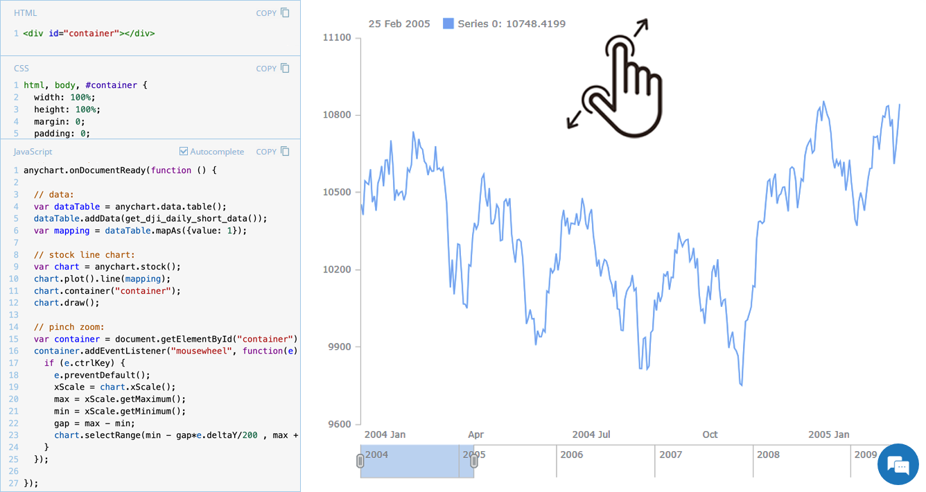 Stock charts are designed to handle large volumes of time-based data, and smooth navigation is key to working with them effectively. One common need is zooming — whether to focus on a specific time range in greater detail or to get a broader view of the data.
In our JavaScript stock charts, zooming works out of the box through the scroller element, which appears by default as the main navigational UI control, making it easy to adjust the visible range on the go. For even greater flexibility, the range selection UI provides extra tools like preset time period buttons and date input fields. You can also activate zooming via mouse wheel scrolling with the zoomOnMouseWheel() method, which corresponds to the two-finger swipe gesture on touchpads and trackpads.
Pinch-to-zoom is another intuitive zooming option. It allows users to zoom in and out naturally on mobile and touch devices by moving two fingers farther apart or closer together. This is also easy to implement — and it is exactly what we cover in this edition of JS Chart Tips. Learn how to add pinch-to-zoom to your JavaScript stock chart!
- Categories: AnyChart Charting Component, AnyStock, Big Data, Financial Charts, HTML5, JavaScript, JS Chart Tips, Stock Charts, Tips and Tricks
- No Comments »
Stock Chart with Custom Time Intervals — JS Chart Tips
January 30th, 2025 by AnyChart Team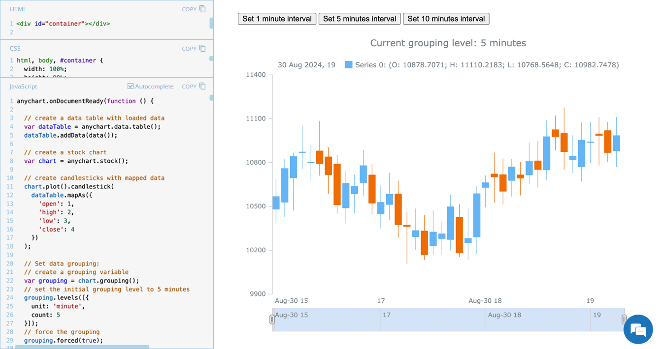 Grouping data points into appropriate time intervals is essential for making stock charts more readable and insightful. While raw data may be collected at a high frequency, such as every minute, financial analysts and traders often need to view broader trends, where grouping data into 5-minute, 15-minute, 1-hour, 1-day, and other time frames can provide clearer insights. In this edition of JS Chart Tips, we will walk you through the process of setting a custom time interval for a stock chart using our JavaScript charting library.
- Categories: AnyChart Charting Component, AnyStock, Big Data, Financial Charts, HTML5, JavaScript, JS Chart Tips, Stock Charts, Tips and Tricks
- No Comments »
Integrating AnyChart JS Charts in Python Django Financial Trading Dashboard
December 3rd, 2024 by Michael Whittle We are pleased to share an insightful article by Michael Whittle, a seasoned solution architect and developer with over 20 years of experience. Originally published on EODHD.com, it explores how he integrated our JavaScript charting library into a financial trading dashboard built with Python Django. Michael also shares his experience migrating a treemap from D3.js to AnyChart and explains why he chose our solution for implementing a stock chart, highlighting the intuitive code and enhanced functionality. Read on to discover how you can elevate your financial data visualizations in Python Django web applications with AnyChart JS Charts.
- Categories: AnyChart Charting Component, AnyStock, Big Data, Dashboards, Financial Charts, HTML5, JavaScript, Stock Charts, Third-Party Developers, Tips and Tricks
- No Comments »
Introducing AnyChart 8.13.0 for Elevated JavaScript Charting Experience
October 3rd, 2024 by AnyChart Team AnyChart 8.13.0 is now available, bringing a set of new features and improvements designed to further elevate your data visualization experience. In this release, we’ve focused on enhancing the Timeline, Waterfall, and Circle Packing charts in our JavaScript charting library, making them even more flexible and user-friendly. Read on to explore what’s new!
- Categories: AnyChart Charting Component, AnyGantt, AnyMap, AnyStock, Big Data, Business Intelligence, Dashboards, Financial Charts, Gantt Chart, HTML5, JavaScript, News, Stock Charts
- No Comments »
OHLC Chart: Understanding & Creating in JavaScript Step-by-Step
November 13th, 2023 by Awan Shrestha Unearthing insights from vast datasets is an intricate blend of art and science. In the realm of financial analysis, a pivotal instrument for visually exploring complex data is the Open-High-Low-Close (OHLC) chart. This tutorial is your roadmap to swiftly crafting your OHLC chart using JavaScript, a step-by-step journey. We’ll harness S&P 500 data, and by the end of this article, you’ll possess the skills to orchestrate visual stock analysis adeptly.
Read the JS charting tutorial »
- Categories: AnyChart Charting Component, AnyStock, Big Data, Business Intelligence, Financial Charts, HTML5, JavaScript, JavaScript Chart Tutorials, Stock Charts, Tips and Tricks
- No Comments »
Stock Chart Creation in JavaScript: Step-by-Step Guide
September 5th, 2023 by Shachee Swadia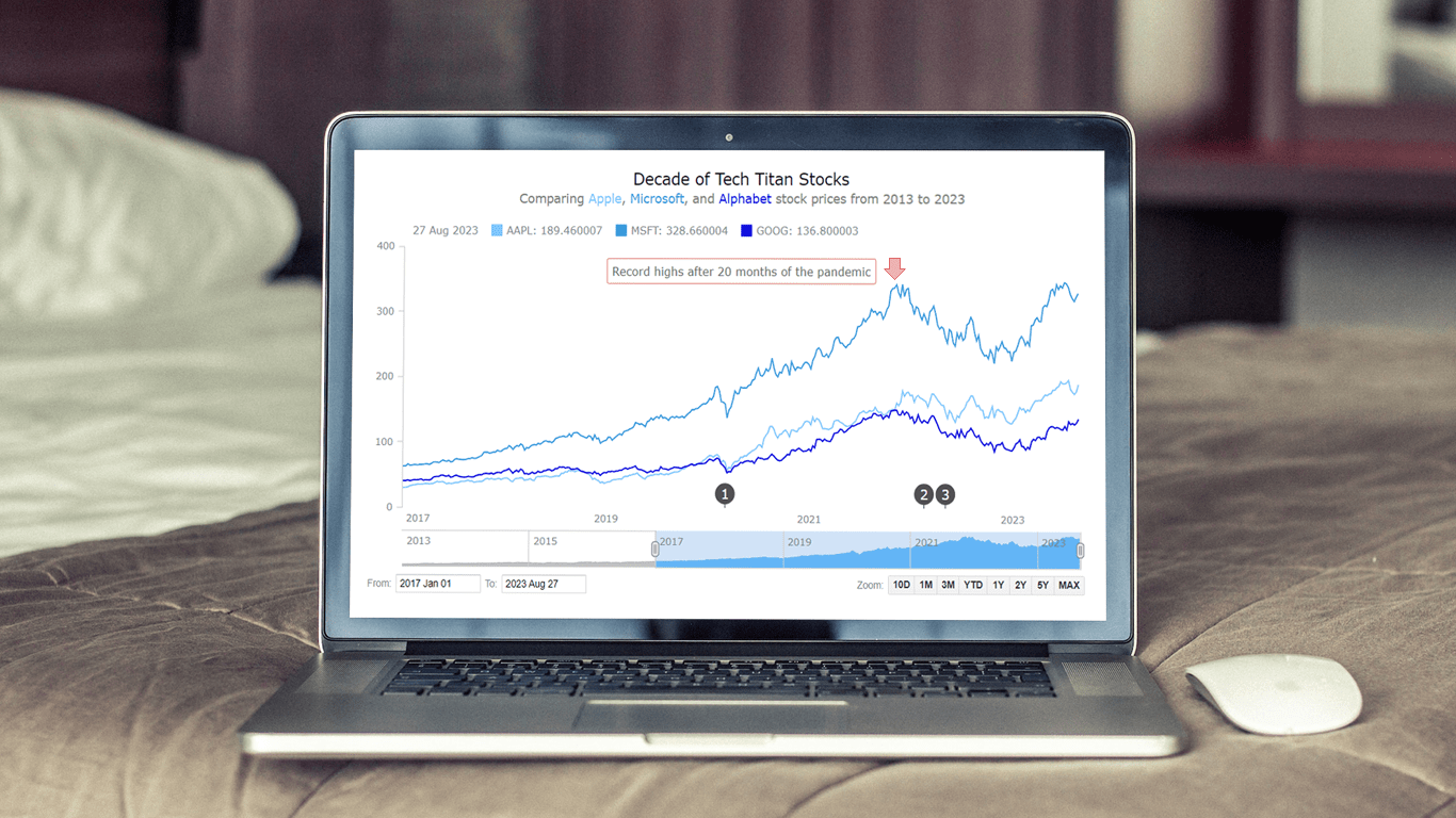 Chances are, you’ve come across various stock charts, whether you’re a seasoned trader or not. If crafting your data graphics piques your interest, you’re in the right place. Welcome to this user-friendly tutorial on building an interactive stock chart using JavaScript!
The JS stock chart we’ll create by the end of this guide will visually compare stock prices for three tech giants — Apple, Microsoft, and Google (Alphabet) — over the past decade. It’s a robust example to illustrate the stock charting process and the power of market data visualization.
So, hop on board as we explore the world of stock charts and learn how to create one from scratch.
Read the JS charting tutorial »
- Categories: AnyChart Charting Component, AnyStock, Big Data, Financial Charts, HTML5, JavaScript, JavaScript Chart Tutorials, Stock Charts, Tips and Tricks
- No Comments »
Building Stock Chart with JavaScript
February 24th, 2022 by Shachee Swadia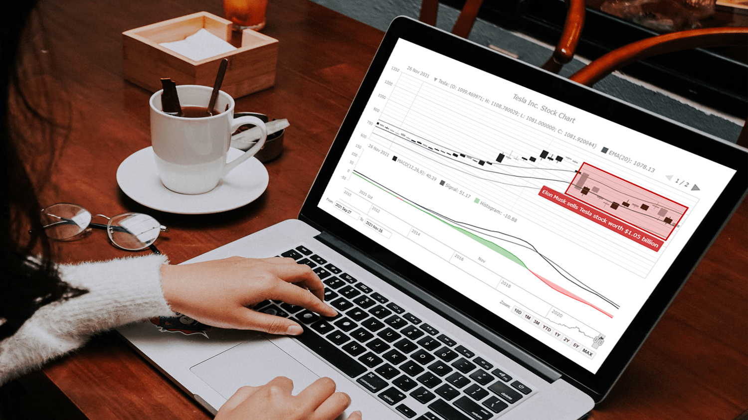 Data visualization is vastly applied in various fields. One such domain is financial trading, where stock charts are essential for smart market data analysis and decision making. Whether you invest in stocks or not, I am pretty sure that you have come across such graphics or even might need to build one right now. So, would you like to know how to make a stock chart? I’m ready to show you an easy path using the Tesla stock price data and JavaScript! Come along with me throughout this tutorial and you’ll learn how to quickly create elegant, interactive JS stock charts like the one you see in the picture.
Read the JS charting tutorial »
- Categories: AnyChart Charting Component, AnyStock, Big Data, Financial Charts, HTML5, JavaScript, JavaScript Chart Tutorials, Stock Charts, Tips and Tricks
- No Comments »
How to Create Financial Open-High-Low-Close (OHLC) Chart Using JavaScript
September 7th, 2021 by Shachee Swadia A stepwise guide on how to create interactive financial charts in the form of an OHLC chart. Visualizing the stock prices of Amazon over the course of Jeff Bezos’s tenure as the CEO.
Financial charts are especially useful to represent large amounts of data and identify trends. Would like to learn one such cool financial chart called the OHLC chart that visualizes stock price movement?
Read the JS charting tutorial »
- Categories: AnyChart Charting Component, AnyStock, Big Data, Financial Charts, HTML5, JavaScript, JavaScript Chart Tutorials, Stock Charts, Tips and Tricks
- No Comments »
Creating Waterfall Chart with JS
March 16th, 2021 by Dilhani Withanage Do you want to know how to easily add a waterfall chart to a web page or application using JavaScript? This tutorial will make sure you’re prepared to confidently deal with that sort of interactive data visualization development!
Waterfall charts illuminate how a starting value turns into a final value over a sequence of intermediate additions (positive values) and subtractions (negative values). These additions and subtractions can be time-based or represent categories such as multiple income sources and expenditures. In finance, a waterfall chart is often called a bridge; you may have also heard it referred to as a cascade, Mario, or flying bricks chart.
To see waterfall charts in action and learn how to build them with JavaScript (HTML5), we need some interesting real-world data to visualize. In this tutorial, let’s look at the 2020 income statement for Alphabet Inc. (GOOGL), the parent company of Google.
Hence, be with me to reach our target step by step, so in the end, you’ll see how a lot of numbers can be made sense of with real ease when illustrated as a beautiful, interactive, JS waterfall chart. All aboard!
Read the JS charting tutorial »
- Categories: AnyChart Charting Component, Business Intelligence, HTML5, JavaScript, JavaScript Chart Tutorials, Tips and Tricks
- No Comments »