Politics Across New Data Visualizations — DataViz Weekly
April 4th, 2025 by AnyChart Team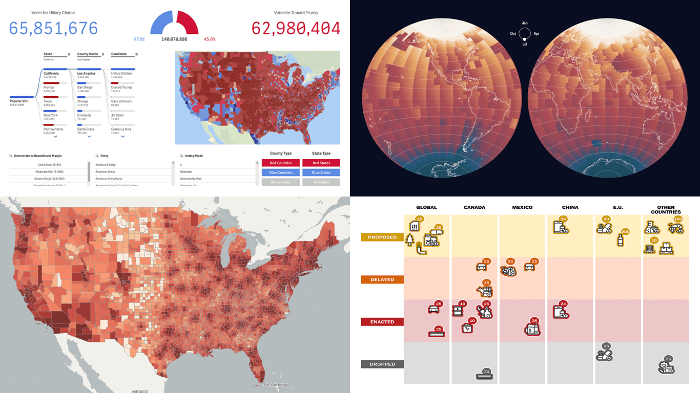 Politics shapes the world in many ways — and, as always, data visualization helps make sense of it all. This time in DataViz Weekly, we are looking at how charts and maps reflect political shifts, decisions, and consequences — from election results and government budgets to tariff policies and even time zones.
One of these projects is ours. We hesitated for a moment — but let’s be honest, we would have featured it anyway if we had stumbled upon it elsewhere.
So, without further ado, here are the four new data visualization projects we think you’ll want to check out:
- U.S. presidential elections — AnyChart
- Trump tariffs timeline — The Washington Post
- Science funding cuts in the United States — SCIMaP
- Politics of time zones — The Economist
- Categories: Data Visualization Weekly
- No Comments »
Insightful Data Visualizations You Need to See — DataViz Weekly
March 7th, 2025 by AnyChart Team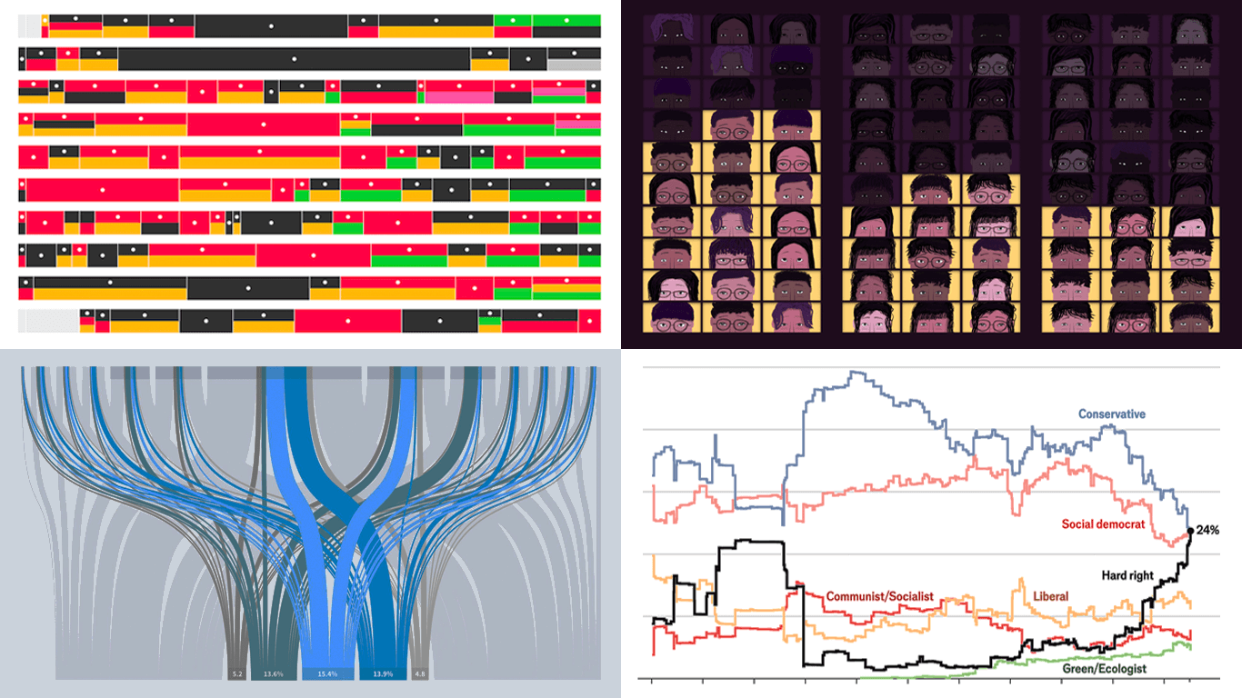 Data visualization is powerful — when done right, it conveys meaning clearly and helps insights emerge naturally. We continue DataViz Weekly, where we regularly highlight some excellent examples from around the internet, offering a firsthand look at how graphical representation can effectively reveal and clarify information. This time, we think you just need to see the following:
- U.S. imports and tariffs — Reuters
- Coalition scenarios in Germany — Bloomberg
- Hard-right parties in Europe — The Economist
- Emotional experiences of middle schoolers — The Pudding
- Categories: Data Visualization Weekly
- No Comments »
New Selection of Significant Data Visualization Examples — DataViz Weekly
February 28th, 2025 by AnyChart Team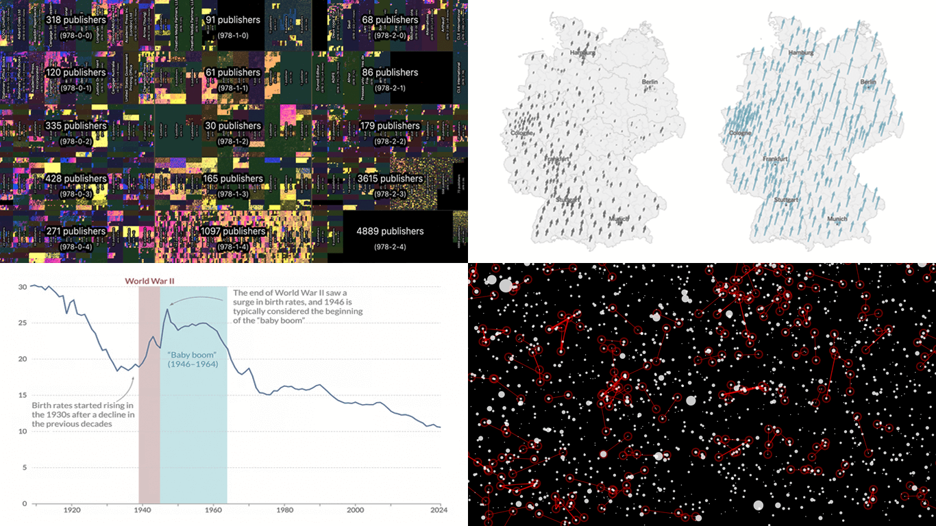 Our JavaScript charting library, Qlik Sense extensions, and other products give you the flexibility to visualize data how, where, and when you need. But making a chart or map truly effective — whether for exploration or explanation — is an art of its own. That is why we run DataViz Weekly: to share a selection of significant examples we have recently encountered, showcasing how others tackle visualization challenges across different contexts and datasets.
Here are some new examples — take a closer look and see what insights they might inspire:
- All books in the ISBN space — phyresky
- Germany’s 2025 federal election — The New York Times (and more)
- Baby boom in 7 charts — Our World in Data
- School shootings in America — Mohamad Waked
- Categories: Data Visualization Weekly
- No Comments »
Data Visualization in Action: Fresh Examples — DataViz Weekly
February 14th, 2025 by AnyChart Team We’re back with DataViz Weekly, where we showcase some of the best new data visualization examples — from individual charts and maps to full-scale visual stories and projects. Take a look at our latest picks:
- Swiss research funding — Colas Droin
- Education and voting patterns in U.S. presidential elections — Jon Boeckenstedt
- City walkability and improvement potential — The Economist & Matteo Bruno et al.
- Self-censorship in Super Bowl halftime shows — Artur Galocha for The Washington Post
- Categories: Data Visualization Weekly
- No Comments »
Awesome New Data Visualization Works — DataViz Weekly
November 15th, 2024 by AnyChart Team Welcome back to DataViz Weekly, where we spotlight the most awesome data visualization works we have recently come across. Check out the projects we’re diving into this time:
- Love songs: death or evolution? — The Pudding
- Historical dry streaks in NYC — Bloomberg Green
- NYC subway ridership in detail — Subway Stories
- Vote swings in U.S. presidential elections — NYT
- Categories: Data Visualization Weekly
- No Comments »
27 Election Maps of 2024 U.S. Presidential Vote Results — DataViz Weekly Special Edition
November 8th, 2024 by AnyChart Team The 2024 U.S. presidential election has concluded, and media outlets worldwide are offering a plethora of data graphics to convey the election results. In this special edition of DataViz Weekly, we’ve curated a collection of over twenty election maps, showcasing diverse ways to represent voting data — cartograms, choropleth maps, bubble maps, and more. Whether you’re a data enthusiast, professional, or simply intrigued by the 2024 election outcomes, explore the latest U.S. election maps from top media!
💡 Also see our previous special editions with election maps: 2020 U.S. election maps and 2024 UK election maps.
- Categories: AnyMap, Dashboards, Data Visualization Weekly
- No Comments »
Fresh Data Visuals That Impressed Us — DataViz Weekly
November 4th, 2024 by AnyChart Team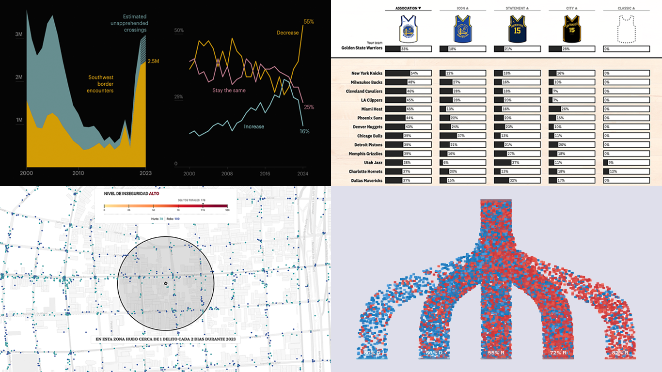 We’re a bit behind schedule after last week’s big release of updates for our Qlik Sense extensions, including the transformative AI Splits feature in the Decomposition Tree. But finally, here we are with a fresh edition of DataViz Weekly! Check out the projects with charts and maps that stood out to us most lately:
- U.S. immigration trends in historical context — ProPublica
- Crime trends in Buenos Aires — LA NACION
- Evolution of NBA uniform colors — The Pudding
- Internal migration and political polarization in the United States — The Upshot
- Categories: Data Visualization Weekly
- No Comments »
Top Data Visualizations We’ve Recently Seen — DataViz Weekly
October 18th, 2024 by AnyChart Team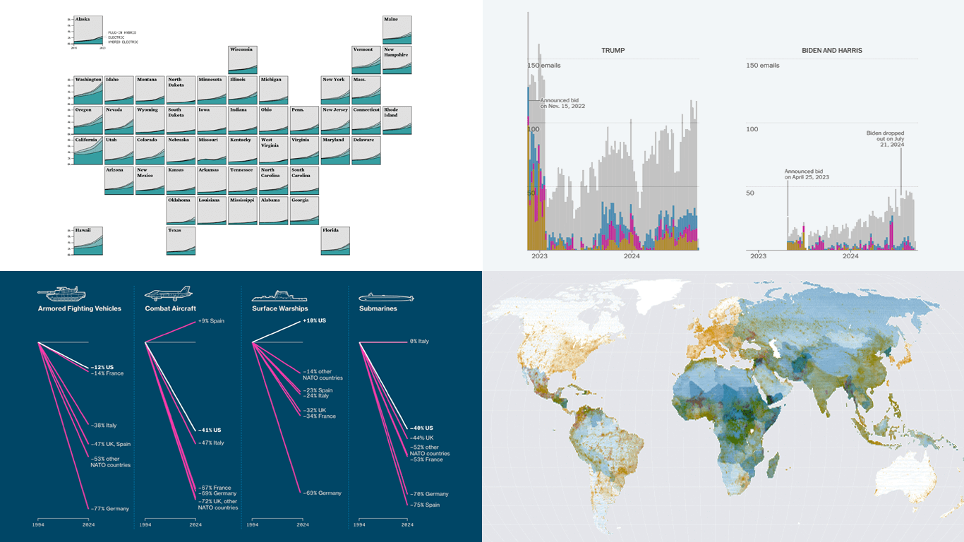 It’s Friday, which means it’s the perfect moment to look back at the data visualizations that have sparked our curiosity over the past few days. So, without further ado, welcome to DataViz Weekly!
- Electric vehicle adoption across the United States — FlowingData
- Europe’s military reductions and defense challenges — Bloomberg
- Climate—Conflict—Vulnerability Index for global risk assessment — UniBw München, PIK, AA, Truth & Beauty
- Campaign emails with donation incentives in the 2024 U.S. presidential race — The New York Times
- Categories: Data Visualization Weekly
- No Comments »
Stunning New Charts & Maps from Around Internet — DataViz Weekly
October 4th, 2024 by AnyChart Team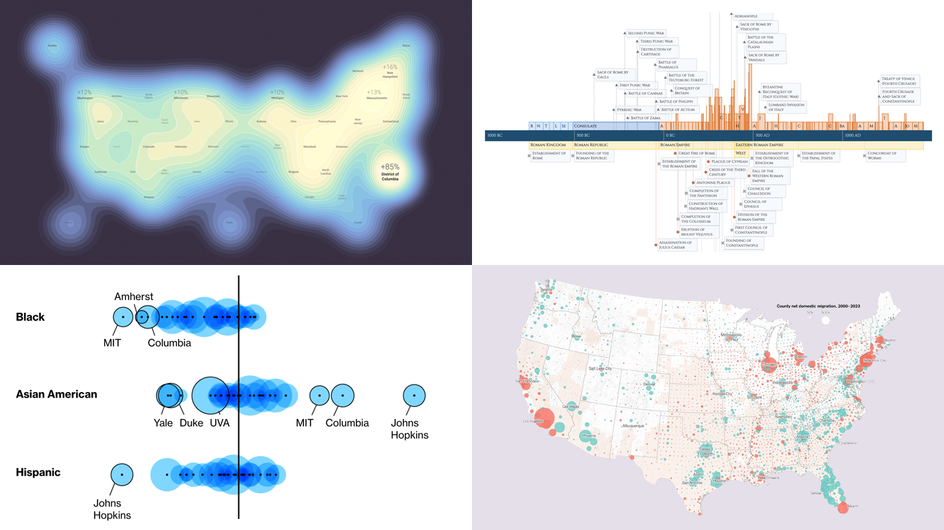 Charts and maps have a unique power to let data talk, transforming raw numbers into meaningful insights that anyone can grasp. In this edition of DataViz Weekly, we’re featuring some of the most stunning new examples of how data visualization brings information to life.
- Hazard-prone locations in the United States attracting migration — NYT
- Shifts in college admissions after the affirmative action ruling — Bloomberg
- Google search trends around U.S. elections — Google Trends and Truth & Beauty
- Interactive timeline of Roman history — AnyChart
- Categories: Data Visualization Weekly
- No Comments »
Discovering Fresh Compelling Visual Data Stories — DataViz Weekly
September 20th, 2024 by AnyChart Team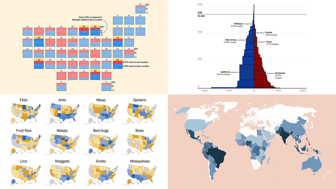 When properly visualized, data comes to life and reveals the stories hidden within the numbers. In this edition of DataViz Weekly, we showcase a selection of new projects that present data in compelling and insightful ways. Let’s dive into the visual data stories that caught our attention this week.
- Neglected tropical diseases — Nexo
- Migrants in U.S. swing states — Bloomberg
- Decisive votes in U.S. presidential elections — The Guardian
- What Americans are searching to kill — The Washington Post
- Categories: Data Visualization Weekly
- No Comments »