Tesla Sales, Brexit Vote, Birth Costs, Health Disparities — DataViz Weekly
January 25th, 2019 by AnyChart Team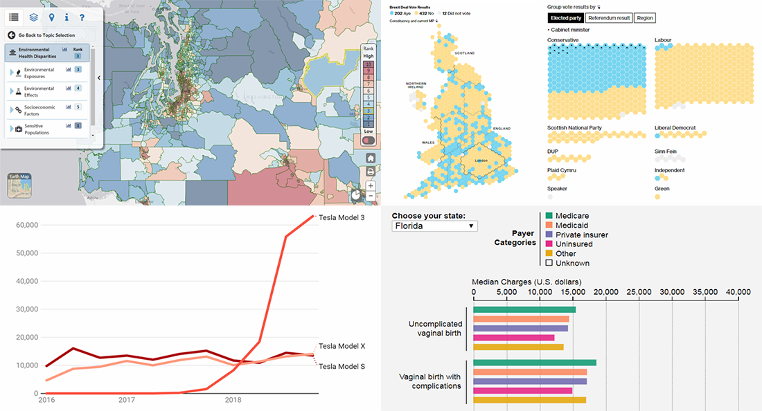 In the new DataViz Weekly post, we highlight interesting interactive data visualizations that have come to our attention this week. Take a look at charts showing details about Tesla sales, Brexit vote in the British Parliament, birth charges in American hospitals, and environmental health disparities in the Washington state.
- Categories: Data Visualization Weekly
- No Comments »
Data Analysis Through Visualization in New Examples: Citywide Migration, Cost of Living, #JobsNotMobs, Urban Evolution — DataViz Weekly
November 16th, 2018 by AnyChart Team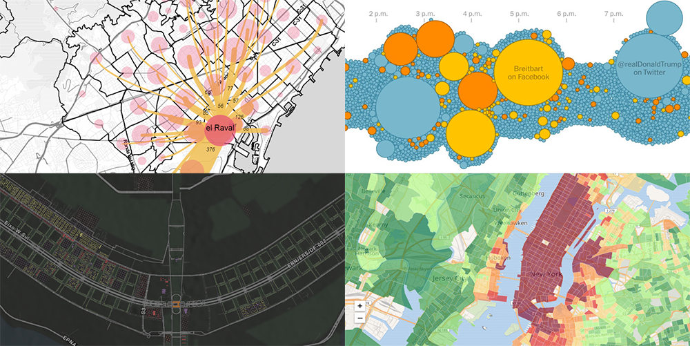 With visualization, data analysis can get easier, faster, and more insightful. In this DataViz Weekly article, we’ll share a few more interesting practical examples we’ve recently come across:
- internal migration paths in Barcelona;
- cost of living in the United States;
- #JobsNotMobs meme transition onto a slogan;
- urban evolution of Brasilia.
- Categories: Data Visualization Weekly
- No Comments »
2018 Midterm Election Results in Data Visualization — DataViz Weekly
November 9th, 2018 by AnyChart Team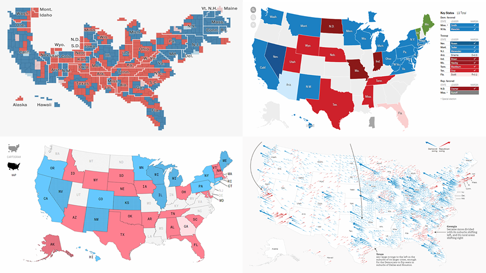 The 2018 midterm election in the United States of America has been among the hottest topics on the media agenda for quite a long time. Various publications were covering the course of the House, Senate, and governor campaigns, sharing forecasts from analysts, and so on. Now that voting is over, all eyes are on the outcome.
Today’s DataViz Weekly will show you how several prominent publications communicated the results of the midterms to their readers with the help of data visualization techniques: The New York Times, The Washington Post, Bloomberg, and The Guardian. So get ready for a lot of choropleth maps! But not only.
- Categories: Data Visualization Weekly
- 1 Comment »
Choose Right Chart Type for Data Visualization. Part 7: Geovisualization with Maps (Geo-Related Data)
May 24th, 2017 by AnyChart Team Geovisualization and map-based analysis of geo-data sets related to given territories or spatial environments can provide significant insight into trends and assist greatly in exploring and associating the impacts of variables. Nowadays, maps are used for data visualization very frequently, both as standalone geovisualizations and part of complex dashboards.
In this new article within the framework of our Choose Right Chart Type for Data Visualization series, we’ll write about map charts and explain how (when) to properly use each of corresponding types.
- Categories: Choosing Chart Type, Tips and Tricks
- No Comments »
Web Analytics Dashboard – Made With JS Maps and Charts Powered by AnyChart
October 19th, 2016 by AnyChart TeamIn today’s world of data, a well-designed web analytics dashboard is a must-have for everyone who is managing a website, a web app, or a number of various web projects. You get tons of statistics about traffic, and you should make them work and help you make right decisions.
How much traffic are you getting? Who are your visitors? Where are they coming from? And maybe even most important – is your marketing strategy working well? It gets much easier and takes significantly less time to answer all these questions when the data is visualized. Here comes an interactive analytics dashboard that allows you to have your data organized, see everything at-a-glance, and pay sufficient attention to all metrics that are important to you.
First-class dashboarding experience is one of the biggest advantages of our interactive data visualization solutions. JavaScript graphs, maps, and stock charts powered by AnyChart can be easily put on a single, effective, interactive HTML5 dashboard, making your traffic data analytics even more powerful and insightful. And here is another great example – Web Audience Dashboard, freshly made by the team of AnyChart for your inspiration.
Look at this:

(large image / interactive version)
And now we definitely should take note of some composition and development features of this dashboard.
- Categories: AnyChart Charting Component, AnyMap, Business Intelligence, Dashboards, HTML5, JavaScript, Tips and Tricks
- No Comments »