January 21st, 2026 by AnyChart Team
 Microsoft Excel has been declared obsolete countless times. Yet even with the rise of modern BI platforms like Qlik Sense by Qlik, spreadsheets remain central in enterprise analytics. And that is unlikely to change anytime soon.
These two worlds are not rivals; they complement each other. Qlik Sense delivers trusted data, scale, and interactive dashboards. Excel gives formulas, quick checks, and everyday collaboration in an interface everyone knows. Together, they bring a single source of truth plus the familiar flexibility of spreadsheets.
This article provides a comprehensive guide to using Excel with Qlik Sense. We will cover methods from simple exports and imports to advanced integrations such as automated reporting, live connectors, and embedding fully functional spreadsheets directly into Qlik dashboards.
Continue reading at qlik.anychart.com »
January 16th, 2026 by AnyChart Team
 DataViz Weekly is back on the AnyChart blog! It is our regular roundup where we share the most interesting data visualization work we have come across recently. In this edition:
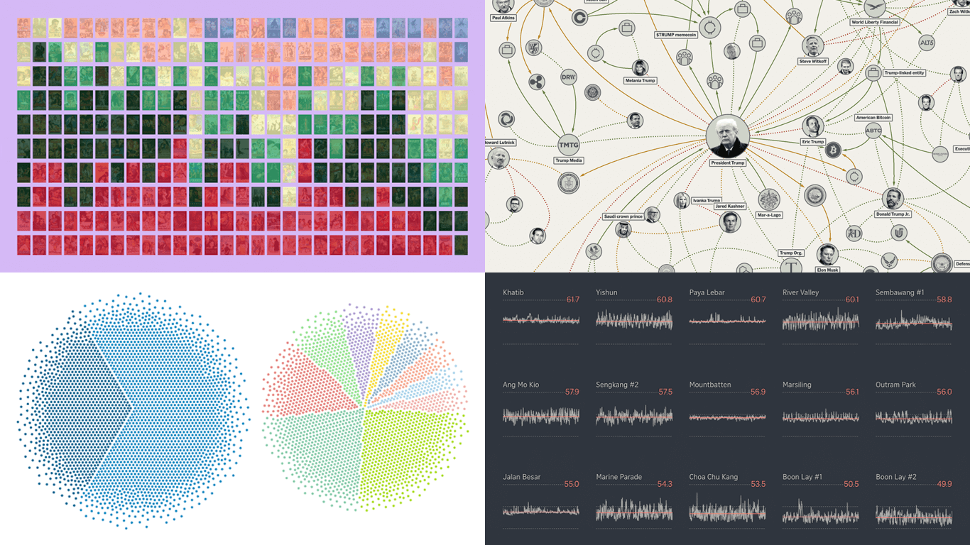
- Bollywood’s shift away from romance — Kontinentalist
- Homeland Security footprint in Minnesota — The Minnesota Star Tribune
- Traffic noise inside Singapore homes — The Straits Times
- Trump deal connections — The New York Times
Read more »
January 9th, 2026 by AnyChart Team
 In 2025, data visualization kept proving its value as a practical way to work through complexity without losing the thread. From conflict and humanitarian crises to climate risks, technology, culture, and long-running social trends, charts and maps helped people see structure, scale, and change more clearly.
This special edition of DataViz Weekly brings together the best data visualizations of 2025 as selected in major year-end picks. It features selections from FlowingData, GIJN, The Pudding, and Datawrapper, followed by a set of newsroom year-in-graphics roundups for more storytelling standouts from across the year.
Read more »
December 23rd, 2025 by AnyChart Team
 As 2025 winds down, we want to say thank you to our customers, partners, and everyone who builds and uses analytics every day. Merry Christmas and Happy New Year from all of us at AnyChart!
Closing out 2025, we are sharing this holiday sweater as a small nod to a theme we focused on this year ?
Read more »
December 19th, 2025 by AnyChart Team
 If you love good charts and maps or want inspiration for your own work, you are in the right place. DataViz Weekly rounds up great new data visualization examples from around the web. In this edition:
- Time with others across the day — Nathan Yau
- Housing potential of NYC parking lots — Tom Weatherburn
- China’s rise in global trade — Our World in Data
- AI questions beyond tech earnings — Bloomberg
Read more »
December 17th, 2025 by AnyChart Team
 Many teams still rely on Excel because it is familiar, flexible, and fast for ad-hoc analysis. But when spreadsheet work happens outside Qlik, it often means extra exports, duplicate files, and numbers that can drift away from what your dashboards show.
This tutorial shows how to create an Excel-style spreadsheet directly inside Qlik Sense using the Spreadsheets extension, so users can work in a familiar spreadsheet interface without leaving the app.
See the tutorial at qlik.anychart.com »
December 12th, 2025 by AnyChart Team
 Welcome to DataViz Weekly, where we highlight strong examples of data visualization in action. Take a look at the projects that stood out to us this week:
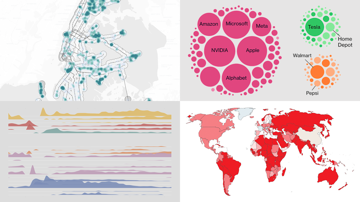
- Global defense industry at record highs — Reuters
- Climate-driven rise in home insurance costs — The New York Times
- Interactive Star Wars galaxy map — Tim Sircoloumb
- Sizes of life on Earth — Neal Agarwal
Read more »
December 5th, 2025 by AnyChart Team
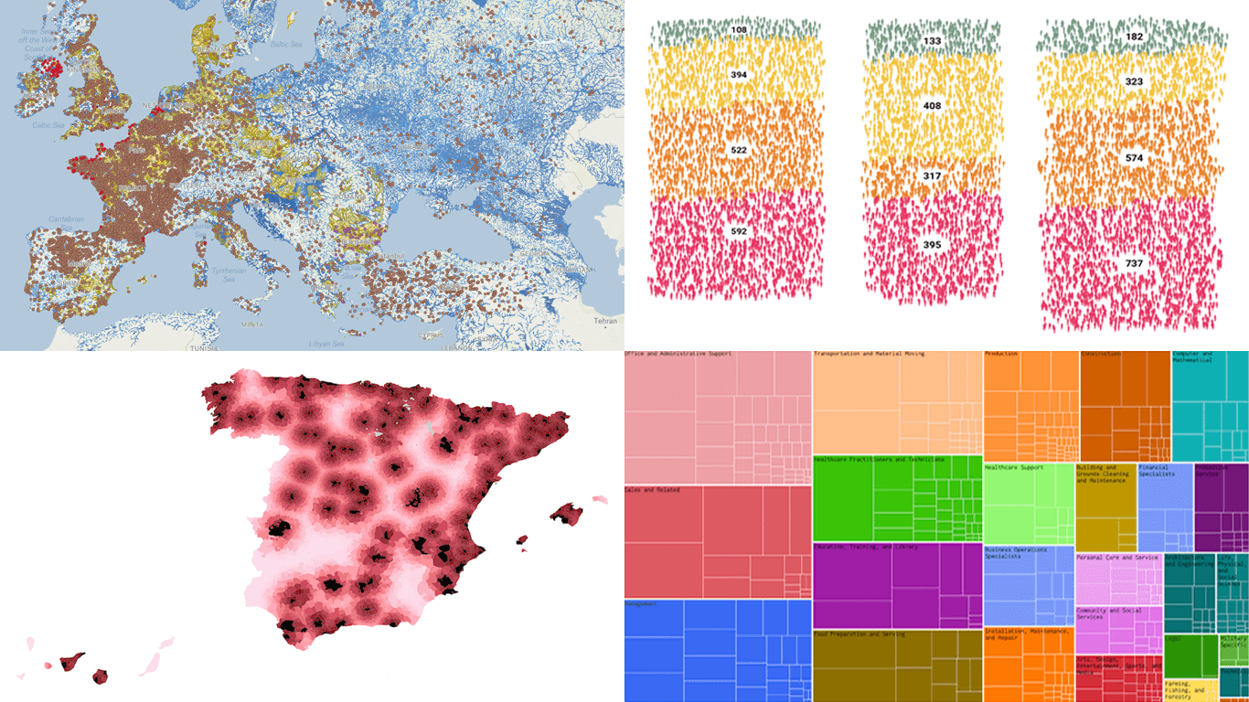 We continue our regular DataViz Weekly feature, where we curate the most interesting data visualization work we have come across over the past few days. Here is what made it into this edition:
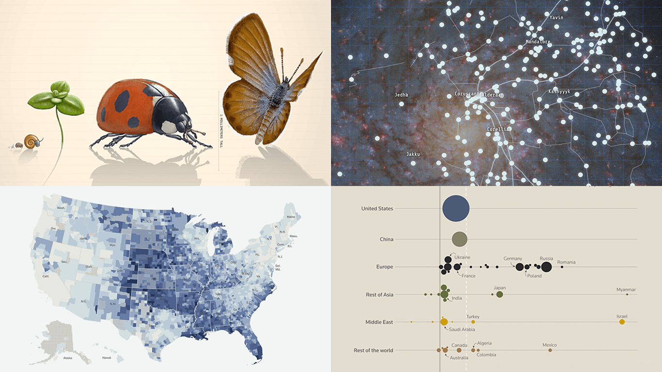
- Michelin star restaurants in Spain — Colpisa
- Occupations with higher pay (than yours) — FlowingData
- Landfills across Europe — Investigate Europe & Watershed Investigations
- Catastrophic residential fire in Hong Kong — SCMP
Read more »
November 28th, 2025 by AnyChart Team
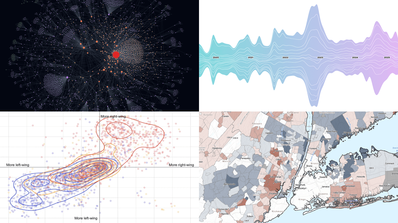 Some data visuals invite a closer look the moment they appear. We selected a set of fresh projects that have that effect and are happy to share them here in DataViz Weekly. Take a moment to explore the examples we picked for this edition:
- Trans media coverage patterns — Trans News Initiative
- Voters’ ideal political party positions — Strength In Numbers
- Epstein email network explorer — Max Andrews
- Fiscal inequality across the United States — Tax Base Fragmentation
Read more »
November 26th, 2025 by AnyChart Team
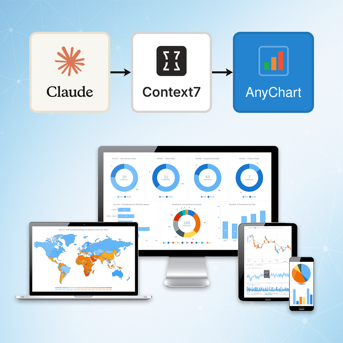 At AnyChart, we are constantly exploring tools and workflows that help developers work more efficiently, stay up to date, and minimize friction when integrating data visualization into their projects.
One approach we’ve recently tested — and found highly effective — is connecting Claude to Context7 via the Model Context Protocol (MCP). This integration gives Claude access to a continuously updated, extensive database of technical documentation across libraries, packages, and APIs.
This means you can rely on Claude not just for reasoning, but also for live, accurate, and authoritative documentation retrieval, dramatically reducing the chances of outdated suggestions or hallucinated methods.
Read about setup and more »
- Categories: AnyChart Charting Component, AnyGantt, AnyMap, AnyStock, Big Data, Business Intelligence, Charts and Art, Dashboards, Financial Charts, Gantt Chart, GraphicsJS, HTML5, JavaScript, JS Chart Tips, News, Stock Charts, Third-Party Developers, Tips and Tricks
- No Comments »