 Data visualization helps present information in a way that is easy to navigate. DataViz Weekly brings together recent projects that follow this idea. Here are four new ones we thought you would want to see:
- Neuroscience research topics over 50 years — The Transmitter
- Walking and cycling patterns worldwide — Scientific American
- Billionaire migration flows — Wesley Stubenbord
- Political content seen by new X users — Sky News

Data Visualization Weekly: November 14–21, 2025
Neuroscience Research Topics Over Half Century
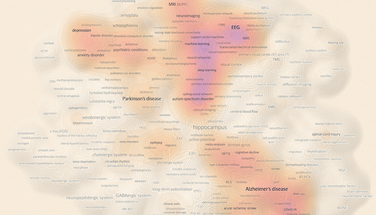
Neuroscience spans a wide range of approaches and subject areas, and over the past fifty years its literature has formed a dense web of related ideas. A new interactive visualization captures this landscape by showing how major research topics connect to one another and how their prominence has changed since 1975.
The Transmitter presents this semantic trend map as part of its 2025 special report “The State of Neuroscience,” created with World Wide Neuro and data viz designer Moritz Stefaner. Drawing on a semantic analysis of nearly 350,000 abstracts, the graphic positions 500 topics by how often they appear together in the literature. Type size reflects total publication volume, and a color overlay highlights which areas have been trending in the past five years. You can search for any term or explore the map freely to see how clusters emerge across the field.
Explore the map and see the full report on the website of The Transmitter.
Walking and Cycling Patterns Worldwide
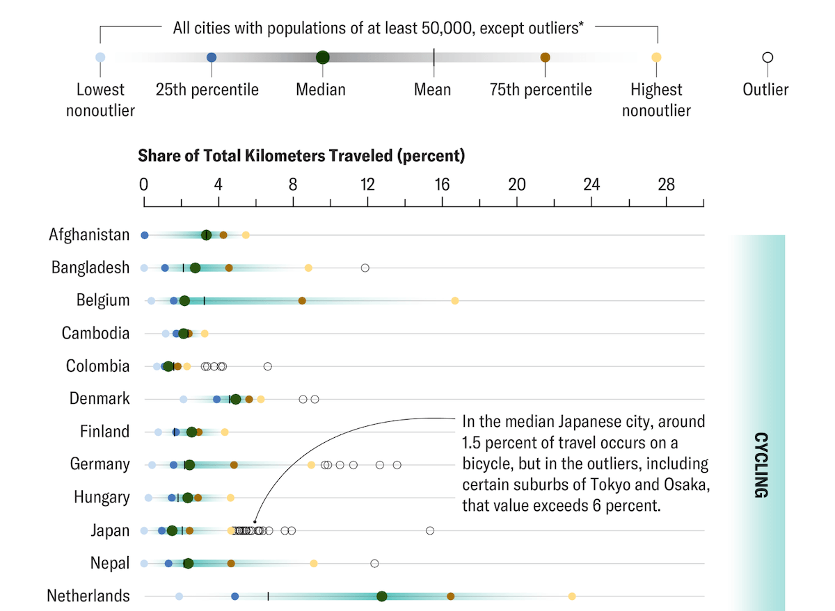
Cities vary widely in how much people travel on foot or by bicycle, and even within the same country those differences can be substantial. Factors such as density, terrain, infrastructure, fuel prices, and economic constraints all affect how often residents choose active travel.
Scientific American, reporting on a PNAS study by Adam Millard-Ball and colleagues, presents charts by Eve Lu that show the 15 countries with the highest shares of cycling and the 15 with the highest shares of walking. Using data derived from Google for 11,587 cities in 121 countries, the visuals plot city-level distributions through percentile dots, medians, and outliers, making clear how much variation exists behind each national average. Cycling and walking are shown in separate panels, allowing a direct view of how patterns differ across and within countries.
Take a look at the article on Scientific American, by Jesse Greenspan.
Billionaire Migration Flows
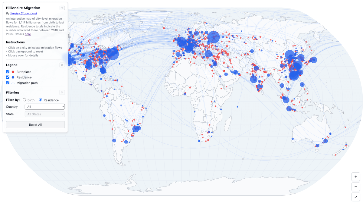
Birthplaces and eventual residences of the world’s wealthiest individuals often form distinct geographic patterns. Looking at where billionaires come from and where they move highlights how elite populations concentrate across cities and countries.
Wesley Stubenbord visualizes this pattern with an interactive map charting migration paths for 3,117 billionaires. Red and blue bubbles, sized by counts, represent birthplace and residence totals, and curved lines link origins to destinations. Users can click any city to isolate its flows, toggle birth and residence layers, and filter by country, with an additional state filter for the United States. Hovering displays city-level totals, including how many individuals remain in their birthplace or at least within the same country.
Check out the project on Wesley Stubenbord’s website.
Political Content Seen by New X Users
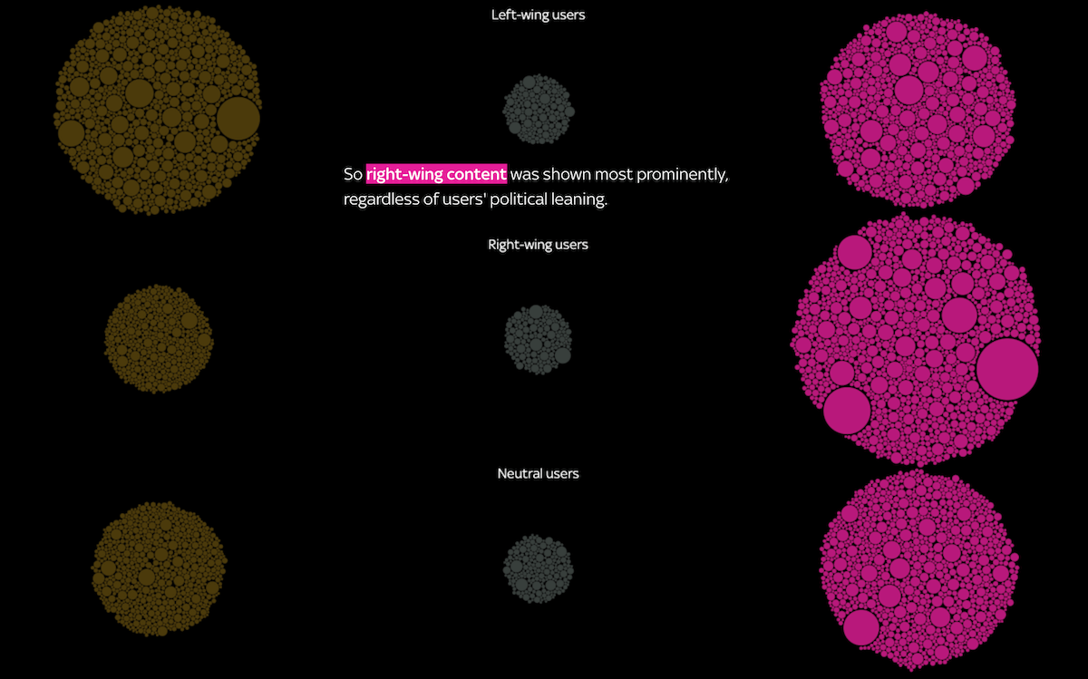
What people encounter on social platforms is shaped by the systems that decide which posts rise to the top of their feeds. Comparing the material shown to different types of new users helps reveal how political themes are distributed by those systems.
Sky News published a visual story based on an experiment using nine newly created X accounts, each modeled on a British user with a specific political leaning: three right-leaning, three left-leaning, and three neutral. Over two weeks, these accounts received about 90,000 recommended posts from more than 20,000 sources. Bubbles represent roughly 6,000 accounts that appeared most often, with color indicating political alignment. As the visuals progress, they show how much material from each category reached each user type, revealing clear differences in exposure across the profiles.
View the story on Sky News, by Kaitlin Tosh and Michelle Inez Simon of the Data and Forensics team.
Wrapping Up
These projects offer clear examples of how visualizations can help make data easier to work with. We hope you found something useful or interesting in this set. Stay connected for more visual brilliance.
- Categories: Data Visualization Weekly
- No Comments »