Building Bubble Chart with JavaScript
August 1st, 2023 by Awan Shrestha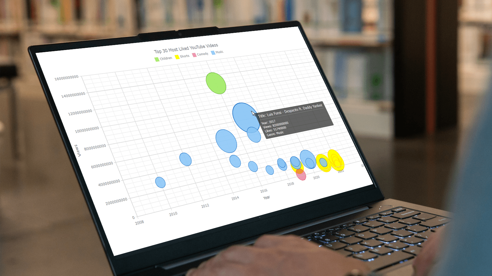 Do you want to turn that data chaos into a comprehensible data show? Look no further than data visualization! And let me tell you, one chart to rule them all is the bubble chart. It's like blowing bubbles at your data and watching them pop into understanding! And the best part? With JavaScript, you can easily create an interactive bubble chart, and I will show you how!
Bubble charts are versatile data visualizations that display data points in the form of bubbles, where the bubbles' size, color, and position represent different variables. In this tutorial, I'll walk you through building these graphics step by step, making the process a breeze. For illustration, we'll take data on the popularity of various YouTube videos and use JavaScript to create an interactive bubble chart showcasing the top 30 most-liked videos of all time, categorized by year of release, views, and likes.
By the end of this tutorial, you'll be able to create visually-stunning JS-based bubble charts without any hassle. So let's dive into the world of data bubbles and turn numbers into a visual feast for the eyes!
Read the JS charting tutorial »
- Categories: AnyChart Charting Component, Big Data, Business Intelligence, HTML5, JavaScript, JavaScript Chart Tutorials, Tips and Tricks
- No Comments »
How to Visualize Data with Pareto Charts Using JavaScript
July 11th, 2023 by Shachee Swadia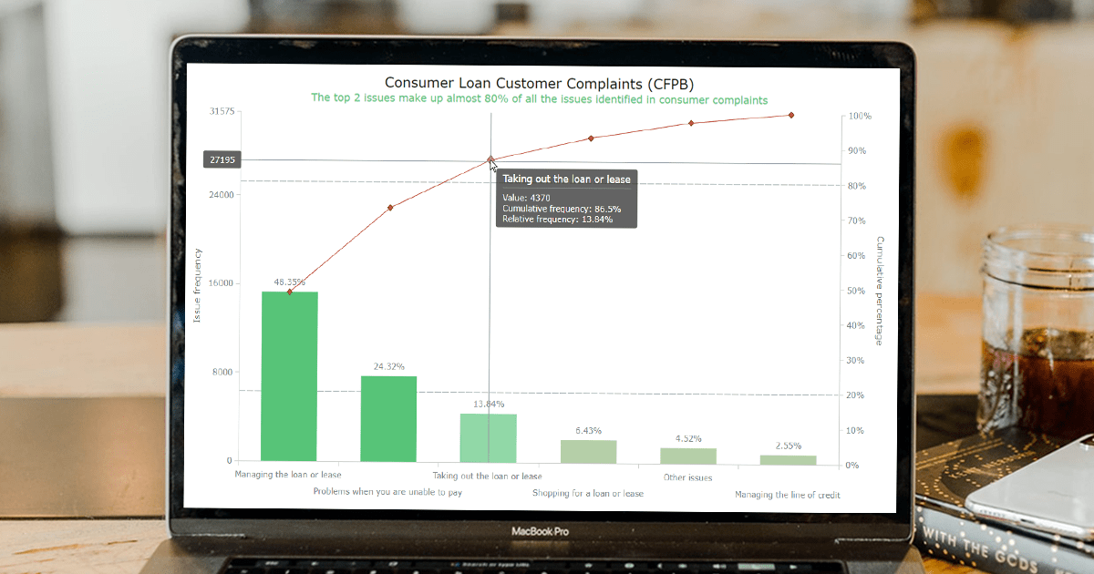 Welcome to this step-by-step tutorial that will empower you to create an interactive Pareto chart using JavaScript that will look nice on any device and in any browser!
A Pareto chart is a captivating graphical combo representation that showcases individual values through descending bars, while a line graph illustrates the cumulative total. It is a powerful tool highlighting the relative importance of different categories within a dataset. Named after the visionary economist Vilfredo Pareto, the Pareto chart embodies the Pareto principle, also known as the 80/20 rule. This principle reveals that approximately 80% of effects stem from a mere 20% of causes. With their ability to pinpoint the most significant elements driving a specific scenario, Pareto charts have become indispensable in certain areas of data analysis.
Every chart needs data, and for this tutorial, I have chosen a dataset to serve as an example for illustration. Together, we will embark on a journey to visualize the major customer complaints for consumer loans in a Pareto chart, demonstrating how easily you can achieve it at every step. So get ready, and let’s dive into the world of Pareto charts and create our own interactive masterpiece!
Read the JS charting tutorial »
- Categories: AnyChart Charting Component, Big Data, Business Intelligence, HTML5, JavaScript, JavaScript Chart Tutorials, Tips and Tricks
- No Comments »
Creating Decomposition Tree in Qlik Sense
June 27th, 2023 by Alejandro Wassermann Hey Qlikkies, are you itching to explore your data ad-hoc across multiple dimensions and conduct root cause analysis like a boss? Look no further than the Decomposition Tree visualization! I first stumbled upon this gem in Power BI, but guess what? Now you can harness its power within the realms of the Qlik Analytics Platform. In this tutorial, I’ll demonstrate how you can easily create amazing decomposition trees for your BI dashboards and apps in Qlik Sense.
A decomposition tree is a type of chart that uses a tree-like structure to represent how a whole metric or outcome can be broken down into its constituent parts or factors. It provides a hierarchical view of the relationships between different dimensions or variables and their contributions to the overall metric. By visually displaying the decomposition of a measure, such as sales or revenue, into various components, such as product categories, regions, or time periods, the decomposition tree helps identify the key drivers and understand the underlying factors influencing the metric. And I’ll use the tech layoffs data to show you how this can look and work in reality.
Let’s dive in and unleash the decomposition tree power in Qlik Sense!
Read more at qlik.anychart.com »
- Categories: AnyChart Charting Component, Big Data, Business Intelligence, Dashboards, Qlik, Tips and Tricks
- No Comments »
How to Make Sunburst Chart in JavaScript
June 19th, 2023 by Awan Shrestha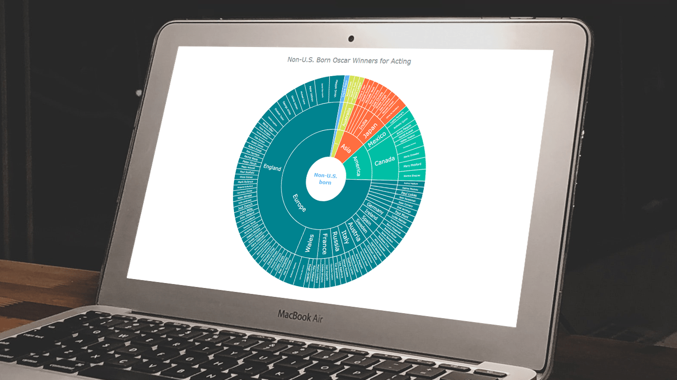 In the world of data all around us, charts play a crucial role in helping us explore and understand data more effectively. One powerful visualization technique is the sunburst chart, which allows us to represent hierarchical datasets, providing insights into complex compositions visually. In this tutorial, I’ll show you how to create your own stunning interactive sunburst charts using JavaScript effortlessly.
We’ll embark on an exciting journey using data about Oscar-winning actors and actresses from countries around the world as an example. Our JS-based sunburst chart will shine a spotlight on the achievements of those born outside the United States, representing the rich diversity of their origins.
Get ready to unlock the secrets of JavaScript sunburst chart development as I’ll guide you step-by-step. Together, we’ll learn how to effortlessly bring data to life, creating this mesmerizing visualization that engages and informs. Let’s dive in and discover the fascinating world of the sunburst chart!
Read the JS charting tutorial »
- Categories: AnyChart Charting Component, Big Data, HTML5, JavaScript, JavaScript Chart Tutorials, Tips and Tricks
- No Comments »
How to Create Donut Chart Using JavaScript
June 13th, 2023 by Shachee Swadia Visualizing data isn’t just insightful, it’s also a lot of fun! One of the simplest and most enjoyable charts you can create is the donut chart. And now, I will show you how to make an awesome interactive one using JavaScript effortlessly!
Aptly named because it looks like a donut, a donut chart is essentially a pie chart with a hole in the center. It can be nice for representing categorical data with a moderate number of categories, where each slice represents a percentage of the whole. Throughout this tutorial, we will apply the donut charting technique to visualize the impressive Grand Slam title tally of a tennis legend, Roger Federer. So you’ll have a real-world example to work with and enhance your understanding.
I’ll guide you through each step, ensuring a seamless learning experience. By the end of the tutorial, you’ll have all the skills and knowledge required to create your very own personalized and impressive JS donut chart. So let’s embark on this exciting journey and get started!
Read the JS charting tutorial »
- Categories: AnyChart Charting Component, HTML5, JavaScript, JavaScript Chart Tutorials, Tips and Tricks
- No Comments »
How to Build Heatmap in JavaScript
May 30th, 2023 by Shachee Swadia Data visualization is a powerful tool that helps us make sense of complex data. With it, we can spot patterns and trends that might take much more time to become obvious just by looking at raw numbers. One particularly useful chart type is the heatmap, and I’m excited to teach you how to create one with JavaScript in this tutorial.
Read the JS charting tutorial »
- Categories: AnyChart Charting Component, Big Data, HTML5, JavaScript, JavaScript Chart Tutorials, Tips and Tricks
- No Comments »
How to Build Choropleth Map with JavaScript
May 18th, 2023 by Shachee Swadia Are you ready to learn how to create a choropleth map with JavaScript like a boss? Maps are a powerful way to visualize data, but building one from scratch can be a daunting task. Don’t worry, I’m here to help!
In this tutorial, I’ll guide you through the process of building a JavaScript choropleth map step by step. And to make things more interesting, we’ll use Queen Elizabeth II’s state visits as an example to showcase the power of this type of map.
Get ready to impress yourself and your audience with stunning data visualizations, and let’s get started on this exciting journey together!
Read the JS charting tutorial »
- Categories: AnyChart Charting Component, AnyMap, HTML5, JavaScript, JavaScript Chart Tutorials, Tips and Tricks
- No Comments »
How to Create Candlestick Chart with JavaScript for Stock Analysis
May 2nd, 2023 by Awan Shrestha Candlestick charts are a fantastic data visualization tool for tracking the price movements of stocks over a period of time. In this tutorial, I'll show you how to create your own candlestick chart using JavaScript.
We’ll be using TSMC (Taiwan Semiconductor Manufacturing Company) as an example, as they're the largest contract chip maker in the world and have been making waves in the stock market recently.
By the end of this tutorial, you'll be able to create your own JS candlestick charts and analyze stock trends like a pro. So, let's get started and dive into the exciting world of data visualization with JavaScript!
Read the JS charting tutorial »
- Categories: AnyChart Charting Component, AnyStock, Big Data, Financial Charts, HTML5, JavaScript, JavaScript Chart Tutorials, Tips and Tricks
- 2 Comments »
Building 3D Surface Plot in JavaScript
April 11th, 2023 by Awan Shrestha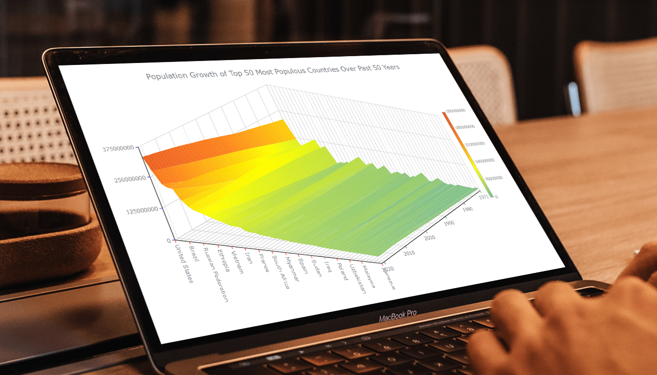 Welcome to this tutorial on creating a visually stunning and interactive 3D surface plot using JavaScript! If you’re passionate about data visualization and want to expand your skills to the next level, this guide is for you. Here, we’ll take you through a step-by-step process to create an engaging 3D surface plot that will make your data come alive.
Sometimes, representing complex information using traditional 2D charts can be difficult, especially when working with large datasets or data that varies over three or more dimensions. This is where a 3D surface plot (or surface chart) can prove to be useful. In this tutorial, we’ll be using real-world population data to create our surface plot, showcasing the population growth trends of the top 50 most populous countries in the world. You don’t need to be a data expert to follow this guide, as we’ll cover everything in detail.
So, sit back, grab your favorite beverage, and let’s dive into the world of data visualization with a 3D surface plot. By the end of this tutorial, you’ll have an impressive chart that you can showcase to your colleagues or friends. Let’s get started!
Read the JS charting tutorial »
- Categories: AnyChart Charting Component, Big Data, HTML5, JavaScript, JavaScript Chart Tutorials, Tips and Tricks
- No Comments »
Creating Interactive Flow Maps with JavaScript
March 22nd, 2023 by Awan Shrestha Flow maps are a powerful way to represent the movement of objects between different geographic locations, and with JavaScript, creating an interactive flow map is easier than you might think. Flow maps combine the functionality of a map and a flow diagram; this type of visualization shows the direction of movement of people, goods, money, or information, as well as the quantity of those.
In this step-by-step tutorial, we’ll guide you through the process of creating a JavaScript flow map. To make it more practical, we’ll use the example of visualizing the number of students from India studying abroad in different countries. By following the tutorial, you’ll learn how to create your own flow maps using JavaScript, regardless of the data you choose to use.
So, let’s get started! Follow along with us to learn how to develop your own JS Flow Map.
Read the JS charting tutorial »
- Categories: AnyChart Charting Component, AnyMap, HTML5, JavaScript, JavaScript Chart Tutorials, Tips and Tricks
- No Comments »