Interactive JS Map by AnyChart and More
February 28th, 2016 by Margaret Skomorokh
Here is a quick recap of the visualizations that we have shared with you this week on AnyChart Facebook Page and Twitter (including an interactive JS map by AnyChart):
- Categories: AnyChart Charting Component, AnyMap, HTML5, JavaScript, News
- No Comments »
ACME Corp. Prices – JS Dashboard by AnyChart
February 21st, 2016 by Margaret Skomorokh
A dashboard is a set of charts, which is usually created when you need to show a lot of different information about one particular subject. It can contain as many charts (of the same type or of different types) as it is necessary.
As you can see from the title of this interactive JS dashboard, it shows information about the stock prices of ACME Corporation for the given period. The dashboard contains two charts: the first one is a combination of three chart types (Japanese Candlestick, Range Area, and Spline) and the second one is a simple Column chart.
The Japanese Candlestick series in the upper chart shows us the open, high, low, and closing prices of ACME Stocks for each trading day within the mentioned period. Each vertical line represents the range between the highest and the lowest prices during the trading period, and the body represents the opening and the closing trades. While in classical Candlesticks the rise and fall of a stock price are coded with a white-colored and a black-colored body, in this dashboard light blue and dark blue colors are used.
Besides the Candlestick series, there are Range Area and Spline series in the first chart. The second chart contains a Column series showing the change in the volume of stocks sold.
As you can see, AnyChart is a powerful and flexible tool, allowing you to create sophisticated data visualizations like this JS dashboard. AnyChart offers a wide range of features and chart types, so you can easily implement any visual solution and communicate your data in the best way possible.
By the way, we have recently updated the roadmaps of AnyChart, AnyStock, and AnyMap. Check out all these great features that are coming soon!
- Categories: AnyChart Charting Component, AnyMap, AnyStock, Dashboards, HTML5, JavaScript
- No Comments »
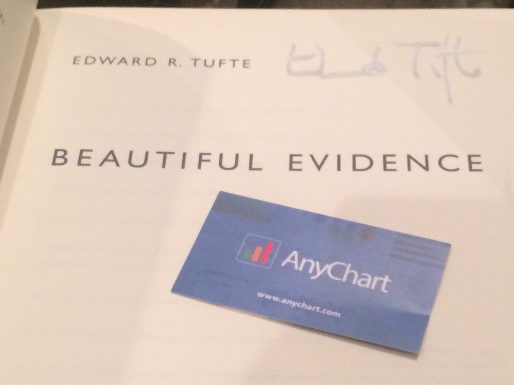
Edward Tufte in San Francisco (meets AnyChart)
February 18th, 2016 by Margaret SkomorokhEdward Tufte one-day course in San Francisco
Edward Tufte, which was once called “The Leonardo da Vinci of data”, is a statistician and artist, a professor emeritus of political science, statistics, and computer science at Yale University, and an author of 4 classic books on data visualization. In December 2015, Mr. Tufte read his one-day course in data visualization (Presenting Data and Information) in San Francisco. We were there and enjoyed it a lot! See our short report about this event, along with some photos we took during the lecture.

In this picture Edward Tufte shows a most remarkable book – Euclid’s Geometry (1570) with pop-up 3D models:

And here is an image of Russian army command center, which was used by Mr. Tufte to express his disapproval of 3D Pie charts. He said that a country that uses 3D Pie charts in its’ command center will lose any war. However, we believe that, if used properly, 3D Charts can be a decent tool for data visualization – that is why we have added them in AnyChart JavaScript Charts Library.

After the lecture, we were lucky to get our books signed by the author and talk to him. Mr. Tufte remembered us because AnyChart implemented Sparkline Charts – a type of charts he invented. He suggested that we use AnyChart to create some of the challenging data visualizations mentioned in his books. Challenge accepted, coming soon!
Our short but intensive conversation with Mr. Tufte was followed by discussing Sparklines in Twitter:
@EdwardTufte Thank you for very interesting day-a lot to think about! You've asked about our sparklines – https://t.co/G0VwY308NZ Thank you!
— AnyChart (@AnyChart) December 17, 2015
So we ended up getting a boxed set of four books: Beautiful Evidence, Visual Explanations: Images and Quantities, Evidence and Narrative, Envisioning Information, and The Visual Display of Quantitative Information.

- Categories: AnyChart Charting Component, News, Tufte
- No Comments »
AnyChart JavaScript Charts 7.9.0 Released
January 27th, 2016 by Margaret SkomorokhWe are very glad to announce that we have updated all products in our AnyChart JavaScript Charts Package! Four new releases are now available for download: AnyChart 7.9.0, AnyMap 7.9.0, AnyGantt 7.9.0, and AnyStock 7.9.0.
We have added 3D charts and String Tokens to AnyChart and have significantly improved its performance. AnyMap now supports Longitude and Latitude as well as Move and Zoom; unique projections for more than 220 maps have been added. Other important new features are Event Markers, Timeline Markers, Localization Support (AnyGantt) and Technical Indicators (AnyStock).
AnyChart 7.9.0 New Features
 |
3D Bar/Column Chart Though data visualization specialists take a negative attitude towards any Pseudo 3D graphics, we think that our 3D Bar and Column JavaScript Charts are able to complement and enhance any visualization. You can adjust the angle and depth using the zAngle and zDepth methods. Take a look at 3D Bar/3D Column Chart in the Gallery. Learn more about 3D Bar/3D Column Chart. |
 |
3D Area Chart We are very proud that we have succeeded to create such a beautiful 3D Area JavaScript chart. Just as in the case of 3D Bar/Column Charts, you can adjust the angle and depth using the zAngle and zDepth methods. Take a look at 3D Area Chart in the Gallery >> Learn more about 3D Area Chart >> |
 |
String Tokens The String Tokens feature is an alternative to formatting text in labels and tooltips using formatting functions. Unlike functions, String Tokens are much more convenient in simple cases. They provide more flexibility in terms of settings serialization and are more familiar to the customers that have been using our Flash-based components. Learn more about String Tokens >> |
 |
Migration Tool Migration Tool is a small JavaScript library with an open source code, which is aimed to facilitate the transition from AnyChart 6 to AnyChart 7. Its main function is converting AnyChart 6 XML/JSON settings to AnyChart 7 settings. This library also contains special functions for partial conversion and creating custom converters. Learn more about Migration Tool >> Check out the Github repo >> |
 |
Performance Improvement In this release we have significantly improved performance: the number of points that can be displayed in less than a second has increased from 3000 to 10000. However, it is not the limit of AnyChart capabilities. Every release contains performance improvements, and we are not going to stop! Take a look at the Benchmark Page >> |
AnyMap 7.9.0 New Features
 |
Longitude/Latitude support We have added an option to set coordinates (specify a location) of Bubbles in Bubble JavaScript Charts in longitude and latitude degrees. New methods have been added to the API: the allow to convert mouse coordinates to longitude and latitude (transform) and vice versa (inverseTransform). Take a look at the Bubble Gallery sample >> Take a look at the Lat/Long API Gallery sample >> Learn more about Longitude/Latitude support >> |
 |
Move/Zoom API Now there is a possibility to change the scale and move a map. An API for creating a custom UI (buttons, scrolls, etc.) has been added. Take a look at the Gallery sample >> Learn more about Move/Zoom API >> |
 |
Rich Integration of Keyboard and Mouse Controls Mouse integration: Mouse Wheel – Zoom a map; Mouse Drag – Move a map (works only when the map is zoomed); Keyboard integration: Cmd/Ctrl + – Zoom in; Cmd/Ctrl – – Zoom out; Cmd/Ctrl 0 – Actual size; Arrow up – Move up; Arrow down – Move down; Arrow left – Move left; Arrow right – Move right. Take a look at the Gallery sample >> Learn more about the Integration of Keyboard and Mouse Controls >> |
| Map Collection Improvement We have added unique projections for more than 220 maps, which has significantly improved their appearance. |
AnyGantt 7.9.0 New Features
 |
Localization Support Our new Localization Engine localizes dates and numbers according to the settings of choice. All the functions available work both with the input data and displayed data. Our Localization Engine can be used in custom formatting functions of AnyChart as well as apart from AnyChart to localize your own UI elements. To simplify the integration process, we have prepared more than 180 localization files for various regions of the world. Take a look at the Gallery sample >> Learn more about Localization Support >> |
 |
Event Markers Even Markers is an excellent feature for displaying time intervals and important events on Gantt JavaScript Charts. Take a look at the Gallery sample >> Learn more about Event Markers >> |
") |
Timeline Markers (Multiple Milestones) Timeline Markers are aimed for displaying various events in processes – such as receiving a payment, specifying a task, meeting a customer, etc. Take a look at the Gallery sample >> Learn more about Timeline Markers >> |
AnyStock 7.9.0 New Features
 |
Technical Indicators In this release we are happy to introduce one of the most anticipated features – AnyStock JavaScript Charts Technical Indicators. The advantage of our Technical Indicators is the possibility to create custom indicators. Full customization of both visual and mathematical components is available. This release includes 5 predefined indicators: MACD, RSI, SMA, EMA, ROC. Take a look at Technical Indicators in the Gallery >> Learn more about Technical Indicators >> |
AnyChart version history: https://www.anychart.com/products/anychart/history/
AnyMap version history: https://www.anychart.com/products/anymap/history/
AnyGantt version history: https://www.anychart.com/products/anygantt/history/
AnyStock version history: https://www.anychart.com/products/anystock/history/
Trial download: https://www.anychart.com/download/
- Categories: AnyChart Charting Component, AnyGantt, AnyMap, AnyStock, Gantt Chart, HTML5, JavaScript, News
- No Comments »
AnyChart Business Dashboard Solutions
January 24th, 2016 by Timothy LoginovWe are glad to introduce a new section of our site – AnyChart Business Dashboard Solutions. It is a series of sample dashboards demonstrating how our JavaScript Charts can be applied to various visualization tasks in various industries.
You can use AnyChart to visualize literally ANYTHING. Of course, our component is intended for reporting and data analysis in business applications in the first place, but we also provide AnyChart Graphics Framework allowing you to draw absolutely anything.
Here are the samples available at the moment:
Site Speed Dashboard
 Nowadays every decent website admin panel has a web analytics tool with graphs, allowing an administrator to understand at a glance what is going on with a website and whether there are any problems. Site Speed Dashboard created with AnyChart JavaScript charting library combines simple chart types (Column, Bar, Line, Area) with less common Bullet charts to show web pages load speed, the number of visitors, and other parameters.
Please note that charts can be added even to tooltips: if you hover over the main column chart, you will see a small bar chart showing the list of the pages visited. This sample also demonstrates the possibility of real-time data streaming, which is very easy to implement in our flexible data architecture (for more information, see our documentation).
Sales Dashboard
 Reporting is a keystone when it comes to sales. A good manager knows everything about the sales situation, and this situation is not just a “Total” line in a daybook or a general ledger. One needs to know all the details of every bargain: what, where, when, who, to whom, and at what price. In the modern world, either you have this information, or you risk finding yourself at the bottom of the ladder very soon.
Wine Sales in France is a HTML5 dashboard based on the extensive usage of Bootstrap for creating tabs. The dashboard contains such chart types as Bar, Pie, Column&Line, Bullet, and Sparkline as well as Geo Maps from the standard set of AnyChart JavaScript charts library. Due to Bootstrap and AnyChart being cross-platform solutions, you will be able to see this dashboard on your smartphone or tablet. What is even more important is that a big data set can be presented in the form of small units, which allows one to grasp the situation and to come to a good decision quickly.
CIO Dashboard
 This sample is a tribute. It is a tribute to one of the great minds in modern data visualization – Stephen Few. His book “Information Dashboard Design: Displaying Data for At-a-Glance Monitoring” has been an inspiration for everyone at AnyChart – we have read it from cover to cover several times. It is hard to keep up with masterminds, but we try. We believe this dashboard shows that AnyChart JS charting library can be used to create visualizations that are clean, simple, compact, and easy to understand – “meaningfully see” as Stephen Few would say.
States of United States Dashboard

States of United States Dashboard is more of an infographic rather than a dashboard (though, of course, it is clear that there is a fine line between them, so it is a question of terminology). JavaScript Maps and pie charts are used in this solution to show the order of states joining the Union and to present some additional information such as the population and land area of a state and the number of seats in the House of Representatives it has. We are going to add more information to this dashboard and turn it into a real tool for learning the history of the United States.
AnyChart Bonfire
 As it was said in the beginning, AnyChart is not all about boring line and pie charts. You can use our component to visualize anything you want. For example, here you see that we drew an animated bonfire with the help of AnyChart Graphics Framework.
All the samples are distributed under an Apache 2.0 license, which means that you can use them from top to bottom, changing or not changing things. You can also fork them on GitHub, as well as pull requests and raise issues if you discover a bug or think the samples can be improved. We are looking forward to your feedback and collaboration!
Please do not forget about another new page on our site: the section of technical samples we wrote about earlier.
- Categories: AnyChart Charting Component, Business Intelligence, Dashboards, HTML5, Humor, JavaScript, News
- No Comments »
AnyChart JavaScript Charts: Integration Samples
December 25th, 2015 by Margaret SkomorokhAnyChart JavaScript Charts: Integration with PHP, MySQL, iOS, SQLite, Clojure, Clojurescript, NodeJs, and MongoDB
AnyChart JavaScript charts run on any platform and with any database. To make integration of AnyChart into your application as easy as possible, we have created several samples demonstrating how to integrate our component into the most popular platforms and databases. With the help of these tutorials, you will be able to start developing a prototype of your application right now.
Below you will find the samples that are currently available. Please note that all of them are repositories on GitHub, distributed under an Apache 2.0 License, and you can fork and change them as you like. Do not hesitate to pull requests or raise issues if you want to suggest an improvement or think that there is a bug in the code. We are going to expand this list and improve the samples, but if right now you are interested in a particular integration not listed here, please contact us.
|
|
Simple PHP Integration Sample PHP is one of the most popular tools for creating web applications and web pages. If you are a beginner developer or you need the simplest base for your charting application, this sample will help you. It shows Bar, Column, and Pie JavaScript charts created with PHP and displayed on a web page using AnyChart. |
|
|
PHP Integration Sample, Based on Slim If you are using the MySQL database (which is widely used with PHP applications) and the Slim PHP framework (a very convenient PHP microframework), this sample will help you to create a proof of concept of your charting application in a matter of minutes. You will see how to get data from MySQL, convert them into a format that can be used with AnyChart, and display as interactive JavaScript charts. You will also learn how to update your data without refreshing the page and how to customize different chart types, tooltips, labels, axes, and so on. |
|
|
iOS Objective-C Integration Sample Nowadays iPhone and iPad are used not only for making phone calls and entertainment. Phones and tablet computers are the integral part of an entrepreneur’s everyday life, and iOS apps serve business. Though AnyChart is a JavaScript charting library, you can easily combine it with the native Objective-C code and make any iOS app display big or small data as charts, with all great big and small features of AnyChart: from continuous real-time updates and multi-level drill-downs to the ability to customize the color of a particular axis label. Run our sample charting application in XCode, and you will get an iOS project where data are stored in the SQLite database management system and displayed as HTML5 charts on the screens of mobile devices. |
|
|
Clojure and ClojureScript Integration Sample Clojure is a dialect of the Lisp programming language, which is a very popular choice for creating server/backend applications. ClojureScript and the Postgresql database together make an excellent combination of tools, suitable for the most wide range of applications including data visualization solutions of any kind. Today there is rarely just one or two charts in an application – usually you see a dashboard with many interrelated elements. In this sample you will find a sales dashboard with such common chart types as Line, Bar, and Pie, and you will be surprised to realize how well AnyChart’s ideology fit the principles of Closure: simple modules will allow you to quickly get all the things that users expect to see on an up-to-date HTML5 website. |
|
|
NodeJs and MongoDB Integration Sample The NoSQL database is an integral part of the modern world, and MongoDB is a good choice if you decide to go this way. And when MongoDB is in play, a Node.js server is a logical choice to go with. So, if you are breaking the ground with your scalable application where run-time performance is paramount, use our sample to see how AnyChart JavaScript charts fit into this environment (and they fit perfectly). We are confident that you will not be disappointed with AnyChart in this case – its client-side performance will compliment your server-side performance, and users will be glad to see their data seamlessly updated on-the-fly. |


AnyChart charting library is a number one choice for anyone who is going into the world of data visualization and wants to excel in the fast-evolving world of BI solutions. When we develop our charts, one of our aims is providing users with the best result in any browser, but we also do our best to make the process of creating and supporting applications easier for developers.
We maintain a clear system of versions, each version being saved at AnyChart CDN. The API of each version is available at https://api.anychart.com/, and the documentation is available here: https://docs.anychart.com/. There are thousands of samples in our API and documentation, and you can see and try any method and any feature of AnyChart JavaScript charts on our website. Still, if there is no answer to your question neither in API, nor in our documentation, nor in the FAQ, just contact AnyChart Support Center, and our engineers will solve your problem.
We hope that these integration samples will help you to jump-start your project, and you will become one of the lucky ones who enjoy the power and flexibility of our JavaScript charts.
PS: If you are already convinced and none of the standard licenses fits your needs, our sales team is dying to hear from you and work out the best deal ever. You will be amazed to discover how fair our Support, OEM, and SaaS contracts are.
- Categories: AnyChart Charting Component, Business Intelligence, Dashboards, HTML5, JavaScript, Tips and Tricks
- 1 Comment »
Bubble JavaScript Map by AnyChart, Abolitionist infographic, and more
December 13th, 2015 by Margaret Skomorokh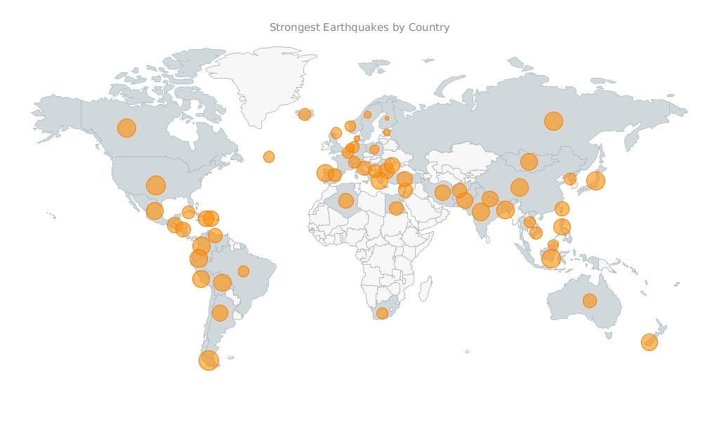
Javascript Map by AnyChart
Have you seen the cool data visualizations (including an interactive JavaScript map by AnyChart) that we have shared this week on AnyChart Facebook Page and Twitter? Here is a quick recap of these posts:
- This abolitionist infographic (1788) shows deck plans and cross sections of British slave ship Brookes. It is a strange, unexamined feature of the bicentenary that this image has still served to shape perceptions over two hundred years since its publication. Its continued usage cannot be explained away with traditional assumptions of its ‘innate power’ or ‘effective communication’. Read more about the poster in this article.
- NARKOZ/hacker-scripts – Hate to waste your time on routine tasks like waiting for the coffee-machine to make your latte? Use scripts to hack your life! LOL “The coffee machines uses telnet not SSH!!! this one waits exactly 17 seconds (!), then opens a telnet session to our coffee-machine (we had no frikin idea the coffee machine is on the network, runs linux and has a TCP socket up and running) and sends something like
sys brew…” - Bubble Earthquakes Map – Visit our gallery and check out this interactive bubble JavaScript map created with AnyMap. It shows where the world’s strongest earthquakes occurred. AnyMap is ideal for interactive dashboards and side-by-side reporting. This JavaScript mapping solution will help you to build interactive maps and display them in any browser on any platform. AnyMap is useful when you need to display sales by region, election results, population density, or any other information related to a geographic area.
- 15 Years of Terror – a time-lapse of all terrorist attacks with more than 20 fatalities between 1.12.2000 and 13.11.2015.
- Categories: AnyChart Charting Component, AnyMap, Charts and Art, HTML5, JavaScript, News
- No Comments »
Recap of the Week – 12/6/2015
December 7th, 2015 by Margaret Skomorokh
In this post you will find a quick recap of the information on data visualization and AnyChart we have shared this week on AnyChart Facebook Page and Twitter:
- Kepler Orrery IV – This awesome data visualization is a new version of the Kepler Orrery animation. It shows all of the Kepler multi-planet systems on the same scale as the Solar System.
- CIO Dashboard – This complex JavaScript dashboard was created with AnyChart. Check it out in our sample gallery! (The dashboard is based on a sample from the book “Information Dashboard Design: Displaying Data for At-a-Glance Monitoring” by Stephen Few.)
- Tor Flow is a fascinating data visualization showing information flow in the Tor network – a group of volunteer-operated servers that allows people to improve their privacy and security on the Internet.
- GOP early debate: candidates ranked – a cool interactive visualization based on Google search.
- Categories: AnyChart Charting Component, HTML5, JavaScript, News
- No Comments »
Recap of the Week – 11/8/2015
November 9th, 2015 by Margaret SkomorokhHere is a quick recap of AnyChart news and interesting information on data vsualization, which we have shared with you this week on AnyChart Facebook Page and Twitter:
- AnyChart 7.8.0 – Good News! We have updated all our products, and now #AnyChart, #AnyGantt, #AnyStock, and #AnyMap 7.8.0 are available for download. We have added a number of important features, including JavaScript Heat Map charts and Zoom & Scroll in AnyChart as well as Editing Mode and UI in AnyGantt.
- Bond v Bond: the return of 007 – The history of Bond… James Bond!
- Data Cycles is a simulated real-time visualization using a year’s worth of Bay Area Bike Share data – just click Play and enjoy all these bikes riding from station to station. You can also see a few nice interactive charts in the Statistics section.
- A Nation of Poverty – Concentrated poverty in the neighborhoods of the largest urban cores in the United States has exploded since the 1970s. Check out the charts illustrating this process.
- Categories: AnyChart Charting Component, AnyGantt, AnyMap, AnyStock, HTML5, JavaScript, News
- No Comments »
Heat Maps, Scrolling, Live Gantt Charts – 7.8.0 Release
November 4th, 2015 by Margaret SkomorokhGood News! We have updated all our products, and now AnyChart, AnyGantt, AnyStock, and AnyMap 7.8.0 are available for download. We have added a number of important features, including JavaScript Heat Map charts and Zoom & Scroll in AnyChart as well as Editing Mode and UI in AnyGantt (see Gantt Interactivity and Gantt Live Edit API and UI).
AnyChart 7.8.0 New Features
 |
Heat Map Chart A Heat Map chart is a graphical representation of data where the individual values contained in a matrix are represented as colors. Take a look at Heat Maps in the Gallery >> Learn more about Heat Maps >> |
 |
Zoom and Scroll (All Basic Chart Types) The Scroller feature works with all basic chart types. It allows users to zoom and scroll. Take a look at the Gallery Sample >> Learn more about the Scroller Feature >> |
- Categories: AnyChart Charting Component, AnyGantt, AnyMap, AnyStock, News
- No Comments »