Demonstrating Data Visualization at Work — DataViz Weekly
August 29th, 2025 by AnyChart Team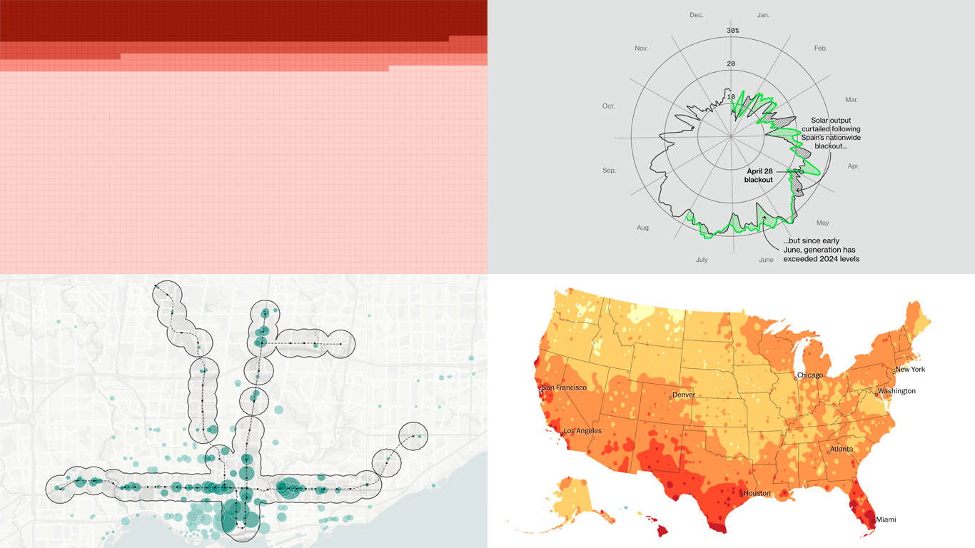 We are surrounded by data, but making sense of it is not always straightforward. Graphics can serve as a lens, helping key patterns and implications come through more clearly. We have selected several interesting projects from around the web that caught our attention these days, capturing how data visualization can be effectively put to work. See what’s on DataViz Weekly today:
- Longer summers across the United States — The Washington Post
- Workforce cuts at U.S. health agencies — ProPublica
- Grid stability in renewable-rich systems — Bloomberg Green
- Toronto parking land and housing potential — School of Cities
- Categories: Data Visualization Weekly
- No Comments »
New Data Stories Driven by Visualization — DataViz Weekly
August 22nd, 2025 by AnyChart Team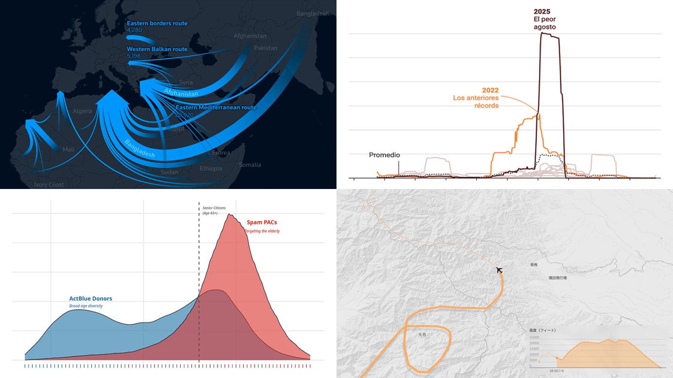 Visual graphics often play a crucial role in revealing the stories hidden in data. They help untangle complex realities while highlighting insights that might otherwise be hard to grasp. This edition of DataViz Weekly showcases recent articles where robust visualization of data drives effective storytelling:
- Donor age in U.S. political fundraising — On Data and Democracy
- Migration across the Mediterranean — Reuters
- Wildfires in Spain — Colpisa
- Japan Airlines Flight 123 crash, 40 years ago — Nikkei
- Categories: Data Visualization Weekly
- No Comments »
Trending Real-Life Data Visualization Examples — DataViz Weekly
August 15th, 2025 by AnyChart Team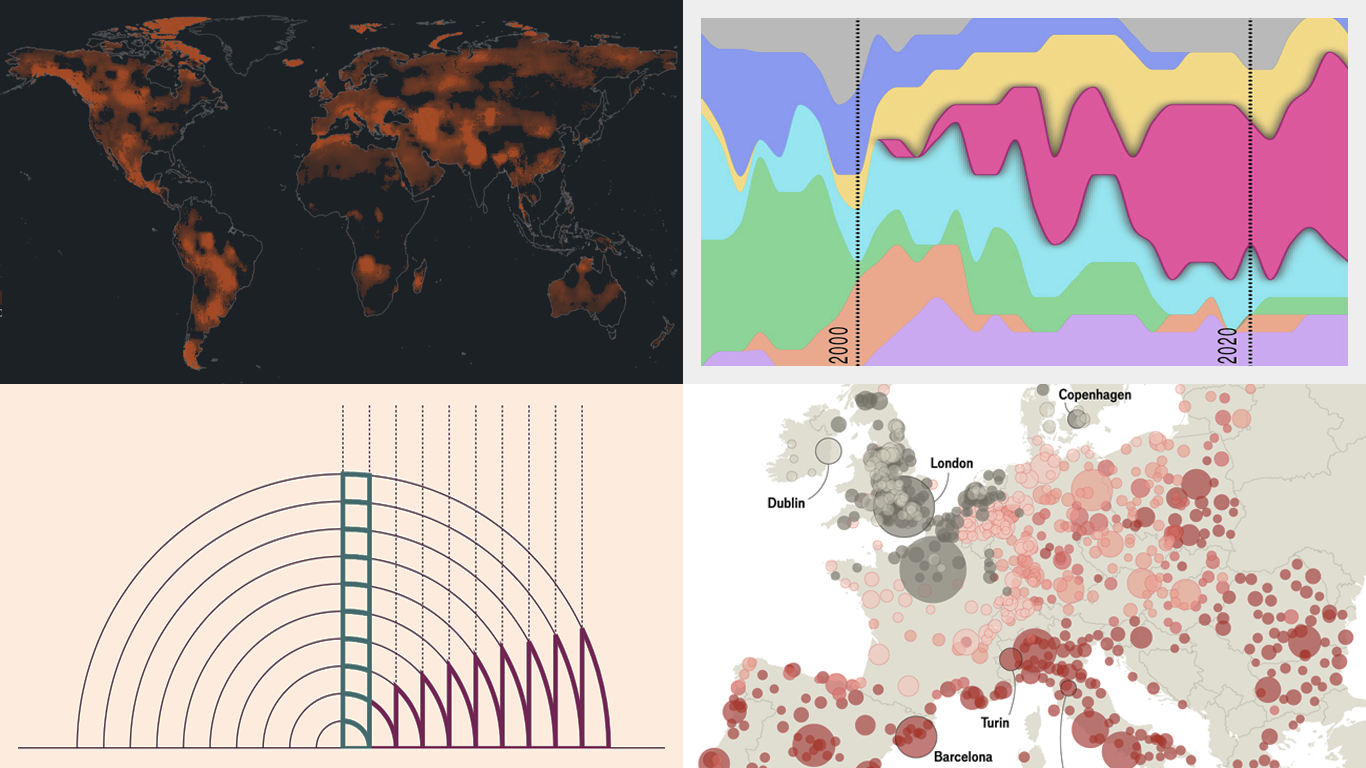 Curious how data visualization plays out in practice? Welcome to DataViz Weekly, our regular roundup of striking real-world examples. Here is what we are pleased to present in this edition:
- Gambling dominance in the Premier League shirt sponsors — Bloomberg
- Global groundwater loss and mega drying regions — ProPublica
- Finding the most consistent way to dice an onion — The Pudding
- Heatwave mortality risk across Europe — The Economist
- Categories: Data Visualization Weekly
- No Comments »
New Charts and Maps Worth Your Attention — DataViz Weekly
August 8th, 2025 by AnyChart Team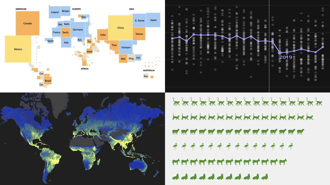 Figures alone can inform, but visuals make their meaning clear. Well-crafted charts and maps reveal trends, comparisons, and scale in ways text cannot match. That is the idea behind DataViz Weekly — a place to spotlight new projects that make data easier to grasp and interpret. This time, we invite you to check out:
- U.S. tariffs by country — The New York Times
- TikTok’s effect on pop song lengths — BBC
- Global underground fungal biodiversity — SPUN
- Zoo escapes — The Washington Post
- Categories: Data Visualization Weekly
- No Comments »
Fresh Visual Projects Turning Data Into Perspective — DataViz Weekly
August 1st, 2025 by AnyChart Team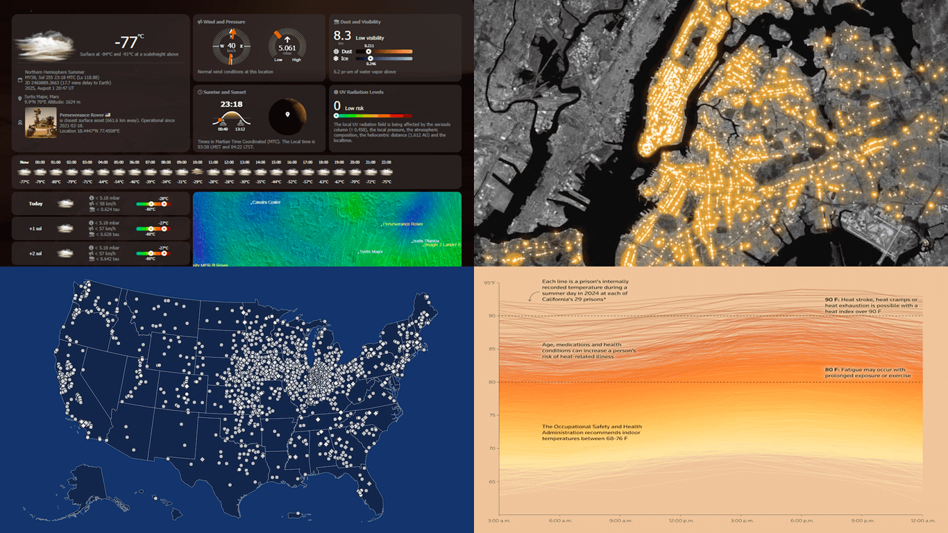 Seeing numbers is one thing — seeing what they mean is another. With data visualization, even familiar topics can take on new depth, and unexpected ones become approachable. This edition of DataViz Weekly brings together four compelling new projects that turn diverse datasets into visual insight:
- Heat in U.S. prisons — Reuters
- All Carnegie libraries in America — Carnegie Corporation of New York
- Words seen on New York City streets — The Pudding & alltext.nyc
- Weather on Mars — NASA Goddard Space Flight Center
- Categories: Data Visualization Weekly
- No Comments »