 Seeing numbers is one thing — seeing what they mean is another. With data visualization, even familiar topics can take on new depth, and unexpected ones become approachable. This edition of DataViz Weekly brings together four compelling new projects that turn diverse datasets into visual insight:
- Heat in U.S. prisons — Reuters
- All Carnegie libraries in America — Carnegie Corporation of New York
- Words seen on New York City streets — The Pudding & alltext.nyc
- Weather on Mars — NASA Goddard Space Flight Center
Data Visualization Weekly: July 25, 2025 — August 1, 2025
Heat in U.S. Prisons
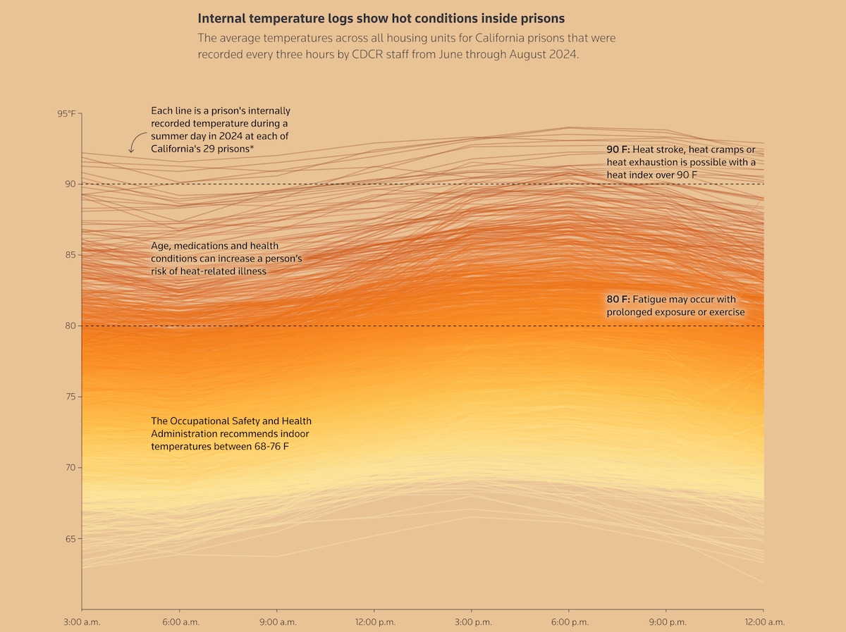
Incarcerated people in the United States often endure extreme summer heat without effective relief. Many prisons were built with little regard for thermal comfort, and with rising temperatures, inadequate cooling infrastructure has become a growing concern across the country.
Reuters explored this problem through an interactive scrollytelling project combining reporting, data analysis, and visual storytelling. Drawing on public records from correctional systems across the country — including a large collection of internal temperature logs — the project highlights the real impact of heat behind bars. One of the key visualizations, shown above, plots hourly temperature readings from California prisons during the summer of 2024, with each line representing a separate facility.
Check out the story on Reuters, created by Disha Raychaudhuri, Clare Farley, Travis Hartman, and Adolfo Arranz.
All Carnegie Libraries in America
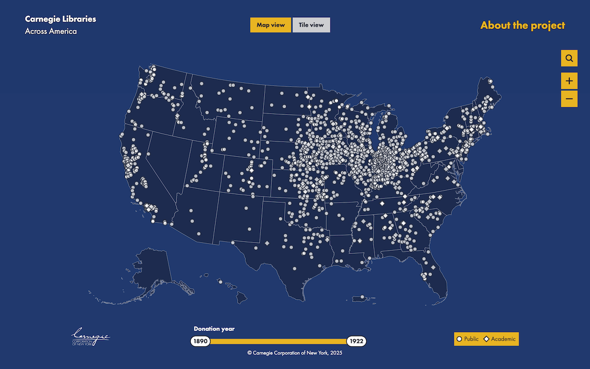
In the early 20th century, Andrew Carnegie funded the construction of about 1,700 libraries across the United States. His philanthropy was rooted in personal experience — as a young immigrant, he once depended on access to borrowed books — and aimed to broaden access to knowledge in communities across the country.
Carnegie Corporation of New York launched the Carnegie Libraries Mapping Project that visualizes this historic effort through an interactive marker map, based on data from a 1963 study by Florence Anderson. Public libraries are shown as circles, academic ones as diamonds. displays a card with details about the specific library, from where you can also access its archive.
Explore the project at carnegie-libraries.carnegie.org.
Words Seen on New York City Streets
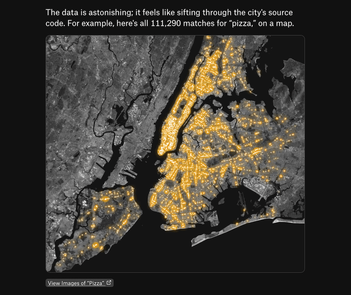
Every city speaks through its surroundings — on signs, storefronts, windows, and walls. In a place like New York, where the streets are packed with visual noise, that language becomes part of the city’s identity. What if you could actually read all of it?
Brooklyn-based media artist Yufeng Zhao created a searchable index of the words seen throughout New York City by extracting visible text — from store signs to protest banners and graffiti — across millions of Google Street View panoramas. Building on this enormous dataset, which includes 138 million text fragments from 8 million images, Matt Daniels crafted a visual essay for The Pudding that surfaces how language appears across the cityscape.
See the story on The Pudding and Zhao’s search tool at alltext.nyc.
Weather on Mars
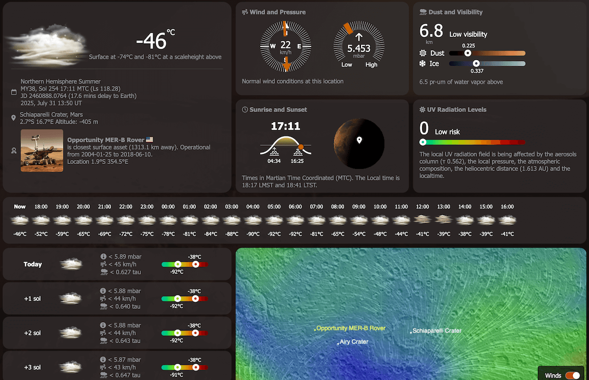
Climate dashboards are nothing new — for Earth. But now, there is one for Mars.
NASA’s Mars Explorer web app offers a familiar interface to explore conditions on an unfamiliar planet. Developed by Geronimo Villanueva and the Mars OSSE team at Goddard Space Flight Center, it visualizes EMARS MY32 climatological data across the Martian surface. You can select any point on the planet to see modeled values for temperature, wind, pressure, UV exposure, and more — much like a terrestrial weather app.
Check it out on NASA’s PSG platform. While still in development, it is already a striking example of how data visualization can make even extraterrestrial weather feel familiar.
Wrapping Up
These four are among the most compelling data visualization projects we have seen lately. Each takes a different approach, but all make the data more accessible and meaningful. Stay connected for more visual brilliance in Data Visualization Weekly!
- Categories: Data Visualization Weekly
- No Comments »