Stunning New Data Visualizations Not to Miss — DataViz Weekly
May 17th, 2024 by AnyChart Team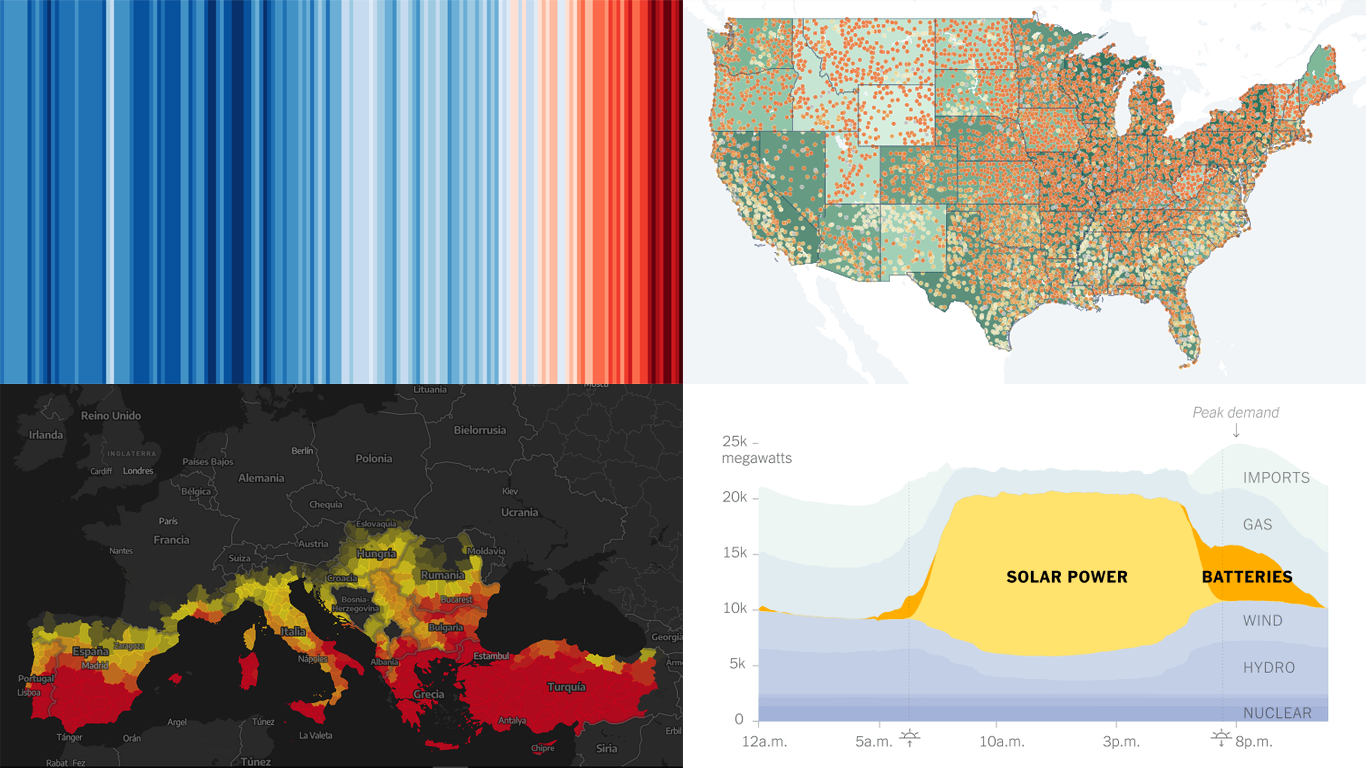 Data visualization is not just about making data look pretty; it’s about uncovering hidden patterns, revealing trends, and providing a clearer understanding of information. Through innovative visual techniques, we can explore data in ways that traditional methods can’t match. This week on DataViz Weekly, we bring you four compelling projects that showcase the transformative power of data visualization:
- Revealing the warming stripe for 2023 — Ed Hawkins
- Analyzing and predicting megafires in Europe — elDiario.es
- Understanding the growing role of giant batteries in electricity grids — NYT
- Analyzing segregation in U.S. schools — Stanford University
- Categories: Data Visualization Weekly
- No Comments »
Visualizing Data on Prices, Emissions, Workforce, Palm Oil — DataViz Weekly
November 12th, 2021 by AnyChart Team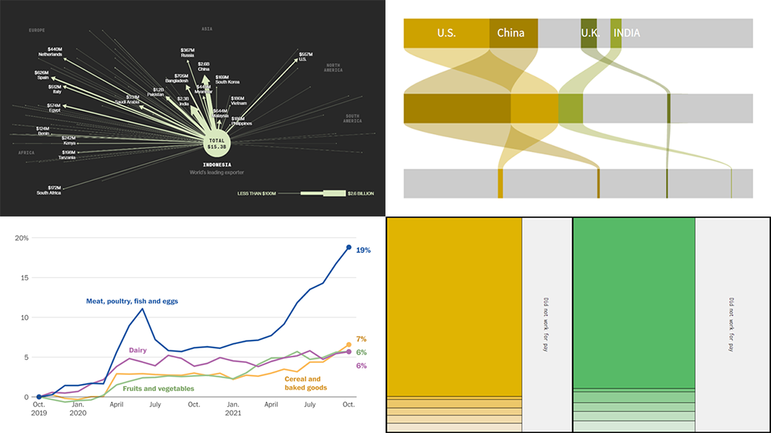 Hi everyone! DataViz Weekly is here to introduce you to some awesome new data visualizations that we have recently found out there and admired!
- Inflation in America — The Washington Post
- Carbon dioxide emissions by country — Reuters
- Shifts in how much U.S. men and women work — Nathan Yau
- Sustainable palm oil problem — Bloomberg Green
- Categories: Data Visualization Weekly
- No Comments »