Impressive New Data Graphics on Abortions, Homes, Names, Land — DataViz Weekly
March 11th, 2022 by AnyChart Team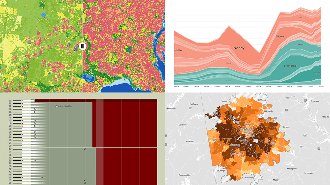 DataViz Weekly is here with another batch of impressive data graphics worth looking at and exploring! Today, we are eager to tell you about the following four new projects:
- Burden of abortion across the United States — FiveThirtyEight
- Real estate investor activity in the 40 major American cities in 2021 — The Washington Post
- Historical popularity of baby names in the U.S. since the 1880s — Namerology
- Australia land cover in detail — Geoscience Australia
- Categories: Data Visualization Weekly
- No Comments »
New Information Visualization Projects Not to Be Missed — DataViz Weekly
August 14th, 2020 by AnyChart Team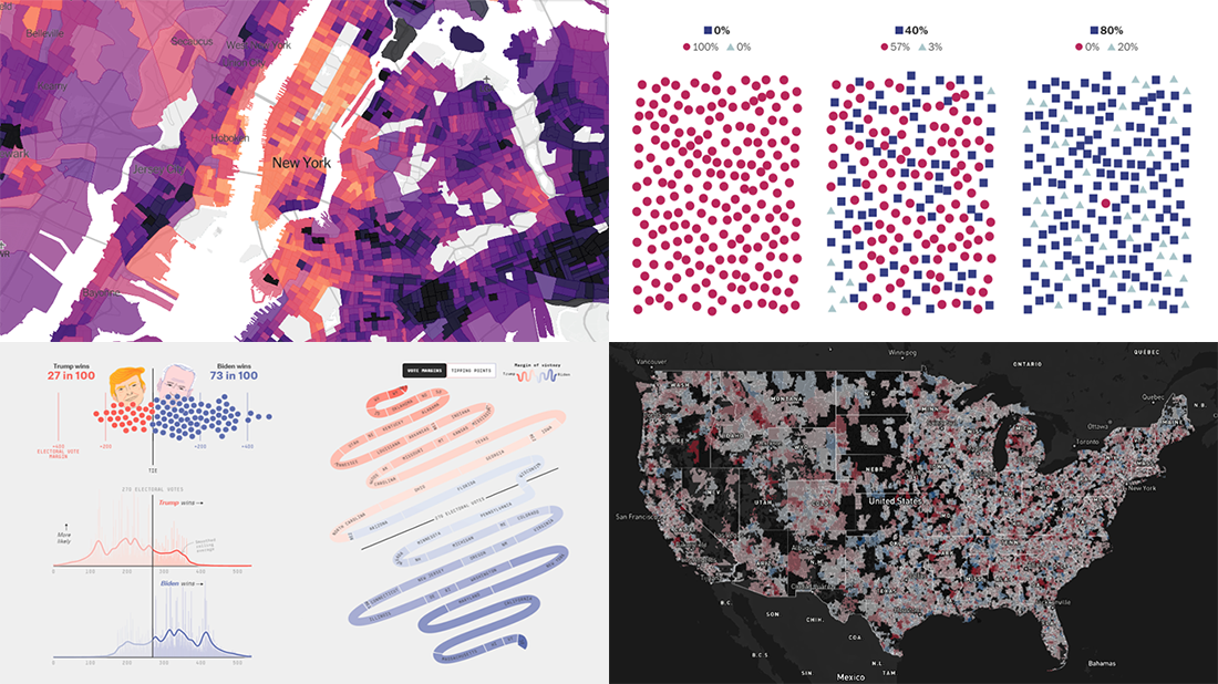 Look at these new cool information visualization projects and notice how different techniques help explore and communicate data, in practice.
Today in DataViz Weekly:
- FiveThirtyEight’s 2020 U.S. presidential election model — FiveThirtyEight
- Herd immunity simulations — The Washington Post
- Unemployment in the United States at the census tract level — The Upshot
- Home prices in America — Realbloc
- Categories: Data Visualization Weekly
- No Comments »
Cool Charts on Housing, Climate, Jobs, and Economy — DataViz Weekly
December 13th, 2019 by AnyChart Team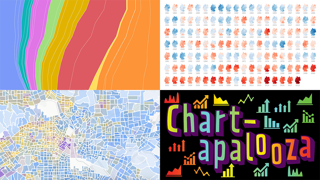 We know you love good data visualizations. So what we have here for you today is a presentation of new cool charts we’ve found this week. Look at the fresh examples of awesome data graphics, in DataViz Weekly:
- U.S. metropolitan growth — Zillow
- Climate change in Germany — Zeit Online
- Changes in job distribution in America — FlowingData
- Canada’s economy chartapalooza — Maclean’s Magazine
- Categories: Data Visualization Weekly
- No Comments »