Creating Radar Chart with JavaScript
December 23rd, 2022 by Awan Shrestha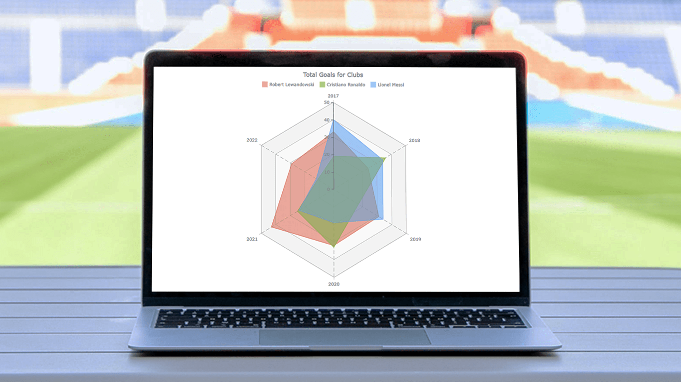 There are various data visualization techniques designed to reveal insights that numbers alone just can’t. In this tutorial, we will see how to easily create a radar chart using JavaScript. It is an effective way to graphically represent multivariate data of several quantitative variables.
Writing the tutorial during the FIFA World Cup 2022, I could not resist taking some football data for a practical illustration. The JS radar chart examples built and customized here step by step will plot the number of goals three top players have scored for their clubs over the last six years: Lionel Messi, Cristiano Ronaldo, and Robert Lewandowski.
The whistle for kickoff is blown, and it all begins!
Read the JS charting tutorial »
- Categories: AnyChart Charting Component, HTML5, JavaScript, JavaScript Chart Tutorials, Tips and Tricks
- No Comments »
Building JavaScript Radar Chart
July 7th, 2020 by Wayde Herman Radar charts, which are also referred to as spider charts or radar plots, are a data visualization used to compare observations with multiple quantitative variables. Each variable is encoded to a spoke which are equidistant apart. The higher the value, the further away from the center of the chart the point is made. Radar charts are best used to compare the ‘profile’ of observations and to detect outliers within the data. They are therefore used quite a bit in sports, most notably in basketball and soccer for profiling players.
In this tutorial I will be teaching you how to build your own radar chart with JavaScript and how to use them to help with one of the toughest decisions in gaming history: which starting pokemon to choose!
That’s right, we will be building radar charts to perform data analysis on Bulbasaur, Charmander and Squirtle to determine, once and for all, which is the best choice.
Read the JS charting tutorial »
- Categories: AnyChart Charting Component, Charts and Art, HTML5, JavaScript, JavaScript Chart Tutorials, Tips and Tricks
- No Comments »
Choose Right Chart Type for Data Visualization. Part 1: Data Comparison
April 12th, 2017 by AnyChart Team When it comes to creating data analytics and reporting solutions, choosing the right chart type for a certain data visualization task remains a common challenge. What do you pick for data comparison, studying distribution, observing data over time, or some other purpose? It can be very tricky! To help you overcome this challenge to the best effect, today we are launching a series of articles titled Choose Right Chart Type for Data Visualization. The series is designed to quickly explain what chart types you should pick for different purposes of data analysis. With that said, each article here will be devoted to a specific, yet still big question that you want your data to answer.
The current (first) guide of the series is all about chart types that work best for finding out the differences in data: Data Comparison. In fact, it is one of the most frequently established purposes of data analytics. And sometimes many people use wrong chart types to fulfil it correctly. Now, finally, let’s get to the very point and see what visualization forms work best for comparing data.
- Categories: Choosing Chart Type, Tips and Tricks
- 4 Comments »