AnyChart カイゼン:Qlik 拡張機能の最新イノベーションを発見しよう(東京・8月6日|CEO自ら進行)|Meet AnyChart CEO in Tokyo
July 29th, 2025 by AnyChart Team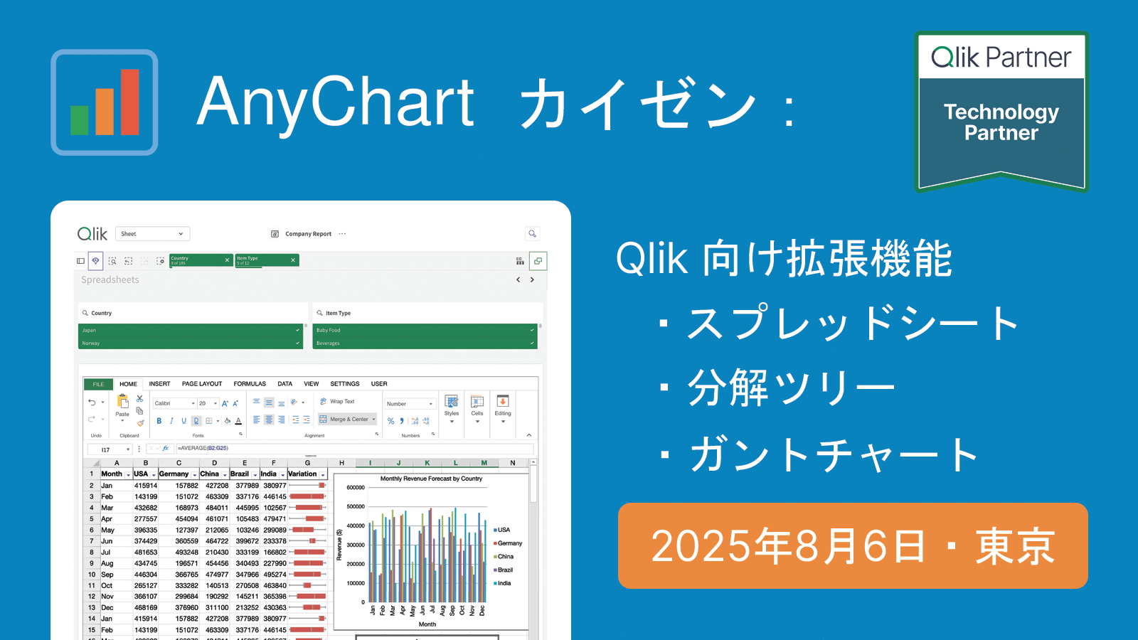 2025年8月6日(水)、私たちは東京にて、Qlik の分析環境を強化するための実用的なツールをご紹介する対面セッションを開催いたします。
本セッションでは、AnyChart 社 CEO の Anton Baranchuk が自ら進行を務め、Qlik Sense 拡張機能における最新のイノベーションを紹介し、それらが分析ワークフローをどのように改善し、より的確なデータドリブンな意思決定を支援できるかを実演を交えてご説明します。
We are pleased to invite you to an in-person session in Tokyo introducing practical tools to enhance your Qlik analytics environment.
During the session, AnyChart‘s CEO Anton Baranchuk will present the latest in Qlik Sense extensions, demonstrating how they can improve analysis workflows and support more informed, data-driven decision-making.
詳しく見る | Read more at qlik.anychart.com »
- Categories: AnyChart Charting Component, Big Data, Business Intelligence, Dashboards, News, Qlik
- No Comments »
Qlik Connect 2025 Recap: Incredible Ride for Excel-lence
June 19th, 2025 by AnyChart Team Qlik Connect 2025 is now in the books, and it was everything we hoped for — and more. Building on last year’s success, we returned to Orlando to find even more connections, deeper engagement, and a truly electric atmosphere around our booth. Our brand-new Excel-style Spreadsheets for Qlik Sense turned heads, and our chance-to-win activities became a real magnet on the show floor.
The buzz was real — just take a look below, then read on for a recap of our time at Qlik Connect:
Read more at qlik.anychart.com »
- Categories: AnyChart Charting Component, Big Data, Business Intelligence, Dashboards, News, Qlik
- No Comments »
Celebrating Success at Qlik Connect: Recap from AnyChart
July 10th, 2024 by AnyChart Team Qlik Connect 2024 was nothing short of amazing, not just for its vibrant atmosphere but also for the palpable successes we experienced. Beyond the buzz, we showcased our latest advancements for Qlik Sense, gathered a wealth of insights, made meaningful contacts, and ran a hit interactive game that became the talk of the event. We even clinched a win in the social media contest — an unplanned but welcome accolade indeed! Join us for a recap of our time at Qlik Connect in Orlando.
Read more at qlik.anychart.com »
- Categories: Big Data, Business Intelligence, Dashboards, News, Qlik, Success Stories
- No Comments »
How to Create Decomposition Tree in Qlik Sense: Transform Root Cause Analysis [Video Tutorial]
March 25th, 2024 by AnyChart Team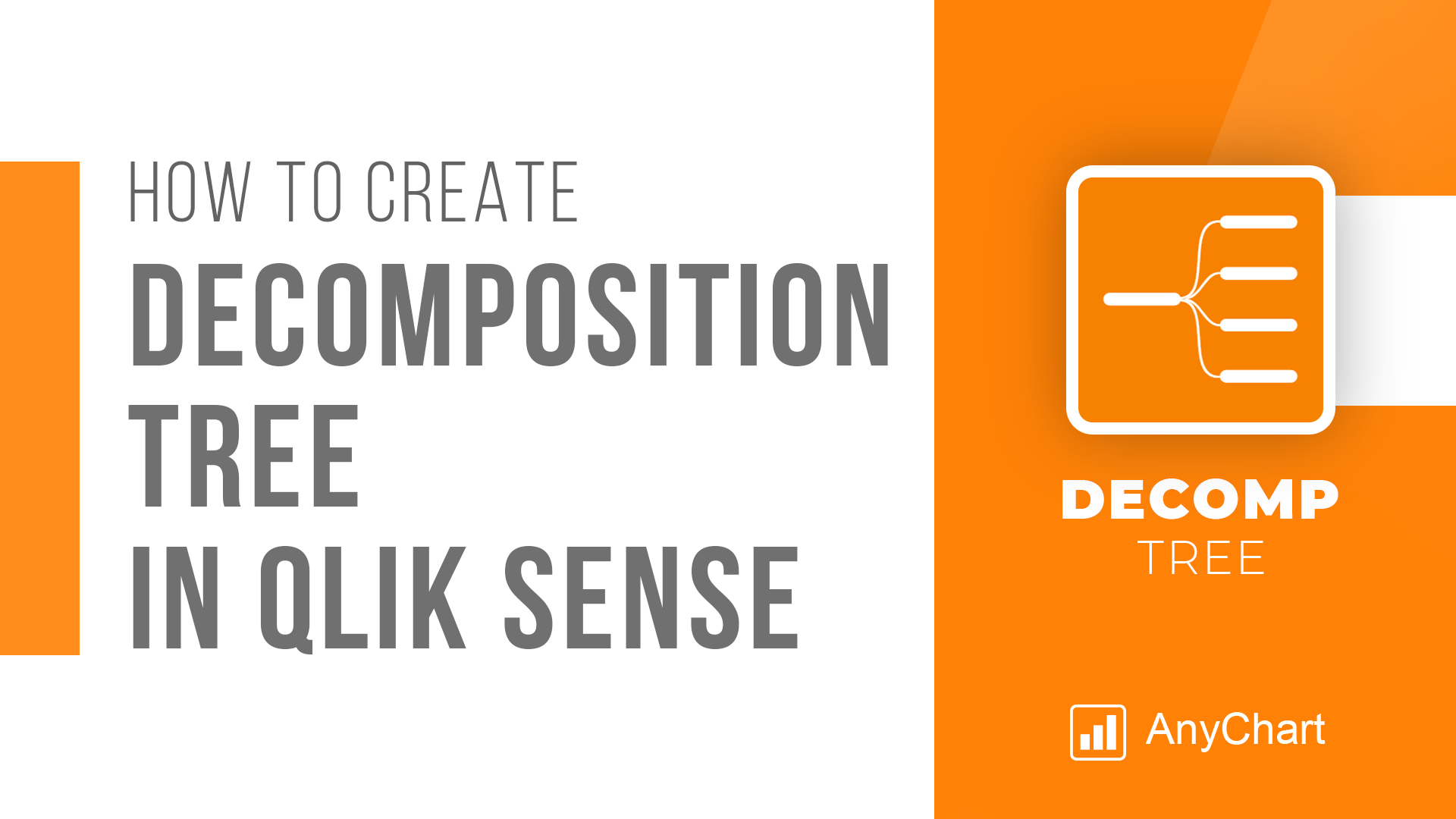 An important note for Qlikkies: Are you ready to elevate your dashboards? Dive into our latest Qlik tutorial — discover the power of the Decomposition Tree and learn how to create it in Qlik Sense in about no time!
Learn more and watch the tutorial at qlik.anychart.com »
- Categories: Qlik
- No Comments »
Qlik Webinar: Fewer Sheets, More Insights
January 30th, 2024 by AnyChart Team Hey Qlikkies! Ever feel overwhelmed by complex datasets, endless sheets, and constant requests from business users? The solution is here — join our exclusive webinar on February 8th and meet the Decomposition Tree, a new rockstar chart in Qlik Sense that’s worth a dozen! Enabling users to slice and dice metrics as they please, this game-changing visualization unlocks root cause analysis and ad-hoc exploration of complex datasets on the spot.
- Categories: Big Data, Business Intelligence, News, Qlik
- No Comments »
Join AnyChart at QlikWorld Tour 2023
August 10th, 2023 by AnyChart Team Get ready to dive into an exceptional data experience at QlikWorld Tour 2023! We at AnyChart are super stoked to be part of this epic roadshow as proud sponsors and warmly invite you to join us in one of the participating U.S. cities:
- Dallas (The Star in Frisco) — August 10
- San Francisco (Oracle Park) — August 24
- New York (Pier60 at Chelsea Pier) — September 18
- Atlanta (College Football Hall of Fame) — September 20
Spoiler alert: The star of the show will be our first-ever presentation of YODA — Your Own Documents Assistant, the newest, groundbreaking, AI-driven extension for Qlik Sense. Be among the first to witness its power!
Read more at qlik.anychart.com »
- Categories: AnyChart Charting Component, AnyGantt, Big Data, Business Intelligence, Dashboards, Gantt Chart, News, Qlik
- No Comments »
Creating Decomposition Tree in Qlik Sense
June 27th, 2023 by Alejandro Wassermann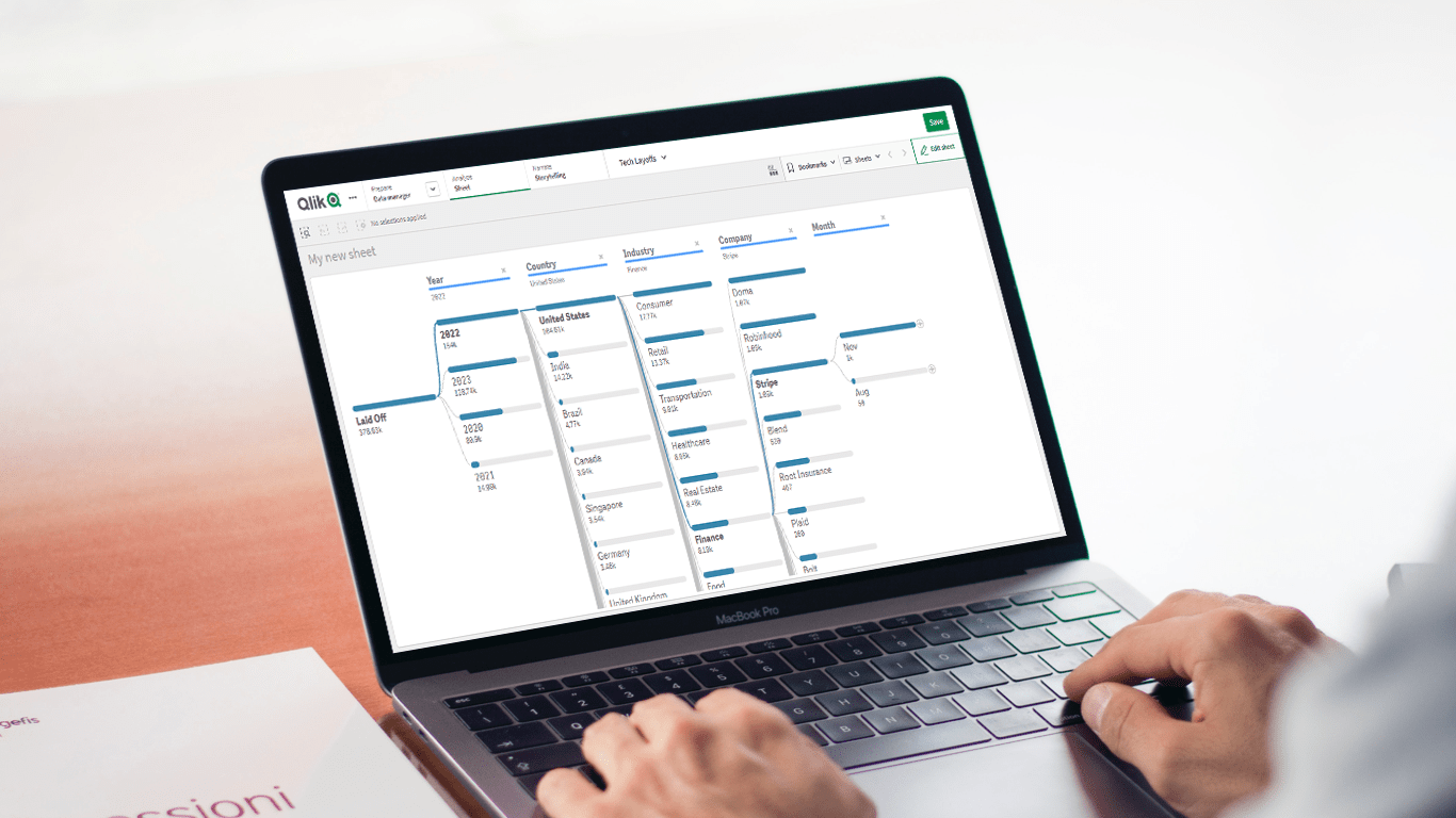 Hey Qlikkies, are you itching to explore your data ad-hoc across multiple dimensions and conduct root cause analysis like a boss? Look no further than the Decomposition Tree visualization! I first stumbled upon this gem in Power BI, but guess what? Now you can harness its power within the realms of the Qlik Analytics Platform. In this tutorial, I’ll demonstrate how you can easily create amazing decomposition trees for your BI dashboards and apps in Qlik Sense.
A decomposition tree is a type of chart that uses a tree-like structure to represent how a whole metric or outcome can be broken down into its constituent parts or factors. It provides a hierarchical view of the relationships between different dimensions or variables and their contributions to the overall metric. By visually displaying the decomposition of a measure, such as sales or revenue, into various components, such as product categories, regions, or time periods, the decomposition tree helps identify the key drivers and understand the underlying factors influencing the metric. And I’ll use the tech layoffs data to show you how this can look and work in reality.
Let’s dive in and unleash the decomposition tree power in Qlik Sense!
Read more at qlik.anychart.com »
- Categories: AnyChart Charting Component, Big Data, Business Intelligence, Dashboards, Qlik, Tips and Tricks
- No Comments »
Qlik Sense Timeline Chart and More New Features in AnyGantt Extension V 4.1.244
April 24th, 2020 by AnyChart Team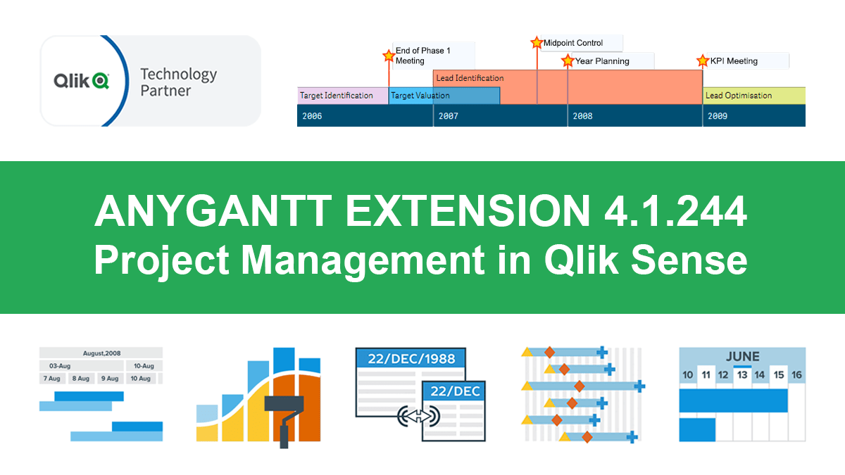 Hey Qlikkies, meet the awesome Qlik Sense Timeline Chart from AnyChart! We are excited to deliver it in the new, just-released version of our AnyGantt extension.
Hence the Timeline Chart has become — wait for it — the 40th chart type available in our data visualization extensions for Qlik Sense overall! For AnyGantt specifically it is the 3rd one, making AnyGantt a unique, cutting-edge Project Management Bundle for Qlik now comprising the Project Gantt Chart, Resource Chart, and Timeline Chart in a single intuitive extension.
However, it is not all great news. Release 4.1.244 also brings a bunch of other awesome features and improvements to the AnyGantt extension.
Read more at qlik.anychart.com »
- Categories: AnyChart Charting Component, AnyGantt, Big Data, Business Intelligence, Gantt Chart, News, Qlik
- No Comments »
How to Color Qlik Gantt Chart Powered by AnyGantt Extension for Qlik Sense
April 15th, 2020 by AnyChart Team Within the framework of our series of tutorials explaining in detail different aspects of building a Gantt chart in Qlik Sense, we are glad to share a new quick visual manual. This one describes how to color a Project Gantt chart in the AnyGantt extension for Qlik Gantt charts.
Join us as in this tutorial we are going to make it completely clear how to color all main parts of Project Gantt charts: elements, chart area, table cells, table header, and timeline levels. In addition, you can see tutorials about labels, tooltips, and reference lines and ranges — they can also be colored. (Those about tooltips and reference lines and ranges are coming soon. Meanwhile, check out the AnyGantt extension’s documentation or ask our support engineers for assistance.)
For your convenience, this tutorial is available in two versions. Check it out as a video with a voice over or keep reading the alternative, text+pictures version.
Read more at qlik.anychart.com »
- Categories: AnyGantt, Big Data, Business Intelligence, Gantt Chart, Qlik
- No Comments »
How to Configure Project Gantt Chart Labels in Qlik Sense
April 1st, 2020 by AnyChart Team We continue a series of tutorials delving into the details of how to create Gantt charts in Qlik Sense and customize them using our intuitive AnyGantt Extension. This time, let’s look at configuring Gantt chart labels.
You can watch the video version of this tutorial or keep reading to see it in the text and pictures.
Read more at qlik.anychart.com »
- Categories: AnyGantt, Big Data, Business Intelligence, Gantt Chart, Qlik
- 1 Comment »