27 Election Maps of 2024 U.S. Presidential Vote Results — DataViz Weekly Special Edition
November 8th, 2024 by AnyChart Team The 2024 U.S. presidential election has concluded, and media outlets worldwide are offering a plethora of data graphics to convey the election results. In this special edition of DataViz Weekly, we’ve curated a collection of over twenty election maps, showcasing diverse ways to represent voting data — cartograms, choropleth maps, bubble maps, and more. Whether you’re a data enthusiast, professional, or simply intrigued by the 2024 election outcomes, explore the latest U.S. election maps from top media!
💡 Also see our previous special editions with election maps: 2020 U.S. election maps and 2024 UK election maps.
- Categories: AnyMap, Dashboards, Data Visualization Weekly
- No Comments »
Paris 2024 Olympic Medal Count Trackers — DataViz Weekly
August 9th, 2024 by AnyChart Team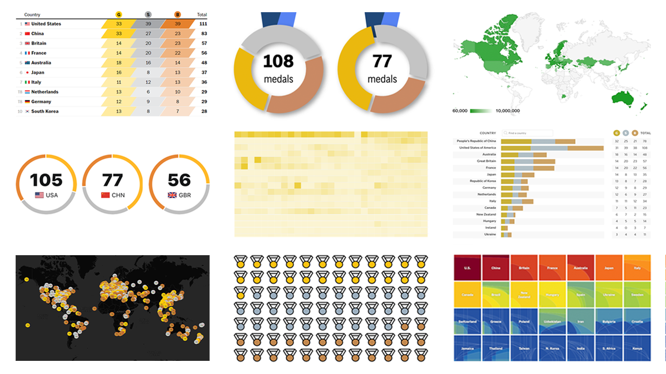 The Paris Summer Olympics are in full swing. If you’re interested in tracking the results and want to know which countries are excelling, numerous media outlets have prepared a variety of medal count trackers. In this special edition of DataViz Weekly, we showcase a selection of these projects, with a special focus on those that not only display numbers but also present them through compelling visualizations. Let’s dive in!
- Categories: Data Visualization Weekly
- No Comments »
20+ Electoral Maps Visualizing 2020 U.S. Presidential Election Results — DataViz Weekly Special Edition
November 6th, 2020 by AnyChart Team All eyes on election maps! Yes, they could be misleading. And even widely misleading. But it can be at least so fascinating to look at them, especially at times like this! So, we have curated a list of over twenty reputable resources — as of now, to be precise, 24 and counting! — where you can watch the live results of the 2020 United States Presidential election in compelling data visualizations. At the same time, it is a great chance for you to investigate and understand how election maps (and some other graphics) can look and work in practice.
💡 See also: 2024 U.S. Election Maps (November 2024).
Vote counts may be different on different platforms and update as more data becomes available out there — it’s absolutely okay. The election results are still partial. Over the coming days, all numbers will be adjusted to match the real, final vote count. Just in case: We’ve added only reliable sources — notable, reputable media outlets.
Without further ado, check out maybe the most important data visualizations these days! (Electoral vote count numbers in the text last updated on November 9th, 2020, for each source.)
- Categories: Data Visualization Weekly, News, Third-Party Developers
- 3 Comments »
4 Great Examples of Data Visualization in Action — DataViz Weekly
August 28th, 2020 by AnyChart Team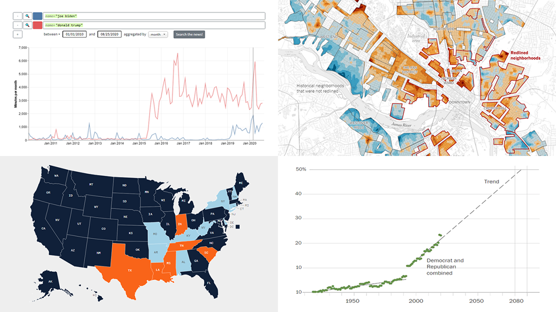 We’ve curated another four great examples of data visualization in action. Would you like to learn about them and check them out right now? Wait no longer! Below is a list of the projects highlighted in the new DataViz Weekly — just give it a glance and go ahead!
- Exploring a link between racism in the housing policy and hotter neighborhoods — The New York Times
- Analyzing the content of cable TV news — Stanford University
- Tracking gender inequality in American politics — The Washington Post
- Summarizing voting rules for the 2020 U.S. election by state — NBC News
- Categories: Data Visualization Weekly
- No Comments »