Create Simple Gantt Chart Using JavaScript — Tutorial
September 4th, 2019 by Alfrick Opidi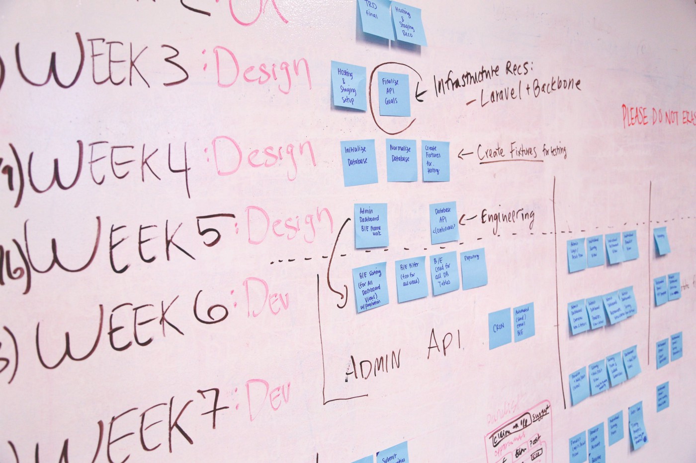
Use a JavaScript library to create a Gantt chart and take your project management efforts to the next level.
Earlier this year, my team was looking for a project management tool that could assist us in charting the various tasks related to our app development project against some specific timelines. After doing some research, we finally settled on Gantt charts. However, some people think Gantts are complicated to create. Not true! Thanks to numerous JavaScript chart libraries, data visualization is now simple, flexible, and embeddable.
In our situation, we settled on AnyChart’s JS Charts library because of its ease of use, extensive documentation, flexible code playground for trying out stuff, and other powerful features.
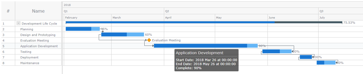
In this tutorial, I’ll walk you through how to create a simple interactive Gantt chart using this data visualization library. Here’s what we’ll be making and you can get the entire code for creating such a Gantt chart at the end of the tutorial:
Read the JS charting tutorial »
- Categories: AnyChart Charting Component, AnyGantt, Big Data, Business Intelligence, Gantt Chart, HTML5, JavaScript, JavaScript Chart Tutorials, Tips and Tricks
- 3 Comments »
Data Visualization Practices on Relationships, Brands, Hollywood, and Wildlife — DataViz Weekly
March 29th, 2019 by AnyChart Team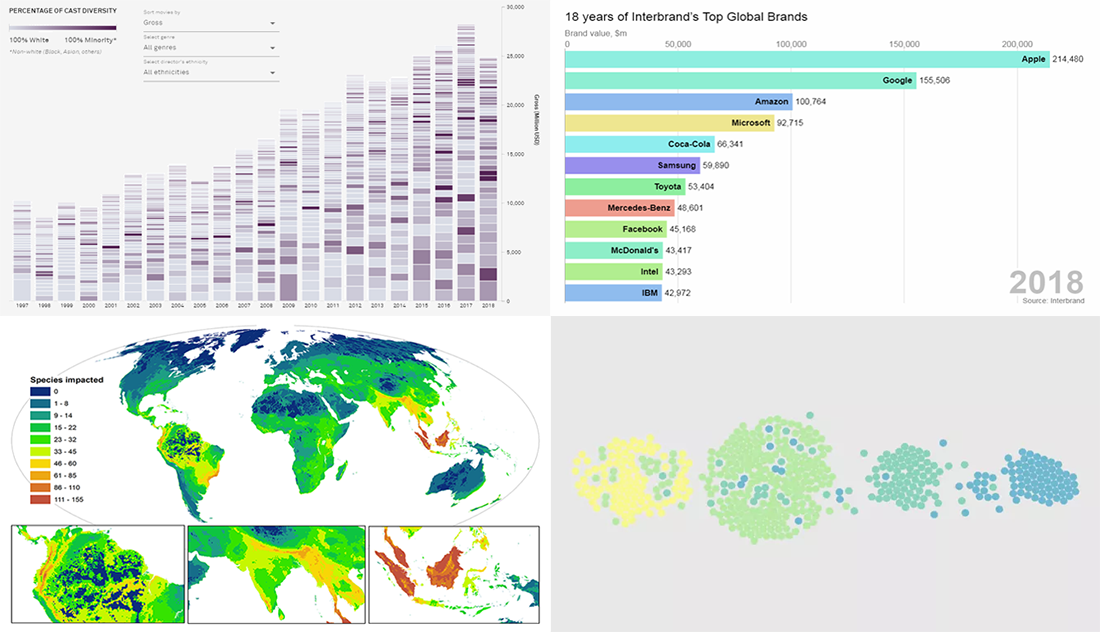 By looking at the best data visualization practices, not only do you have fun and learn something interesting about life and the world around us, but you can also pull together ideas that will help you take your charting skills to the next level. DataViz Weekly on the AnyChart blog is the right place to get such inspiration as that’s where we share with you some of the most interesting charts and graphics-based projects that have recently come to our attention.
Join us as we take a quick overview of new data visualizations on the following subjects:
- relationship timeline in 1970s vs 2010s
- top global brands in 2000-2018
- Asian on-screen representation in Hollywood movies
- global hotspots of human impact on threatened species
- Categories: Data Visualization Weekly
- No Comments »
Map Visualizations About US Violence, UK Real Estate, Brazil Streets, and Berliners — DataViz Weekly
August 31st, 2018 by AnyChart Team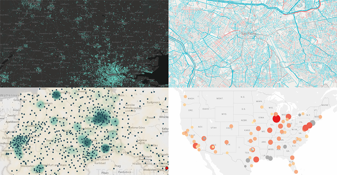 Hey everyone. This week, we’ve come across four interesting map visualizations and decided to share them with you within the framework of our DataViz Weekly feature. Let’s start with a quick list of what projects are featured and then, without more ado, take a look at them more closely right away:
- gender of all streets in Brazil;
- birthplaces of current Berliners;
- house price change in England and Wales;
- violent crime trends in the USA.
- Categories: Data Visualization Weekly
- No Comments »