Exploring Formula 1 History, Recession Indicators, Migration Patterns, Heat Effects — DataViz Weekly
August 12th, 2022 by AnyChart Team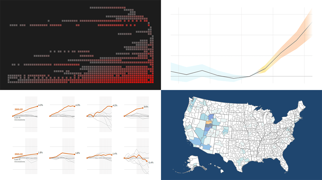 Visualizing data is an excellent way to quickly see patterns and trends hidden in it. In the DataViz Weekly series, we illuminate great fresh examples to illustrate how that works in practice. This time, we invite you to check out the following:
- 73 years of Formula One history — ATLO by Átlátszó
- Indicators of an economic recession in the U.S. — The Washington Post
- Migration patterns of young adults in the U.S. — Policy Impacts, U.S. Census Bureau, Opportunity Insights, Darkhorse Analytics
- Effects of rising temperatures outside on our daily lives — El País
- Categories: Data Visualization Weekly
- No Comments »
DataViz Projects About Cities, Opportunity, Mortality, and Migration — DataViz Weekly
October 5th, 2018 by AnyChart Team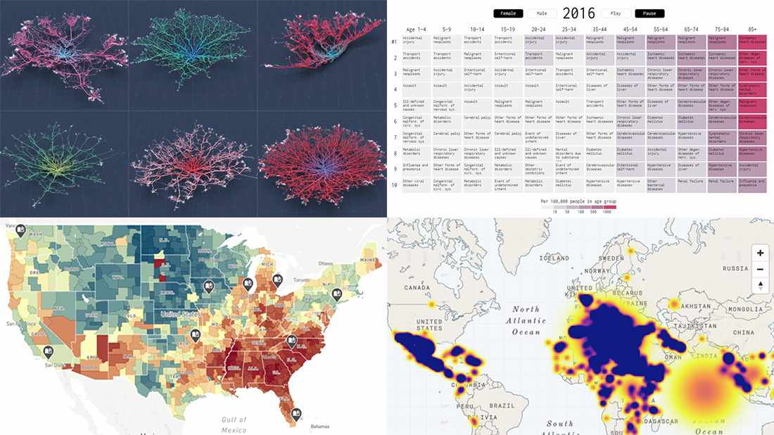 Read the first October issue of Data Visualization Weekly to learn about four interesting dataviz projects that have recently come to light:
- city road networks visualized as corals;
- U.S. Opportunity Atlas;
- top 10 causes of death over years;
- human migration routes that are most dangerous.
- Categories: Data Visualization Weekly
- No Comments »