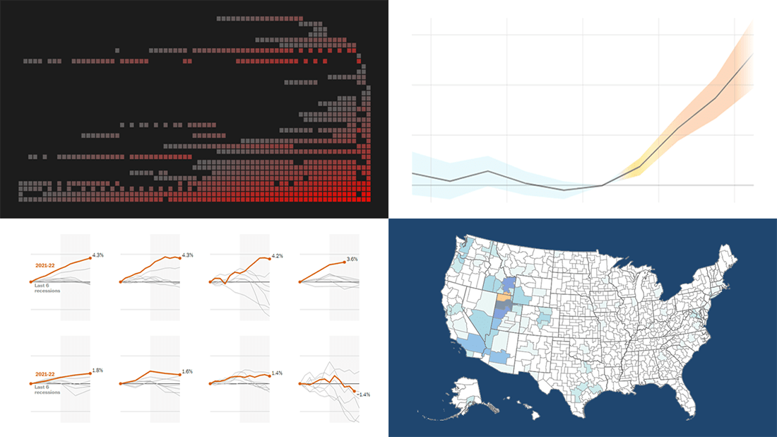
 Visualizing data is an excellent way to quickly see patterns and trends hidden in it. In the DataViz Weekly series, we illuminate great fresh examples to illustrate how that works in practice. This time, we invite you to check out the following:
- 73 years of Formula One history — ATLO by Átlátszó
- Indicators of an economic recession in the U.S. — The Washington Post
- Migration patterns of young adults in the U.S. — Policy Impacts, U.S. Census Bureau, Opportunity Insights, Darkhorse Analytics
- Effects of rising temperatures outside on our daily lives — El País
Data Visualization Weekly: August 5, 2022 — August 12, 2022
73 Years of Formula One History
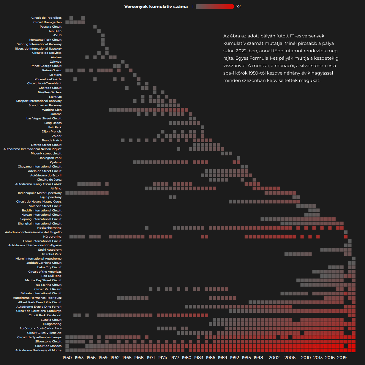
Numerous fans of Formula One all over the world must be excited by this new fascinating work by ATLO, the data team of Átlátszó, a Budapest-based center for investigative journalism.
In advance of the 37th Hungarian Grand Prix held a few days ago, the team released a monumental data visualization project representing the 73 years of the history of F1. There are beautiful charts, maps, and animations on drivers, teams, locations, and so on. The diagram displayed above, for example, shows which tracks have seen the most races.
Explore Formula One’s history in great visualizations on ATLO’s website.
Indicators of Economic Recession in U.S.
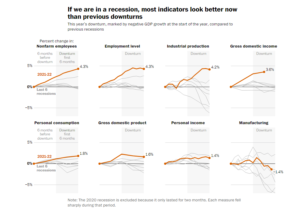
Is the economy of the United States in a recession or not? This question is difficult to answer. While GDP fell for the second quarter in a row, most indicators still look not too bad.
The National Bureau of Economic Research (NBER) tracks a range of measures to understand whether the current downturn is already a recession. The Washington Post’s Alyssa Fowers and Kevin Schaul plotted those using data from the Federal Reserve Bank of St. Louis. Their baseline charts show where eight indicators currently stand compared with previous recessions in the U.S. over the past fifty years.
Find out what the data says on whether America is in a recession, on The Post.
Migration Patterns of Young Adults in U.S.
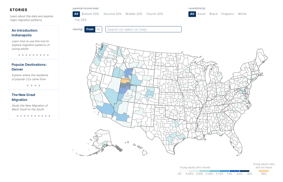
Young adults in the U.S. are reluctant to move far away from where they grew up. A study by Ben Sprung-Keyser, Nathaniel Hendren (both from Harvard University), and Sonya Porter (U.S. Census Bureau) shows that, on average, 69% of 26-year-old Americans live in the same commuting area as when they were 16, 80% within 100 miles, and 90% within 500 miles.
Darkhorse Analytics designed an interactive map that visualizes the entire migration matrix the researchers had developed based on tax and census data. For each commuting zone, you can quickly see where people move from it (and from where people move to it) and explore migration patterns for different races and parental income levels.
Look at how young adults in the U.S. migrate, at migrationpatterns.org.
Effects of Rising Temperatures Outside on Our Daily Life
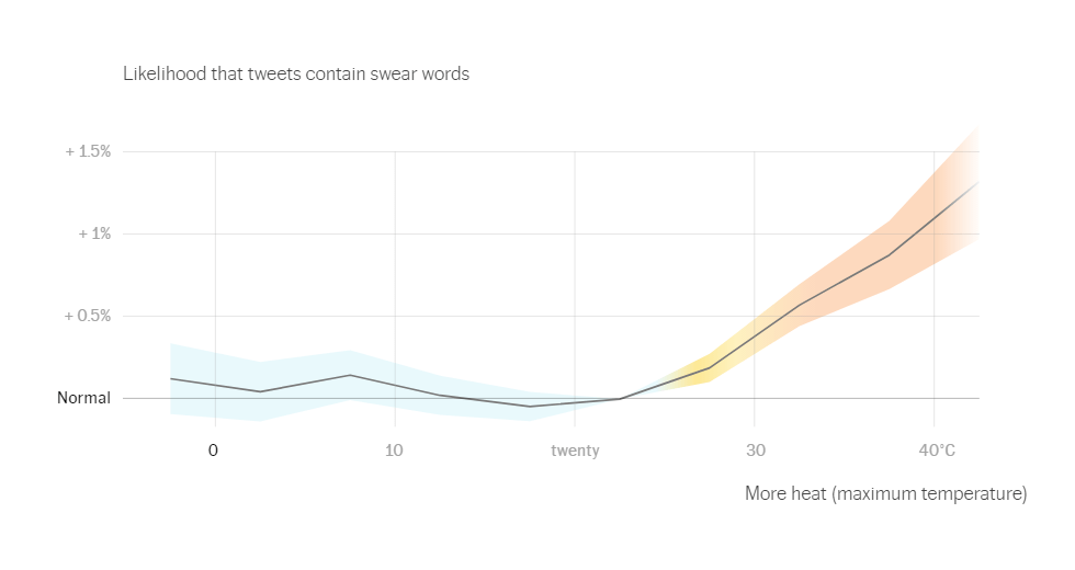
Excess heat caused by climate change impacts our lives in multiple ways. How many of them could you name off the top of your head?
Kiko Llaneras, Daniele Grasso, and José A. Álvarez of El País visualized data from various research works on the effects of rising temperatures and made a cool summary piece. The chart you see above, for example, reveals that the hotter the day, the more frequent the swearing in tweets. With the heat, people also get more violent, study and work worse, and honk more in traffic jams.
See the many data graphics showing these and other trends at a glance on El País.
***
We’ll keep you posted on the most interesting dataviz examples out there. Stay tuned for Data Visualization Weekly!
- Categories: Data Visualization Weekly
- No Comments »